Offers を運営している株式会社 overflow の あほむ でございます。最近書いた JavaScript は Google Apps Script です。UI 書きたいけどマネージャーという名の雑用忙しいウオオ。
最上層に浮かせて表示したい UI の配置を制御する仕様
なんとなく Chrome Platform Status から Proposed なステータスのフィーチャーを取り上げて、そのプロポーザルな仕様を眺めてみるシリーズです。本当にシリーズにするかは謎です。
今回は CSS Anchored Positioning を眺めてみます。本当に眺めるだけで深入りしないので概要のみのライトな記事とご認識ください。
Microsoft Edge チームからの提案
MicrosoftEdge/MSEdgeExplainers にあることから Microsoft 社の Edge ないし Chromium 開発チームですかね。[1]
同じく MSEdgeExplainers で Enabling Popups という現在は Archived なスタータスのドキュメントで <popup> の提案をした/しようとしていた形跡がありますし、同じ Open UI Community Group の系譜のようです。
バブル、ポップアップ、ツールチップ等の UI 配置がラクに
CSS Anchored Positioning は、バブル、ポップアップ、ツールチップといったビジュアル的に画面の上層に浮き出てくる系の UI の表示位置について、従来のめんどうくさい処理に代わって宣言的に制御できるようにします。

MicrosoftEdge/MSEdgeExplainers より引用
前述の Explainer からの引用ですが、こちらの画像を見ると分かりやすいでしょう。セレクトボックスのような UI を表示する際、画面の下方向に十分なスペースがあればそのまま下に配置できますが、なければ上方向に配置するためには従来は JavaScript による制御が必要でした。これが不要になります。
position: relative のくびきから逃れるために </body> の直前にすべての表示要素に勝るグローバルなポップアップ用の <div> 要素等を置いたことがある人も少なくないでしょう。あの工夫も position: fixed との併用によって不要になります。[2]
本稿執筆時点で提案されている API
ではこれをどのように表現するかというと、執筆時点のプロポーザルによれば次のような使い方が想定されています。
anchor HTML 属性と position-set CSS プロパティ
HTML はポップアップのような浮かせたい側の要素に anchor 属性で、どの要素を基準位置とするか対象要素の id 属性値を指定しています。CSS はポップアップ要素側に position-set プロパティで表示位置のパターンを指定しています。
別のプロポーザルにある <popup> 要素が例で使われています。button#myButton に指定されている popup="myPopup" は「このボタンを押すとこの ID の <popup> 要素を開くぞ」という宣言と思われます。あまり本筋に関係ないので架空の Custom Element くらいに考えておきましょう。
<button id="myButton" popup="myPopup">Anchor</button>
<popup id="myPopup" anchor="myButton" role="menu">…</popup>
<style>
    #myPopup {
        position: fixed;
        position-set: buttonMenuPos;
        overflow: auto;

        /* The popup is at least as wide as the button */
        min-width: calc(anchor(right) - anchor(left));

        /* The popup is at least as tall as 2 menu items */
        min-height: 6em;
    }

    /* This example intentionally left verbose */
    @position-set buttonMenuPos {
        1 {
            top: anchor(bottom);
            left: anchor(left);
            max-width: calc(100vw - anchor(left));
            max-height: calc(100vh - anchor(bottom));
        }
        2 {
          /* 省略(後述) */
        }
        3 {
          /* 省略(後述) */
        }
        4 {
          /* 省略(後述) */
        }
    }
</style>
いったんこれがスタンダードなユースケースと言えるでしょう。仕様を読むと他にも色々書いてありますが、今回は眺めるだけなので深追いしません!
@position-set ルールセットは番号順に試行される
ユーザーエージェント(Web ブラウザ)は例でいう @position-set buttonMenuPos {...} における 1 番の指定を試行してビューポートの境界からオーバーフローするようであれば、2 番の指定を試行します。全部失敗したら 1 番を使います。
anchor() CSS 関数は、例えば anchor(bottom) であれば、ビューポートの上端から HTML 側でアンカーとして指定された要素の下端までの距離を返します。よって top: anchor(bottom) はアンカー要素の下端に接することを示し、left: anchor(left) はアンカー要素の左端に接することを示します。例では max-width や max-height も anchor() を使って調整しています。
/* This example intentionally left verbose */
@position-set buttonMenuPos {
    /* First try to align the top, left edge of the popup
    with the bottom, left edge of the button. */
    1 {
        top: anchor(bottom);
        left: anchor(left);

        /* The popup is no wider than the distance from the
        left button edge to the right edge of the viewport */
        max-width: calc(100vw - anchor(left));

        /* clamp the height of the popup to be no taller than
        the distance between the bottom of the button and the
        bottom of the layout viewport. */
        max-height: calc(100vh - anchor(bottom));
    }

    /* Next try to align the bottom, left edge of the popup
    with the top, left edge of the button. */
    2 {
        bottom: anchor(top);
        left: anchor(left);

        max-width: calc(100vw - anchor(left));

        /* clamp the height of the popup to be no taller than
        the distance between the top of the button and the
        bottom of the layout viewport. */
        max-height: anchor(top);
    }

    /* Next try to align the top, right edge of the popup
    with the bottom, right edge of the button. */
    3 {
        top: anchor(bottom);
        right: anchor(right);

        /* The popup is no wider than the distance from the
        right button edge to left edge of the viewport. */
        max-width: anchor(right);

        max-height: calc(100vh - anchor(bottom));
    }

    /* Finally, try to align the bottom, right edge of the popup
    with the top, right edge of the button. Other positions are possible,
    but this is the final option the author would like the rendering
    engine to try. */
    4 {
        bottom: anchor(top);
        right: anchor(right);

        /* The popup is no wider than the distance from the
        right button edge to left edge of the viewport. */
        max-width: anchor(right);

        max-height: anchor(top);
    }
}
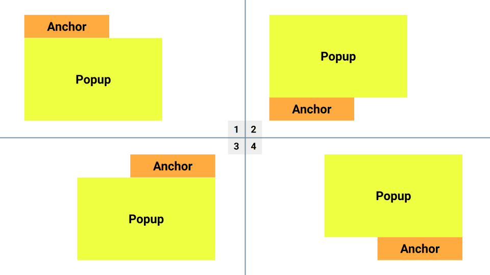
テキストにすると次のような表示イメージです。
- アンカーの左下とポップアップの左上が接し、アンカー右下方向に拡がるポップアップ
- アンカーの左上とポップアップの左下が接し、アンカー右上方向に拡がるポップアップ
- アンカーの右下とポップアップの右上が接し、アンカー左下方向に拡がるポップアップ
- アンカーの右上とポップアップの右下が接し、アンカー左上方向に拡がるポップアップ
...絶望的に分かりづらいので図も作りました。こんな感じでビューポートの境界に触れない良い感じの位置を探し求めるわけですね。
ざっくりとした解説でしたが、プロポーザルの意図や目的をなんとなく掴めたのではないでしょうか。Auto Layout with Constraits みがありますね。
プロポーザルは星の数ほどに
星の数は言いすぎですが生まれては消え、なんなら Chromium には実装されても他のベンダーからはシグナルのない仕様もあるわけで、肩の力を抜いて眺めてみるのもよろしいのではないでしょうか。ではでは。
関連記事
Discussion