MUIのStepperやTabsのコンテンツに自作のスライドビューワーを組み込む


始めに
MUIを使ってStepperやTabsを使った際に、コンテンツをスライドアニメーションで遷移したいことがあると思います。その場合、MUIではreact-swipeable-viewsを紹介されてますが、これを使用した場合、いくつか不都合が生じました。
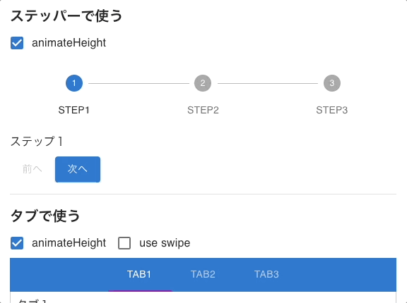
コンテンツごとの高さ対応が微妙
ステップごとにコンテンツの高さが異なる場合、animateHeightを指定しないときは一番高いコンテンツの高さに合わせられてしまいます。
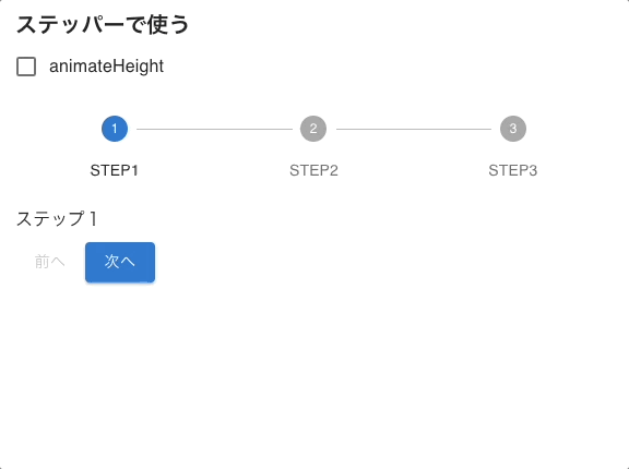
逆にanimateHeightを指定した場合は高さが固定されてしまうため、途中でコンテンツの高さが変わってしまうと困ってしまいます。。
スライドアニメーション動作が不安定
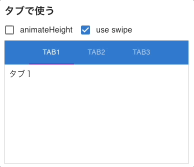
タブだと一番最初だけアニメーションが発火しない問題があります。公式でも発生していたので衝撃ですよね。。
他にも僕の書き方が悪いのか分かりませんが、スワイプによるスライドの切り替えではアニメーションされませんでした(react-swipeable-viewsのデモだと問題なく動いていたので不思議です)
こういった問題から、最初から自前で作った方が楽なのでは?と思ってきたので自作でスライド表示するだけのビューワーコンポーネントを作ってみましたので、それの備忘録としてまとめました。
スライドビューワーの実装
スライド表示する
まずは高さの自動調整は考慮さずにスライド切り替えだけを考えます。スライドで表示するには各スライドをルートコンテナを起点にtranslateで配置しておくとやりやすく、イメージでいうと以下のようになります。

これをコードに落とすと以下のようになります。
import { Box } from "@mui/material";
import { FC, ReactNode, Children } from "react";

export type SlideViewerProps = {
  /** 表示するindex値 */
  activeIndex: number;
  /** アニメーション時間[ms] */
  duration?: number;
  /** スライド表示する要素リスト */
  children: ReactNode[];
};

/**
 * スライド表示するコンポーネント。
 * このコンポーネント自体は操作するUIは持たないため、他のコンポーネントと組み合わせて使用する。
 */
export const SlideViewer: FC<SlideViewerProps> = ({
  activeIndex,
  duration = 300,
  children
}) => {
  return (
    <Box
      sx={{ position: "relative", overflow: "hidden" }}
    >
      {Children.map(children, (child, index) => {
        const offsetIndex = index - activeIndex;
        return (
          <Box
            key={index}
            style={{
              position: index !== activeIndex ? "absolute" : undefined,
              width: "100%",
              top: 0,
              left: 0,
              transform: `translate(${offsetIndex * 100}%, 0)`,
              transition: `transform ${duration}ms`
            }}
          >
            {child}
          </Box>
        );
      })}
    </Box>
  );
};
これで高さのアニメーションはされませんが、表示中のスライドの高さに合わさるようにスライドアニメーションされるようになりました。
高さの変動をアニメーションする
続いて高さも自動で調整されるようにしたいと思います。他でも使っていけるように別コンポーネントに切り出して実装します。特定のタイミングで高さ変動時にアニメーションしたいためtriggerKeyを渡して、それが切り替わったときに再render直前の高さからtargetHeightに向かってアニメーションするようにしました。render直前の高さはhooksだと上手く取れなかったので、renderサイクルで取得しています。
import { FC, ReactNode, useRef, useLayoutEffect } from "react";
import { Box, SxProps } from "@mui/material";

export type HeightAdjusterProps = {
  /** MUIのsx props */
  sx?: SxProps;
  /** トリガーキーが変わった時に高さ変動アニメーションが発火する */
  triggerKey: any;
  /** アニメーション先の目的の高さ(undefinedの時は何もしない) */
  targetHeight?: number;
  /** アニメーション時間[ms] */
  duration: number;
  /** 子要素 */
  children: ReactNode;
};

/**
 * アニメーションで高さの変動に追従するコンポーネント
 */
export const HeightAdjuster: FC<HeightAdjusterProps> = ({
  triggerKey,
  targetHeight,
  duration,
  sx,
  children,
}) => {
  const elRootRef = useRef<HTMLDivElement | null>(null);
  const prevRootHeight = useRef<number>(0);
  const prevTriggerKeyRef = useRef(triggerKey);

  // triggerKeyが変わった時にrender直前の高さを保持する
  if (triggerKey !== prevTriggerKeyRef.current && elRootRef.current != null) {
    prevTriggerKeyRef.current = triggerKey;
    prevRootHeight.current = elRootRef.current.clientHeight;
  }

  useLayoutEffect(() => {
    if (targetHeight == null) {
      return;
    }
    const elRoot = elRootRef.current;
    if (elRoot == null) {
      return;
    }

    // 直前の高さから目的の高さまでアニメーションする
    elRoot.animate(
      [
        { height: `${prevRootHeight.current}px`, overflow: "hidden" },
        { height: `${targetHeight}px`, overflow: "hidden" },
      ],
      { duration }
    );
  }, [triggerKey]);

  return (
    <Box ref={elRootRef} sx={sx}>
      {children}
    </Box>
  );
};
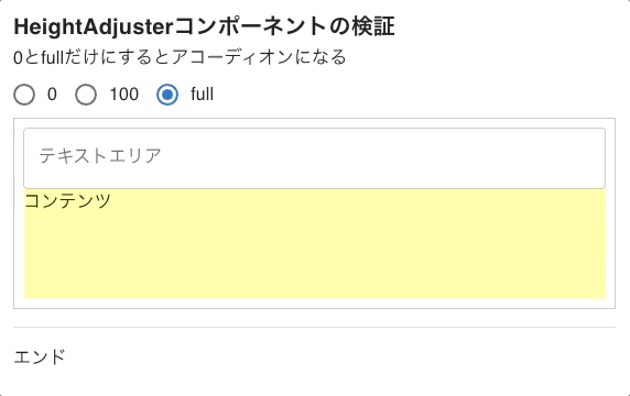
アコーディオンに応用する
今作ったコンポーネントの検証で以下のような動きをする検証コードを書きました。このコンポーネントを使ってスライドビューワーの高さ調整を実装しますが、こちらの検証コードは少し発展させるとアコーディオンとしても作れそうです。
import { FC, useState, useRef } from "react";
import {
  Box,
  Typography,
  RadioGroup,
  Radio,
  FormControlLabel,
  TextField
} from "@mui/material";

import { HeightAdjuster } from "../../components/HeightAdjuster";

export const TrialHeightAdjusterContainer: FC = () => {
  const elContentRef = useRef<HTMLDivElement | null>(null);
  const [heightType, setHeightType] = useState("full");

  const isFullHeight = heightType === "full";

  return (
    <Box>
      <Typography variant="h6" fontWeight="bold">
        HeightAdjusterコンポーネントの検証
      </Typography>
      <Box>0とfullだけにするとアコーディオンになる</Box>
      <RadioGroup
        value={heightType}
        row
        onChange={(event) => {
          setHeightType(event.target.value);
        }}
      >
        <FormControlLabel value="0" control={<Radio />} label="0" />
        <FormControlLabel value="100" control={<Radio />} label="100" />
        <FormControlLabel value="full" control={<Radio />} label="full" />
      </RadioGroup>
      <HeightAdjuster
        sx={{
          height: isFullHeight ? undefined : parseInt(heightType),
          overflow: isFullHeight ? undefined : "hidden"
        }}
        triggerKey={heightType}
        targetHeight={
          isFullHeight
            ? elContentRef.current?.clientHeight
            : parseInt(heightType)
        }
        duration={500}
      >
        <Box ref={elContentRef} sx={{ p: 1, border: "solid 1px #ccc" }}>
          <TextField label="テキストエリア" multiline fullWidth />
          <Box sx={{ height: 100, backgroundColor: "#ffa" }}>コンテンツ</Box>
        </Box>
      </HeightAdjuster>
    </Box>
  );
};
このコンポーネントをSlideViewerに適応します。targetHeightは各スライド要素の高さを取った方が良いため、MapでDOM要素を管理して、該当するスライド要素の高さを渡せるようにします。
+import { HeightAdjuster } from "./HeightAdjuster";

 // 既出のものは省略

 export const SlideViewer: FC<SlideViewerProps> = ({
   activeIndex,
   duration = 300,
   children
 }) => {
+  const elSlidesRef = useRef(new Map<number, HTMLDivElement>());
+
+  const elTargetSlide = elSlidesRef.current.get(activeIndex);
   return (
-    <Box
+    <HeightAdjuster
       sx={{ position: "relative", overflow: "hidden" }}
+      triggerKey={activeIndex}
+      targetHeight={elTargetSlide?.clientHeight}
+      duration={duration}
     >
       {Children.map(children, (child, index) => {
         const offsetIndex = index - activeIndex;
         return (
           <Box
             key={index}
+            ref={(el: HTMLDivElement | null) => {
+              if (el != null) {
+                elSlidesRef.current.set(index, el);
+              } else {
+                elSlidesRef.current.delete(index);
+              }
+            }}
             style={{
               position: index !== activeIndex ? "absolute" : undefined,
               width: "100%",
               top: 0,
               left: 0,
               transform: `translate(${offsetIndex * 100}%, 0)`,
               transition: `transform ${duration}ms`
             }}
           >
             {child}
           </Box>
         );
       })}
+    </HeightAdjuster>
-    </Box>
   );
 };
これで無事スライド切り替え時に高さ変更のアニメーションもされるようになりました。
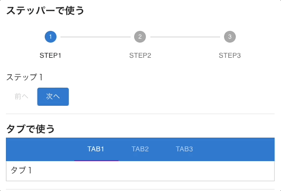
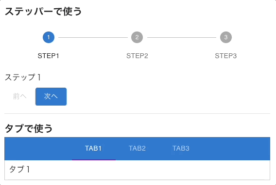
検証コード
今まで見せてきたものは以下のCodeSandboxで書いております。react-swipeable-viewsを使ったパターンやタブへの適応もこちらに載せておりますので、詳細のコードや動きを確認したい方はご覧ください。
終わりに
以上が自作のスライドビューワーを作ってMUIのStepperやTabsのコンテンツに組み込んでみた内容でした。コード的にはそこまでボリュームがあるものではないため、ライブラリが上手く動かず自作を検討されている方の参考になれたら幸いです。
Discussion