はじめに
こんにちは! no plan inc. にてエンジニアやってます @somasekiです。
これはno plan inc.の Advent Calendar 2023の3日目の記事です。
フロントエンドの実装が得意ではない僕が、Nextjsで十数ページのフロントエンドのコードを書いた際に、とても助かったライブラリについて紹介したいと思います。
要約
- shadcn/ui はいいぞー
shadcn/ui とは
shadcn/uiはRadix UI と Tailwind CSSを利用した、カスタマイズ性が高く、テーマ可能なコンポーネントを提供する新しいCSSライブラリです。
オープンソースであり、アクセシブルな設計が特徴です。また、npmやyarnを使用して依存関係としてダウンロードする必要がありません。なので、必要なコンポーネントだけ使用できます。
ユースケース
- デザイナーがいない、デザインが苦手
- シンプルなデザインにしたい
- 完成されたコンポーネントを使い、それに少し手を加えたい
推しポイント1. data-tableのカスタマイズ性高い
Tanstack Table を利用して作成される data-table.tsxのカスタマイズ性高いと感じたので一部紹介します。
ヘッダー
ヘッダーを編集して、カラムのソートや行選択できるようになります。

ヘッダー編集
const columns = [
export const columns: ColumnDef<Payment>[] = [
  {
    id: 'select',
    header: ({table}) => (
      <Checkbox
        checked={
          table.getIsAllPageRowsSelected() ||
          (table.getIsSomePageRowsSelected() && 'indeterminate')
        }
        onCheckedChange={value => table.toggleAllPageRowsSelected(!!value)}
        aria-label="Select all"
      />
 .....省略
  {
    accessorKey: 'email',
    header: ({column}) => {
      return (
        <Button
          variant="ghost"
          onClick={() => column.toggleSorting(column.getIsSorted() === 'asc')}
        >
          Email
          <CaretSortIcon className="ml-2 h-4 w-4" />
        </Button>
      );
    },
 .....省略
]

 .....省略

<DataTable columns={columns}>
セル
カラムごとのセルの編集もかなり自由に設定できます。
cell編集
export const columns: ColumnDef<Payment>[] = [
{
id: 'select',
header: (省略)
cell: ({row}) => (
<Checkbox
checked={row.getIsSelected()}
onCheckedChange={value => row.toggleSelected(!!value)}
aria-label="Select row"
/>
),
enableSorting: false,
enableHiding: false,
},
{
accessorKey: 'status',
header: 'Status',
cell: ({row}) => <div className="capitalize">{row.getValue('status')}</div>,
},
{
accessorKey: 'email',
header: (省略)
cell: ({row}) => <div className="lowercase">{row.getValue('email')}</div>,
},
{
accessorKey: 'amount',
header: (省略)
},
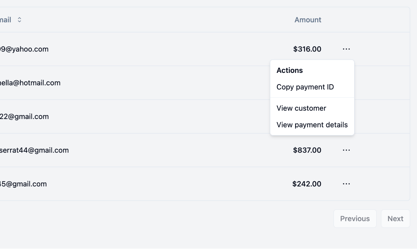
{
id: 'actions',
enableHiding: false,
cell: ({row}) => {
const payment = row.original;
return (
<DropdownMenu>
<DropdownMenuTrigger asChild>
<Button variant="ghost" className="h-8 w-8 p-0">
<span className="sr-only">Open menu</span>
<DotsHorizontalIcon className="h-4 w-4" />
</Button>
</DropdownMenuTrigger>
<DropdownMenuContent align="end">
<DropdownMenuLabel>Actions</DropdownMenuLabel>
<DropdownMenuItem
onClick={() => navigator.clipboard.writeText(payment.id)}
>
Copy payment ID
</DropdownMenuItem>
<DropdownMenuSeparator />
<DropdownMenuItem>View customer</DropdownMenuItem>
<DropdownMenuItem>View payment details</DropdownMenuItem>
</DropdownMenuContent>
</DropdownMenu>
);
},
},
];
.....省略
<DataTable columns={columns}>
ページネーション
ページネーションもすでに用意されたものがあります。ページネーション
少し元のコードを修正して、useSWRInfiniteと一緒に利用することもできました。
page.tsx
 .....省略
export default async function DataTableDemoPage() {
  const [page, setPage] = useState(10);
  const {data, error, size, setSize, mutate} = useSWRInfinite(
    getKey,
    dataFetchFunction
  );
  return (
    <>
      <DataTableDemo
        columns={columns}
        options={{
          totalCount: data.totalCount,
          size,
          setSize,
          page,
          setPage,
        }}
      />
    </>
  );
}
data-table.tsx
interface DataTableProps<TData, TValue> {
  columns: ColumnDef<TData, TValue>[];
  options?: {
    totalCount: number;
    size: number;
    setSize: SWRInfiniteResponse['setSize'];
    page: number;
    setPage: React.Dispatch<React.SetStateAction<number>>;
  };
}

export function DataTableDemo({
  columns,
  options,
}: DataTableProps<Payment, any>) {
  const [sorting, setSorting] = React.useState<SortingState>([]);
  const [columnFilters, setColumnFilters] = React.useState<ColumnFiltersState>(
    []
  );
  const [columnVisibility, setColumnVisibility] =
    React.useState<VisibilityState>({});
  const [rowSelection, setRowSelection] = React.useState({});

  const table = useReactTable({
    data,
    columns,
    onSortingChange: setSorting,
    onColumnFiltersChange: setColumnFilters,
    getCoreRowModel: getCoreRowModel(),
    getPaginationRowModel: getPaginationRowModel(),
    getSortedRowModel: getSortedRowModel(),
    getFilteredRowModel: getFilteredRowModel(),
    onColumnVisibilityChange: setColumnVisibility,
    onRowSelectionChange: setRowSelection,
    state: {
      sorting,
      columnFilters,
      columnVisibility,
      rowSelection,
    },
  });

  const {totalCount, setSize, setPage, size, page} = options ?? {};
  // ページの総数
  const pageCount =
    totalCount && page ? Math.ceil(totalCount / page) : table.getPageCount();
  // 現在のページ
  const currentPage = size ?? table.getState().pagination.pageIndex + 1;
  // 前のページに戻れるか
  const canPreviousPage = size ? size == 1 : !table.getCanPreviousPage();
  // 次のページに進めるか
  const canNextPage =
    size && totalCount && page ? pageCount == size : !table.getCanNextPage();
  // 選択されているページのサイズ
  const selectedValue = page ?? table.getState().pagination.pageSize;
  // デフォルトで選択されているページのサイズ
  const defaultSelectedValue = page ?? table.getState().pagination.pageSize;

  return (
    <div className="rounded-md border">
      <Table>
        <TableHeader>
          {table.getHeaderGroups().map(headerGroup => (
            <TableRow key={headerGroup.id}>
              {headerGroup.headers.map(header => {
                return (
                  <TableHead key={header.id}>
                    {header.isPlaceholder
                      ? null
                      : flexRender(
                          header.column.columnDef.header,
                          header.getContext()
                        )}
                  </TableHead>
                );
              })}
            </TableRow>
          ))}
        </TableHeader>
        <TableBody>
          {table.getRowModel().rows?.length ? (
            table.getRowModel().rows.map(row => {
              return (
                <TableRow
                  key={row.id}
                  data-state={row.getIsSelected() && 'selected'}
                >
                  {row.getVisibleCells().map(cell => (
                    <TableCell key={cell.id}>
                      {flexRender(
                        cell.column.columnDef.cell,
                        cell.getContext()
                      )}
                    </TableCell>
                  ))}
                </TableRow>
              );
            })
          ) : (
            <TableRow>
              <TableCell colSpan={columns.length} className="h-24 text-center">
                No results.
              </TableCell>
            </TableRow>
          )}
        </TableBody>
      </Table>

      <div className="flex items-center justify-between px-2">
        <div className="flex-1 text-sm text-muted-foreground"></div>
        <div className="flex items-center space-x-6 lg:space-x-8">
          <div className="flex items-center space-x-2">
            <p className="text-sm font-medium">Rows per page</p>
            <Select
              value={`${selectedValue}`}
              defaultValue={`${defaultSelectedValue}`}
              onValueChange={value => {
                if (setSize && setPage) {
                  setPage(Number(value));
                  setSize(1);
                }
                table.setPageSize(Number(value));
              }}
            >
              <SelectTrigger className="h-8 w-[70px]">
                <SelectValue placeholder={defaultSelectedValue} />
              </SelectTrigger>
              <SelectContent side="top">
                {[10, 20, 30, 40, 50].map(pageSize => (
                  <SelectItem key={pageSize} value={`${pageSize}`}>
                    {pageSize}
                  </SelectItem>
                ))}
              </SelectContent>
            </Select>
          </div>
          <div className="flex w-[100px] items-center justify-center text-sm font-medium">
            Page {currentPage} of {pageCount}
          </div>
          <div className="flex items-center space-x-2">
            <Button
              variant="outline"
              className="hidden h-8 w-8 p-0 lg:flex"
              onClick={() => {
                if (setSize) {
                  setSize(1);
                }
                table.setPageIndex(0);
              }}
              disabled={canPreviousPage}
            >
              <span className="sr-only">Go to first page</span>
              <DoubleArrowLeftIcon className="h-4 w-4" />
            </Button>
            <Button
              variant="outline"
              className="h-8 w-8 p-0"
              onClick={() => {
                if (size && setSize) {
                  setSize(size - 1);
                }
                table.previousPage();
              }}
              disabled={canPreviousPage}
            >
              <span className="sr-only">Go to previous page</span>
              <ChevronLeftIcon className="h-4 w-4" />
            </Button>
            <Button
              variant="outline"
              className="h-8 w-8 p-0"
              onClick={() => {
                if (size && setSize) {
                  setSize(size + 1);
                }
                table.nextPage();
              }}
              disabled={canNextPage}
            >
              <span className="sr-only">Go to next page</span>
              <ChevronRightIcon className="h-4 w-4" />
            </Button>
            <Button
              variant="outline"
              className="hidden h-8 w-8 p-0 lg:flex"
              onClick={() => {
                if (setSize && totalCount && page) {
                  setSize(Math.ceil(totalCount / page));
                }
                table.setPageIndex(pageCount - 1);
              }}
              disabled={canNextPage}
            >
              <span className="sr-only">Go to last page</span>
              <DoubleArrowRightIcon className="h-4 w-4" />
            </Button>
          </div>
        </div>
      </div>
    </div>
  );
}
推しポイント2. FormはAutoFormを使ってzodと連携
AutoFormは、shadcn/uiを使ってフォームが簡単に作れるコンポーネントで、React Hook Form と、zod を作られています。
zodでフォームのスキーマを作成すればすぐにフォームが完成します。
AutoForm
import AutoForm, {AutoFormSubmit} from '@/components/ui/auto-form';
import {z} from 'zod';

const formSchema = z.object({
  username: z
    .string({
      required_error: 'Username is required.',
    })
    // You can use zod's built-in validation as normal
    .min(2, {
      message: 'Username must be at least 2 characters.',
    }),

  password: z
    .string({
      required_error: 'Password is required.',
    })
    // Use the "describe" method to set the label
    // If no label is set, the field name will be used
    // and un-camel-cased
    .describe('Your secure password')
    .min(8, {
      message: 'Password must be at least 8 characters.',
    }),

  description: z.string(),
});

export const FormDemo = () => {
  const onSubmit = async (values: z.infer<typeof formSchema>) => {
    console.log('登録中');
  };
  return (
    <AutoForm
      formSchema={formSchema}
      onSubmit={onSubmit}
      fieldConfig={{
        description: {
          fieldType: 'textarea',
        },
      }}
    >
      <AutoFormSubmit variant={'outline'}>登録</AutoFormSubmit>
    </AutoForm>
  );
};
推しポイント3. AI でコンポーネントを自動生成できる
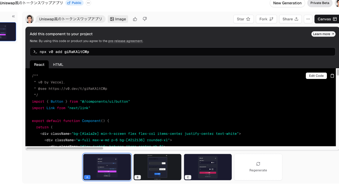
v0というサービスが、shadcn/uiのコンポーネントを利用して自然言語からコードを生成してくれるらしい。
軽く使ってみた感じ、基本的なものであれば簡単に作ってくれる。まだPrivate Beta版らしいです。
テキストと画像からUIを生成してくれます。
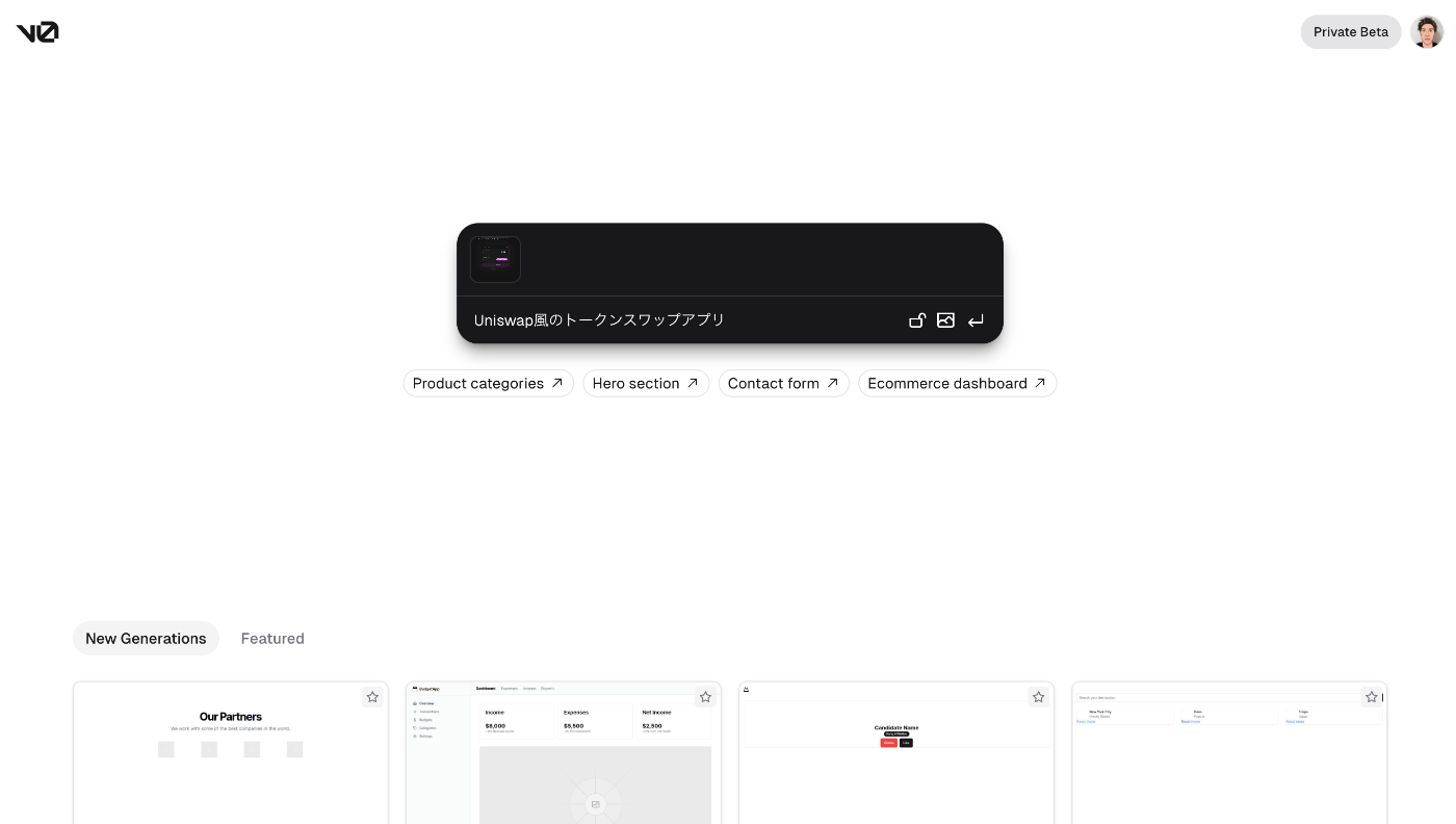
数パターン用意してくれます
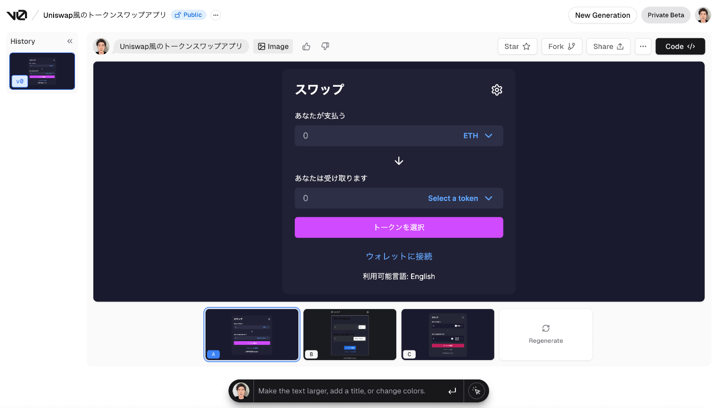
あとはコードコピペするだけなので、超簡単にカッコ良いUIが作れます
おわりに
フロントエンドの実装にあまり時間使いたくない場合にとても助かるライブラリでした。
僕は一からフロント書くのが苦手なので(特にCSS)、そこを補ってくれ、かつ必要最低限のコードのみ取り入れることができるのも好きでした。
no plan株式会社について
- no plan株式会社は 「テクノロジーの力でZEROから未来を創造する、精鋭クリエイター集団」 です。
- ブロックチェーン/AI技術をはじめとした、Webサイト開発、ネイティブアプリ開発、チーム育成、などWebサービス全般の開発から運用や教育、支援なども行っています。よくわからない、ふわふわしたノープラン状態でも大丈夫!ご一緒にプランを立てていきましょう!
- no plan株式会社について
- no plan株式会社 | web3実績
- no plan株式会社 | ブログ一覧
エンジニアの採用も積極的に行なっていますので、興味がある方は是非ご連絡ください!
Discussion