Shopifyアプリ調査
 西川信行
西川信行新規プロジェクトを作成
// ストアにログイン
shopify login --store=20211030-app-test.myshopify.com

// Shopifyアプリを作成
shopify app create node

// Shopifyアプリをローカルにデプロイ
shopify app serve

// このコマンドは謎
shopify app open

// Shopifyアプリをherokuにデプロイ
shopify app deploy

// theme app extensionを作成
shopify extension create

// フォルダを移動
cd theme-app-extension

// テーマ拡張機能をアプリに登録
shopify extension register

// アプリをドラフトバージョンにプッシュする
shopify extension push
react-hook-formとpolarisでフォームを作ってみた。
import {
  Button,
  Card,
  Form,
  FormLayout,
  TextField,
  Page,
  Select,
} from "@shopify/polaris";
import { useForm, Controller } from "react-hook-form";

const Index = () => {
  const { control, handleSubmit } = useForm();
  const onSubmit = (data) => console.log(data);
  return (
    <Page>
      <Card sectioned>
        <Form onSubmit={handleSubmit(onSubmit)}>
          <FormLayout>
            <Controller
              name="name"
              control={control}
              defaultValue="UnReact 太郎"
              render={({ field }) => <TextField label="名前" {...field} />}
            />
            <Controller
              name="age"
              control={control}
              defaultValue="24"
              render={({ field }) => <TextField label="年齢" {...field} />}
            />
            <Controller
              name="jobType"
              control={control}
              defaultValue="学生"
              render={({ field }) => (
                <Select
                  label="あなたの職業は?"
                  {...field}
                  options={[
                    { value: "学生", label: "学生" },
                    { value: "会社員", label: "会社員" },
                    { value: "自営業", label: "自営業" },
                  ]}
                />
              )}
            />
            <Button submit primary>
              保存
            </Button>
          </FormLayout>
        </Form>
      </Card>
    </Page>
  );
};

export default Index;

西川信行requireとかを足した。
import {
  Button,
  Card,
  Form,
  FormLayout,
  TextField,
  Page,
  Select,
} from "@shopify/polaris";
import { useForm, Controller } from "react-hook-form";

const Index = () => {
  const { control, handleSubmit } = useForm();
  const onSubmit = (data) => console.log(data);
  return (
    <Page>
      <Card sectioned>
        <Form onSubmit={handleSubmit(onSubmit)}>
          <FormLayout>
            <Controller
              name="name"
              control={control}
              defaultValue="UnReact 太郎"
              rules={{ required: "名前は必須項目です" }}
              render={({ field }) => <TextField label="名前" {...field} />}
            />
            <Controller
              name="age"
              control={control}
              defaultValue="24"
              rules={{ required: "年齢は必須項目です"}}
              render={({ field }) => (
                <TextField type="number" label="年齢" {...field} />
              )}
            />
            <Controller
              name="jobType"
              control={control}
              defaultValue="学生"
              render={({ field }) => (
                <Select
                  label="あなたの職業は?"
                  {...field}
                  options={[
                    { value: "学生", label: "学生" },
                    { value: "会社員", label: "会社員" },
                    { value: "自営業", label: "自営業" },
                  ]}
                />
              )}
            />
            <Button submit primary>
              保存
            </Button>
          </FormLayout>
        </Form>
      </Card>
    </Page>
  );
};

export default Index;
テーマアプリエクステンションを使用
shopify extension create
What type of extension are you creating?と質問されるので、theme-app-extensionを選択すればOK
西川信行作成したTheme app extensitonに移動し、アプリに登録します。
cd theme-app-extension/
shopify extension register
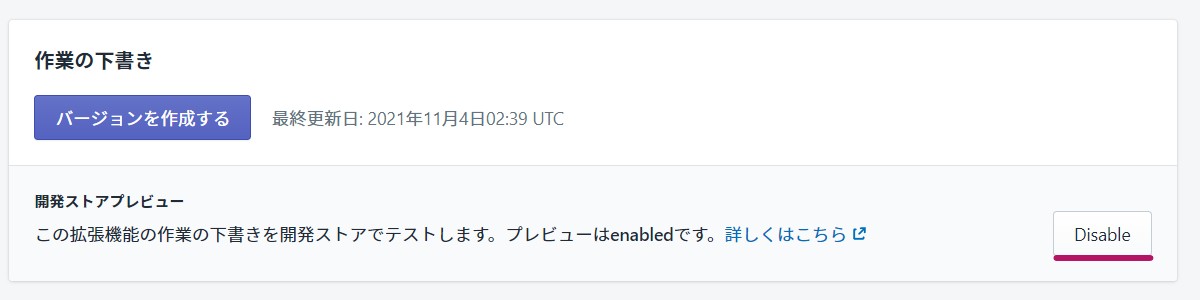
アプリをドラフトバージョンにプッシュする
以下のコマンドで、拡張機能をドラフトバージョンにプッシュします。
shopify extension push
上記のコードで返却されるURLに移動して、以下のように「Enable」にしましょう。
既にEnableをクリックしているので、画像は「Disable」になっています。
西川信行こんな感じで出てきます。
西川信行import {
AppProvider,
ResourceList,
Avatar,
TextStyle,
Card,
Page,
} from "@shopify/polaris";
const Index = () => (
<AppProvider
i18n={{
Polaris: {
ResourceList: {
sortingLabel: "Sort by",
defaultItemSingular: "item",
defaultItemPlural: "items",
showing: "Showing {itemsCount} {resource}",
Item: {
viewItem: "View details for {itemName}",
},
},
Common: {
checkbox: "checkbox",
},
},
}}
>
<Page>
<Card>
<ResourceList
showHeader
items={[
{
id: 341,
url: "customers/341",
name: "Mae Jemison",
location: "Decatur, USA",
},
{
id: 256,
url: "customers/256",
name: "Ellen Ochoa",
location: "Los Angeles, USA",
},
]}
renderItem={(item) => {
const { id, url, name, location } = item;
const media = <Avatar customer size="medium" name={name} />;
return (
<ResourceList.Item id={id} url={url} media={media}>
<h3>
<TextStyle variation="strong">{name}</TextStyle>
</h3>
<div>{location}</div>
</ResourceList.Item>
);
}}
/>
</Card>
</Page>
</AppProvider>
);
export default Index;

西川信行import { Page } from "@shopify/polaris";
import ActionListInPopoverExample from "../component/ActionList";
const Index = () => (
<Page>
<ActionListInPopoverExample />
</Page>
);
export default Index;
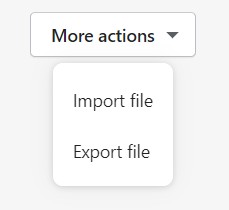
import { Popover, ActionList, Button } from "@shopify/polaris";
import { useCallback, useState } from "react";

function ActionListInPopoverExample() {
  const [active, setActive] = useState(true);

  const toggleActive = useCallback(() => setActive((active) => !active), []);
  const handleImportedAction = useCallback(
    () => console.log("Imported action"),
    []
  );

  const handleExportedAction = useCallback(
    () => console.log("Exported action"),
    []
  );

  const activator = (
    <Button onClick={toggleActive} disclosure>
      More actions
    </Button>
  );

  return (
    <div style={{ height: "250px" }}>
      <Popover active={active} activator={activator} onClose={toggleActive}>
        <ActionList
          items={[
            {
              content: "Import file",
              onAction: handleImportedAction,
            },
            {
              content: "Export file",
              onAction: handleExportedAction,
            },
          ]}
        />
      </Popover>
    </div>
  );
}
export default ActionListInPopoverExample;
西川信行AutoCompleteの実装
import { Page } from "@shopify/polaris";
import AutocompleteExample from "../component/Autocomplete";

const Index = () => (
  <Page>
    <AutocompleteExample />
  </Page>
);

export default Index;
import { useState, useCallback } from "react";
import { Autocomplete, Icon } from "@shopify/polaris";

function AutocompleteExample() {
  const deselectedOptions = [
    { value: "rustic", label: "Rustic" },
    { value: "antique", label: "Antique" },
    { value: "vinyl", label: "Vinyl" },
    { value: "vintage", label: "Vintage" },
    { value: "refurbished", label: "Refurbished" },
  ];
  const [selectedOptions, setSelectedOptions] = useState([]);
  const [inputValue, setInputValue] = useState("");
  const [options, setOptions] = useState(deselectedOptions);
  const updateText = useCallback(
    (value) => {
      setInputValue(value);

      if (value === "") {
        setOptions(deselectedOptions);
        return;
      }
      const filterRegex = new RegExp(value, "i");
      const resultOptions = deselectedOptions.filter((option) =>
        option.label.match(filterRegex)
      );
      setOptions(resultOptions);
    },
    [deselectedOptions]
  );
  const updateSelection = useCallback(
    (selected) => {
      const selectedValue = selected.map((selectedItem) => {
        const matchedOption = options.find((option) => {
          return option.value.match(selectedItem);
        });
        return matchedOption && matchedOption.label;
      });
      setSelectedOptions(selected);
      setInputValue(selectedValue[0]);
    },
    [options]
  );
  const textField = (
    <Autocomplete.TextField
      onChange={updateText}
      label="Tags"
      value={inputValue}
      prefix={<Icon color="base" />}
      placeholder="Search"
    />
  );
  return (
    <div style={{ height: "225px" }}>
      <Autocomplete
        options={options}
        selected={selectedOptions}
        onSelect={updateSelection}
        textField={textField}
      />
    </div>
  );
}

export default AutocompleteExample;
Avatarの実装
import { Page, Avatar } from "@shopify/polaris";

const Index = () => (
  <Page>
    <Avatar customer name="Farrah" />
  </Page>
);

export default Index;
Badgeの実装
import { Page, Badge } from "@shopify/polaris";


const Index = () => (
  <Page>
    <Badge>Fulfilled</Badge>
  </Page>
);

export default Index;

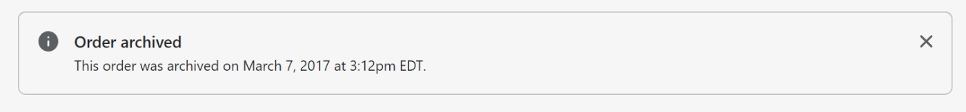
西川信行Bannerの実装
onDismissにはバナーの☓ボタンがクリックされたときに発火される関数を定義します。
import { Page, Banner } from "@shopify/polaris";

const Index = () => (
  <Page>
    <Banner title="Order archived" onDismiss={() => {}}>
      <p>This order was archived on March 7, 2017 at 3:12pm EDT.</p>
    </Banner>
  </Page>
);

export default Index;
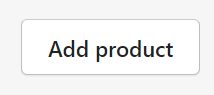
西川信行ボタンの実装
import { Page, Button } from "@shopify/polaris";

const Index = () => (
  <Page>
    <Button>Add product</Button>
  </Page>
);

export default Index;
西川信行ボタングループの実装。
複数のボタンがある場合に使用して、ボタンの間隔を均等にします。
import { Page, Button, ButtonGroup } from "@shopify/polaris";

const Index = () => (
  <Page>
    <ButtonGroup>
      <Button>Cancel</Button>
      <Button primary>Save</Button>
    </ButtonGroup>
  </Page>
);

export default Index;

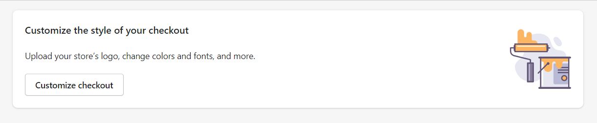
西川信行CalloutCardの実装
import { Page, CalloutCard } from "@shopify/polaris";
import { useState, useCallback } from "react";

const Index = () => (
  <Page>
    <CalloutCard
      title="Customize the style of your checkout"
      illustration="https://cdn.shopify.com/s/assets/admin/checkout/settings-customizecart-705f57c725ac05be5a34ec20c05b94298cb8afd10aac7bd9c7ad02030f48cfa0.svg"
      primaryAction={{
        content: "Customize checkout",
        url: "https://www.shopify.com",
      }}
    >
      <p>Upload your store’s logo, change colors and fonts, and more.</p>
    </CalloutCard>
  </Page>
);

export default Index;
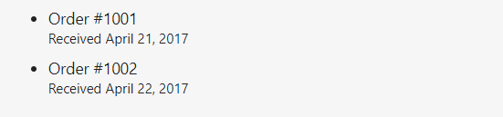
西川信行キャプションの実装
import { Page, List, Caption } from "@shopify/polaris";
import { useState, useCallback } from "react";

const Index = () => (
  <Page>
    <List>
      <List.Item>
        Order #1001 <Caption>Received April 21, 2017</Caption>
      </List.Item>
      <List.Item>
        Order #1002 <Caption>Received April 22, 2017</Caption>
      </List.Item>
    </List>
  </Page>
);

export default Index;
西川信行カードを追加
import { Page, Card } from "@shopify/polaris";
import { useState, useCallback } from "react";
const Index = () => (
<Page>
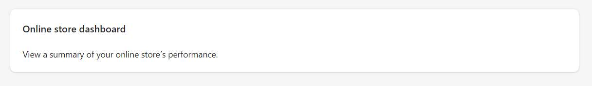
<Card title="Online store dashboard" sectioned>
<p>View a summary of your online store’s performance.</p>
</Card>
</Page>
);
export default Index;

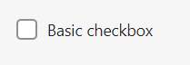
西川信行チェックボックスの実装
import { Page, Checkbox } from "@shopify/polaris";
import { useState, useCallback } from "react";

const Index = () => {
  const [checked, setChecked] = useState(false);
  const handleChange = useCallback((newChecked) => setChecked(newChecked), []);

  return (
    <Page>
      <Checkbox
        label="Basic checkbox"
        checked={checked}
        onChange={handleChange}
      />
    </Page>
  );
};

export default Index;
西川信行チェックボックスの実装
import { Page, ChoiceList } from "@shopify/polaris";
import { useState, useCallback } from "react";

const Index = () => {
  const [selected, setSelected] = useState(["hidden"]);
  const handleChange = useCallback((value) => setSelected(value), []);
  return (
    <Page>
      <ChoiceList
        title="Company name"
        choices={[
          { label: "Hidden", value: "hidden" },
          { label: "Optional", value: "optional" },
          { label: "Required", value: "required" },
        ]}
        selected={selected}
        onChange={handleChange}
      />
    </Page>
  );
};

export default Index;

西川信行Collapsibleを実装
import {
Page,
Card,
Stack,
Button,
Collapsible,
TextContainer,
Link,
} from "@shopify/polaris";
import { useState, useCallback } from "react";
const Index = () => {
const [open, setOpen] = useState(true);
const handleToggle = useCallback(() => setOpen((open) => !open), []);
return (
<Page>
<div style={{ height: "200px" }}>
<Card sectioned>
<Stack vertical>
<Button
onClick={handleToggle}
ariaExpanded={open}
ariaControls="basic-collapsible"
>
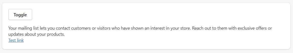
Toggle
</Button>
<Collapsible
open={open}
id="basic-collapsible"
transition={{ duration: "500ms", timingFunction: "ease-in-out" }}
expandOnPrint
>
<TextContainer>
<p>
Your mailing list lets you contact customers or visitors who
have shown an interest in your store. Reach out to them with
exclusive offers or updates about your products.
</p>
<Link url="#">Test link</Link>
</TextContainer>
</Collapsible>
</Stack>
</Card>
</div>
</Page>
);
};
export default Index;
西川信行Colorピッカー
import {
  Page,
  ColorPicker
} from "@shopify/polaris";
import { useState, useCallback } from "react";

const Index = () => {
  const [color, setColor] = useState({
    hue: 120,
    brightness: 1,
    saturation: 1,
  });
  return (
    <Page>
      <ColorPicker onChange={setColor} color={color} />;
    </Page>
  );
};

export default Index;

西川信行Contextual save barの実装
import { Page, AppProvider, Frame, ContextualSaveBar } from "@shopify/polaris";
import { useState, useCallback } from "react";

const Index = () => {
  return (
    <Page>
      <div style={{ height: "250px" }}>
        <AppProvider
          theme={{
            logo: {
              width: 124,
              contextualSaveBarSource:
                "https://cdn.shopify.com/s/files/1/0446/6937/files/jaded-pixel-logo-gray.svg?6215648040070010999",
            },
          }}
          i18n={{
            Polaris: {
              Frame: {
                skipToContent: "Skip to content",
              },
              ContextualSaveBar: {
                save: "Save",
                discard: "Discard",
              },
            },
          }}
        >
          <Frame>
            <ContextualSaveBar
              message="Unsaved changes"
              saveAction={{
                onAction: () => console.log("add form submit logic"),
                loading: false,
                disabled: false,
              }}
              discardAction={{
                onAction: () => console.log("add clear form logic"),
              }}
            />
          </Frame>
        </AppProvider>
      </div>
    </Page>
  );
};

export default Index;

西川信行Dateテーブルの実装
import { Page, Card, DataTable } from "@shopify/polaris";
import { useState, useCallback } from "react";
const Index = () => {
const rows = [
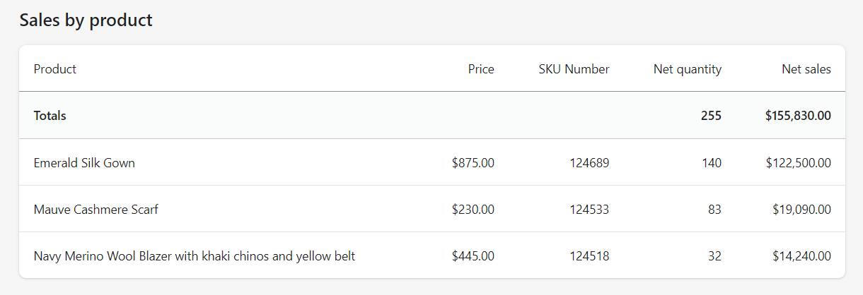
["Emerald Silk Gown", "$875.00", 124689, 140, "$122,500.00"],
["Mauve Cashmere Scarf", "$230.00", 124533, 83, "$19,090.00"],
[
"Navy Merino Wool Blazer with khaki chinos and yellow belt",
"$445.00",
124518,
32,
"$14,240.00",
],
];
return (
<Page title="Sales by product">
<Card>
<DataTable
columnContentTypes={[
"text",
"numeric",
"numeric",
"numeric",
"numeric",
]}
headings={[
"Product",
"Price",
"SKU Number",
"Net quantity",
"Net sales",
]}
rows={rows}
totals={["", "", "", 255, "$155,830.00"]}
/>
</Card>
</Page>
);
};
export default Index;
西川信行DatePickerの実装
import { Page, DatePicker } from "@shopify/polaris";
import { useState, useCallback } from "react";

const Index = () => {
  const [{ month, year }, setDate] = useState({ month: 1, year: 2018 });
  const [selectedDates, setSelectedDates] = useState({
    start: new Date("Wed Feb 07 2018 00:00:00 GMT-0500 (EST)"),
    end: new Date("Wed Feb 07 2018 00:00:00 GMT-0500 (EST)"),
  });

  const handleMonthChange = useCallback(
    (month, year) => setDate({ month, year }),
    []
  );
  return (
    <Page title="こんにちは">
      <DatePicker
        month={month}
        year={year}
        onChange={setSelectedDates}
        onMonthChange={handleMonthChange}
        selected={selectedDates}
      />
    </Page>
  );
};

export default Index;

西川信行Description listの実装
import { DescriptionList } from "@shopify/polaris";
import { useState, useCallback } from "react";

const Index = () => {
  return (
    <DescriptionList
      items={[
        {
          term: "Logistics",
          description:
            "The management of products or other resources as they travel between a point of origin and a destination.",
        },
        {
          term: "Sole proprietorship",
          description:
            "A business structure where a single individual both owns and runs the company.",
        },
        {
          term: "Discount code",
          description:
            "A series of numbers and/or letters that an online shopper may enter at checkout to get a discount or special offer.",
        },
      ]}
    />
  );
};

export default Index;

西川信行DisplayTextの実装
import { Page, DisplayText } from "@shopify/polaris";
import { useState, useCallback } from "react";

const Index = () => {
  return (
    <Page>
      <DisplayText size="extraLarge">Good evening, Dominic.</DisplayText>
    </Page>
  );
};

export default Index;

西川信行Drop Zoneの実装
import { Page, Stack, Thumbnail, DropZone, Caption } from "@shopify/polaris";
import { useState, useCallback } from "react";

const Index = () => {
  const [files, setFiles] = useState([]);

  const handleDropZoneDrop = useCallback(
    (_dropFiles, acceptedFiles, _rejectedFiles) =>
      setFiles((files) => [...files, ...acceptedFiles]),
    []
  );

  const validImageTypes = ["image/gif", "image/jpeg", "image/png"];

  const fileUpload = !files.length && <DropZone.FileUpload />;
  const uploadedFiles = files.length > 0 && (
    <Stack vertical>
      {files.map((file, index) => (
        <Stack alignment="center" key={index}>
          <Thumbnail
            size="small"
            alt={file.name}
            source={
              validImageTypes.includes(file.type)
                ? window.URL.createObjectURL(file)
                : NoteMinor
            }
          />
          <div>
            {file.name} <Caption>{file.size} bytes</Caption>
          </div>
        </Stack>
      ))}
    </Stack>
  );

  return (
    <Page>
      <DropZone onDrop={handleDropZoneDrop}>
        {uploadedFiles}
        {fileUpload}
      </DropZone>
    </Page>
  );
};

export default Index;

西川信行Empty Stateの実装
import { Page, Card, EmptyState } from "@shopify/polaris";
import { useState, useCallback } from "react";

const Index = () => {
  return (
    <Page>
      <Card sectioned>
        <EmptyState
          heading="Manage your inventory transfers"
          action={{ content: "Add transfer" }}
          secondaryAction={{
            content: "Learn more",
            url: "https://help.shopify.com",
          }}
          image="https://cdn.shopify.com/s/files/1/0262/4071/2726/files/emptystate-files.png"
        >
          <p>Track and receive your incoming inventory from suppliers.</p>
        </EmptyState>
      </Card>
    </Page>
  );
};

export default Index;

西川信行ExceptionListの実装
import { Page, ExceptionList } from "@shopify/polaris";
import { useState, useCallback } from "react";

const Index = () => {
  return (
    <Page>
      <ExceptionList
        items={[
          {
            icon: "",
            description:
              "This customer is awesome. Make sure to treat them right!",
          },
        ]}
      />
    </Page>
  );
};

export default Index;

西川信行FooterHelpの実装
import { Page, FooterHelp, Link } from "@shopify/polaris";
import { useState, useCallback } from "react";

const Index = () => {
  return (
    <Page>
      <FooterHelp>
        Learn more about{" "}
        <Link
          external
          url="https://help.shopify.com/manual/orders/fulfill-orders"
        >
          fulfilling orders
        </Link>
      </FooterHelp>
    </Page>
  );
};

export default Index;

西川信行フォームの実装
import {
  Page,
  Form,
  FormLayout,
  Checkbox,
  TextField,
  Button,
} from "@shopify/polaris";
import { useState, useCallback } from "react";

const Index = () => {
  const [newsletter, setNewsletter] = useState(false);
  const [email, setEmail] = useState("");
  const handleSubmit = useCallback((_event) => {
    setEmail("");
    setNewsletter(false);
  }, []);
  const handleNewsLetterChange = useCallback(
    (value) => setNewsletter(value),
    []
  );
  const handleEmailChange = useCallback((value) => setEmail(value), []);
  return (
    <Page>
      <Form onSubmit={handleSubmit}>
        <FormLayout>
          <Checkbox
            label="Sign up for the Polaris newsletter"
            checked={newsletter}
            onChange={handleNewsLetterChange}
          />
          <TextField
            value={email}
            onChange={handleEmailChange}
            label="Email"
            type="email"
            autoComplete="email"
            helpText={
              <span>
                We’ll use this email address to inform you on future changes to
                Polaris.
              </span>
            }
          />
          <Button submit>Submit</Button>
        </FormLayout>
      </Form>
    </Page>
  );
};

export default Index;

西川信行Headingの実装
import {
  Page,
  Heading
} from "@shopify/polaris";
import { useState, useCallback } from "react";

const Index = () => {
  return (
    <Page>
      <Heading>Online store dashboard</Heading>
    </Page>
  );
};

export default Index;

西川信行Iconの実装
import { Page, Icon } from "@shopify/polaris";
import { useState, useCallback } from "react";

const Index = () => {
  return (
    <Page>
      <Icon source="<svg viewBox='0 0 20 20' xmlns='http://www.w3.org/2000/svg'><path d='M10.707 17.707l5-5a.999.999 0 1 0-1.414-1.414L11 14.586V3a1 1 0 1 0-2 0v11.586l-3.293-3.293a.999.999 0 1 0-1.414 1.414l5 5a.999.999 0 0 0 1.414 0' /></svg>" />
    </Page>
  );
};

export default Index;

西川信行Inline errorの実装
import { Page, InlineError } from "@shopify/polaris";
import { useState, useCallback } from "react";
const Index = () => {
return (
<Page>
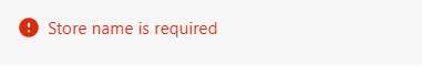
<InlineError message="Store name is required" fieldID="myFieldID" />
</Page>
);
};
export default Index;
西川信行KeyBoard Keyの実装
import { Page, KeyboardKey } from "@shopify/polaris";
import { useState, useCallback } from "react";

const Index = () => {
  return (
    <Page>
      <KeyboardKey>Ctrl</KeyboardKey>
    </Page>
  );
};

export default Index;

西川信行Layoutの実装
import { Page, Layout, Card } from "@shopify/polaris";
import { useState, useCallback } from "react";

const Index = () => {
  return (
    <Page>
      <Layout>
        <Layout.Section>
          <Card title="Online store dashboard" sectioned>
            <p>View a summary of your online store’s performance.</p>
          </Card>
        </Layout.Section>
      </Layout>
    </Page>
  );
};

export default Index;
西川信行Linkの実装
import { Page, Link } from "@shopify/polaris";
import { useState, useCallback } from "react";

const Index = () => {
  return (
    <Page>
      <Link url="https://help.shopify.com/manual">fulfilling orders</Link>
    </Page>
  );
};

export default Index;

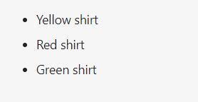
西川信行Listの実装
import { Page, List } from "@shopify/polaris";
import { useState, useCallback } from "react";

const Index = () => {
  return (
    <Page>
      <List type="bullet">
        <List.Item>Yellow shirt</List.Item>
        <List.Item>Red shirt</List.Item>
        <List.Item>Green shirt</List.Item>
      </List>
    </Page>
  );
};

export default Index;
西川信行Loadingの実装
import { Page, Frame, Loading } from "@shopify/polaris";
import { useState, useCallback } from "react";

const Index = () => {
  return (
    <Page>
      <div style={{ height: "100px" }}>
        <Frame>
          <Loading />
        </Frame>
      </div>
    </Page>
  );
};

export default Index;

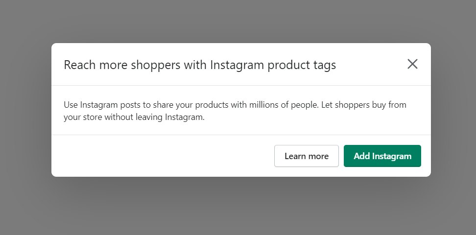
西川信行モーダルの実装
import { Page, Modal, TextContainer, Button } from "@shopify/polaris";
import { useState, useCallback } from "react";

const Index = () => {
  const [active, setActive] = useState(true);

  const handleChange = useCallback(() => setActive(!active), [active]);

  const activator = <Button onClick={handleChange}>Open</Button>;
  return (
    <Page>
      <div style={{ height: "500px" }}>
        <Modal
          activator={activator}
          open={active}
          onClose={handleChange}
          title="Reach more shoppers with Instagram product tags"
          primaryAction={{
            content: "Add Instagram",
            onAction: handleChange,
          }}
          secondaryActions={[
            {
              content: "Learn more",
              onAction: handleChange,
            },
          ]}
        >
          <Modal.Section>
            <TextContainer>
              <p>
                Use Instagram posts to share your products with millions of
                people. Let shoppers buy from your store without leaving
                Instagram.
              </p>
            </TextContainer>
          </Modal.Section>
        </Modal>
      </div>
    </Page>
  );
};

export default Index;
西川信行ナビゲーションバーの実装
import { Page, Navigation } from "@shopify/polaris";
import { useState, useCallback } from "react";

const Index = () => {
  return (
    <Page>
      <Navigation location="/">
        <Navigation.Section
          items={[
            {
              url: "/path/to/place",
              label: "Home",
              icon: HomeMajor,
            },
            {
              url: "/path/to/place",
              label: "Orders",
              icon: OrdersMajor,
              badge: "15",
            },
            {
              url: "/path/to/place",
              label: "Products",
              icon: ProductsMajor,
            },
          ]}
        />
      </Navigation>
    </Page>
  );
};

export default Index;

西川信行Option Listの実装
import { Page, Card, OptionList } from "@shopify/polaris";
import { useState, useCallback } from "react";

const Index = () => {
  const [selected, setSelected] = useState([]);
  return (
    <Page>
      <Card>
        <OptionList
          title="Inventory Location"
          onChange={setSelected}
          options={[
            { value: "byward_market", label: "Byward Market" },
            { value: "centretown", label: "Centretown" },
            { value: "hintonburg", label: "Hintonburg" },
            { value: "westboro", label: "Westboro" },
            { value: "downtown", label: "Downtown" },
          ]}
          selected={selected}
        />
      </Card>
    </Page>
  );
};

export default Index;

西川信行Pageの実装
import { Page, Thumbnail, Badge, Avatar } from "@shopify/polaris";
import { useState, useCallback } from "react";

const Index = () => {
  return (
    <Page
      breadcrumbs={[{ content: "Products", url: "/products" }]}
      title="3/4 inch Leather pet collar"
      titleMetadata={<Badge status="success">Paid</Badge>}
      subtitle="Perfect for any pet"
      thumbnail={
        <Thumbnail
          source="https://burst.shopifycdn.com/photos/black-leather-choker-necklace_373x@2x.jpg"
          alt="Black leather pet collar"
        />
      }
      compactTitle
      primaryAction={{ content: "Save", disabled: true }}
      secondaryActions={[
        {
          content: "Duplicate",
          accessibilityLabel: "Secondary action label",
          onAction: () => alert("Duplicate action"),
        },
        {
          content: "View on your store",
          onAction: () => alert("View on your store action"),
        },
      ]}
      actionGroups={[
        {
          title: "Promote",
          accessibilityLabel: "Action group label",
          actions: [
            {
              content: "Share on Facebook",
              accessibilityLabel: "Individual action label",
              onAction: () => alert("Share on Facebook action"),
            },
          ],
        },
      ]}
      pagination={{
        hasPrevious: true,
        hasNext: true,
      }}
      additionalNavigation={
        <Avatar size="small" initials="CD" customer={false} />
      }
    >
      <p>Page content</p>
    </Page>
  );
};

export default Index;

西川信行PageActionsの実装
import { Page, PageActions } from "@shopify/polaris";
import { useState, useCallback } from "react";

const Index = () => {
  return (
    <Page>
      <PageActions
        primaryAction={{
          content: "Save",
        }}
        secondaryActions={[
          {
            content: "Delete",
            destructive: true,
          },
        ]}
      />
    </Page>
  );
};

export default Index;

西川信行Pagenationの実装
import { Page, Pagination } from "@shopify/polaris";
import { useState, useCallback } from "react";

const Index = () => {
  return (
    <Page>
      <Pagination
        hasPrevious
        onPrevious={() => {
          console.log("Previous");
        }}
        hasNext
        onNext={() => {
          console.log("Next");
        }}
      />
    </Page>
  );
};

export default Index;

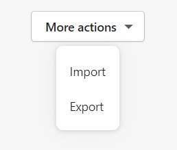
西川信行Popoverの実装
import { Page, ActionList, Popover, Button } from "@shopify/polaris";
import { useState, useCallback } from "react";

const Index = () => {
  const [popoverActive, setPopoverActive] = useState(true);

  const togglePopoverActive = useCallback(
    () => setPopoverActive((popoverActive) => !popoverActive),
    []
  );

  const activator = (
    <Button onClick={togglePopoverActive} disclosure>
      More actions
    </Button>
  );
  return (
    <Page>
      <div style={{ height: "250px" }}>
        <Popover
          active={popoverActive}
          activator={activator}
          onClose={togglePopoverActive}
        >
          <ActionList items={[{ content: "Import" }, { content: "Export" }]} />
        </Popover>
      </div>
    </Page>
  );
};

export default Index;
西川信行Progress barの実装
import { Page, ProgressBar } from "@shopify/polaris";
import { useState, useCallback } from "react";

const Index = () => {
  return (
    <Page>
      <ProgressBar progress={75} />
    </Page>
  );
};

export default Index;

西川信行ラジオボタンの実装
import { Page, Stack, RadioButton } from "@shopify/polaris";
import { useState, useCallback } from "react";

const Index = () => {
  const [value, setValue] = useState('disabled');

  const handleChange = useCallback(
    (_checked, newValue) => setValue(newValue),
    [],
  );
  return (
    <Page>
      <Stack vertical>
        <RadioButton
          label="Accounts are disabled"
          helpText="Customers will only be able to check out as guests."
          checked={value === "disabled"}
          id="disabled"
          name="accounts"
          onChange={handleChange}
        />
        <RadioButton
          label="Accounts are optional"
          helpText="Customers will be able to check out with a customer account or as a guest."
          id="optional"
          name="accounts"
          checked={value === "optional"}
          onChange={handleChange}
        />
      </Stack>
    </Page>
  );
};

export default Index;

西川信行Rangeスライダーの実装
import { Page, Card, RangeSlider } from "@shopify/polaris";
import { useState, useCallback } from "react";

const Index = () => {
  const [rangeValue, setRangeValue] = useState(32);

  const handleRangeSliderChange = useCallback(
    (value) => setRangeValue(value),
    []
  );
  return (
    <Page>
      <Card sectioned title="Background color">
        <RangeSlider
          label="Opacity percentage"
          value={rangeValue}
          onChange={handleRangeSliderChange}
          output
        />
      </Card>
    </Page>
  );
};

export default Index;

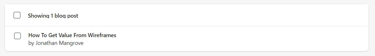
西川信行ResourceListの実装
import { Page, Card, ResourceList, ResourceItem, TextStyle } from "@shopify/polaris";
import { useState, useCallback } from "react";

const Index = () => {
  const [selectedItems, setSelectedItems] = useState([]);
  return (
    <Page>
      <Card>
        <ResourceList
          resourceName={{ singular: "blog post", plural: "blog posts" }}
          items={[
            {
              id: 6,
              url: "posts/6",
              title: "How To Get Value From Wireframes",
              author: "Jonathan Mangrove",
            },
          ]}
          selectedItems={selectedItems}
          onSelectionChange={setSelectedItems}
          selectable
          renderItem={(item) => {
            const { id, url, title, author } = item;
            const authorMarkup = author ? <div>by {author}</div> : null;
            return (
              <ResourceItem
                id={id}
                url={url}
                accessibilityLabel={`View details for ${title}`}
                name={title}
              >
                <h3>
                  <TextStyle variation="strong">{title}</TextStyle>
                </h3>
                {authorMarkup}
              </ResourceItem>
            );
          }}
        />
      </Card>
    </Page>
  );
};

export default Index;
西川信行Scrollableの実装
import { Page, Card, Scrollable } from "@shopify/polaris";
import { useState, useCallback } from "react";

const Index = () => {
  return (
    <Page>
      <Card title="Terms of service" sectioned>
        <Scrollable shadow style={{ height: "100px" }} focusable>
          <p>
            By signing up for the Shopify service (“Service”) or any of the
            services of Shopify Inc. (“Shopify”) you are agreeing to be bound by
            the following terms and conditions (“Terms of Service”). The
            Services offered by Shopify under the Terms of Service include
            various products and services to help you create and manage a retail
            store, whether an online store (“Online Services”), a physical
            retail store (“POS Services”), or both. Any new features or tools
            which are added to the current Service shall be also subject to the
            Terms of Service. You can review the current version of the Terms of
            Service at any time at https://www.shopify.com/legal/terms. Shopify
            reserves the right to update and change the Terms of Service by
            posting updates and changes to the Shopify website. You are advised
            to check the Terms of Service from time to time for any updates or
            changes that may impact you.
          </p>
        </Scrollable>
      </Card>
    </Page>
  );
};

export default Index;

西川信行Selectの実装
import { Page, Select } from "@shopify/polaris";
import { useState, useCallback } from "react";

const Index = () => {
  const [selected, setSelected] = useState("today");

  const handleSelectChange = useCallback((value) => setSelected(value), []);

  const options = [
    { label: "Today", value: "today" },
    { label: "Yesterday", value: "yesterday" },
    { label: "Last 7 days", value: "lastWeek" },
  ];
  return (
    <Page>
      <Select
        label="Date range"
        options={options}
        onChange={handleSelectChange}
        value={selected}
      />
    </Page>
  );
};

export default Index;

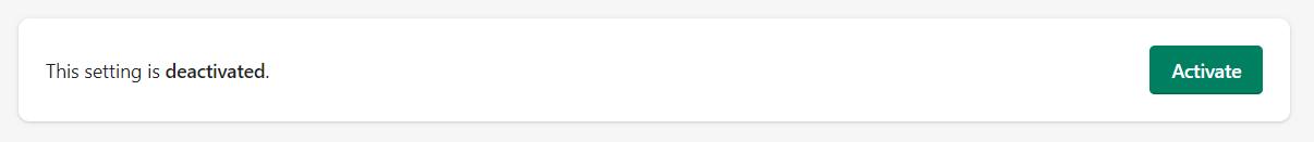
西川信行SettingToggleの実装
import { Page, SettingToggle, TextStyle } from "@shopify/polaris";
import { useState, useCallback } from "react";

const Index = () => {
  const [active, setActive] = useState(false);

  const handleToggle = useCallback(() => setActive((active) => !active), []);

  const contentStatus = active ? "Deactivate" : "Activate";
  const textStatus = active ? "activated" : "deactivated";
  return (
    <Page>
      <SettingToggle
        action={{
          content: contentStatus,
          onAction: handleToggle,
        }}
        enabled={active}
      >
        This setting is <TextStyle variation="strong">{textStatus}</TextStyle>.
      </SettingToggle>
    </Page>
  );
};

export default Index;
西川信行Skeleton body Textの実装
import { Page, SkeletonBodyText } from "@shopify/polaris";
import { useState, useCallback } from "react";

const Index = () => {
  return (
    <Page>
      <SkeletonBodyText />
    </Page>
  );
};

export default Index;

西川信行SkeletonDisplayTextの実装
import { Page, SkeletonDisplayText } from "@shopify/polaris";
import { useState, useCallback } from "react";

const Index = () => {
  return (
    <Page>
      <SkeletonDisplayText size="medium" />
    </Page>
  );
};

export default Index;

西川信行Skelton Pageの実装
import {
  Layout,
  Card,
  SkeletonPage,
  SkeletonBodyText,
  SkeletonDisplayText,
  TextContainer,
} from "@shopify/polaris";
import { useState, useCallback } from "react";

const Index = () => {
  return (
    <SkeletonPage primaryAction secondaryActions={2}>
      <Layout>
        <Layout.Section>
          <Card sectioned>
            <SkeletonBodyText />
          </Card>
          <Card sectioned>
            <TextContainer>
              <SkeletonDisplayText size="small" />
              <SkeletonBodyText />
            </TextContainer>
          </Card>
          <Card sectioned>
            <TextContainer>
              <SkeletonDisplayText size="small" />
              <SkeletonBodyText />
            </TextContainer>
          </Card>
        </Layout.Section>
        <Layout.Section secondary>
          <Card>
            <Card.Section>
              <TextContainer>
                <SkeletonDisplayText size="small" />
                <SkeletonBodyText lines={2} />
              </TextContainer>
            </Card.Section>
            <Card.Section>
              <SkeletonBodyText lines={1} />
            </Card.Section>
          </Card>
          <Card subdued>
            <Card.Section>
              <TextContainer>
                <SkeletonDisplayText size="small" />
                <SkeletonBodyText lines={2} />
              </TextContainer>
            </Card.Section>
            <Card.Section>
              <SkeletonBodyText lines={2} />
            </Card.Section>
          </Card>
        </Layout.Section>
      </Layout>
    </SkeletonPage>
  );
};

export default Index;

西川信行スケルトンサムネイルの実装
import { Page, SkeletonThumbnail } from "@shopify/polaris";
import { useState, useCallback } from "react";

const Index = () => {
  return (
    <Page>
      <SkeletonThumbnail size="medium" />
    </Page>
  );
};

export default Index;

西川信行Spinnerの実装
import { Page, Spinner } from "@shopify/polaris";
import { useState, useCallback } from "react";

const Index = () => {
  return (
    <Page>
      <Spinner accessibilityLabel="Spinner example" size="large" />
    </Page>
  );
};

export default Index;

西川信行Stackの実装
import { Page, Spinner } from "@shopify/polaris";
import { useState, useCallback } from "react";

const Index = () => {
  return (
    <Page>
      <Stack>
        <Badge>Paid</Badge>
        <Badge>Processing</Badge>
        <Badge>Fulfilled</Badge>
        <Badge>Completed</Badge>
      </Stack>
    </Page>
  );
};

export default Index;

西川信行Subheadingの実装
import { Page, Subheading } from "@shopify/polaris";
import { useState, useCallback } from "react";

const Index = () => {
  return (
    <Page>
      <Subheading>Accounts</Subheading>
    </Page>
  );
};

export default Index;

西川信行Tagsの実装
import { Page, Card, Tabs } from "@shopify/polaris";
import { useState, useCallback } from "react";

const Index = () => {
  const [selected, setSelected] = useState(0);

  const handleTabChange = useCallback(
    (selectedTabIndex) => setSelected(selectedTabIndex),
    []
  );

  const tabs = [
    {
      id: "all-customers-1",
      content: "All",
      accessibilityLabel: "All customers",
      panelID: "all-customers-content-1",
    },
    {
      id: "accepts-marketing-1",
      content: "Accepts marketing",
      panelID: "accepts-marketing-content-1",
    },
    {
      id: "repeat-customers-1",
      content: "Repeat customers",
      panelID: "repeat-customers-content-1",
    },
    {
      id: "prospects-1",
      content: "Prospects",
      panelID: "prospects-content-1",
    },
  ];

  return (
    <Page>
      <Card>
        <Tabs tabs={tabs} selected={selected} onSelect={handleTabChange}>
          <Card.Section title={tabs[selected].content}>
            <p>Tab {selected} selected</p>
          </Card.Section>
        </Tabs>
      </Card>
    </Page>
  );
};

export default Index;

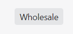
西川信行Tagの実装
import { Page, Tag } from "@shopify/polaris";
import { useState, useCallback } from "react";

const Index = () => {

  return (
    <Page>
      <Tag>Wholesale</Tag>
    </Page>
  );
};

export default Index;
西川信行Text Containerの実装
import { Page, TextContainer, Heading } from "@shopify/polaris";
import { useState, useCallback } from "react";

const Index = () => {
  return (
    <Page>
      <TextContainer>
        <Heading>Install the Shopify POS App</Heading>
        <p>
          Shopify POS is the easiest way to sell your products in person.
          Available for iPad, iPhone, and Android.
        </p>
      </TextContainer>
    </Page>
  );
};

export default Index;

西川信行Textfieldの実装
import { Page, TextField } from "@shopify/polaris";
import { useState, useCallback } from "react";

const Index = () => {
  const [value, setValue] = useState("Jaded Pixel");
  const handleChange = useCallback((newValue) => setValue(newValue), []);
  return (
    <Page>
      <TextField
        label="Store name"
        value={value}
        onChange={handleChange}
        autoComplete="off"
      />
    </Page>
  );
};

export default Index;

西川信行TextStyleの実装
import { Page, TextStyle } from "@shopify/polaris";
import { useState, useCallback } from "react";

const Index = () => {
  return (
    <Page>
      <TextStyle variation="subdued">No supplier listed</TextStyle>
    </Page>
  );
};

export default Index;

西川信行サムネイルの実装
import { Page, Thumbnail } from "@shopify/polaris";
import { useState, useCallback } from "react";

const Index = () => {
  return (
    <Page>
      <Thumbnail
        source="https://burst.shopifycdn.com/photos/black-leather-choker-necklace_373x@2x.jpg"
        alt="Black choker necklace"
      />
    </Page>
  );
};

export default Index;

西川信行Toastの実装
import { Page, Frame, Button, Toast } from "@shopify/polaris";
import { useState, useCallback } from "react";

const Index = () => {
  const [active, setActive] = useState(false);

  const toggleActive = useCallback(() => setActive((active) => !active), []);

  const toastMarkup = active ? (
    <Toast content="Message sent" onDismiss={toggleActive} />
  ) : null;
  return (
    <Page>
      <div style={{ height: "250px" }}>
        <Frame>
          <Page title="Toast example">
            <Button onClick={toggleActive}>Show Toast</Button>
            {toastMarkup}
          </Page>
        </Frame>
      </div>
    </Page>
  );
};

export default Index;

西川信行Visually hiddenの実装
import {
  Page,
  Card,
  VisuallyHidden,
  Heading,
  FormLayout,
  TextField,
} from "@shopify/polaris";
import { useState, useCallback } from "react";

const Index = () => {
  return (
    <Page>
      <Card sectioned>
        <VisuallyHidden>
          <Heading>Title and description</Heading>
        </VisuallyHidden>
        <FormLayout>
          <TextField
            label="Title"
            value="Artisanal Wooden Spoon"
            onChange={() => {}}
            autoComplete="off"
          />
          <TextField
            label="Description"
            multiline
            onChange={() => {}}
            autoComplete="off"
          />
        </FormLayout>
      </Card>
    </Page>
  );
};

export default Index;
