ReactNative@v0.63で追加されたPressableが地味にすごい
はじめに
今回はReactNativeのv0.63で追加されたPressableについての記事になります。
タップ時とそれ以外とでスタイルや描画内容を変更できるコンポーネントになります。
そこまで目新しいものではないですが、定義部分が面白く参考になったので解説していきます。
Pressableとは
v0.63で追加されたコンポーネントのひとつです。
タップ操作に関するコンポーネントで、公式には下記の説明があります。
How it works
On an element wrapped by Pressable:
- onPressIn is called when a press is activated.
- onPressOut is called when the press gesture is deactivated.
After pressing onPressIn, one of two things will happen:
- The person will remove their finger, triggering onPressOut followed by onPress.
- If the person leaves their finger longer than 500 milliseconds before removing it, onLongPress is triggered. (onPressOut will still fire when they remove their finger.)
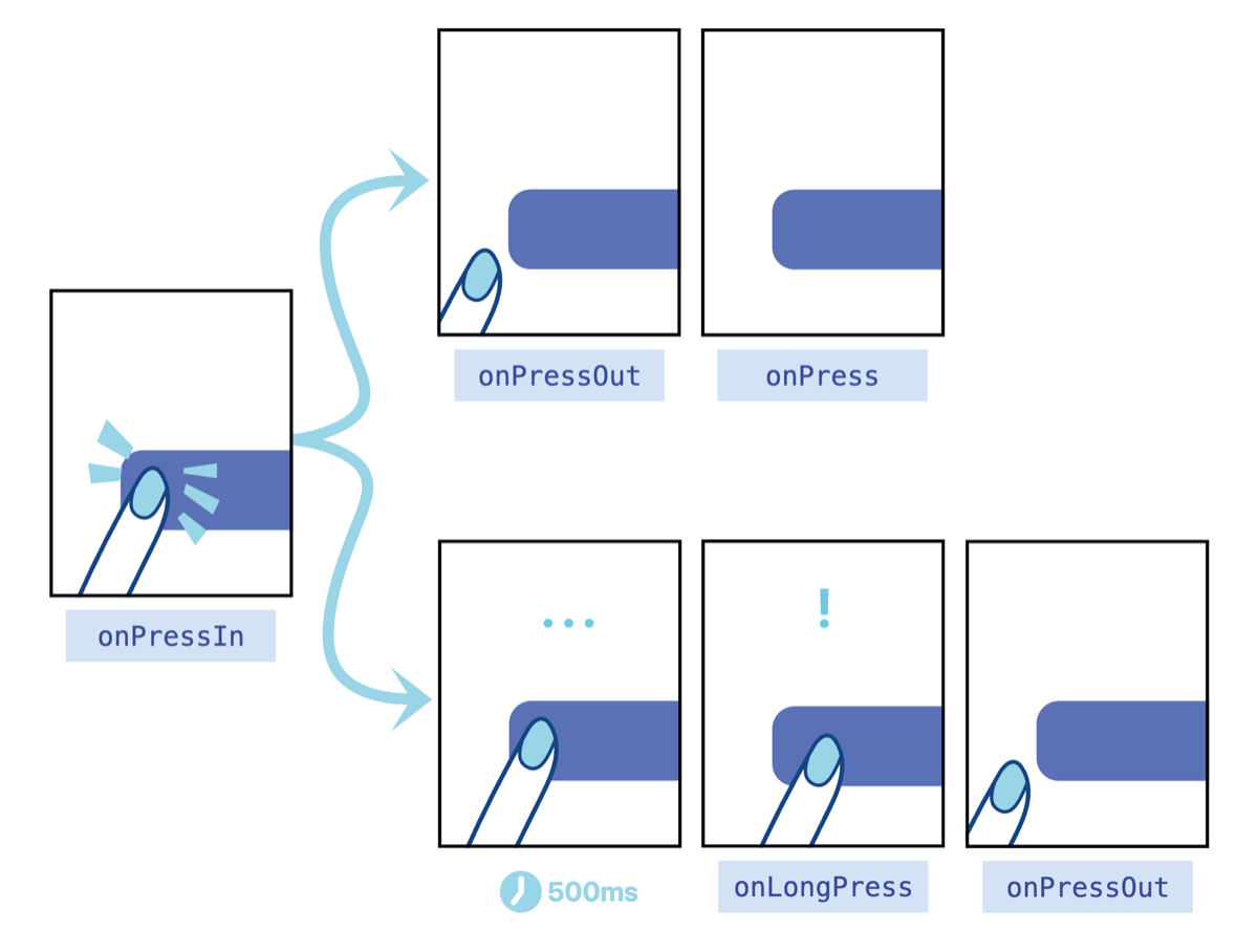
タップしてから離すまでの挙動や、長押しした時のイベント操作についての説明です。
この挙動自体は目新しいものではなくTouchableOpacity等でも同じようなプロパティが用意されています。
実際「押された時に○○する」といった動作を実装する場合、TouchableOpacityやButtonを使った方が馴染みがあります。
どこが新しい?
個人的にいいなと思ったのはstyleとchildrenのプロパティです。
例えば、下記のような見た目のUIを実装したいとします。
「押される前」と「押している間」で「背景色」と「内部の文字列」が異なります。
これをTouchableOpacityやButtonで実装する場合「押している間」というのが何気に面倒臭いです。
なぜなら、 クラスコンポーネントのstateや関数コンポーネントでuseStateを使ってpressingのように「今押している」という状態を持つ必要がある からです。
これをPressableで実装すると下記のようになります。
import React from 'react';
import {StyleSheet, View, Text, StatusBar, Pressable} from 'react-native';

const App: () => React.ReactNode = () => {
  return (
    <>
      <StatusBar barStyle="dark-content" />
      <View style={{flex: 1, justifyContent: 'center', alignItems: 'center'}}>
        <Pressable
          style={({pressed} : PressableStateCallbackType) => [
            {
              borderRadius: 8,
              padding: 6,
              backgroundColor: pressed ? 'rgb(210, 230, 255)' : 'white',
            },
          ]}>
          {({pressed} : PressableStateCallbackType) => <Text>{pressed ? 'Pressed!' : 'Press Me'}</Text>}
        </Pressable>
      </View>
    </>
  );
};

export default App;
見てわかる通り、stateを使っていません。
その代わりstyleとchildrenに該当するPressableの子要素でpressedという見慣れない変数を使っています。
このpressedはコード上で定義されたものではなく、Pressable側で定義されたプロパティです。
これだけだと挙動がわかりにくいので、定義ファイルを参照していきましょう。
styleの定義
Pressableのstyleの定義は以下のようになります。
/**
 * Either view styles or a function that receives a boolean reflecting whether
 * the component is currently pressed and returns view styles.
 */
style?: StyleProp<ViewStyle> | ((state: PressableStateCallbackType) => StyleProp<ViewStyle>);
ポイントは StylePropを返す関数 を指定できる点です。
ここが通常のコンポーネントのstyleと異なります。
例えばViewでstyleを指定する場合、以下のように書くことが多いと思います。
<View style={{ flex: 1, backgroundColor: '#333' }}></View>
オブジェクト指定しています。
これはViewのstyleが以下のように定義されているためです。
style?: StyleProp<ViewStyle>;
Pressableのstyleでは上記の定義に加えて、
((state: PressableStateCallbackType) => StyleProp<ViewStyle>)
という形式でもstyleを指定できるようになっています。
これは PressableStateCallbackType型の引数を受けてStyleProp<ViewStyle>を返す関数を指定 できるという意味です。
ちなみにv0.63時点でPressableStateCallbackTypeの型定義は以下のようになります。
export type PressableStateCallbackType = Readonly<{
    pressed: boolean;
}>;
ここで先ほどのpressedが定義されていました。
pressedはPressableがタップされているかどうかの状態を表します。
上記を踏まえて、先ほどのコードをstyleに着目してみると以下のことが分かります。
<Pressable
    // ①styleにPressableStateCallbackType型の引数を取り、StyleProp<ViewStyle>を返す関数を指定している
    // ②PressableStateCallbackTypeにはPressableの押下状態であるpressedが格納されている
    style={({pressed} : PressableStateCallbackType) => [
    {
        borderRadius: 8,
        padding: 6,
        // ③pressedの値によってbackgroundColorの値を変更している
        backgroundColor: pressed ? 'rgb(210, 230, 255)' : 'white',
    },
    ]}>
    {({pressed} : PressableStateCallbackType) => <Text>{pressed ? 'Pressed!' : 'Press Me'}</Text>}
</Pressable>
こうすることでstateに頼ることなく「押している間」のスタイル変更を実現しています。
childrenの定義
styleと同様にchildrenの定義も異なります。
通常のFunctionalComponentのchildrenは以下のような定義です。
children?: ReactNode;
それに対してPressableのchildrenは以下のような定義です。
/**
 * Either children or a render prop that receives a boolean reflecting whether
 * the component is currently pressed.
 */
children?: React.ReactNode | ((state: PressableStateCallbackType) => React.ReactNode);
こちらもポイントは PressableStateCallbackTypeを受け取りReact.ReactNodeを返す関数を指定できる ことです。
こうすることでchildrenにあたる子孫コンポーネントの描画内容を動的に定義することができます。
あたらめてchildrenに該当する部分を見ていきましょう。
styleの時と同じようにpressedの値で描画する内容を書き分けていますね。
// PressableStateCallbackTypeを受けて、その中のpressedの値で中身が異なるReact.Nodeを返す関数を定義
{({pressed} : PressableStateCallbackType) => <Text>{pressed ? 'Pressed!' : 'Press Me'}</Text>}
まとめ
今回はPressableについて、定義部分に着目しながら特徴を紹介しました。
冒頭でも少し触れましたが、単純に「押した時」にあれこれするだけならTouchableOpacityやButtonの方が分かりやすいかと思います。
ただ、押している時に細かくUIを制御したい場合にはPressableを利用するとオススメです。
styleやchildrenの考え方については、自作のFunctionalComponentを作成する場合にも応用できるため極力分かりやすく解説しました。
Hooksが主流となるとFunctionalComponentを使う機会も増えるので、今後は外部ライブラリでもこういったコンポーネントが増えるかもしれませんね。
Discussion