[Rails] stimulusといろんなライブラリを使ってモーダルを作る。自作モーダルも作ってみる。
Hotwire Advent Calendar 2023の7日目の記事です。
個人的にRailsでモーダル作成するときにいっつも実装方法がわからなくてググるのでまとめておこうと思います。ライブラリのインストールやページ作成などの細かい部分は割愛しますー。
bootstrap
まずは定番のbootstrapから。
bootstrapはドキュメント通りstimulusなしでできるので簡単ですね。
簡単すぎるので割愛します!!
モーダルの開閉をコントロールしたい時
独自のタイミングでモーダルを開きたい時がたまにあるので、その時はstimulusを使います。
今回はページが読み込まれたタイングでモーダルを開いてみます。
stimulusファイルを作成します。
> rails g stimulus modal_controller
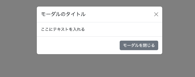
基本的にbootstrapのドキュメントのままなのですが、モーダルにdata-controller属性を定義しているのがみそ。
%button.btn.btn-primary{ 'data-bs-target': '#exampleModal', 'data-bs-toggle': 'modal', type: 'button' }
  モーダルを開く
#exampleModal.modal.fade{ 'aria-hidden': 'true', 'aria-labelledby': 'exampleModalLabel', tabindex: '-1', 'data-controller': 'modal' }
  .modal-dialog
    .modal-content
      .modal-header
        %h1#exampleModalLabel.modal-title.fs-5 モーダルのタイトル
        %button.btn-close{ 'aria-label': 'Close', 'data-bs-dismiss': 'modal', type: 'button' }
      .modal-body
        ここにテキストを入れる
      .modal-footer
        %button.btn.btn-secondary{ 'data-bs-dismiss': 'modal', type: 'button' } モーダルを閉じる
initializeを使って、modal_controllerの初期化時にモーダルを開くようにすれば、ページを開いたときにモーダルが表示されるようになります。
import { Controller } from "@hotwired/stimulus"
import { Modal } from "bootstrap"

export default class extends Controller {
  initialize() {
    const modal = new Modal(this.element)
    modal.show()
  }
}
完成!
コードはこちら
tailwindcss-stimulus-components
tailwind使いたいって時はこのライブラリを使えば、いろいろやってそうです。
デモページ
docsも充実しててありがたい。modal.mdを見ればすぐにできそうですね。
まずはインストール。
yarn add tailwindcss-stimulus-components
app/javascript/controllers/index.jsに以下を追加します。
import { Modal } from "tailwindcss-stimulus-components"
application.register('modal', Modal)
viewもそのまま使えばいいので簡単ですね。
.relative.z-10{"data-action" => "keydown.esc->modal#close", "data-controller" => "modal", :tabindex => "-1"}
%a.bg-blue-500.hover:bg-blue-700.text-white.font-bold.py-3.px-6.rounded{"data-action" => "click->modal#open", :href => "javascript:void(0);"} Open Modal
/ Modal Background
.hidden.fixed.inset-0.bg-black.bg-opacity-80.overflow-y-auto.flex.items-center.justify-center{"data-action" => "click->modal#closeBackground", "data-modal-target" => "background", "data-transition-enter" => "transition-all ease-in-out duration-300", "data-transition-enter-from" => "bg-opacity-0", "data-transition-enter-to" => "bg-opacity-80", "data-transition-leave" => "transition-all ease-in-out duration-300", "data-transition-leave-from" => "bg-opacity-80", "data-transition-leave-to" => "bg-opacity-0"}
/ Modal Container
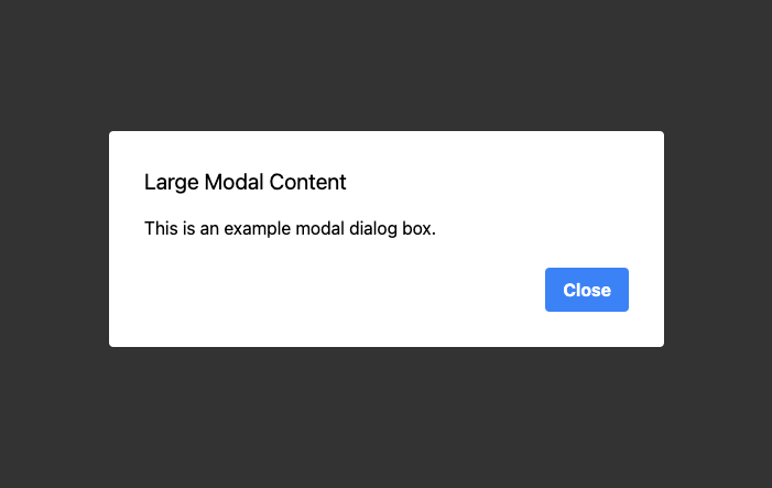
.max-h-screen.w-full.max-w-lg.relative{"data-modal-target" => "container"}
/ Modal Card
.m-1.bg-white.rounded.shadow
.p-8
%h2.text-xl.mb-4 Large Modal Content
%p.mb-4 This is an example modal dialog box.
.flex.justify-end.items-center.flex-wrap.mt-6
%button.bg-blue-500.hover:bg-blue-700.text-white.font-bold.py-2.px-4.rounded{"data-action" => "click->modal#close:prevent"} Close
controllerを読み込んでいる箇所で"data-modal-open-value": "true"を追加すれば、ページが読み込まれた時にモーダルが開いてくれるみたいです。
完成!!
コードはこちら
Micromodal
bootstrapもtailwindもデザインがゴリゴリなので、見た目をカスタマイズしたい時に不便。でも自分でモーダル自作するのはめんどくさい!って時はMicromodalを使ってみましょう。
アクセシビリティ対応をしっかりしてくれているライブラリです。
stimulusファイルを作成します。
> rails g stimulus modal_controller
modal controllerでMicroModalを初期化します。
import { Controller } from "@hotwired/stimulus"
import MicroModal from 'micromodal'

export default class extends Controller {
  initialize() {
    MicroModal.init()
  }
}
data-controller="modal"でモーダル部分を囲みます。
%div{"data-controller" => "modal"}
  #modal-1.modal.micromodal-slide{"aria-hidden" => "true"}
    .modal__overlay{"data-micromodal-close" => "", :tabindex => "-1"}
      .modal__container{"aria-labelledby" => "modal-1-title", "aria-modal" => "true", :role => "dialog"}
        %header.modal__header
          %h2#modal-1-title.modal__title Micromodal
          %button.modal__close{"aria-label" => "Close modal", "data-micromodal-close" => ""}
        #modal-1-content.modal__content
          %p This is a completely accessible modal.
  %button.modal__btn.modal__btn-primary{"data-micromodal-trigger" => "modal-1"}
    OPEN
cssは好みで当てます。長いのでこちらを参照ください。
完成!!

コードはこちら
自作
自分で作るのは一番!ではないのですが、勉強のために作ってみます。
あまり使い所がよくわからないCSS Classesを使ってみようと思います。
要素全体をdata-controllerで囲んで、data-modal-active-classを定義。今回はモーダルの表示非表示に切り替えなのでactiveクラスをつけておきます。
あとモーダル自体と各ボタンにはtargetをつけます。
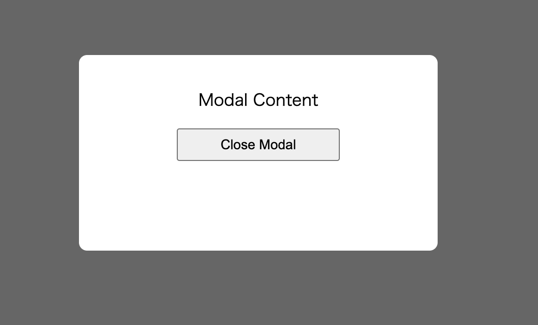
%div{'data-controller': 'modal', 'data-modal-active-class': 'active'}
  %button.btn{type: :button, 'data-action': 'click->modal#open'} Open Modal
  .modal{'data-modal-target': 'modal'}
    .modal-overlay
    .modal-content
      %p Modal Content
      %button.btn{type: :button, 'data-action': 'click->modal#close'} Close Modal
modal_controllerはメソッドを定義してクラスの切り替えをしているだけです。
import { Controller } from "@hotwired/stimulus"

export default class extends Controller {
  static targets = [ "modal" ]
  static classes = [ "active" ]

  open() {
    this.modalTarget.classList.add(this.activeClass)
  }

  close() {
    this.modalTarget.classList.remove(this.activeClass)
  }
}
cssは以下。
完成!!
コードはこちら
今回の場合はCSS Classesよりcssでユーティリティクラス(hidden)定義してベタ書きでよかったですね。もっと複雑なクラスを追加したいときに使ったりするんでしょうか?
小ネタ dialog要素と:modal要素
:modalって擬似要素があるみたいですね。
dialog要素を使えばちょっとだけ簡単にモーダルが作れます。
%div{'data-controller': 'modal'}
  %button.btn{type: :button, 'data-action': 'click->modal#open'} Open Modal
  %dialog{'data-modal-target': 'modal'}
    %p Modal Content
    %button.btn{type: :button, 'data-action': 'click->modal#close'} Close Modal
showModalはdialog要素をモーダルのように見せてくれるメソッドです。
HTMLDialogElement: showModal()
import { Controller } from "@hotwired/stimulus"

export default class extends Controller {
  static targets = [ "modal" ]

  open() {
    this.modalTarget.showModal()
  }

  close() {
    this.modalTarget.close()
  }
}
cssはこれだけ
.btn {
  display: block;
  margin: auto;
  width: 10rem;
  height: 2rem;
}

:modal {
  border: 5px solid red;
  background-color: yellow;
  box-shadow: 3px 3px 10px rgba(0 0 0 / 0.5);
}
完成!!!
:modalのスタイルが当たってますね。
グレーの背景は:backdrop要素が作られていてモーダルっぽい感じになってます。

Discussion
tailwindのclassを複数使う時に、便利らしい。