こんにちは。よこちょです。
Robloxをパソコンとスマホ両方に対応したResponsiveなDesignにするための実装方法をご紹介します。
Responsive Designにするには、大きく二つの過程があります。
- スマートフォンの場合のスクリーンの向きを指定する
- 画面サイズを取得して、各UIサイズを調整する
スマートフォンの場合のスクリーンの向きを指定する
まず、何も設定していないとスマートフォンでRobloxのエクスペリエンスを遊ぶ際に縦長表示もできてしまう状態になっているので、必ず横向きで遊ばせるように指定します。
最初の状態では、ScreenOrientationが"Sensor"となっているので、スマートフォンがどの向きかによって縦長表示になったり横長表示になったりします。
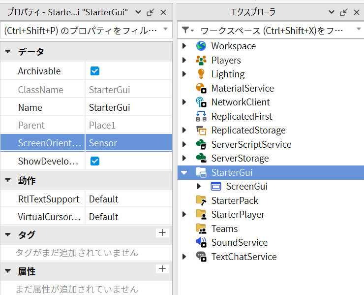
そこで"LandscapeRight"か"LandscapeLeft"を指定すれば、スマートフォンの向きをセンサーがどう検知するかに関わらず、横長で固定することができます。
"LandscapeRight"の場合は、スマホの下部(多くの場合充電口があるところ)が右側に、"LandscapeLeft"の場合は、スマホ下部が左側に来ます。
画面サイズを取得して、各UIサイズを調整する
画面サイズを取得することで、そのサイズ別にUIを調整することができます。
以下の関数をStarterGui > ScreenGui 内のLocalScriptに記載することで画面幅を取得することができます。
local function getViewportHeight()
	local camera = game.Workspace.CurrentCamera
	local viewportSize = camera.ViewportSize
	local height = viewportSize.Y
	return height
end
ただ、カメラのviewportのY軸を取ると、場合によってはスマホスクリーンの長い方の幅を取得してしまう場合もあるようです(原因は不明です)。
そのため、以下のように、viewportのX軸とY軸を両方取得したうえで短い方の幅を、スクリーンの縦幅(screenHeight)と判別することにします。
local screenHeight

local function getViewportHeight()
	local camera = game.Workspace.CurrentCamera
	local viewportSize = camera.ViewportSize
	local height = viewportSize.Y
	return height
end

local function getViewportWidth()
	local camera = game.Workspace.CurrentCamera
	local viewportSize = camera.ViewportSize
	local width = viewportSize.X
	return width
end

local height = getViewportHeight()
local width = getViewportWidth()

if height > width then
    screenHeight = width
else
	screenHeight = height
end
ButtonAとButtonBのサイズをレスポンシブに変更するコードは最終的にはこちらになります。
local UserInputService = game:GetService("UserInputService")
local screenHeight

local Buttons = script.Parent
local ButtonA = Buttons.ButtonA
local ButtonB = Buttons.ButtonB

local function getViewportHeight()
	local camera = game.Workspace.CurrentCamera
	local viewportSize = camera.ViewportSize
	local height = viewportSize.Y
	return height
end

local function getViewportWidth()
	local camera = game.Workspace.CurrentCamera
	local viewportSize = camera.ViewportSize
	local width = viewportSize.X
	return width
end

local height = getViewportHeight()
local width = getViewportWidth()

if UserInputService.TouchEnabled then -- タッチ可能なデバイス(主にタブレットやスマホ)か判別
	if height > width then
		screenHeight = width
	else
		screenHeight = height
	end

	if screenHeight < 330 then
            ButtonA.Size = UDim2.new(0.2, 0, 0.52, 0)
            ButtonB.Size = UDim2.new(0.2, 0, 0.52, 0)
	elseif screenHeight < 380 then
            ButtonA.Size = UDim2.new(0.2, 0, 0.6, 0)
            ButtonB.Size = UDim2.new(0.2, 0, 0.6, 0)
	end
end
タブレットやスマホ表示の確認方法
"テスト > デバイス"で様々なデバイスに切り替えて表示を確認することができます。
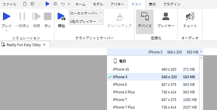
スクリプトを用いて画面サイズを調整する場合には、テストプレイを開始してスクリプトを動かした上で表示状態を確認するようにしてください。
Discussion