Next.js x TypeScript初心者向け利用ガイド(フロントエンド編)-Page 2/3
Next.js x TypeScript 利用ガイド (フロントエンド 編) - Page 1 / 3 の続きの記事になります。
このページでは Next.js で利用する React フックの途中からの説明になるため、必要であれば Page 1 / 3 よりお読みください。
GitHub からソースコードをダウンロードする場合はプロフの GitHub リンクよりご確認ください。
※6/12 Sidebar 開閉の状態管理に useContext 等が利用できない理由を追記
※6/15 Next.js のレンダリングを SSG と書いてたので SSR に修正
※6/18 Next.js の dev 実行速度の改善、ModalContainer、SnackbarContainer の styled を削除し作り直し + プリロードで高速化
(目次)
(Page 2 / 3)
-
Next.js 概要、Next.js で利用する React フック (続き)
5-12. コンポーネントのメモ化 (memo)
5-13. 関数のメモ化 (useCallback)
5-14. カスタムフックの概要
5-15. カスタムフックで開閉式のサイドバーの状態管理 (useSettingSidebar + localforage)
5-16. カスタムフックで HTTP リクエストの状態管理・例外処理 (useApiRequest)をして、純粋な関数 (createUserService + Axios) で HTTP リクエストを実行 -
共通ユーティリティ関数、共通コンポーネント
6-1. AJV Validation でのデータ検証 (ajvValidate)
6-2. DOMPurify で文字列の無害化 (sanitize)
6-3. MUI 用モーダル内の Box のスタイル付きコンポーネント (ModalContainer)
6-4. MUI 用エラーメッセージ表示用 Snackbar 内のスタイル付きコンポーネント (SnackbarContainer) -
ATOMIC デザインについて
7-1. ATOMIC デザインの説明
7-2. ATOMIC デザインのフォルダ構成案
7-3. ATOMIC デザインでの React フック利用イメージ -
パーツごとのサンプル画面の作成
8-1. Web テーブル (AG-Grid + Axios)
8-2. モーダル (MUI)
8-3. モーダル登録フォーム (MUI + React Hook Form + AJV + Axios)
(Page 3 / 3)
-
サンプルアプリの作成
9-1. 前項のサンプルパーツを 1 画面にまとめたページの作成
9-2. サンプルアプリの公開 URL (GitHub、StackBlitz で公開) -
あとがき
5-13. 関数のメモ化 (useCallback)
親コンポーネントで作成した関数を Props で子コンポーネントに渡したい時があります。このような時に useCallback でラップして関数を渡して不要な再レンダリングが起きないようにする必要があります。ここでは useCallback について説明します。
関数をメモ化して渡さないと関数の再生成が発生するため、値が変わっていなくても Props が変化したと見なされ、再レンダリングが発生してしまいます。
そのため、子コンポーネントへ関数を渡す時は基本的に useCallback でラップしてから渡すようにしましょう。合わせて子コンポーネントは memo 化しておく必要があります。
その他 useCallback を利用する場面としては、useEffect 内で利用する関数、重いロジックを含む関数などでも useCallback でラップする必要があります。
書き方としては、関数イベントを useCallback で囲み、useCallback の第 1 引数に関数、第 2 引数に依存配列(useCallback 内で利用する変数を配列形式で指定)の形で入力します。
(書き方)
const handleSubmit = useCallback(関数, [依存配列]);
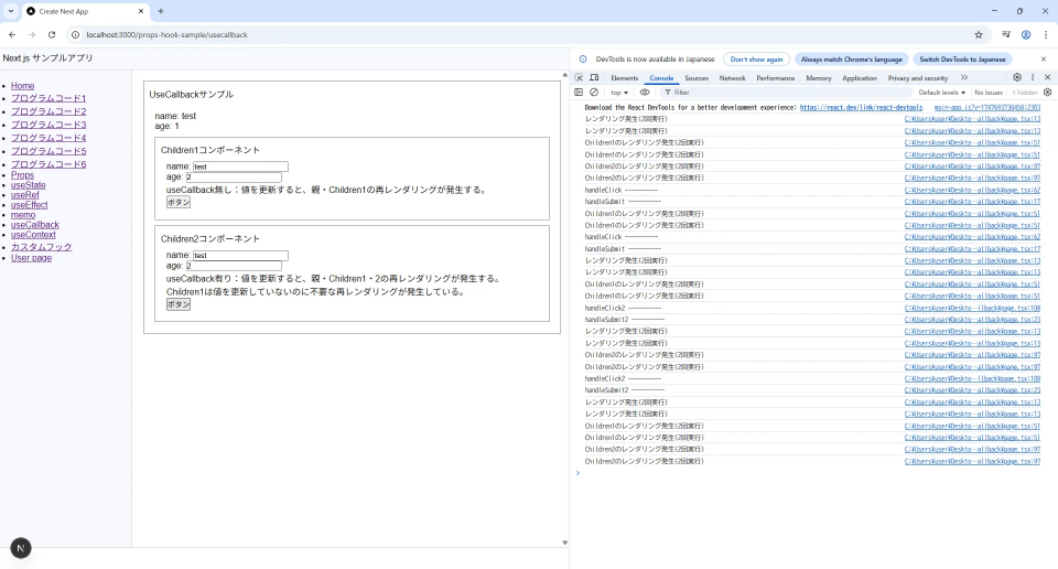
下記のコードでは useCallback のサンプルを比較で載せています。
関数のメモ化をしている場合は、値が変わらない場合に再レンダリングが発生しないですが、関数のメモ化をしていない場合は不要な再レンダリングが発生することが確認できます。
TypeScript:/app/props-hook-sample/usecallback/page.tsx
"use client";

import React, { JSX, memo, useState, useCallback, ChangeEvent } from "react";

interface Test {
  account: string;
  age: number;
}

export default function Page(): JSX.Element {
  const [data, setData] = useState<Test>({ account: "test", age: 0 });
  const [data2, setData2] = useState<Test>({ account: "test", age: 0 });
  console.log("レンダリング発生(2回実行)");

  // useCallback無しの関数
  const handleSubmit = (form: Test): void => {
    console.log("handleSubmit ----------");
    setData(form);
  };

  // useCallback有りの関数
  const handleSubmit2 = useCallback((form: Test) => {
    console.log("handleSubmit2 ----------");
    setData2(form);
  }, []);

  return (
    <>
      <div style={{ border: "1px gray solid", padding: "10px" }}>
        UseCallbackサンプル
        <div style={{ marginTop: "10px", padding: "10px" }}>
          <div>name: {data.account ?? ""}</div>
          <div>age: {data.age ?? ""} </div>
          <Children1 data={data} onSubmit={handleSubmit} />
          <Children2 data2={data2} onSubmit2={handleSubmit2} />
        </div>
      </div>
    </>
  );
}

// IProps (子コンポーネントで受け取るデータ型)
interface IProps {
  data: Test;
  onSubmit: (form: Test) => void;
}

const Children1 = memo(function Children(props: IProps): JSX.Element {
  const { data, onSubmit } = props;
  const [form, setForm] = useState<Test>(data);
  console.log("Children1のレンダリング発生(2回実行)");

  // 検証用のダミー
  const handleChange = (e: ChangeEvent<HTMLInputElement>): void => {
    // const { name, value } = e.target;
    // setForm((prev) => ({ ...prev, [name]: value }));
    console.log(e);
  };

  // ボタンイベント
  // onSubmitで親へ渡す
  const handleClick = (): void => {
    console.log("handleClick ----------");
    setForm({ account: form.account, age: form.age + 1 });
    onSubmit(form);
  };

  return (
    <>
      <div style={{ border: "1px gray solid", marginTop: "10px", padding: "10px" }}>
        Children1コンポーネント
        <div style={{ padding: "10px" }}>
          <div>
            name: <input type="text" name="account" value={form["account"]} onChange={handleChange} />
          </div>
          <div>
            age: <input type="number" name="age" value={form["age"]} onChange={handleChange} />
          </div>
          <div>useCallback無し:値を更新すると、親・Children1の再レンダリングが発生する。</div>
          <div>
            <button onClick={handleClick}>ボタン</button>
          </div>
        </div>
      </div>
    </>
  );
});

// IProps (子コンポーネントで受け取るデータ型)
interface IProps2 {
  data2: Test;
  onSubmit2: (form: Test) => void;
}

const Children2 = memo(function Children(props: IProps2): JSX.Element {
  const { data2, onSubmit2 } = props;
  const [form, setForm] = useState<Test>(data2);
  console.log("Children2のレンダリング発生(2回実行)");

  // 検証用のダミー
  const handleChange = (e: ChangeEvent<HTMLInputElement>): void => {
    // const { name, value } = e.target;
    // setForm((prev) => ({ ...prev, [name]: value }));
    console.log(e);
  };

  // ボタンイベント
  // onSubmitで親へ渡す
  const handleClick2 = (): void => {
    console.log("handleClick2 ----------");
    setForm({ account: form.account, age: form.age + 1 });
    onSubmit2(form);
  };

  return (
    <>
      <div style={{ border: "1px gray solid", marginTop: "10px", padding: "10px" }}>
        Children2コンポーネント
        <div style={{ padding: "10px" }}>
          <div>
            name: <input type="text" name="account" value={form["account"]} onChange={handleChange} />
          </div>
          <div>
            age: <input type="number" name="age" value={form["age"]} onChange={handleChange} />
          </div>
          <div>useCallback有り:値を更新すると、親・Children1・2の再レンダリングが発生する。Children1は値を更新していないのに不要な再レンダリングが発生している。</div>
          <div>
            <button onClick={handleClick2}>ボタン</button>
          </div>
        </div>
      </div>
    </>
  );
});
(useCallback 実行結果)
5-14. カスタムフックの概要
Next.js で状態 (useState) や 副作用 (useEffect) なを含む機能を外の関数にして利用する場合、カスタムフックを作成することがあります。
関数に状態を含まなくてよい場合は"通常の関数"で作成します。
ファイル名、カスタムフック名については、同じ名前で use から始めます。
例えばこのページの後項サンプルでは、
・サイドバーの開閉状態の管理
・HTTP リクエストを行う際の例外処理と状態の部分
をカスタムフック化をしています。カスタムフックだけで完結するような機能をカスタムフックで作成したり、通常の関数で状態・副作用を持たせたいと思った場合に、その部分だけをカスタムフック化して分離するとよいと思います。
画面に影響するもの以外の大きなロジックごとカスタムフック化するのは避けたほうがよいです。
この場合はロジックを通常の関数のみで処理をし、状態・副作用は分離して共通で利用できるようにしましょう。
(関数の利用パターン)
| 項目 | 説明 |
|---|---|
| 通常の関数(.ts) | 状態・副作用などを持たない関数、画面に影響するもの以外の大きなロジックを含むもの |
| カスタムフック(.tsx) | 状態・副作用などを持つ関数 |
| カスタムフック(.tsx) + 通常の関数(.ts) | 状態・副作用管理、カスタムフックの引数に通常の関数を渡して実行 |
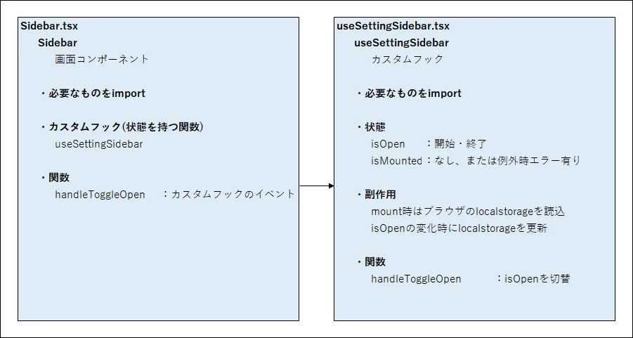
5-15. カスタムフックで開閉式のサイドバーの状態管理 (useSettingSidebar + localforage)
カスタムフックで開閉式のサイドバーを実装する方法を説明します。
行っていることは、layout.tsx 内に 開閉アイコン付きの Sidebar コンポーネントを用意して、サイドバーの開閉状態を記憶・読み込みするカスタムフックを用意していることです。その Sidebar の開閉アイコンをクリックすると、Sidebar が開閉します。
ただし、今回 Next.js を SPA で利用していないため、React フック の useContext やその他の状態管理の方法で、Sidebar の開閉状態を記憶することができないです。
そのため、localforage のパッケージを利用して localstrage(ブラウザの記憶領域の Indexed DB)に記憶するようにしています。
Sidebar を閉じた状態で、ページを再更新しても閉じたままになっていることが確認できます。
useSettingSidebar のカスタムフックは動きがわかりやすいようにコメントを追加しました。
Sidebar コンポーネントは画面の作成と、アイコンにカスタムフックで用意した関数を当てているだけです。
ここでは作成したサンプルでの Sidebar 開閉の例で、モバイル表示は未対応です。
モバイル対応する場合は@media 等で調整になると思います。
実際は画面の見た目スタイルなどは調べながら調整になるかなと思います。
(開閉式のサイドバーを実装するために利用するファイル)
| ファイル | 説明 |
|---|---|
| /app/hooks/common/useSettingSidebar.tsx | Sidebar の開閉状態を記憶するためのカスタムフック パッケージの localforage で localstrage(ブラウザの Indexed DB) にキーで値をセット or 読み込み |
| /app/common/organisms/Sidebar.tsx | Sidebar のコンポーネント、開閉ボタンがある |
| /app/layout.tsx | 全体のレイアウト |
(開閉式のサイドバーを行うイメージ)
layout 部のため専用のサンプル画面はありませんが、Sidebar を閉じた状態で画面を再更新しても、Sidebar が閉じたままのことを確認できます。
/app/hooks/common/useSettingSidebar.tsx
"use client";

/**************************************************
 * useSettingSidebar: Sidebarの状態管理
 *
 *
 **************************************************/
import { useState, useEffect, useRef } from "react";
import localforage from "localforage";

interface IUseSidebar {
  isOpen: boolean;
  handleToggleOpen: () => void;
}

export const useSettingSidebar = (): IUseSidebar => {
  // 開閉状態
  const [isOpen, setIsOpen] = useState<boolean>(false);

  // mount状態
  const [isMounted, setIsMounted] = useState(false);

  // localstrage key
  const localStorageKey = useRef<string>("sidebar-state");

  // 初回のみ実行、localforage でlocalstrage(ブラウザのIndexed DB)の、キーの値を読み込む
  useEffect(() => {
    localforage.getItem<boolean>(localStorageKey.current).then((value) => {
      if (typeof value === "boolean") {
        setIsOpen(value);
      } else {
        // 値がなかったときは true
        setIsOpen(true);
      }

      setIsMounted(true);
    });
  }, []);

  // 開閉の度に実行
  useEffect(() => {
    // mounted以降
    if (isMounted) {
      // localforage でlocalstrage(ブラウザのIndexed DB)のキーに値をセット
      localforage.setItem(localStorageKey.current, isOpen);
    }
  }, [isMounted, isOpen]);

  const handleToggleOpen = (): void => setIsOpen((prev) => !prev);

  return { isOpen, handleToggleOpen };
};
TypeScript:/app/common/organisms/Sidebar.tsx
"use client";

/**************************************************
 * Sidebar component (共通)
 * ※Sidebar の状態管理付き
 *
 **************************************************/
import { JSX } from "react";
import Link from "next/link";
// import { useRouter } from "next/navigation";
import Box from "@mui/material/Box";
import IconButton from "@mui/material/IconButton";
import KeyboardDoubleArrowLeftIcon from "@mui/icons-material/KeyboardDoubleArrowLeft";
import KeyboardDoubleArrowRightIcon from "@mui/icons-material/KeyboardDoubleArrowRight";
import { useSettingSidebar } from "@/hooks/common/useSettingSidebar";
// import { setRenderTimerStart } from "@/hooks/common/useRenderTimer";

export default function Sidebar(): JSX.Element {
  /**************************************************
   * 状態 (State)、カスタムフック、共通関数
   *
   **************************************************/

  // const router = useRouter();
  const { isOpen, handleToggleOpen } = useSettingSidebar();

  /**************************************************
   * 関数・イベント ※Propsで渡す関数名はhandleから始める
   *
   **************************************************/

  // 描画時間 計測用
  /*
  const handleClick = (): void => {
    setRenderTimerStart();
    router.push("/users");
  };
   */

  /**************************************************
   * return JSX.Element
   *
   **************************************************/
  return (
    <Box
      sx={{
        position: "relative",
        width: isOpen ? 240 : 80,
        paddingTop: isOpen ? "40px" : "20px",
        paddingLeft: isOpen ? "20px" : 0,
        backgroundColor: "ghostwhite",
        borderRight: "1px solid lightgray",
        overflowY: "scroll"
      }}>
      <IconButton
        sx={{
          position: "absolute",
          top: 8,
          right: 8,
          // ← 最前面
          zIndex: 10,
          backgroundColor: "white",
          boxShadow: 1,
          "&:hover": {
            backgroundColor: "lightgray"
          }
        }}
        onClick={handleToggleOpen}>
        {isOpen ? <KeyboardDoubleArrowLeftIcon /> : <KeyboardDoubleArrowRightIcon />}
      </IconButton>

      {isOpen && (
        <nav>
          <ul>
            <li>
              <Link href="/">Home</Link> ※以下省略
            </li>
          </ul>
        </nav>
      )}
    </Box>
  );
}
TypeScript:/app/layout.tsx
import { JSX } from "react";
import type { Metadata } from "next";
// import { Geist, Geist_Mono } from "next/font/google";
import Header from "@/common/organisms/Header";
import Sidebar from "@/common/organisms/Sidebar";
import "./globals.css";

/*
const geistSans = Geist({
  variable: "--font-geist-sans",
  subsets: ["latin"],
});

const geistMono = Geist_Mono({
  variable: "--font-geist-mono",
  subsets: ["latin"],
});
 */

export const metadata: Metadata = {
  title: "Create Next App",
  description: "Generated by create next app",
};

export default function RootLayout({
  children,
}: Readonly<{
  children: React.ReactNode;
}>): JSX.Element {
  return (
    <html lang="ja">
      <body>
        {/* className={`${geistSans.variable} ${geistMono.variable}`}*/}
        {/* Header */}
        <header>
          <Header />
        </header>

        {/* Content */}
        <main>
          {/* 削除 className={styles.main} */}
          {/* サイドバー */}
          <Sidebar />

          {/* メインコンテンツ */}
          <div className="content">{children}</div>
        </main>

        {/* Footer */}
        <footer>{/* 削除 className={styles.footer} */}</footer>
      </body>
    </html>
  );
}
(カスタムフックで開閉式のサイドバーを実装 (useSettingSidebar + localforage) 実行結果)
5-16. カスタムフックで状態管理・例外処理 (useApiRequest)をして、純粋な関数 (createUserService + Axios) で HTTP リクエストを行う
カスタムフックで状態管理・例外処理 (useApiRequest)をして、純粋な関数 (createUserService + Axios) で HTTP リクエストを行う方法を説明します。
ここでは、HTTP リクエストを行うために専用の純粋な関数 (createUserService + Axios) と、HTTP リクエスト時の状態管理や例外処理(エラーメッセージ取得)を行うカスタムフックの 2 つの関数に分けて、役割を分離しています。
(HTTP リクエストをするために利用するファイル)
| ファイル | 説明 |
|---|---|
| /app/hooks/common/useApiRequest.tsx | HTTP リクエストの状態管理・例外処理、共通で利用可能なカスタムフック(axios 専用、エラーの判定部のみ axios 利用のため) |
| /app/services/createUserService.ts | HTTP リクエストを行うための純粋な関数、基本の GET、POST、PATCH、DELETE ができます ※データ型を変更すれば他でも利用可 |
| /app/props-hook-sample/custom-hook-useapirequest/useapirequest/page.tsx | HTTP リクエストをテストするサンプル画面 |
(カスタムフックで状態管理・例外処理 (useApiRequest)をして、純粋な関数 (createUserService + Axios) で HTTP リクエストを行うイメージ)
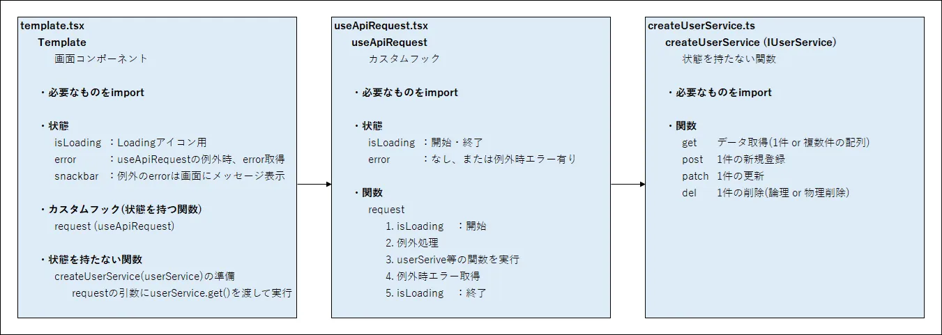
純粋な関数の createUserService は、axios で HTTP リクエストをしてデータの取得、新規登録、更新、削除の CRUD 操作を行うためのものです。
useApiRequest の引数では、createUserService 内の関数を渡して、例外処理の中で HTTP リクエストを行い、HTTP レスポンス、loading の設定、例外時にエラーメッセージを取得するようにしています。
コード中の"T"は引数で受け取ったデータ型が利用されます。
※Next.js の React フックの useSWR、useSWRMutation でも HTTP リクエストができますが、そこまで高機能なものが必要ないので、useApiRequest を経由して service を利用できるようにしています。
待ち時間が長いときは MUI のコンポーネントで loading を表示し、例外時のエラーを Snackbar で表示できるようにしています。
それぞれのコードについてわかりやすいようにコメントを追加しましたが、やっていることは単純なのですが理解は少し難しいかもしれません。
TypeScript:/app/hooks/common/useApiRequest.tsx
"use client";

/**************************************************
 * useApiRequest: HTTPリクエストの状態管理
 *
 *
 **************************************************/
import axios from "axios";
import { ResponseMessages } from "@/constants/ResponseMessages";

interface IProps {
  setIsLoading: (isLoading: boolean) => void;
  setError: (e: Error | null) => void;
}

interface IUseApiRequest {
  request: <T>(fn: () => Promise<T>) => Promise<T | null>;
}

export const useApiRequest = (props: IProps): IUseApiRequest => {
  // Props
  const { setIsLoading, setError } = props;

  // request関数の
  // 引数 (fn: () => Promise<T>) の、
  // fnの型の "() => Promise<T>"" は、 function(): Promise<T> { } のことであり、
  // createService内で定義したget, post, patch, del関数が使える
  // requestの戻り値は Promise<T | null> なので、呼び出し元は T (1件または複数件の配列) 、または null を受け取ることができる

  // stackblitz用のprettier除外設定
  // prettier-ignore
  const request = async <T,>(fn: () => Promise<T>): Promise<T | null> => {
    // loading開始、エラーリセット
    setIsLoading(true);
    setError(null);

    // HTTP リクエストの例外処理
    try {
      // 純粋な関数を実行
      const result: T = await fn();
      return result;
    } catch (error: unknown) {
      // 例外時、HTTP レスポンスのステータスコードから、ResponseMessagesのエラーメッセージ取得
      // 基本のステータスコードがResponseMessagesになければ一律500エラー
      const status: number = axios.isAxiosError(error)
        ? error.response?.status ?? 500
        : 500;
      const message = ResponseMessages[status] || ResponseMessages[500];

      // setErrorに追加
      setError(new Error(message));
      return null;
    } finally {
      // loading終了
      setIsLoading(false);
    }
  };

  return { request };
};
TypeScript:/app/services/createUserService.ts
import axios, { AxiosResponse } from "axios";
import { User } from "@/types/User";

// Interface
// 実際は画面で扱うデータ型とHTTPリクエストで扱うデータ型は異なる場合があります
export interface IUserService {
  get: (params?: string[]) => Promise<User[] | null>;
  post: (user: User) => Promise<User | null>;
  patch: (user: User) => Promise<User | null>;
  del: (user: User) => Promise<User | null>;
}

export const createUserService = (apiUrl: string): IUserService => {
  // データ取得 (1件の配列 or 複数件の配列)
  const get = async (params?: string[]): Promise<User[] | null> => {
    const response: AxiosResponse<User[]> = await axios.get(apiUrl, {
      params,
      headers: {
        Accept: "application/json",
        // Authorization: "Bearer ...", // 認証でjsonwebtokenを利用する時など、実際はAuthorizationが必須になります
        "Content-Type": "application/json",
      },
    });

    return response.data;
  };

  // 新規登録 (1件) ※画面によっては複数件の処理に変更が必要
  const post = async (user: User): Promise<User | null> => {
    const response: AxiosResponse<User> = await axios.post(
      apiUrl,
      JSON.stringify(user),
      {
        headers: {
          Accept: "application/json",
          // Authorization: "Bearer ...",
          "Content-Type": "application/json", // 画像などのバイナリデータを扱いたい時は調整が必要
        },
      }
    );

    return response.data;
  };

  // 更新 (1件) ※画面によっては複数件の処理に変更が必要
  const patch = async (user: User): Promise<User | null> => {
    const response: AxiosResponse<User> = await axios.patch(
      apiUrl,
      JSON.stringify(user),
      {
        headers: {
          Accept: "application/json",
          // Authorization: "Bearer ...",
          "Content-Type": "application/json",
        },
      }
    );

    return response.data;
  };

  // deleteが予約語のためdelにしています
  // 削除 (1件) ※backendでは論理削除の場合が多い、画面によっては複数件の処理に変更が必要
  const del = async (user: User): Promise<User | null> => {
    const response: AxiosResponse<User> = await axios.delete(apiUrl, {
      data: JSON.stringify(user),
      headers: {
        Accept: "application/json",
        // Authorization: "Bearer ...",
        "Content-Type": "application/json",
      },
    });

    return response.data;
  };

  return { get, post, patch, del };
};
TypeScript:/app/props-hook-sample/useapirequest/page.tsx
"use client";
// React、MUI
import { JSX, useState, useEffect } from "react";
import {
Backdrop,
CircularProgress,
Snackbar,
SnackbarContent,
} from "@mui/material";
// App
import { useApiRequest } from "@/hooks/common/useApiRequest";
import { User } from "@/types/User";
import { IUserService, createUserService } from "@/services/createUserService";
// Template (Layout & stateを持つ場所)
export default function Template(): JSX.Element {
const PUBLIC_API_URL: string = process.env.NEXT_PUBLIC_API_URL ?? "";
const API_URL: string = `${PUBLIC_API_URL}/users`;
// State (loading、error、message、modal)
const [isLoading, setIsLoading] = useState<boolean>(false);
const [error, setError] = useState<Error | null>(null);
const [snackbar, setSnackbar] = useState<{ open: boolean; message: string }>({
open: false,
message: "",
});
// Custom hook (API requestの状態の保持、例外処理に利用)
const { request } = useApiRequest({ setIsLoading, setError });
// Service (状態を持たない関数)
const userService: IUserService = createUserService(API_URL);
// 不正なAPI_URL
const userService2: IUserService = createUserService("test");
/**************************************************
* データ取得
*
**************************************************/
const fetch = async (): Promise<void> => {
// useApiRequestのrequestにserviceの関数を渡して実行
// 必要があれば、get()の引数にパラメータのオブジェクトを指定します
const response: User[] | null = await request(() => userService.get());
const users: User[] = Array.isArray(response) ? response : [];
if (response) {
console.log(users);
} else {
console.log(null);
}
};
const fetch2 = async (): Promise<void> => {
// useApiRequestのrequestにserviceの関数を渡して実行
// 必要があれば、get()の引数にパラメータのオブジェクトを指定します
const response: User[] | null = await request(() => userService2.get());
const users: User[] = Array.isArray(response) ? response : [];
if (response) {
console.log(users);
} else {
console.log(null);
}
};
const handleClick = (): void => {
fetch();
};
const handleClick2 = (): void => {
fetch2();
};
/**************************************************
* エラーメッセージ表示
*
**************************************************/
useEffect(() => {
if (error) {
setSnackbar({ open: true, message: error.message });
}
}, [error]);
/**************************************************
* return JSX.Element
*
**************************************************/
return (
<>
<div style={{ border: "1px gray solid", padding: "10px" }}>
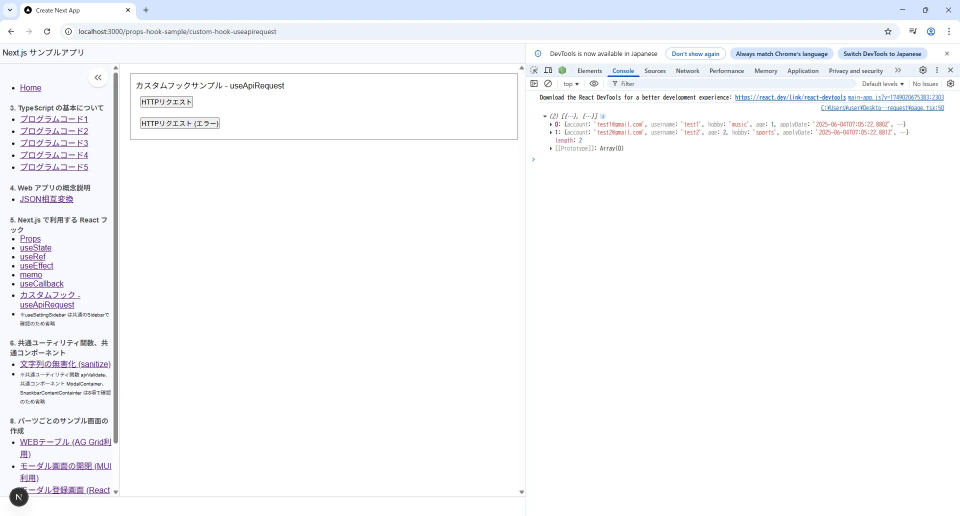
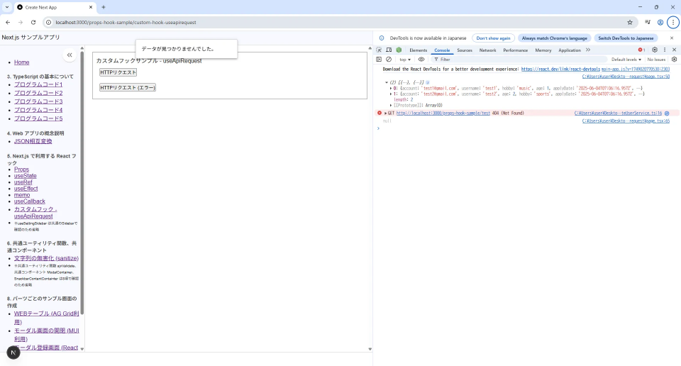
カスタムフックサンプル - useApiRequest
<div style={{ padding: "10px" }}>
<div>
<button onClick={handleClick}>HTTPリクエスト</button>
</div>
</div>
<div style={{ padding: "10px" }}>
<div>
<button onClick={handleClick2}>HTTPリクエスト (エラー)</button>
</div>
</div>
</div>
{/* Loading */}
<Backdrop
open={isLoading}
sx={{
// ← 最前面、背景を透明
zIndex: (theme) => theme.zIndex.tooltip + 1,
backgroundColor: "transparent",
}}
>
<CircularProgress color="inherit" />
</Backdrop>
{/* Message */}
<Snackbar
open={snackbar.open}
onClose={() => setSnackbar({ ...snackbar, open: false })}
autoHideDuration={3000}
anchorOrigin={{ vertical: "top", horizontal: "center" }}
>
<SnackbarContent
sx={{
border: "1px solid #ccc",
backgroundColor: "#fff",
color: "#000",
boxShadow: 3,
borderRadius: 1,
px: 2,
py: 1,
}}
message={snackbar.message}
/>
</Snackbar>
</>
);
}
(カスタムフックで状態管理・例外処理 (useApiRequest)をして、純粋な関数 (createUserService + Axios) で HTTP リクエストを行う 実行結果)
(カスタムフックで状態管理・例外処理 (useApiRequest)をして、純粋な関数 (createUserService + Axios) で HTTP リクエストを行う-エラー 実行結果)
6. 共通ユーティリティ関数、共通コンポーネント
ここでは frontend でよく使いそうな機能を共通のユーティリティ関数として作成したものや、共通のコンポーネント化したものを説明します。
6-1. AJV Validation でのデータ検証 (ajvValidate)
画面に入力する際に、入力チェックを実施し、誤ったデータを防いだり、エラーメッセージを表示するようにする必要があります。
入力チェックについては Validation とも呼びます。
ここでは 最もシェアの高い AJV パッケージの Validation を利用して入力チェックを行い、エラー時にエラーメッセージを表示したいと思います。
AJV で入力チェックをする上でユーザー定義型にチェック用の Schema を書く必要がありますが、このエラーメッセージを取得する際のロジックが複雑になるため、
ユーザー定義型のデータと Schema を渡したらエラーメッセージを取り出せる共通のユーティリティ関数を作成しています。
React Hook Form のパッケージとも組み合わせが必要なため、具体的な利用方法は後項の "パーツごとのサンプル画面の作成"の"モーダル登録フォーム"で説明します。
TypeScript:/common/utilities/ajvValidate.ts
/**************************************************
 * AJV validation
 *
 * AJV(Another JSON Schema Validator)を使用して、data を JSON Schemaで検証する
 *
 * ajvValidate: AjvValidationResult<T>
 * @param data - 検証する data
 * @param schema - dataに対応する JSON Schema
 * @returns - Record<string, string>[]
 *  - valid: true の場合はエラーなし []
 *  - valid: false の場合は Record<string, string>[] でフィールドとエラーメッセージを返す
 *
 **************************************************/

import Ajv, { JSONSchemaType } from "ajv";
import addFormats from "ajv-formats";
import ajvErrors from "ajv-errors";

export const ajvValidate = <T>(data: T, schema: JSONSchemaType<T>): Record<string, string>[] => {
  // Validation
  const ajv = new Ajv({ allErrors: true, strict: false });
  addFormats(ajv);
  ajvErrors(ajv);

  const validate = ajv.compile(schema);
  const valid = validate(data);

  // valid: true trueは終了
  if (valid) return [];

  // valid: false
  const errors: Record<string, string>[] = [];

  // Get error messages
  for (const error of validate.errors || []) {
    const field: string = error.instancePath.replace(/^\//, "");

    // ルートのschemaはfieldが空、かつ利用無しのためスキップ
    if (!field) continue;

    // エラーメッセージ取得
    const message: string = error.message || "入力エラーがあります";

    // fieldがなければ配列にpush、すでに存在してればそのfieldのメッセージに改行して追加
    const found: Record<string, string> | undefined = errors.find((element: Record<string, string>) => element.field === field);

    if (found === undefined) {
      errors.push({ field, message });
    } else {
      found.message += `\n${message}`;
    }

    // 呼び出し側でValidation後に元のデータを型にセット
  }

  return errors;
};
TypeScript:/types/User.ts
import { JSONSchemaType } from "ajv";

// ユーザー定義型
// 必須でないプロパティはオプショナル"?"、ユニオン型でnullを許可
// 登録・更新等でデータ型が分かれる場合がある
export interface User {
  account: string;
  username: string;
  password?: string | null; // 新規登録時のみ利用
  age?: number | null;
  hobby?: string | null;
  applyDate?: string | null;
  isEnabled?: boolean | null;
  remarks?: string | null;
  isDeleted?: boolean | null;
  sortOrder?: number | null;
  createdAt?: string | null;
  updatedAt?: string | null;
  createdBy?: string | null;
  updatedBy?: string | null;
}

// AJV Validation schema
// nullの時、nullable: trueにする必要がある
export const userSchema: JSONSchemaType<User> = {
  type: "object",
  properties: {
    account: {
      type: "string",
      format: "email",
      maxLength: 256,
      errorMessage: {
        format: "アカウント名は有効なメールアドレスを入力してください", // formatチェックがあるため必須チェックの代わりとなる
        maxLength: "アカウント名は 256 文字以内で入力してください"
      }
    },
    username: {
      type: "string",
      minLength: 1,
      maxLength: 256,
      errorMessage: {
        minLength: "ユーザー名は入力が必須です",
        maxLength: "ユーザー名は 256 文字以内で入力してください"
      }
    },
    password: {
      type: "string",
      maxLength: 256,
      errorMessage: {
        maxLength: "パスワードは 256 文字以内で入力してください"
      },
      nullable: true
    },
    age: { type: "integer", nullable: true },
    hobby: { type: "string", nullable: true },
    applyDate: { type: "string", nullable: true },
    isEnabled: {
      type: "boolean",
      errorMessage: {
        type: "有効フラグには true か false を指定してください"
      },
      nullable: true
    },
    remarks: {
      type: "string",
      nullable: true,
      maxLength: 4000,
      errorMessage: {
        maxLength: "備考は 4000 文字以内で入力してください"
      }
    },
    isDeleted: { type: "boolean", nullable: true },
    sortOrder: { type: "integer", nullable: true },
    createdAt: { type: "string", nullable: true },
    updatedAt: { type: "string", nullable: true },
    createdBy: { type: "string", nullable: true },
    updatedBy: { type: "string", nullable: true }
  },
  // JSONSchemaType<T>を利用しているため、ここにrequiredのプロパティを記載する必要がある
  required: ["account", "username"],
  additionalProperties: false,
  errorMessage: {
    additionalProperties: "不明なプロパティが含まれています"
  }
};
6-2. DOMPurify で文字列の無害化 (sanitize)
画面でユーザーが入力した HTML や文字列から、危険なスクリプトやタグを取り除いて、XSS (クロスサイトスクリプティング)などの攻撃を防止する必要があるため、文字列を無害化する必要があります。
この危険な文字列を除去することをサニタイズとも呼びます。
ここでは DOMPurify パッケージを利用して、文字列のサニタイズを行います。
実際は、オブジェクトのプロパティの値が文字だったら処理を行うことが多いため、
ユーザー定義型のデータを渡したら一括でサニタイズを行う共通のユーティリティ関数を作成しています。
TypeScript:/common/utilities/sanitize.ts
/**************************************************
 * DompurifyでSanitize
 *
 * Dompurifyを利用して text または オブジェクト のサニタイズを行う
 *
 * sanitizeObject: T
 * @param input - 処理するオブジェクト、配列、オブジェクトのネスト対応
 * @return cleanObject
 *
 **************************************************/
import DOMPurify from "dompurify";

export const sanitize = <T>(input: T): T => {
  // 戻り値がTのため "as T" を利用する必要がある

  // stringであればサニタイズ、number, boolean, null, undefined などはそのまま
  if (typeof input === "string") {
    return DOMPurify.sanitize(input) as T;
  }

  // 配列であれば再帰処理
  if (Array.isArray(input)) {
    return input.map((element) => sanitize(element)) as T;
  }

  // オブジェクトであればプロパティごとに再帰処理
  if (input !== null && typeof input === "object") {
    // 入力がオブジェクトの場合、各プロパティを再帰的にサニタイズ
    const sanitizedObj = {} as { [K in keyof T]: T[K] };

    for (const key in input) {
      if (Object.prototype.hasOwnProperty.call(input, key)) {
        sanitizedObj[key] = sanitize(input[key]);
      }
    }

    return sanitizedObj;
  }

  return input;
};
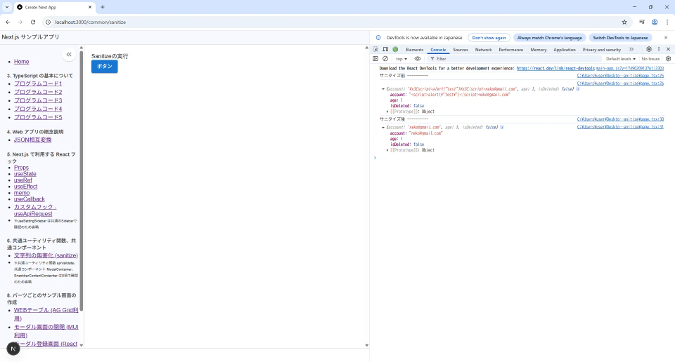
サニタイズ関数の実行例です。
TypeScript:/app/sanitize-sample/page.tsx
"use client";

import React, { JSX } from "react";
import { Button } from "@mui/material";
import { sanitize } from "@/common/utilities/sanitize";
// import styles from "./page.module.css";

export default function Page(): JSX.Element {
  /*
   * サニタイズ関数の実行例
   *
   */
  // ユーザー定義型
  // eslint-disable-next-line no-restricted-syntax
  interface User {
    account: string;
    age?: number | null;
    isDeleted: boolean;
  }

  const doSomething: () => void = (): void => {
    // Sanitizeの実行
    const formData: User = { account: '<script>alert("test")</script>neko@gmail.com', age: 1, isDeleted: false };

    console.log("サニタイズ前 ----------");
    console.log(formData);

    const user: User = sanitize(formData);

    console.log("サニタイズ後 ----------");
    console.log(user);
  };

  return (
    <div>
      <div>Sanitizeの実行</div>
      <Button variant="contained" onClick={doSomething}>
        ボタン
      </Button>
    </div>
  );
}
(DOMPurify で文字列の無害化 (sanitize) 実行結果)
6-3. MUI 用モーダル内の Box のスタイル付きコンポーネント (ModalContainer)
MUI のモーダル利用時に Modal 直下の Box にスタイルを当てないと正しく表示できないため、Containter (囲むだけ)の部分の Box にスタイルを当てただけのコンポーネントを用意しました。
スタイルが必要なコンポーネントは、スタイル部のみを共通化しておくと便利です。
React コンポーネントはコンポーネント内にスタイルを閉じ込めることが多いため、global.css には書かずにコンポーネント内に記載しています。
ここでの説明はコードだけとし、7 項で利用していますのでそちらで確認ください。
TypeScript:/common/organisms/ModalContainer.tsx
"use client";

/**************************************************
 * Modal container (共通)
 * ※Styleのみ適用
 *
 **************************************************/
import React, { JSX } from "react";
import { Modal, Box } from "@mui/material";

interface IProps {
  open: boolean;
  onClose: () => void;
  children: React.ReactNode;
  width?: number;
}

export const ModalContainer = ({ open, onClose, children, width = 700 }: IProps): JSX.Element => {
  return (
    <Modal open={open} onClose={onClose} keepMounted={false}>
      <Box
        sx={{
          position: "absolute",
          top: "50%",
          left: "50%",
          transform: "translate(-50%, -50%)",
          width,
          maxHeight: "95vh",
          overflowY: "auto",
          bgcolor: "background.paper",
          borderRadius: 2,
          boxShadow: 24,
          p: 4
        }}>
        {children}
      </Box>
    </Modal>
  );
};
6-4. MUI 用エラーメッセージ表示用 Snackbar 内のスタイル付きコンポーネント (SnackbarContainer)
MUI のエラーメッセージ表示用に Snackbar というコンポーネントを利用すると簡単にメッセージが表示できるのですが、中に入る SnackbarContent にスタイルを当てないと正しく表示できないため、この部分にスタイルを当てただけのコンポーネントを用意しました。
同様に、ここでの説明はコードだけとし、7 項で利用していますのでそちらで確認ください。
TypeScript:/common/organisms/SnackbarContainer.tsx
"use client";

/**************************************************
 * Snackbar content container (共通)
 * ※Styleのみ適用
 *
 **************************************************/
import React, { JSX } from "react";
import Snackbar from "@mui/material/Snackbar";
import SnackbarContent from "@mui/material/SnackbarContent";

interface IProps {
  open: boolean;
  onClose: () => void;
  message: string;
  autoHideDuration?: number;
  anchorOrigin?: {
    vertical: "top" | "bottom";
    horizontal: "left" | "center" | "right";
  };
}

export const SnackbarContainer = ({ open, onClose, message, autoHideDuration = 3000, anchorOrigin = { vertical: "top", horizontal: "center" } }: IProps): JSX.Element => {
  return (
    <Snackbar open={open} onClose={onClose} autoHideDuration={autoHideDuration} anchorOrigin={anchorOrigin}>
      <SnackbarContent
        sx={{
          border: "1px solid #ccc",
          backgroundColor: "#fff",
          color: "#000",
          boxShadow: "0px 2px 4px rgba(0, 0, 0, 0.1)",
          borderRadius: "8px",
          padding: "8px 16px"
        }}
        message={message}
      />
    </Snackbar>
  );
};
7. ATOMIC デザインについて
frontend のアプリでは ATOMIC デザインという方法で UI 部品を組み立てる方法を利用することがあります。
ここでは ATOMIC デザインの説明と画面の構築方法について説明していきます。
7-1. ATOMIC デザインの説明
ATOMIC デザインというのは、画面を作成するときに、以下のようなコンポーネント構成で分けて作成します。
(ATOMIC デザインのイメージ)
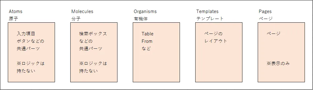
ATOMIC デザインの各要素の役割を整理すると次のイメージになります。
(ATOMIC デザインの要素)
| 項目 | 説明 |
|---|---|
| Pages (ページ) | 最上位のページコンポーネント |
| Templates (テンプレート) | ページ内のレイアウト、状態・副作用・関数を持つ UI コンポーネント |
| Organisms (有機体) | Table や Form などのより具体的な UI コンポーネント、基本的には親の状態を Props で受け取るが、Organisms 独自の状態・副作用・関数を持つ場合もある |
| Molecules (分子) | ラベル付きテキストボックスなど、複数の Atoms を組み合わせて構築した UI コンポーネント |
| Atoms (原子) | ラベル、入力項目、ボタンなどの最小単位の UI コンポーネント |
レンダリングと React フック については 5 項 で少し説明しました。
Next.js アプリで ATOMIC デザインを適用する場合は、App Router で表示する上位のページ(page.tsx) は SSR となり、page.tsx 下の子コンポーネントは画面に動きを持たせるため CSR のことが多く、各要素でレンダリング方式が分かれてくることもあり、いくつか考慮が必要になってきます。
とはいっても、ATOMIC デザインについては理解が難しいと思いますので、7 項で実際のサンプル画面を触ってイメージをつかんでいただくといいかなと思います。
※このページでは Atoms と Molecules については MUI のコンポーネントを直接利用しています。
7-2. ATOMIC デザインのフォルダ構成案
ATOMIC デザインを踏まえて、ディレクトリ&ファイル構成はいろいろな情報がありますが、このページの Next.js アプリで利用しているディレクトリ構成を紹介します。
Next.js の App Router を利用しますので、基本的には App フォルダ下に画面ごとのフォルダを作成してもらい、page.tsx を配置することでフォルダ名で画面を表示することができます。
その画面ごとのフォルダ内には template.tsx、他に必要な oragnisms であれば部品名で作成します。
他、共通で扱うものを app フォルダ外の common、constants、hooks、service、types フォルダに入れて利用しています。
(ATOMIC デザインのフォルダ構成案)
- src
  - app (App Router)
    - users (1画面の例)
       - modal-form.tsx (Organisms) (CSR)
       - page.tsx (Pages) (SSR) ・・・ 最上位コンポーネント (App Router利用のため users でアクセス可)
       - table.tsx (Organisms) (CSR)
       - template.tsx (Templates) (CSR)
    - favicon.ico
    - global.css
    - layout.tsx
    - page.module.css
    - page.tsx

  - assets (画像等)

  - common (共通のコンポーネント)
    - atoms (省略)
    - molecules (省略)
    - organisms
      - Header.tsx (共通のOrganisms) (CSR)
      - ModalContainer.tsx (共通のOrganisms) (CSR)
      - Sidebar.tsx (共通のOrganisms) (CSR)
      - SnackbarContentContainer.tsx (共通のOrganisms) (CSR)

  - constants (定数)
    - ResponseMessages.ts・・・ APIアクセスの例外発生時のレスポンスメッセージ(エラーメッセージ)
  - hooks (カスタムフック)
    - common
      - useApiRequest.tsx ・・・ HTTPリクエストの状態管理・例外処理 (useApiRequest)をして、純粋な関数 (createUserService + Axios) でHTTPリクエストを実行
      - useSettingSidebar.tsx ・・・ 開閉式のサイドバーの状態管理 (useSettingSidebar + localforage)
  - services (Service)
    - createUserService.ts ・・・ APIにHTTPリクエストをするためのService (純粋な関数)
  - types (ユーザー定義型)
    - User.ts ・・・ User型、Validation schema

.gitignore (GitHubの除外設定ファイル)
.eslint.config.mjs (ESLintの設定ファイル)
.prettierrc (Prettierの設定ファイル)
next-env.d.ts (Next.js の型補完を有効にするための設定、編集・削除禁止)
next.config.ts (Next.jsの設定ファイル)
package-lock.json
package.json (Node package manager)
README.md (プロジェクトの説明ドキュメント)
tsconfig.json (TypeScriptの設定ファイル)
7-3. ATOMIC デザインでの React フック利用イメージ
ATOMIC デザインと React フックの関係がわかりやすくするため、具体的なサンプル画面を 後項に記載し、ここで各階層での React フックの利用例を説明します。
ここではそのサンプルの ATOMIC デザインを例に、1 ページ中に一覧のテーブル表示があるのと、登録用のモーダル画面を開くことができるとします。
page.tsx についてはは SSR のため React フックは利用していません。
template.tsx 以下の各コンポーネントでは useState、useRef、useEffect、カスタムフックを必要最低限の数だけ利用しています。
基本的に template が全体の状態を主として持ち、全体的にフックの利用を必要最低限とすることで、役割の分離を明確にすることと、理解しやすいコードにすることができます。
modal-form では React Hook Form の useForm を状態管理に利用しています。
Atoms と Molecules については MUI のコンポーネントを直接利用しています。
(ATOMIC デザインでの React フックの使い方例)
| ATOMIC デザインのレイヤー | ファイル名 | レンダリング方式 | 利用する主な React フック |
|---|---|---|---|
| Pages | page.tsx | 基本的に SSR | ※SSR のため React フックの利用無し |
| Templates | templates.tsx | CSR | useState(主の状態)、useRef、useEffect、useCallback、カスタムフック |
| Organisms | table.tsx | CSR | useState、useEffect、Props で state や useCallback 関数を受取 |
| Organisms | modal-form.tsx | CSR | useEffect、React Hook Form の useForm、Props で state や useCallback 関数を受取 |
| Molecules | - | - | ※利用無し |
| Atoms | - | - | ※MUI のコンポーネントを直接利用 |
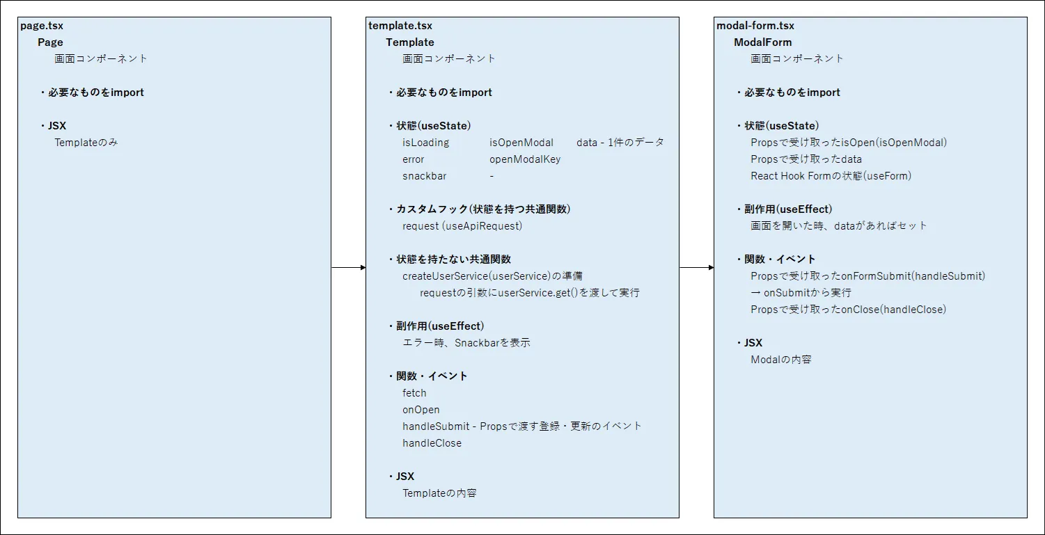
8. パーツごとのサンプル画面の作成
ここではよく使うことがある Web テーブル、モーダル画面、モーダル画面を利用した登録フォームの実装方法について実際のサンプルで確認します。
8 項以降は実際に動かすために書いたプログラムコードを掲載していて、コードが多く読みずらいかもしれなくすみませんが、コード中にコメントを入れて動きを追いやすいように整理しています。
8 項がまわりくどいと感じたら、8 項のサンプルを合体したサンプルアプリを 9 項で解説していますので、そちらをお読みください。
ここでは、web-table、modal-form のそれぞれで、ユーザー定義型 User を共通で利用し、modal-form では AJV validation schema を利用しています。
TypeScript:/types/User.ts
import { JSONSchemaType } from "ajv";

// ユーザー定義型
// 必須でないプロパティはオプショナル"?"、ユニオン型でnullを許可
// 登録・更新等でデータ型が分かれる場合がある
export interface User {
  account: string;
  username: string;
  password?: string | null; // 新規登録時のみ利用
  age?: number | null;
  hobby?: string | null;
  applyDate?: string | null;
  isEnabled?: boolean | null;
  remarks?: string | null;
  isDeleted?: boolean | null;
  sortOrder?: number | null;
  createdAt?: string | null;
  updatedAt?: string | null;
  createdBy?: string | null;
  updatedBy?: string | null;
}

// AJV Validation schema
// nullの時、nullable: trueにする必要がある
export const userSchema: JSONSchemaType<User> = {
  type: "object",
  properties: {
    account: {
      type: "string",
      format: "email",
      maxLength: 256,
      errorMessage: {
        format: "アカウント名は有効なメールアドレスを入力してください", // formatチェックがあるため必須チェックの代わりとなる
        maxLength: "アカウント名は 256 文字以内で入力してください"
      }
    },
    username: {
      type: "string",
      minLength: 1,
      maxLength: 256,
      errorMessage: {
        minLength: "ユーザー名は入力が必須です",
        maxLength: "ユーザー名は 256 文字以内で入力してください"
      }
    },
    password: {
      type: "string",
      maxLength: 256,
      errorMessage: {
        maxLength: "パスワードは 256 文字以内で入力してください"
      },
      nullable: true
    },
    age: { type: "integer", nullable: true },
    hobby: { type: "string", nullable: true },
    applyDate: { type: "string", nullable: true },
    isEnabled: {
      type: "boolean",
      errorMessage: {
        type: "有効フラグには true か false を指定してください"
      },
      nullable: true
    },
    remarks: {
      type: "string",
      nullable: true,
      maxLength: 4000,
      errorMessage: {
        maxLength: "備考は 4000 文字以内で入力してください"
      }
    },
    isDeleted: { type: "boolean", nullable: true },
    sortOrder: { type: "integer", nullable: true },
    createdAt: { type: "string", nullable: true },
    updatedAt: { type: "string", nullable: true },
    createdBy: { type: "string", nullable: true },
    updatedBy: { type: "string", nullable: true }
  },
  // JSONSchemaType<T>を利用しているため、ここにrequiredのプロパティを記載する必要がある
  required: ["account", "username"],
  additionalProperties: false,
  errorMessage: {
    additionalProperties: "不明なプロパティが含まれています"
  }
};
8-1. Web テーブル (AG-Grid + Axios)
AG Grid のパッケージを利用して、Web テーブルを表示したいと思います。
AG Grid は列定義と簡単な設定をするだけで、json データを Web テーブルに表示をすることができます。
他にも高機能でいろいろなことができますが、ここでは画面を表示したらテーブルにデータを反映して表示することと、テーブルの行をダブルクリックしたら、イベントで alert が出るような簡単なサンプルとしています。
利用方法は 最初に import をするのと ModuleRegistry に登録を行い、columnDefs の配列にオブジェクト型で列定義を書くことと、gridOptions に必要な設定をし、最後にコンポーネントを呼び出すことで利用できます。
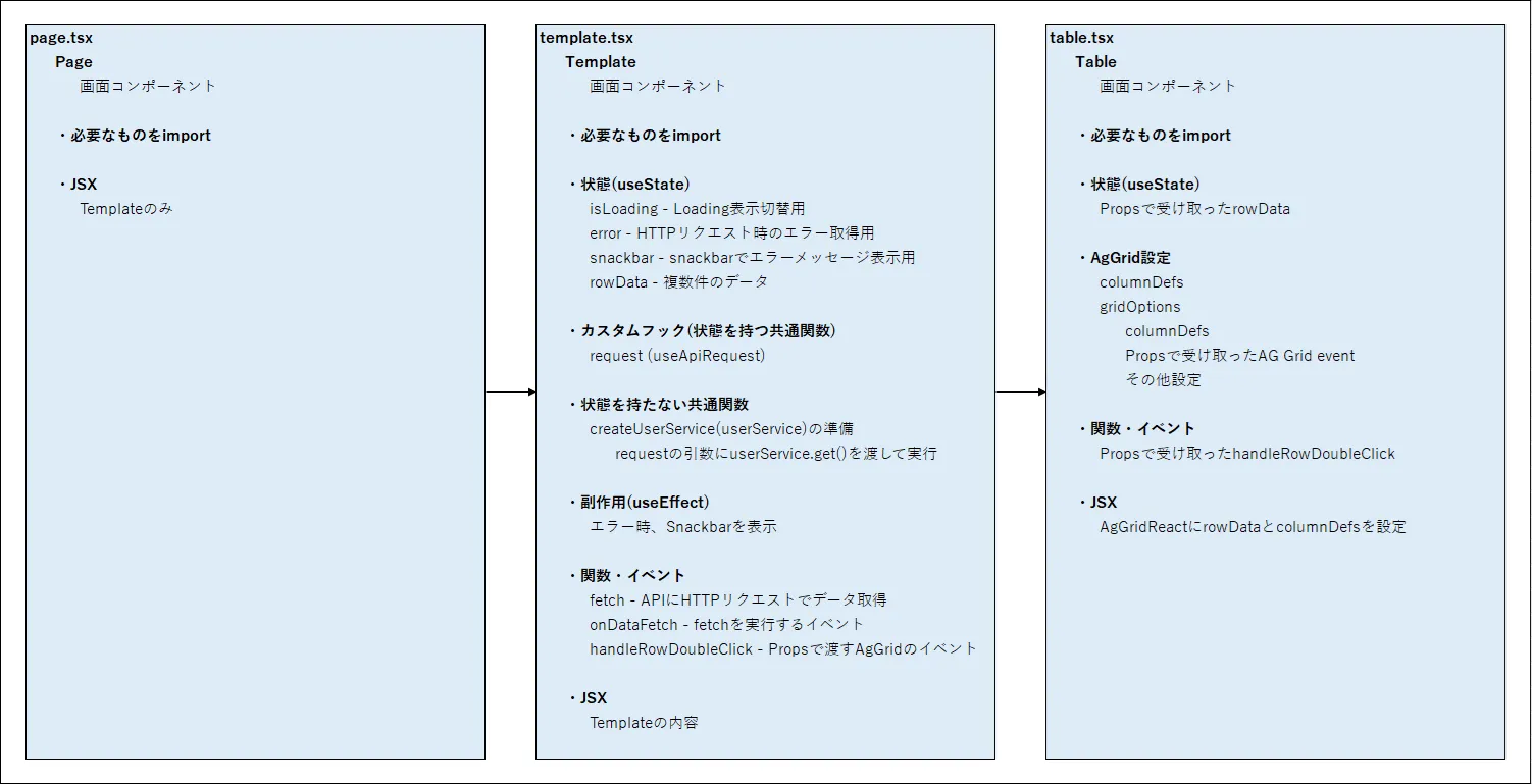
ATOMIC デザインに習って、page → template → organisms の構成とし、table のコンポーネントで AG Grid を作成して利用しています。
(利用しているファイル)
| 用途 | ファイルパス | 備考 |
|---|---|---|
| コンポーネント(Pages) | /app/ui-sample/web-table/page.tsx | |
| コンポーネント(Templates) | /app/ui-sample/web-table/template.tsx | |
| コンポーネント(Organisms) | /app/ui-sample/web-table/table.tsx | |
| 共通:コンポーネント(Organisms) | /common/organisms/ModalContainer.tsx | ※前項に記載のためコードは省略 |
| 共通:共通コンポーネント(Organisms) | /common/organisms/SnackbarContentContainer.tsx | ↓ |
| 共通:Validation 実行 | /common/ajvValidate.ts | ↓ |
| 共通:Sanitize 実行 | /common/sanitize.ts | ↓ |
| HTTP リクエスト用カスタムフック | /hooks/useApiRequest.tsx | ↓ |
| HTTP リクエスト関数 | /services/createUserService.ts | ↓ |
| ユーザー定義型 | /types/User.ts | ↓ |
(Web テーブルページのコンポーネントの構成イメージ)
AG Grid の columnDefs の列定義に設定した内容です。
(AG Grid のテーブル定義 (columnDefs))
| fieldName (プロパティ名) | headerName (ラベル) | panned、value-formatter、hide、他 | 備考 |
|---|---|---|---|
| account | アカウント名 | pinned: "left" | |
| username | ユーザー名 | - | |
| age | 年齢 | - | |
| hobby | 趣味 | value-formatter (選択肢) | |
| applyDate | 適用日 | value-formatter (日付フォーマット) | |
| isEnabled | 有効フラグ | - | |
| remarks | 備考 | - | |
| isDeleted | 削除フラグ | hide: true | |
| sortOrder | 順序 | hide: true | |
| createdAt | 作成日時 | hide: true | |
| updatedAt | 更新日時 | hide: true | |
| createdBy | 作成者 | hide: true | |
| updatedBy | 更新者 | hide: true |
以下コードは長いですが、行っていることはシンプルになるように作成しました。
コードと実行結果を記載します。
TypeScript:/app/ui-sample/web-table/page.tsx
// React
import { JSX } from "react";

// App
import Template from "./template";
// import styles from "./page.module.css";

// Page (Routing)
export default function Page(): JSX.Element {
  /**************************************************
   * return JSX.Element
   *
   **************************************************/

  return (
    <>
      <Template />
    </>
  );
}
TypeScript:/app/ui-sample/web-table/template.tsx
"use client";

// React、MUI
import { JSX, useState, useEffect, useCallback } from "react";
import { Box, Backdrop, CircularProgress, Button } from "@mui/material";

// AG Grid
import type { RowDoubleClickedEvent } from "ag-grid-community";

// App
import { Table } from "./table";

// Data、Service
import { useApiRequest } from "@/hooks/common/useApiRequest";
import { User } from "@/types/User";
import { createUserService } from "@/services/createUserService";

// Common
import { SnackbarContainer } from "@/common/organisms/SnackbarContainer";
import { sanitize } from "@/common/utilities/sanitize";

// Template (Layout & stateを持つ場所)
export default function Template(): JSX.Element {
  const PUBLIC_API_URL: string = process.env.NEXT_PUBLIC_API_URL ?? "";
  const API_URL: string = `${PUBLIC_API_URL}/users`;

  /**************************************************
   * 状態 (State)、カスタムフック、共通関数
   *
   **************************************************/

  const [isLoading, setIsLoading] = useState<boolean>(false);
  const [error, setError] = useState<Error | null>(null);
  const [snackbar, setSnackbar] = useState<{ open: boolean; message: string }>({ open: false, message: "" });
  const [rowData, setRowData] = useState<User[]>([]);

  // Custom hook (API requestの状態の保持、例外処理に利用)
  const { request } = useApiRequest({ setIsLoading, setError });

  // Service (状態を持たない関数)
  const userService = createUserService(API_URL);

  /**************************************************
   * 副作用
   *
   **************************************************/

  // エラーメッセージ表示
  useEffect(() => {
    if (error) {
      setSnackbar({ open: true, message: error.message });
    }
  }, [error]);

  /**************************************************
   * 関数・イベント ※Propsで渡す関数名はhandleから始める
   *
   **************************************************/

  // データ取得
  const fetch = async (): Promise<void> => {
    // useApiRequestのrequestにserviceの関数を渡して実行
    // 必要があれば、get()の引数にパラメータのオブジェクトを指定します
    const response = await request(() => userService.get());

    const users = Array.isArray(response)
      ? response.map((element) => {
          // Sanitize後に型にセット
          return sanitize(element);
        }, [])
      : [];

    if (response) {
      setRowData(users);
    } else {
      setRowData([]);
    }
  };

  // 任意のタイミングでデータ取得し、Tableに表示
  const onDataFetch = async (): Promise<void> => {
    await fetch();
  };

  // TableのRowDoubleClick
  const handleRowDoubleClick = useCallback((event: RowDoubleClickedEvent<User>) => {
    // Sanitize後に型にセット
    const user = sanitize(event.data) ?? null;

    // 実際はデータを渡してモーダルを開く
    if (user) {
      /*
      setData(user);
      setOpenModal(true);
       */
    }

    alert("テーブルの行をダブルクリックしました。");
  }, []);

  /**************************************************
   * return JSX.Element
   *
   **************************************************/

  return (
    <Box sx={{ display: "flex", flexDirection: "column", height: "100%", gap: "5px" }}>
      <Box sx={{ flex: "0 0 auto" }}>
        <h2>ユーザー一覧</h2>
      </Box>

      {/* Table (organisms) */}
      <Box sx={{ flex: "1 1 auto" }}>
        <Table rowData={rowData} onRowDoubleClick={handleRowDoubleClick} />
      </Box>

      <Box sx={{ flex: "0 0 auto" }}>
        <Box sx={{ display: "inline-block" }}>
          <Button size="small" variant="contained" color="primary" onClick={() => onDataFetch()}>
            データ再取得
          </Button>
        </Box>
      </Box>

      {/* Loading */}
      <Backdrop open={isLoading} sx={{ zIndex: (theme) => theme.zIndex.tooltip + 1, backgroundColor: "transparent" }}>
        <CircularProgress color="inherit" />
      </Backdrop>

      {/* Message */}
      <SnackbarContainer open={snackbar.open} message={snackbar.message} onClose={() => setSnackbar({ ...snackbar, open: false })} />
    </Box>
  );
}
TypeScript:/app/ui-sample/web-table/table.tsx
"use client";

// React、MUI
import { JSX } from "react";
// import styles from "./page.module.css";

// AG Grid
import { AgGridReact } from "ag-grid-react";
// import { GridApi } from "ag-grid-community";
import type { ColDef, GridOptions, RowDoubleClickedEvent } from "ag-grid-community";

// AG Grid の ModuleRegistry.registerModules は AppInitializerに移動
// import { ModuleRegistry, ClientSideRowModelModule, RowDragModule } from "ag-grid-community";
// ModuleRegistry.registerModules([ClientSideRowModelModule, RowDragModule]);

// Luxon
import { DateTime } from "luxon";

// Data
import { User } from "@/types/User";

// IProps
interface IProps {
  rowData: User[];
  onRowDoubleClick: (event: RowDoubleClickedEvent<User>) => void;
}

// Organisms
export const Table = (props: IProps): JSX.Element => {
  /**************************************************
   * Props
   *
   **************************************************/

  const { rowData, onRowDoubleClick } = props;

  // Ag Grid: gridApi参照 (必要時)
  // const gridApi = useRef<GridApi | null>(null);

  /**************************************************
   * AG Grid設定
   *
   **************************************************/

  // Ag Grid: Column定義
  const columnDefs: ColDef[] = [
    { rowDrag: true, field: "RowDrag", headerName: "", /* valueGetter: () => { return ""; }, */ /* editable: false, */ width: 40, pinned: "left" },
    { field: "account", headerName: "アカウント名", /* colId: "account", */ width: 140, pinned: "left" },
    { field: "username", headerName: "ユーザー名", width: 140 },
    { field: "age", headerName: "年齢", width: 70 },
    {
      field: "hobby",
      headerName: "趣味",
      width: 100,
      valueFormatter: (params): string => {
        // リストは実際はbackendや定数から取得
        const hobbies: Record<string, string>[] = [
          { code: "", label: "選択してください" },
          { code: "music", label: "音楽" },
          { code: "sports", label: "スポーツ" },
          { code: "reading", label: "読書" },
          { code: "travel", label: "旅行" }
        ];

        const match = hobbies.find((h) => h.code === params.value);
        return match ? match.label : "";
      }
    },
    {
      field: "applyDate",
      headerName: "適用日",
      width: 120,
      valueFormatter: (params): string => {
        if (!params.value) return "";
        const datetime = DateTime.fromISO(params.value);
        return datetime.isValid ? datetime.toFormat("yyyy/MM/dd") : "";
      }
    },
    { field: "isEnabled", headerName: "有効フラグ", width: 110 },
    { field: "remarks", headerName: "備考", width: 140 },
    { field: "isDeleted", headerName: "IsDeleted", hide: true },
    { field: "sortOrder", headerName: "順序", width: 70 },
    { field: "createdAt", headerName: "CreatedAt", hide: true },
    {
      field: "updatedAt",
      headerName: "更新日時",
      width: 160,
      valueFormatter: (params): string => {
        if (!params.value) return "";
        const datetime = DateTime.fromISO(params.value);
        return datetime.isValid ? datetime.toFormat("yyyy/MM/dd HH:mm:ss") : "";
      }
    },
    { field: "createdBy", headerName: "CreatedBy", hide: true },
    { field: "updatedBy", headerName: "UpdatedBy", hide: true }
  ];

  // Ag Grid: GridOptions
  const gridOptions: GridOptions = {
    columnDefs: columnDefs,
    rowDragManaged: true,
    onRowDoubleClicked: onRowDoubleClick
  };

  /**************************************************
   * return JSX.Element
   *
   **************************************************/
  return (
    <>
      {/* AgGridReactを利用、gridOptions と rowData を渡す */}
      <AgGridReact gridOptions={gridOptions} rowData={rowData} />
    </>
  );
};
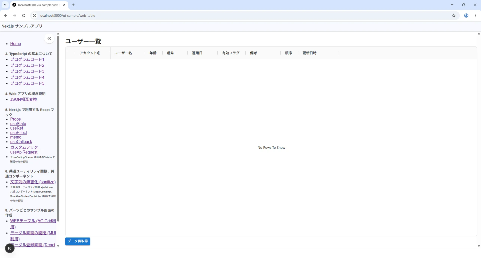
(Web テーブル (AG-Grid + Axios) 実行結果)
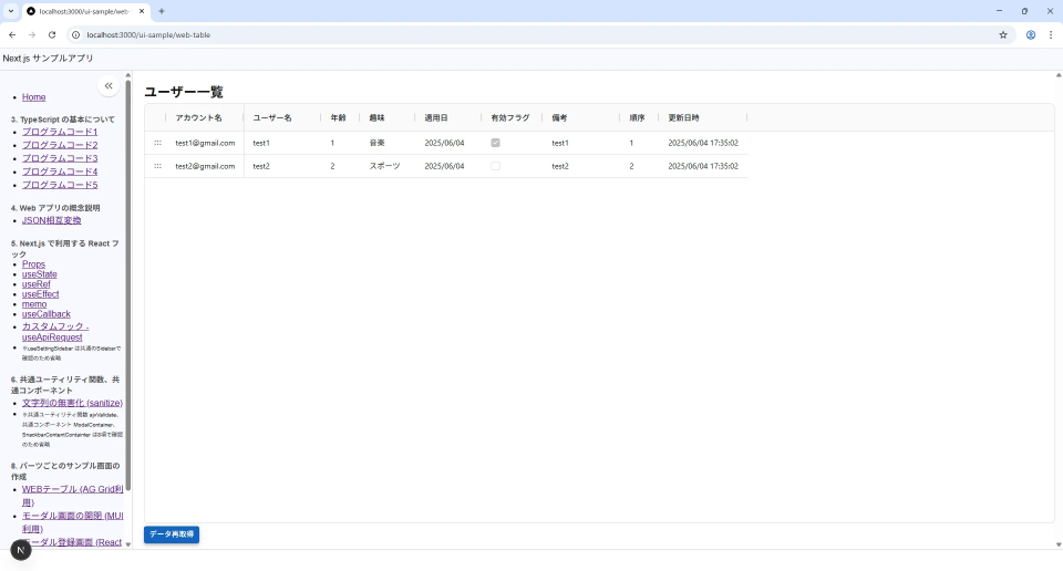
(Web テーブル (AG-Grid + Axios) データ取得後 実行結果 )
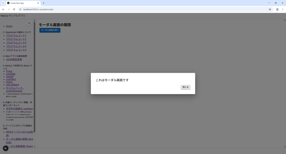
8-2. モーダル (MUI)
MUI のパッケージを利用して、モーダルを表示したいと思います。
ボタンをクリックするとモーダルが open になり、useCallback で作成した関数を Props で渡して、modal のボタンで close できるようにしているだけです。
MUI のモーダルは style を設定を設定しないと表示できないため、modal.tsx 内に style を記述しています。
ATOMIC デザインに習って、page → template → organisms の構成とし、modal コンポーネントで モーダル を作成して利用しています。
(利用しているファイル)
| 用途 | ファイルパス | 備考 |
|---|---|---|
| コンポーネント(Pages) | /app/ui-sample/modal/page.tsx | |
| コンポーネント(Templates) | /app/ui-sample/modal/template.tsx | |
| コンポーネント(Organisms) | /app/ui-sample/modal/modal.tsx | |
| 共通:コンポーネント(Organisms) | /common/organisms/ModalContainer.tsx | ※前項に記載のためコードは省略 |
(モーダルページのコンポーネントの構成イメージ)
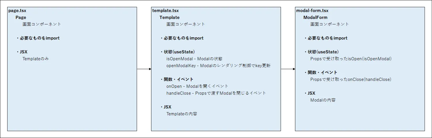
TypeScript:/app/ui-sample/modal/page.tsx
// React
import { JSX } from "react";

// App
import Template from "./template";
// import styles from "./page.module.css";

// Page (Routing)
export default function Page(): JSX.Element {
  /**************************************************
   * return JSX.Element
   *
   **************************************************/
  return (
    <>
      <Template />
    </>
  );
}
TypeScript:/app/ui-sample/modal/template.tsx
"use client";

// React、MUI
import { JSX, useState, useCallback } from "react";
import { Box, Button } from "@mui/material";

// App
import { ModalForm } from "./modal-form";

// Template (Layout & stateを持つ場所)
export default function Template(): JSX.Element {
  /**************************************************
   * 状態 (State)、カスタムフック、共通関数
   *
   **************************************************/

  const [isOpenModal, setIsOpenModal] = useState(false);
  const [openModalKey, setOpenModalKey] = useState<number>(0);

  /**************************************************
   * 関数・イベント ※Propsで渡す関数名はhandleから始める
   *
   **************************************************/

  // ModalFormの開閉
  const onOpen = (): void => {
    setOpenModalKey((prev: number) => prev + 1);
    setIsOpenModal(true);
  };

  // ModalFormを閉じる
  const handleClose = useCallback(() => {
    setOpenModalKey((prev: number) => prev + 1);
    setIsOpenModal(false);
  }, []);

  /**************************************************
   * return JSX.Element
   *
   **************************************************/
  return (
    <Box sx={{ display: "flex", flexDirection: "column", height: "100%", gap: "5px" }}>
      <Box sx={{ flex: "0 0 auto" }}>
        <h2>モーダル画面の開閉</h2>
      </Box>

      {/* ModalForm (organisms) */}
      {/* keyは再マウント用、propsで受取不可 */}
      <ModalForm key={openModalKey} isOpen={isOpenModal} onClose={handleClose} />

      <Box sx={{ flex: "0 0 auto" }}>
        <Box sx={{ display: "inline-block", marginLeft: "5px" }}>
          <Button size="small" variant="contained" color="primary" onClick={onOpen}>
            モーダル画面を開く
          </Button>
        </Box>
      </Box>
    </Box>
  );
}
TypeScript:/app/ui-sample/modal/modal-form.tsx
"use client";

// React、MUI
import { JSX } from "react";
import { Box, Button, Typography } from "@mui/material";

// Common
import { ModalContainer } from "@/common/organisms/ModalContainer";

// MUI modal box style
/*
const modalBoxStyle = {
  position: "absolute", // 位置を自由に指定できるようにする
  top: "50%",
  left: "50%",
  transform: "translate(-50%, -50%)", // 中央に配置
  width: 400,
  bgcolor: "background.paper", // 背景色(白やグレー)
  borderRadius: 2,
  boxShadow: 24, // 影をつけて浮かせる
  p: 4 // padding
};
 */

// Props
interface IProps {
  isOpen: boolean;
  onClose: () => void;
}

// Organisms
export const ModalForm = (props: IProps): JSX.Element => {
  /**************************************************
   * Props
   *
   **************************************************/

  const { isOpen, onClose } = props;

  /**************************************************
   * return JSX.Element
   *
   **************************************************/
  return (
    <>
      {/* Modal */}
      <ModalContainer open={isOpen} onClose={onClose}>
        {/* Modal header */}
        <Typography variant="h6" component="h2">
          これはモーダル画面です
        </Typography>
        {/* Modal content */}

        {/* Modal footer */}
        <Box sx={{ mt: 2, display: "flex", justifyContent: "flex-end" }}>
          <div style={{ display: "inline-block", marginLeft: "5px" }}>
            <Button size="small" sx={{ ml: 1 }} variant="contained" color="inherit" onClick={onClose}>
              閉じる
            </Button>
          </div>
        </Box>
      </ModalContainer>
    </>
  );
};
(モーダル (MUI) 実行結果)
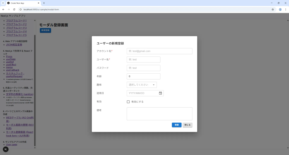
8-3. モーダル登録フォーム (MUI + React Hook Form + AJV + Axios)
モーダルフォームを使用して、Form 登録画面を作成したいと思います。
画面に直接登録画面を作る場合もありますが、Modal 画面内に作成するケースもよくあるかと思います。
ここでは React Hook Form というパッケージで状態管理をして、入力項目を作成していきます。AJV Validation とも連携し、入力チェックも対応できるようにしています。
ATOMIC デザインに習って、page → template → organisms の構成とし、modal コンポーネントで モーダル を作成して利用しています。
(利用しているファイル)
| 用途 | ファイルパス | 備考 |
|---|---|---|
| コンポーネント(Pages) | /app/ui-sample/modal-form/page.tsx | |
| コンポーネント(Templates) | /app/ui-sample/modal-form/template.tsx | |
| コンポーネント(Organisms) | /app/ui-sample/modal-form/modal-form.tsx | |
| 共通:コンポーネント(Organisms) | /common/organisms/ModalContainer.tsx | ※前項に記載のためコードは省略 |
| 共通:共通コンポーネント(Organisms) | /common/organisms/SnackbarContentContainer.tsx | ↓ |
| 共通:Validation 実行 | /common/ajvValidate.ts | ↓ |
| 共通:Sanitize 実行 | /common/sanitize.ts | ↓ |
| HTTP リクエスト用カスタムフック | /hooks/useApiRequest.tsx | ↓ |
| HTTP リクエスト関数 | /services/createUserService.ts | ↓ |
| ユーザー定義型 | /types/User.ts | ↓ |
(モーダル登録画面ページのコンポーネントの構成イメージ)
Form の構成要素としては下記としています。
React Hook Form の書き方をそろえるため、表示している入力項目すべてに Controller を使用しています。
(Form の構成要素)
| プロパティ名 | InputLabel | React Hook form + MUI コンポーネント | Validation | 備考 |
|---|---|---|---|---|
| account | アカウント名 | Controller - TextField | email(required)、length 256 | |
| username | ユーザー名 | Controller - TextField | required、length 256 | |
| password | パスワード | Controller - TextField | 新規登録のみ required、length 256 | |
| age | 年齢 | Controller - TextField number | ||
| hobby | 趣味 | Controller - Autocomplete | ||
| applyDate | 適用日 | Controller - DatePicker | ||
| isEnabled | 有効フラグ | Controller - Checkbox | ||
| remarks | 備考 | Controller - TextField multiline | length 4000 | |
| isDeleted | 削除フラグ | input type="hidden" | ||
| sortOrder | 順序 | input type="hidden" | ||
| createdAt | 作成日時 | input type="hidden" | ||
| updatedAt | 更新日時 | input type="hidden" | ||
| createdBy | 作成者 | input type="hidden" | ||
| updatedBy | 更新者 | input type="hidden" |
以下コードは長いですが、行っていることはシンプルになるように作成しました。
コードと実行結果を記載します。
TypeScript:/app/ui-sample/modal-form/page.tsx
// React
import { JSX } from "react";

// App
import Template from "./template";
// import styles from "./page.module.css";

// Page (Routing)
export default function Page(): JSX.Element {
  /**************************************************
   * return JSX.Element
   *
   **************************************************/
  return (
    <>
      <Template />
    </>
  );
}
TypeScript:/app/ui-sample/modal-form/template.tsx
"use client";

// React、MUI
import { JSX, useState, useEffect, useCallback } from "react";
import { Box, Backdrop, CircularProgress, Button } from "@mui/material";

// App
import { ModalForm } from "./modal-form";

// Data、Service
import { useApiRequest } from "@/hooks/common/useApiRequest";
import { User } from "@/types/User";
import { createUserService } from "@/services/createUserService";

// Common
import { SnackbarContainer } from "@/common/organisms/SnackbarContainer";
import { sanitize } from "@/common/utilities/sanitize";

// Template (Layout & stateを持つ場所)
export default function Template(): JSX.Element {
  const PUBLIC_API_URL: string = process.env.NEXT_PUBLIC_API_URL ?? "";
  const API_URL: string = `${PUBLIC_API_URL}/users`;

  /**************************************************
   * 状態 (State)、カスタムフック、共通関数
   *
   **************************************************/

  const [isLoading, setIsLoading] = useState<boolean>(false);
  const [error, setError] = useState<Error | null>(null);
  const [snackbar, setSnackbar] = useState<{ open: boolean; message: string }>({ open: false, message: "" });
  const [isOpenModal, setIsOpenModal] = useState<boolean>(false);
  const [openModalKey, setOpenModalKey] = useState<number>(0);
  // const [rowData, setRowData] = useState<User[]>([]);
  const [data, setData] = useState<User | null>(null);

  // Custom hook (API requestの状態の保持、例外処理に利用)
  const { request } = useApiRequest({ setIsLoading, setError });

  // Service (状態を持たない関数)
  const userService = createUserService(API_URL);

  /**************************************************
   * 副作用
   *
   **************************************************/

  // エラーメッセージ表示
  useEffect(() => {
    if (error) {
      setSnackbar({ open: true, message: error.message });
    }
  }, [error]);

  /**************************************************
   * 関数・イベント ※Propsで渡す関数名はhandleから始める
   *
   **************************************************/

  // ModalFormを開く
  const onOpen = (): void => {
    setData(null);
    setOpenModalKey((prev) => prev + 1);
    setIsOpenModal(true);
  };

  // ModalFormからの登録
  const handleSubmit = useCallback(async (formData: User) => {
    // Sanitize後に型にセット
    const user = sanitize(formData);

    // useApiRequestのrequestにserviceの関数を渡して実行
    if (!user.createdAt) {
      const response = await request(() => userService.post(user));

      if (response) {
        setIsOpenModal(false);
        // fetch();
      }
    } else {
      const response = await request(() => userService.patch(user));

      if (response) {
        setIsOpenModal(false);
        // fetch();
      }
    }

    // eslint-disable-next-line react-hooks/exhaustive-deps
  }, []);

  // ModalFormを閉じる
  const handleClose = useCallback(() => {
    setData(null);
    setOpenModalKey((prev) => prev + 1);
    setIsOpenModal(false);
  }, []);

  /**************************************************
   * return JSX.Element
   *
   **************************************************/
  return (
    <Box sx={{ display: "flex", flexDirection: "column", height: "100%", gap: "5px" }}>
      <Box sx={{ flex: "0 0 auto" }}>
        <h2>モーダル登録画面</h2>
      </Box>

      {/* ModalForm (organisms) */}
      {/* keyは再マウント用、propsで受取不可 */}
      <ModalForm key={openModalKey} isOpen={isOpenModal} data={data} onFormSubmit={handleSubmit} onClose={handleClose} />

      <Box sx={{ flex: "0 0 auto" }}>
        <Box sx={{ display: "inline-block", marginLeft: "5px" }}>
          <Button size="small" variant="contained" color="primary" onClick={onOpen}>
            新規登録
          </Button>
        </Box>
      </Box>

      {/* Loading */}
      <Backdrop open={isLoading} sx={{ zIndex: (theme) => theme.zIndex.tooltip + 1, backgroundColor: "transparent" }}>
        <CircularProgress color="inherit" />
      </Backdrop>

      {/* Message */}
      <SnackbarContainer open={snackbar.open} message={snackbar.message} onClose={() => setSnackbar({ ...snackbar, open: false })} />
    </Box>
  );
}
TypeScript:/app/ui-sample/modal-form/modal-form.tsx
"use client";
// React、MUI
import { JSX, useEffect } from "react";
import { Autocomplete, Box, Button, Checkbox, FormControl, FormControlLabel, InputLabel, TextField, Typography } from "@mui/material";
import ClearIcon from "@mui/icons-material/Clear";
// 他に Select: Select, MenuItemを利用、FormHelperText: エラーメッセージの位置調整などがある
// MUI for DatePicker
import { LocalizationProvider, DatePicker } from "@mui/x-date-pickers";
import { AdapterLuxon } from "@mui/x-date-pickers/AdapterLuxon";
// Luxon
import { DateTime } from "luxon";
// React Hook Form
import { Controller, useForm } from "react-hook-form";
// Data
import { User, userSchema } from "@/types/User";
// Common
import { ModalContainer } from "@/common/organisms/ModalContainer";
import { ajvValidate } from "@/common/utilities/ajvValidate";
// Props (keyは受取不可、propsに含めないように注意)
interface IProps {
isOpen: boolean;
data: User | null;
onFormSubmit: (user: User) => Promise<void>;
// onDelete: (user: User) => Promise<void>;
onClose: () => void;
}
// Organisms
export const ModalForm = (props: IProps): JSX.Element => {
/**************************************************
* Props
*
**************************************************/
const { isOpen, data, onFormSubmit, onClose } = props;
// console.log("modalマウント");
// リストは実際はbackendや定数から取得
const hobbies: Record<string, string>[] = [
{ code: "music", label: "音楽" },
{ code: "sports", label: "スポーツ" },
{ code: "reading", label: "読書" },
{ code: "travel", label: "旅行" }
];
/**************************************************
* 状態 (State)
*
**************************************************/
// React Hook Form state
const {
control,
formState: { errors },
handleSubmit,
register,
reset,
setError
} = useForm<User>({
defaultValues: {
account: "",
username: "",
age: 0,
hobby: "",
isEnabled: false,
remarks: "",
isDeleted: false,
sortOrder: 0,
createdAt: "",
updatedAt: "",
createdBy: "",
updatedBy: ""
}
});
/**************************************************
* 副作用
*
**************************************************/
// 新規登録 or 編集
useEffect(() => {
if (!data) {
reset();
return;
}
const user: User = {
account: data.account ?? "",
username: data.username ?? "",
password: data.password ?? "",
age: data.age ?? 0,
hobby: data.hobby ?? "",
applyDate: data.applyDate ?? "",
isEnabled: data.isEnabled ?? false,
remarks: data.remarks ?? "",
isDeleted: data.isDeleted ?? false,
sortOrder: data.sortOrder ?? 0,
createdAt: data.createdAt ?? "",
updatedAt: data.updatedAt ?? "",
createdBy: data.createdBy ?? "",
updatedBy: data.updatedBy ?? ""
};
reset(user);
}, [isOpen, data, reset]);
/**************************************************
* 関数・イベント ※Propsで渡す関数名はhandleから始める
*
**************************************************/
// const onChange = (): void => {};
const onSubmit = async (formData: User): Promise<void> => {
// dataとformDataをマージ
// data: 編集時のデータ(キー、日時など)を保持
// formData: 入力内容で上書き
// ...スプレッドでマージする場合は型を指定する
const margeData: User = {
...data,
...formData
};
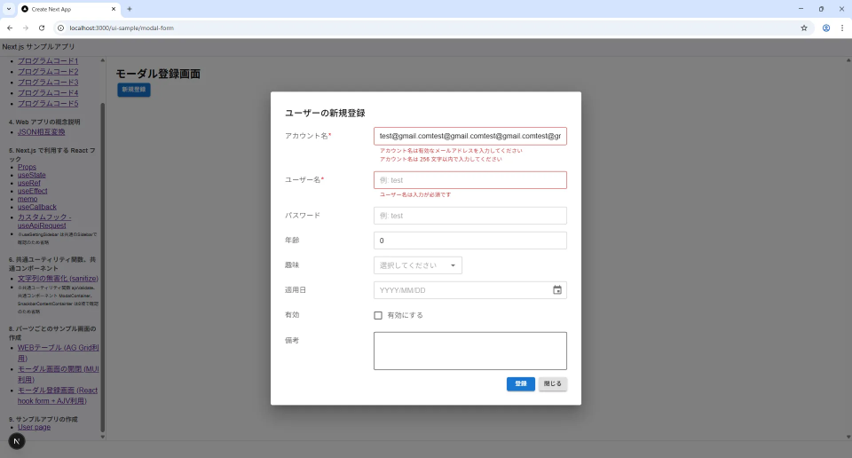
// Validation (自作ユーティリティ)
const validationErrors = ajvValidate<User>(margeData, userSchema);
// エラーがあればReact Hook Formに表示
if (validationErrors.length) {
for (const { field, message } of validationErrors) {
// field as keyof User: User型のプロパティであること
setError(field as keyof User, { type: "manual", message: message });
}
// エラー時は中断
return;
}
const user = margeData;
// Submit
onFormSubmit(user);
};
/**************************************************
* return JSX.Element
*
**************************************************/
return (
<>
{/* Modal form */}
<ModalContainer open={isOpen} onClose={onClose}>
{/* MUI Datepickerの宣言 */}
<LocalizationProvider dateAdapter={AdapterLuxon}>
{/* Modal header */}
<Typography variant="h6" component="h2">
ユーザーの{!data ? "新規登録" : "編集"}
</Typography>
{/* Modal content */}
<Box>
{/* account */}
<Box sx={{ mt: 2, display: "flex", alignItems: "flex-start" }}>
<InputLabel size="small" sx={{ transform: "none", mt: 1, width: 200 }}>
アカウント名<span style={{ marginLeft: 1, color: "red" }}>*</span>
</InputLabel>
<Controller
name="account"
control={control}
render={({ field }) => (
<TextField
size="small"
sx={{
flexGrow: 1,
"& .MuiFormHelperText-root": {
whiteSpace: "pre-line"
}
}}
{...field}
error={!!errors.account}
helperText={errors.account?.message}
placeholder="例: test@gmail.com"
/>
)}
/>
</Box>
{/* username */}
<Box sx={{ mt: 2, display: "flex", alignItems: "flex-start" }}>
<InputLabel size="small" sx={{ transform: "none", mt: 1, width: 200 }}>
ユーザー名<span style={{ marginLeft: 1, color: "red" }}>*</span>
</InputLabel>
<Controller
name="username"
control={control}
render={({ field }) => (
<TextField
size="small"
sx={{
flexGrow: 1,
"& .MuiFormHelperText-root": {
whiteSpace: "pre-line"
}
}}
{...field}
error={!!errors.username}
helperText={errors.username?.message}
placeholder="例: test"
/>
)}
/>
</Box>
{/* password (パスワード更新はパスワードリマインダーなど専用で実施する必要あり) */}
{!data ? (
<Box sx={{ mt: 2, display: "flex", alignItems: "flex-start" }}>
<InputLabel size="small" sx={{ transform: "none", mt: 1, width: 200 }}>
パスワード
</InputLabel>
<Controller
name="password"
control={control}
render={({ field }) => (
<TextField
size="small"
sx={{
flexGrow: 1,
"& .MuiFormHelperText-root": {
whiteSpace: "pre-line"
}
}}
{...field}
error={!!errors.password}
helperText={errors.password?.message}
placeholder="例: test"
/>
)}
/>
</Box>
) : (
""
)}
{/* age */}
<Box sx={{ mt: 2, display: "flex", alignItems: "flex-start" }}>
<InputLabel size="small" sx={{ transform: "none", mt: 1, width: 200 }}>
年齢
</InputLabel>
<Controller
name="age"
control={control}
render={({ field }) => (
<TextField
type="number"
size="small"
sx={{
flexGrow: 1,
"& .MuiFormHelperText-root": {
whiteSpace: "pre-line"
}
}}
{...field}
error={!!errors.age}
helperText={errors.age?.message}
placeholder="例: 20"
/>
)}
/>
</Box>
{/* hobby */}
<Box sx={{ mt: 2, display: "flex", alignItems: "flex-start" }}>
<InputLabel id="hobby-label" size="small" sx={{ transform: "none", mt: 1, width: 200 }}>
趣味
</InputLabel>
<Controller
name="hobby"
control={control}
render={({ field }) => (
<FormControl size="small">
{/* renderInputはslotPropsに更新される可能性あり */}
<Autocomplete
{...field}
sx={{
width: 200,
flexGrow: 1,
"& .MuiFormHelperText-root": {
whiteSpace: "pre-line"
}
}}
options={hobbies}
getOptionLabel={(option) => option.label}
isOptionEqualToValue={(option, value) => option.code === value.code}
value={hobbies.find((element) => element.code === field.value) || null}
onChange={(event, newValue) => field.onChange(newValue?.code || "")}
renderInput={(params) => <TextField {...params} size="small" error={!!errors.hobby} helperText={errors.hobby?.message} placeholder="選択してください" />}
clearOnEscape
/>
</FormControl>
)}
/>
</Box>
{/* applyDate */}
<Box sx={{ mt: 2, display: "flex", alignItems: "flex-start" }}>
<InputLabel size="small" sx={{ transform: "none", mt: 1, width: 200 }}>
適用日
</InputLabel>
<Controller
name="applyDate"
control={control}
render={({ field }) => (
<DatePicker
value={field.value ? DateTime.fromISO(field.value) : null}
onChange={(newValue) => field.onChange(newValue ? newValue.toISO() : "")}
format="yyyy/MM/dd"
slotProps={{
textField: {
size: "small",
sx: {
flexGrow: 1,
"& .MuiFormHelperText-root": {
whiteSpace: "pre-line"
}
},
error: !!errors.applyDate,
helperText: errors.applyDate?.message,
placeholder: "日付を選択してください",
InputProps: {
/* TextFieldの右にクリアボタン埋込 */
endAdornment: field.value ? (
<ClearIcon
onClick={(e) => {
// フォーカス取らせない
e.stopPropagation();
field.onChange(null);
}}
fontSize="small"
sx={{ cursor: "pointer", color: "#888", ml: 1 }}
/>
) : null
}
}
}}
/>
)}
/>
</Box>
{/* isEnabled */}
<Box sx={{ mt: 2, display: "flex", alignItems: "flex-start" }}>
<InputLabel size="small" sx={{ transform: "none", mt: 1, width: 200 }}>
有効
</InputLabel>
<Controller
name="isEnabled"
control={control}
render={({ field }) => (
<FormControlLabel
label="有効にする"
sx={{
"& .MuiFormControlLabel-label": {
color: "rgba(0, 0, 0, 0.6)"
},
flexGrow: 1,
"& .MuiFormHelperText-root": {
whiteSpace: "pre-line"
}
}}
control={<Checkbox {...field} checked={field.value ? field.value : false} onChange={(e) => field.onChange(e.target.checked)} />}
/>
)}
/>
</Box>
{/* remarks */}
<Box sx={{ mt: 2, display: "flex", alignItems: "flex-start" }}>
<InputLabel size="small" sx={{ transform: "none", mt: 1, width: 200 }}>
備考
</InputLabel>
<Controller
name="remarks"
control={control}
render={({ field }) => (
<TextField
multiline
rows={3}
sx={{
flexGrow: 1,
"& .MuiFormHelperText-root": {
whiteSpace: "pre-line"
}
}}
size="small"
{...field}
error={!!errors.remarks}
helperText={errors.remarks?.message}
/>
)}
/>
</Box>
{/* hidden */}
<input type="hidden" {...register("sortOrder")} />
<input type="hidden" {...register("isDeleted")} />
<input type="hidden" {...register("createdAt")} />
<input type="hidden" {...register("updatedAt")} />
<input type="hidden" {...register("createdBy")} />
<input type="hidden" {...register("updatedBy")} />
{/* Modal footer */}
<Box sx={{ mt: 2, display: "flex", justifyContent: "flex-end" }}>
<Button size="small" variant="contained" color="primary" onClick={handleSubmit(onSubmit)}>
{!data ? "登録" : "更新"}
</Button>
{data && (
<Button size="small" sx={{ ml: 1 }} variant="contained" color="error">
削除
</Button>
)}
<Button size="small" sx={{ ml: 1 }} variant="contained" color="inherit" onClick={onClose}>
閉じる
</Button>
</Box>
</Box>
</LocalizationProvider>
</ModalContainer>
</>
);
};
(モーダル登録フォーム (MUI + React Hook Form + AJV + Axios) 実行結果)
(モーダル登録フォーム (MUI + React Hook Form + AJV + Axios) 入力チェックエラー 実行結果)
→ Next.js & TypeScript 利用ガイド (フロントエンド 編) - Page 3 / 3 へ続く
Discussion