Next.js + MUI + Storybook の環境を構築する
最近、個人的に Next.js を MUI を使って構築することが多くなってきました。
プロジェクト構築後に、そのまま Storybook の環境構築まで済ませることが多いので一連の手順を自分のためにも残しておきます。
この記事では、何もないところから Next.js + MUI の環境を構築して、 Storybook を導入して、chromatic に GitHub Actions を用いてデプロイする設定をするまでをやり切りたいと思います。
Next.js の構築
npx create-next-app@latest を実行します.
$ npx create-next-app@latest

✔ What is your project named? … app-name
✔ Would you like to use TypeScript? … No / Yes
✔ Would you like to use ESLint? … No / Yes
✔ Would you like to use Tailwind CSS? … No / Yes
✔ Would you like to use `src/` directory? … No / Yes
✔ Would you like to use App Router? (recommended) … No / Yes
✔ Would you like to customize the default import alias (@/*)? … No / Yes
対話形式でいろいろ聞かれる回答していくと、プロジェクトが完成します。
完成したら、一度確認してみましょう。
$ yarn dev
mui の追加
Material UI のインストールします。
$ yarn add @mui/material @emotion/react @emotion/styled
$ yarn add @fontsource/roboto
$ yarn add @mui/icons-material
Next.js との統合を行います。
$ yarn add @mui/material-nextjs @emotion/cache
+import { AppRouterCacheProvider } from '@mui/material-nextjs/v14-appRouter';

 export default function RootLayout(props) {
   const { children } = props;
   return (
     <html lang="en">
       <body>
+        <AppRouterCacheProvider>{children}</AppRouterCacheProvider>
       </body>
     </html>
   );
 }
Storybook の追加
$ npx storybook@latest init
framework が "@storybook/nextjs" になっていることを確認します。
import type { StorybookConfig } from "@storybook/nextjs";

const config: StorybookConfig = {
  stories: ["../src/**/*.mdx", "../src/**/*.stories.@(js|jsx|mjs|ts|tsx)"],
  addons: [
    "@storybook/addon-links",
    "@storybook/addon-essentials",
    "@storybook/addon-onboarding",
    "@storybook/addon-interactions",
  ],
  framework: {
    name: "@storybook/nextjs", // <--- 確認する
    options: {},
  },
  docs: {
    autodocs: "tag",
  },
};
export default config;
MUI との integration も設定します。
$ npx storybook@latest add @storybook/addon-themes
src/components/theme/theme.tsx を作ります。現状はセットアップしたいだけなので、createTheme の中身はほぼ空です。
import { createTheme } from "@mui/material";

export const lightTheme = createTheme({
  palette: {
    mode: "light",
  },
});

export const darkTheme = createTheme({
  palette: {
    mode: "dark",
  },
});
preview.ts を次のように修正します。
+ import type { Preview, ReactRenderer } from "@storybook/react";
- import type { Preview } from "@storybook/react";
import { CssBaseline, ThemeProvider } from "@mui/material";
import { withThemeFromJSXProvider } from "@storybook/addon-themes";
import { lightTheme, darkTheme } from "../src/components/theme/theme";

const preview: Preview = {
  parameters: {
    actions: { argTypesRegex: "^on[A-Z].*" },
    controls: {
      matchers: {
        color: /(background|color)$/i,
        date: /Date$/i,
      },
    },
  },
+ decorators: [
+   withThemeFromJSXProvider<ReactRenderer>({
+     themes: {
+       light: lightTheme,
+       dark: darkTheme,
+     },
+     defaultTheme: "dark",
+     Provider: ThemeProvider,
+     GlobalStyles: CssBaseline,
+   }),
  ],
};

export default preview;
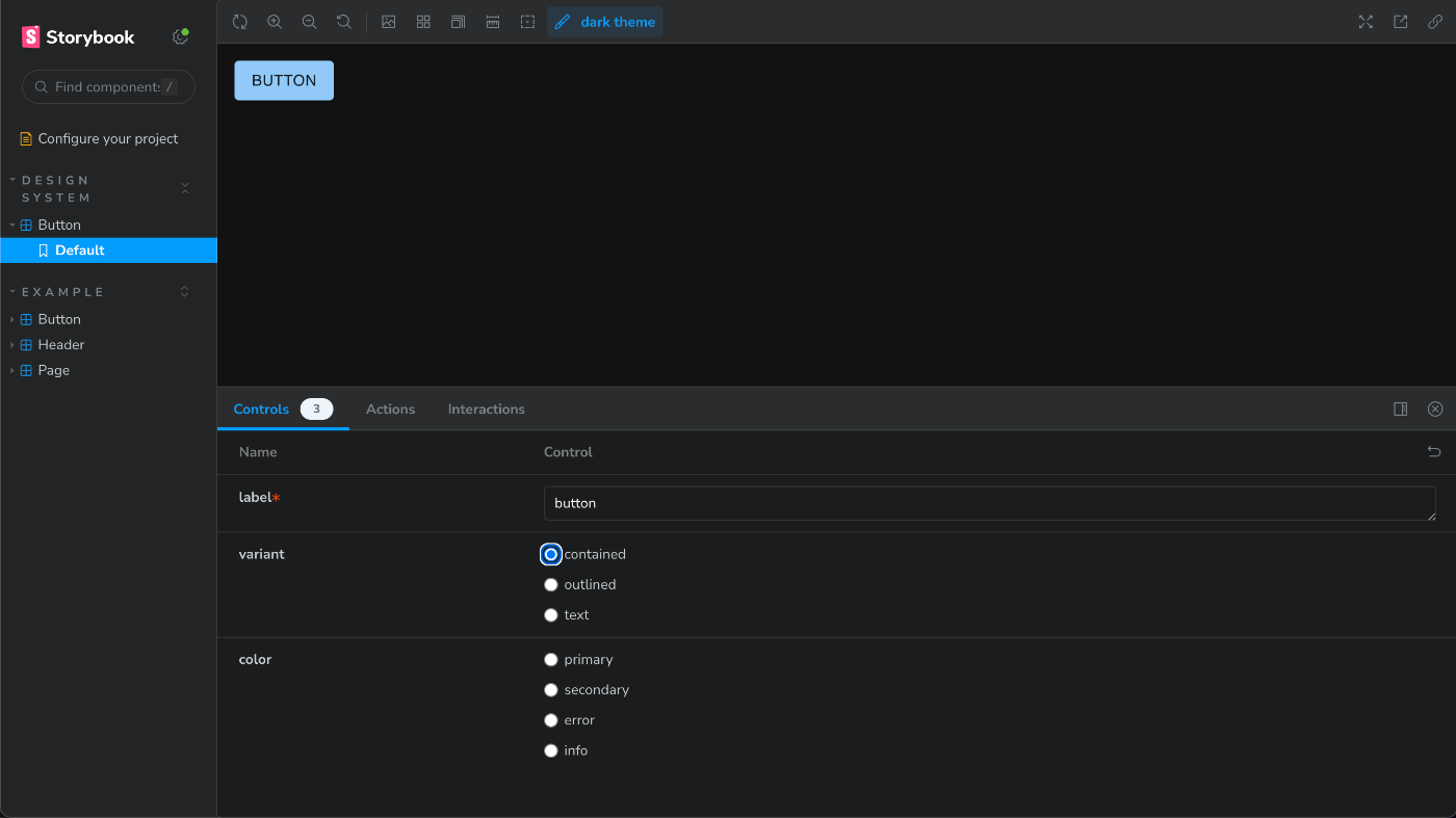
確認できるように適当な Component と Story も用意しておきましょう。
import React from 'react';
import {
  Button as MuiButton,
  ButtonProps as MuiButtonProps,
} from '@mui/material';

type ButtonBaseProps = Pick<MuiButtonProps, 'variant' | 'size' | 'color'>;

export interface ButtonProps extends ButtonBaseProps {
  label: string;
}
export const Button = ({ label, ...rest }: ButtonProps) => (
  <MuiButton {...rest}>{label}</MuiButton>
);
import { Button } from './button.component';

export default {
  title: 'Design System/Button',
  component: Button,
  argTypes: {
    variant: {
      options: ['contained', 'outlined', 'text'],
      control: { type: 'radio' },
    },
    color: {
      options: ['primary', 'secondary', 'error', 'info'],
      control: { type: 'radio' },
    },
  },
};

export const Default = {
  args: {
    label: 'button',
  },
};
ここで一度、確認します。
yarn storybook
公式ドキュメントでは上記で問題なく動作するはずなのですが、下記のエラーがでます。
$ yarn storybook                                                                                                                                  +[main]
yarn run v1.22.21
$ storybook dev -p 6006
🔴 Error: It looks like you are having a known issue with package hoisting.
Please check the following issue for details and solutions: https://github.com/storybookjs/storybook/issues/22431#issuecomment-1630086092


/Users/kgmyshin/ghq/github.com/kgmyshin/soegii/soegii/node_modules/cli-table3/src/utils.js:1
const stringWidth = require('string-width');
                    ^

Error [ERR_REQUIRE_ESM]: require() of ES Module /Users/kgmyshin/ghq/github.com/kgmyshin/soegii/soegii/node_modules/string-width/index.js from /Users/kgmyshin/ghq/github.com/kgmyshin/soegii/soegii/node_modules/cli-table3/src/utils.js not supported.
Instead change the require of index.js in /Users/kgmyshin/ghq/github.com/kgmyshin/soegii/soegii/node_modules/cli-table3/src/utils.js to a dynamic import() which is available in all CommonJS modules.
    at Object.<anonymous> (/Users/kgmyshin/ghq/github.com/kgmyshin/soegii/soegii/node_modules/cli-table3/src/utils.js:1:21) {
  code: 'ERR_REQUIRE_ESM'
}

Node.js v21.2.0
error Command failed with exit code 7.
info Visit https://yarnpkg.com/en/docs/cli/run for documentation about this command.
エラーにあるように 下記を package.json に追記します。
  "resolutions": {
    "jackspeak": "2.1.1"
  }
追記後に yarn.lock を削除後、 yarn install をして、再度 yarn storybook をするとうまく動くことが確認できます。
chromatic に storybook を deploy する
下記を開いて、該当プロジェクトを Add します。
登録後、下記を実行しましょう。
$ yarn add --dev chromatic
その後、下記を実行して deploy してみます。
$ npx chromatic --project-token={{設定時に出てくるプロジェクトトークン}}
deploy時に build-storybook.log というログが root に出てくるので、 .gitignore に登録しておくと良いです。
# storybook
build-storybook.log
deploy すると、 該当プロジェクトページ => Manage => Collaborate => PERMALINKS => Link to your Storybook に Storybook のURLがあります。
自分は このリンクを元に README.md の上部に下記のような Badge を貼り付けています。
[](https://{mainブランチのStorybookのURL})
Badge
Github Action で chromatic に deploy する
GitHub で Actions Secret に CHROMATIC_PROJECT_TOKEN という名前で プロジェクトトークンを設定します。
.github/workflows に下記のファイルを配置して push します。
# Name of our action
name: 'Chromatic'
# The event that will trigger the action
on: push

# What the action will do
jobs:
  test:
    # The operating system it will run on
    runs-on: ubuntu-latest
    # The list of steps that the action will go through
    steps:
      - uses: actions/checkout@v2
        with:
          #👇 Fetches all history so Chromatic can compare against previous builds
          fetch-depth: 0
      - uses: actions/setup-node@v3
        with:
          #👇 Sets the version of Node.js to use
          node-version: 21
      - run: yarn
        #👇 Adds Chromatic as a step in the workflow
      - uses: chromaui/action@v1
        # Options required for Chromatic's GitHub Action
        with:
          #👇 Chromatic projectToken, see https://storybook.js.org/tutorials/design-systems-for-developers/react/en/review/ to obtain it
          projectToken: ${{ secrets.CHROMATIC_PROJECT_TOKEN }}
          token: ${{ secrets.GITHUB_TOKEN }}
push 後に 問題なく chromatic に deploy されていることが確認されれば、以上で完了です。
Discussion