Next.js + TypeScript + Styled Components 環境構築
はじめに
実際に仕事で使用しているNextの環境構築方法を共有します。
Next環境のセットアップ
まずはnpx create-next-appでnextの環境を作成します。
--tsをつけることでTypeScript環境にできます。
npx create-next-app --ts next-sample
componentsの管理
僕はロジックやマークアップのファイルを極力分けて管理しやすくしたい派なのでContainer/Presenter構成でよく開発しています。
今回もそれを念頭にcomponetnsフォルダを以下のように作成していきます。
/
|- components
    |- index                                          // pagesのファイルと同名のフォルダを作成
        |- Index.tsx             // Containerファイル
	|- Presenter.tsx                 // Presenterファイル
tsconfigへの追記
aliasの設定を追記します。
{
  "compilerOptions": {
    "target": "es5",
    "lib": ["dom", "dom.iterable", "esnext"],
    "allowJs": true,
    "skipLibCheck": true,
    "strict": true,
    "forceConsistentCasingInFileNames": true,
    "noEmit": true,
    "esModuleInterop": true,
    "module": "esnext",
    "moduleResolution": "node",
    "resolveJsonModule": true,
    "isolatedModules": true,
    "jsx": "preserve",
    "incremental": true,
+   "baseUrl": "./",
+   "paths": {
+     "~/*": [
+       "./*"
+     ]
+   },
  },
  "include": ["next-env.d.ts", "**/*.ts", "**/*.tsx"],
  "exclude": ["node_modules"]
}
Styled Componentsのインストール&設定
Index.tsxとPresenter.tsxの中身を書く前にStyled Componentsのインストールを行います。
また、CSS設定の初期化も行いたいのでstyled-resetもインストールしておきます。
yarn add -D styled-components @types/styled-components babel-plugin-styled-components styled-reset
ファイルへの設定は以下の通りです。
_document.tsxと.babelrcはファイルを新規作成してください。
/** @type {import('next').NextConfig} */
const nextConfig = {
  reactStrictMode: true,
+ compiler: {
+   styledComponents: true,
+ },
}

module.exports = nextConfig
import Document, {
  DocumentContext,
  Html,
  Head,
  Main,
  NextScript,
} from 'next/document'
import { ServerStyleSheet } from 'styled-components'

export default class MyDocument extends Document {
  static async getInitialProps(ctx: DocumentContext) {
    const sheet = new ServerStyleSheet()
    const originalRenderPage = ctx.renderPage

    try {
      ctx.renderPage = () =>
        originalRenderPage({
          enhanceApp: (App) => (props) =>
            sheet.collectStyles(<App {...props} />),
        })

      const initialProps = await Document.getInitialProps(ctx)
      return {
        ...initialProps,
        styles: (
          <>
            {initialProps.styles}
            {sheet.getStyleElement()}
          </>
        ),
      }
    } finally {
      sheet.seal()
    }
  }

  render() {
    return (
      <Html lang="ja">
        <Head />
        <body>
          <Main />
          <NextScript />
        </body>
      </Html>
    )
  }
}
{
  "presets": ["next/babel"],
  "plugins": [
    ["babel-plugin-styled-components", {
      "ssr": true,
      "displayName": true,
      "preprocess": false
    }]
  ],
  "env": {
    // ビルドしたファイルからはクラス名を知る必要はないため、
    // "displayName": falseにして少しでもwebページの解析速度を上げる
    "production": {
      "plugins": [
        [
          "babel-plugin-styled-components",
          { "ssr": true, "displayName": false, "preprocess": false }
        ]
      ]
    }
  }
}
displayNameの開発・本番での切り替えは業務で行った際にlighthouseの点数が少し上がったのでパフォーマンスにこだわるならやっておいたほうが吉です。
DOMとCSSの移植
今回はnext初心者の方も分かりやすいようにpages/index.tsxに記述された内容をstyled-componentsを使いつつcomponentsフォルダに移植していきます。
まずは大元の_app.tsxの書き換えからやっていきましょう。
import type { AppProps } from 'next/app'
import { createGlobalStyle } from 'styled-components'
import { reset } from 'styled-reset'

const GlobalStyle = createGlobalStyle`
  ${reset}

  html,
  body {
    padding: 0;
    margin: 0;
    font-family: -apple-system, BlinkMacSystemFont, Segoe UI, Roboto, Oxygen,
      Ubuntu, Cantarell, Fira Sans, Droid Sans, Helvetica Neue, sans-serif;
  }

  a {
    color: inherit;
    text-decoration: none;
  }

  * {
    box-sizing: border-box;
  }

  h1,
  h2 {
    font-weight: bold;
  }
`

function MyApp({ Component, pageProps }: AppProps) {
  return (
    <>
      <GlobalStyle />
      <Component {...pageProps} />
    </>
  )
}

export default MyApp
続いてpages/index.tsxとcomponents/index/Index.tsx。
こちらは現段階だと設定するものがまだないので index.tsxはIndex.tsxを、Index.tsxはPresenter.tsxを呼び出すだけで大丈夫です。
import IndexContainer from '~/components/index/Index'

const Index = () => {
  return <IndexContainer />
}

export default Index
import Presenter from './Presenter'

const IndexContainer = () => {
  return <Presenter />
}

export default IndexContainer
最後にPresenter.tsx。
pages/index.tsxのDOMを移植した後はHome.module.cssの中身をそれぞれに設定してあげればOKです。
import styled from 'styled-components'
import colors from '~/styles/colors'
const Container = styled.div`
padding: 0 2rem;
`
const Main = styled.main`
min-height: 100vh;
padding: 4rem 0;
flex: 1;
display: flex;
flex-direction: column;
justify-content: center;
align-items: center;
`
const Title = styled.h1`
margin: 0;
line-height: 1.15;
font-size: 4rem;
a {
color: ${colors.blue};
text-decoration: none;
&:hover,
&:focus,
&:active {
text-decoration: underline;
}
}
.description {
text-align: center;
}
`
const Description = styled.p`
margin: 4rem 0;
line-height: 1.5;
font-size: 1.5rem;
`
const Code = styled.code`
background: ${colors.white};
border-radius: 5px;
padding: 0.75rem;
font-size: 1.1rem;
font-family: Menlo, Monaco, Lucida Console, Liberation Mono, DejaVu Sans Mono,
Bitstream Vera Sans Mono, Courier New, monospace;
`
const Grid = styled.div`
display: flex;
align-items: center;
justify-content: center;
flex-wrap: wrap;
max-width: 800px;
@media (max-width: 600px) {
width: 100%;
flex-direction: column;
}
`
const Card = styled.a`
margin: 1rem;
padding: 1.5rem;
text-align: left;
color: inherit;
text-decoration: none;
border: 1px solid ${colors.beige};
border-radius: 10px;
transition: color 0.15s ease, border-color 0.15s ease;
max-width: 300px;
&:hover,
&:focus,
&:active {
color: ${colors.blue};
border-color: ${colors.blue};
}
h2 {
margin: 0 0 1rem 0;
font-size: 1.5rem;
}
p {
margin: 0;
font-size: 1.25rem;
line-height: 1.5;
}
`
const Footer = styled.footer`
display: flex;
flex: 1;
padding: 2rem 0;
border-top: 1px solid ${colors.beige};
justify-content: center;
align-items: center;
a {
display: flex;
justify-content: center;
align-items: center;
flex-grow: 1;
}
`
const Logo = styled.span`
height: 1em;
margin-left: 0.5rem;
`
const Image = styled.img`
width: 72px;
height: 16px;
`
const Presenter = () => {
return (
<Container>
<Main>
<Title>
Welcome to <a href="https://nextjs.org">Next.js!</a>
</Title>
<Description>
Get started by editing <Code>pages/index.tsx</Code>
</Description>
<Grid>
<Card href="https://nextjs.org/docs">
<h2>Documentation →</h2>
<p>Find in-depth information about Next.js features and API.</p>
</Card>
<Card href="https://nextjs.org/learn">
<h2>Learn →</h2>
<p>Learn about Next.js in an interactive course with quizzes!</p>
</Card>
<Card href="https://github.com/vercel/next.js/tree/canary/examples">
<h2>Examples →</h2>
<p>Discover and deploy boilerplate example Next.js projects.</p>
</Card>
<Card href="https://vercel.com/new?utm_source=create-next-app&utm_medium=default-template&utm_campaign=create-next-app">
<h2>Deploy →</h2>
<p>
Instantly deploy your Next.js site to a public URL with Vercel.
</p>
</Card>
</Grid>
</Main>
<Footer>
<a
href="https://vercel.com?utm_source=create-next-app&utm_medium=default-template&utm_campaign=create-next-app"
target="_blank"
rel="noopener noreferrer"
>
Powered by{' '}
<Logo>
<Image src="/vercel.svg" alt="Vercel Logo" width={72} height={16} />
</Logo>
</a>
</Footer>
</Container>
)
}
export default Presenter
Presenterの中でcolors.tsというtsファイルを読み込んでいます。
こちらはStyled Componentsで指定する色を記述したファイルで、色を複数のコンポーネントで使い回しやすくするために別ファイルで定義しています。
場所はstyleに関するものなのでcssファイルが入っている~/stylesの中に新しく作成しましょう。
const colors = {
  white: '#fafafa',
  beige: '#eaeaea',
  blue: '#0070f3',
}

export default colors
最後に必要なくなったstylesフォルダのcssファイルを全て消せばNextのデフォルトであるCss ModulesからStyled Componentsへの移植は完了です!
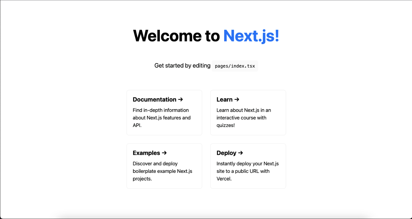
実際にyarn devで動かしてみると移植前と同じ画面が映るはずです。
eslint&prettier設定
eslintとprettier、それぞれconfigファイルを作成して設定が重複したり矛盾しないように組むのも有りですが、今回は.eslintrc.jsonの中でprettierも設定する方法で行います。
インストールするモジュールは以下に。
yarn add -D eslint-config-prettier eslint-import-resolver-typescript eslint-plugin-import eslint-plugin-jsx-a11y eslint-plugin-prettier eslint-plugin-react eslint-plugin-react-hooks prettier @typescript-eslint/eslint-plugin
設定はお好みで大丈夫です。
{
  "root": true,
  "env": {
    "browser": true,
    "es2020": true,
    "node": true
  },
  "extends": [
    "next/core-web-vitals",
    "eslint:recommended",
    "plugin:@typescript-eslint/eslint-recommended",
    "plugin:@typescript-eslint/recommended",
    "plugin:react/recommended",
    "plugin:jsx-a11y/recommended",
    "plugin:import/errors",
    "plugin:import/warnings",
    "plugin:prettier/recommended"
  ],
  "parser": "@typescript-eslint/parser",
  "parserOptions": {
    "ecmaFeatures": {
      "jsx": true
    },
    "ecmaVersion": 2020,
    "sourceType": "module"
  },
  "plugins": ["@typescript-eslint", "react", "import"],
  "settings": {
    "react": {
      "version": "detect"
    },
    "import/resolver": {
      "node": {
        "extensions": [".js", ".jsx", ".ts", ".tsx", ".json"]
      },
      "typescript": {
        "config": "tsconfig.json",
        "alwaysTryTypes": true
      }
    }
  },
  "rules": {
    "@typescript-eslint/ban-types": [
      "error",
      {
        "types": {
          "{}": false
        }
      }
    ],
    "react/prop-types": ["off"],
    "react/react-in-jsx-scope": "off",
    "react/jsx-filename-extension": ["error", { "extensions": [".jsx", ".tsx"] }],
    "import/order": ["error"],
    // ここがprettierの設定
    "prettier/prettier": [
      "error",
      {
        "trailingComma": "all",
        "endOfLine": "lf",
        "semi": false,
        "singleQuote": true,
        "printWidth": 80,
        "tabWidth": 2
      }
    ],
    "@next/next/no-img-element": "off",
    "@next/next/no-page-custom-font": "off",
    "react-hooks/exhaustive-deps": "off"
  }
}
最後にpackage.jsonの"scripts":"lint"の実行コード末尾に--fixをつけて実行すると設定にそぐわない箇所の修正を行ってくれます。
(一応ここまでやり切った場合のpackage.jsonファイルを載せておきます)
{
  "name": "next-sample",
  "version": "0.1.0",
  "private": true,
  "scripts": {
    "dev": "next dev",
    "build": "next build",
    "start": "next start",
    "lint": "next lint --fix"
  },
  "dependencies": {
    "next": "12.1.6",
    "react": "18.1.0",
    "react-dom": "18.1.0"
  },
  "devDependencies": {
    "@types/node": "17.0.33",
    "@types/react": "18.0.9",
    "@types/react-dom": "18.0.4",
    "@types/styled-components": "^5.1.25",
    "@typescript-eslint/eslint-plugin": "^5.23.0",
    "babel-plugin-styled-components": "^2.0.7",
    "eslint": "8.15.0",
    "eslint-config-next": "12.1.6",
    "eslint-config-prettier": "^8.5.0",
    "eslint-import-resolver-typescript": "^2.7.1",
    "eslint-plugin-import": "^2.26.0",
    "eslint-plugin-jsx-a11y": "^6.5.1",
    "eslint-plugin-prettier": "^4.0.0",
    "eslint-plugin-react": "^7.29.4",
    "eslint-plugin-react-hooks": "^4.5.0",
    "prettier": "^2.6.2",
    "styled-components": "^5.3.3",
    "styled-reset": "^4.3.4",
    "typescript": "4.6.4"
  }
}
以上で基本的な部分は完成です。
最後に
これでHPなど簡単なものは問題なく作成できるはずです!
次はいつになるか分かりませんが、これを元にcontextやrecoil、custom hookの使用例の記事も書きたいですね。
Discussion