shadcn/uiでGithubの草を作る


shadcn/uiでGithubの草を作る
先に
今回の成果物
実際の画面
Github Contributions Graph(草)いわゆるヒートマップといわれるUIをshadcn/uiを使って実装します。
Github Contributions Graphのようなheatmapを作成できるライブラリを探す
↑のスクラップを見る限り(3年前のですが)、あまりいいライブラリがないように思えます。なのでshadcn/uiに含まれるUIのみで実装しました。
前提条件
react、shadcn/uiのインストールはすでに終えていることとします
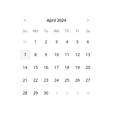
デフォルトではこんな感じ
import { Calendar } from "@/components/ui/calendar"

const Component = () => {
  return (
    <Calender />
  );
}
export default Component;
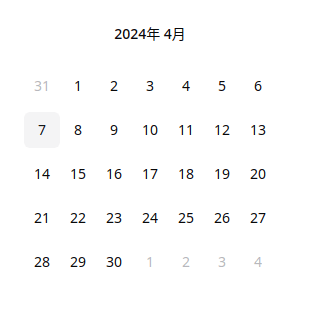
日本語に対応させる
date-fnsの日本語ローカライズデータをインポートしてlocaleとして渡す
ただしデータを渡すだけでは英語圏表記の”4月 2024”のように表示されるため、formatters propsからフォーマットデータを渡す
import { Calendar } from "@/components/ui/calendar";
import { ja } from "date-fns/locale";

const Component = () => {
  return (
    <Calender
      locale={ja}
      formatters={{
      formatCaption: (date) => {
        const date = new Date(date);
        return `${date.getFullYear()}年 ${date.getMonth() + 1}月`;
      }
    }}
    />
  );
}
export default Component;
レンダリング結果

矢印ボタンの非表示
の表を見る限り、navが両方のナビゲーションボタンが表示されている部分なのでこれにhiddenクラスを渡す
import { Calendar } from "@/components/ui/calendar";
import { ja } from "date-fns/locale";

const Component = () => {
  return (
    <Calender
      locale={ja}
      classNames={{
        nav: "hidden"
      }}
      formatters={{
        formatCaption: (date) => {
        const date = new Date(date);

        return `${date.getFullYear()}年 ${date.getMonth() + 1}月`;
        }
      }}
    />
  );
}
export default Component;
曜日表記を消す
これが曜日を表示しているので、Headに空コンポーネントを渡します
import { Calendar } from "@/components/ui/calendar";
import { ja } from "date-fns/locale";

const Component = () => {
  return (
    <Calender
      locale={ja}
      classNames={{
        nav: "hidden"
      }}
      components={{
        Head: () => <></>,
      }}
      formatters={{
      	formatCaption: (date) => {
          const date = new Date(date);

          return `${date.getFullYear()}年 ${date.getMonth() + 1}月`;
      	}
      }}
    />
  );
}
export default Component;
日の向きを変える
GithubのContribute GraphやZennの執筆文字数のヒートマップグラフを見る限り、月の進み方は左から右に、日は上から下向きに進んでいます
なのでカレンダーの並びを変更します。
import { Calendar } from "@/components/ui/calendar";
import { ja } from "date-fns/locale";

const Component = () => {
  return (
    <Calender
      locale={ja}
      classNames={{
        nav: "hidden",
        month: "!ml-0 space-y-4",
        tbody: "flex",
        row: "[user-select:none;] flex flex-col",
      }}
      components={{
        Head: () => <></>,
      }}
      formatters={{
        formatCaption: (date) => {
          const date = new Date(date);

          return `${date.getFullYear()}年 ${date.getMonth() + 1}月`;
        }
      }}
    />
  );
}
export default Component;

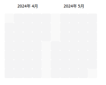
このままでは数字が見えてしまい、ヒートマップにはなりません。なので消します。(numberOfMonthsは表示する月数を制御します。)
import { Calendar } from "@/components/ui/calendar";
import { ja } from "date-fns/locale";

const Component = () => {
  return (
    <Calender
      numberOfMonths={2}
      locale={ja}
      classNames={{
        nav: "hidden",
        month: "!ml-0 space-y-4",
        tbody: "flex",
        row: "[user-select:none;] flex flex-col",
        cell: cn(
          "relative p-0 text-center text-sm focus-within:relative focus-within:z-20 [&:has([aria-selected])]:bg-gray-200 [&:has([aria-selected].day-outside)]:bg-gray-200 rounded-sm"
        ),
        day: cn(
          buttonVariants({ variant: "ghost" }),
          "h-8 w-8 p-0 font-normal text-transparent cursor-pointer aria-selected:opacity-100 hover:text-transparent hover:bg-gray-200 bg-accent rounded-sm"
        ),
      }}
      components={{
        Head: () => <></>,
      }}
      formatters={{
        formatCaption: (date) => {
        const date = new Date(date);

        return `${date.getFullYear()}年 ${date.getMonth() + 1}月`;
        }
      }}
    />
  );
}
export default Component;
結果
若干色が薄いところは次の月もしくは前の月の日があることを示しています。
Rowコンポーネントを拡張
その前に色が薄くなっているところを直します。
classNames={{
  day_outside: "",
}}
これを追加すると色が他の日と同じようになります。
Rowコンポーネントは1週間ごとの行を表示しています。
詳しくは以下を見てください
これを参考にしつつコンポーネントを作成します。
import { getUnixTime } from 'date-fns';

import { Day } from 'components/Day';
import { WeekNumber } from 'components/WeekNumber';
import { useDayPicker } from 'contexts/DayPicker';

export interface CustomRowProps {
  displayMonth: Date;
  weekNumber: number;
  dates: Date[];
}

export function CustomRow(props: CustomRowProps): JSX.Element {
  const { styles, classNames, showWeekNumber, components } = useDayPicker();

  const DayComponent = components?.Day ?? Day;
  const WeeknumberComponent = components?.WeekNumber ?? WeekNumber;

  let weekNumberCell;
  if (showWeekNumber) {
    weekNumberCell = (
      <td className={classNames.cell} style={styles.cell}>
        <WeeknumberComponent number={props.weekNumber} dates={props.dates} />
      </td>
    );
  }

  const thisMonth = new Date(props.displayMonth).getMonth();
  const monthOfData = new Date(props.dates[6]).getMonth();

  return (
    <tr
      className={cn(
        classNames.row,
        thisMonth !== monthOfData && "last:-mr-[2rem]",
      )}
      style={styles.row}
      >
      {weekNumberCell}
      {props.dates.map((date) => (
        <td
          className={classNames.cell}
          style={styles.cell}
          key={getUnixTime(date)}
          role="presentation"
        >
          <DayComponent displayMonth={props.displayMonth} date={date} />
        </td>
      ))}
    </tr>
  );
}
呼び出す側
import { Calendar } from "@/components/ui/calendar";
import { ja } from "date-fns/locale";
import { CustomRow } もしくは CustomRow from "ディレクトリから"

const Component = () => {
  return (
    <Calender
      numberOfMonths={2}
      locale={ja}
      classNames={{
      nav: "hidden",
      month: "!ml-0 space-y-4",
      tbody: "flex",
      row: "[user-select:none;] flex flex-col",
      cell: cn(
        "relative p-0 text-center text-sm focus-within:relative focus-within:z-20 [&:has([aria-selected])]:bg-gray-200 [&:has([aria-selected].day-outside)]:bg-gray-200 rounded-sm"
      ),
      day: cn(
        buttonVariants({ variant: "ghost" }),
          "h-8 w-8 p-0 font-normal text-transparent cursor-pointer aria-selected:opacity-100 hover:text-transparent hover:bg-gray-200 bg-accent rounded-sm"
        ),
      }}
      components={{
        Head: () => <></>,
        Row: (props) => <CustomRow {...props} />
      }}
      formatters={{
        formatCaption: (date) => {
          const date = new Date(date);

          return `${date.getFullYear()}年 ${date.getMonth() + 1}月`;
        }
      }}
    />
  );
}
export default Component;
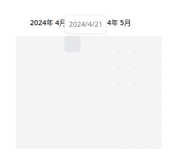
結果
わかりやすいように日付を表示しています。仕組みは単純で、
const thisMonth = new Date(props.displayMonth).getMonth();
const monthOfData = new Date(props.dates[6]).getMonth();
1行目がキャプションとして表示される月を取得しています(2024年 4月の部分)。2行目が最後の週の最後の日の月を取得しています。カレンダーでは週の最後の日が次の月にまたがって書かれている場合があります。その場合、1行目と2行目のコードでは結果が違うのでそのときだけ隙間を埋めるようマイナス値のmarginで重ねて表示することで連続した日付を表現しています。

ツールチップを表示
GithubやZennではカーソルを合わせたとき、日付とコンテンツが表示されます。それをshadcnのtool tipを使って再現します。
先ほどのCustomRowコンポーネントを以下のように修正します。
contentsには表示したいデータを渡します。カーソルでホバーした日とデータのdateプロパティが一致した場合、最初の要素をレンダリングします。DisplayContentはcontentがある場合に表示する簡単なコンポーネントです。
import { getUnixTime } from 'date-fns';

import { Day } from 'components/Day';
import { WeekNumber } from 'components/WeekNumber';
import { useDayPicker } from 'contexts/DayPicker';
import {
  Tooltip,
  TooptipContent,
  TooltipProvider,
  TooltipTrigger
} from "tooltipのディレクトリから"
import {
  cn
} from "cn"

export interface CustomRowProps {
  displayMonth: Date;
  weekNumber: number;
  dates: Date[];
  contents?: Array<{
    content: string;
    date: Date;
  }>
}

const DisplayContent = ({ date, contents }: {
  date: Date,
  contents?: Array<{
    content: string;
    date: Date;
  }>) => {
  if(!content || !contents.length) return <></>;

  const content = contents.filter((content) => {
  if(new Date(content.date).toLocalDateString("ja-JP" === "new Date(date).toLocalDateString("ja-JP")) {
    return content;
  }[0];

  if(!content) return <></>;
    return <span className="font-bold text-gray-800">{content.content}</span>
  }

export function CustomRow(props: CustomRowProps): JSX.Element {
  const { styles, classNames, showWeekNumber, components } = useDayPicker();

  const DayComponent = components?.Day ?? Day;
  const WeeknumberComponent = components?.WeekNumber ?? WeekNumber;

  let weekNumberCell;
  if (showWeekNumber) {
    weekNumberCell = (
      <td className={classNames.cell} style={styles.cell}>
        <WeeknumberComponent number={props.weekNumber} dates={props.dates} />
      </td>
    );
  }

  const thisMonth = new Date(props.displayMonth).getMonth();
  const monthOfData = new Date(props.dates[6]).getMonth();

  return (
    <TooltipProvider>
      <tr
        className={cn(
          classNames.row,
          thisMonth !== monthOfData && "last:-mr-[2rem]",
        )}
        style={styles.row}
      >
      {weekNumberCell}
      {props.dates.map((date) => (
      <Tooltip key={getUnixTime(date)}>
        {date && (
          <td
            className={classNames.cell}
            style={styles.cell}
            role="presentation"
          >
            <TooltipTrigger>
              <DayComponent displayMonth={props.displayMonth} date={date} />
            </TooltipTrigger>
            <TooltipContent
              side="top"
              align="start"
              className="flex flex-col gap-1 rounded-lg border p-2 shadow-sm"
              >
                <span
                  className="text-sm uppercase text-muted-foreground"
                  >
                  {new Date(date).toLocalDateString("ja-JP")}
                </span>
              <DisplayContent date={date} contents={props.contents} />
            </TooltipContent>
          </td>
        )}
        </Tooltip>
      ))}
      </tr>
    </TooltipProvider>
  );
}
呼び出す側
import { Calendar } from "@/components/ui/calendar";
import { ja } from "date-fns/locale";
import { CustomRow } もしくは CustomRow from "ディレクトリから"

const data = [
  {
    content: "Hello World",
    date: new Date(2024, 3, 7)
  }
]

const Component = () => {
  return (
    <Calender
      numberOfMonths={2}
      locale={ja}
      classNames={{
        nav: "hidden",
        month: "!ml-0 space-y-4",
        tbody: "flex",
        row: "[user-select:none;] flex flex-col",
        cell: cn(
          "relative p-0 text-center text-sm focus-within:relative focus-within:z-20 [&:has([aria-selected])]:bg-gray-200 [&:has([aria-selected].day-outside)]:bg-gray-200 rounded-sm"
        ),
        day: cn(
          buttonVariants({ variant: "ghost" }),
          "h-8 w-8 p-0 font-normal text-transparent cursor-pointer aria-selected:opacity-100 hover:text-transparent hover:bg-gray-200 bg-accent rounded-sm"
        ),
      }}
      components={{
        Head: () => <></>,
        Row: (props) => <CustomRow {...props} />
      }}
      formatters={{
        formatCaption: (date) => {
          const date = new Date(date);

          return `${date.getFullYear()}年 ${date.getMonth() + 1}月`;
        }
      }}
    />
  );
}
export default Component;
結果

コンテンツがない場合のツールチップ
結論
実装することは不可能ではないが、専用のライブラリを探して使う方が楽かなと思いました。
ヒートマップのサイズを変更したい場合はclassNamesのday, cellとCustomRowのmarginRightをいじってください。
おすすめのヒートマップライブラリがある場合、もしくはこうした方がスマートに実装できるよなどなどコメントで教えていただけるとありがたいです。
参照サイト
Discussion