Reactのスタイリングガイド: CSS-in-JS編
CSS-in-JSについて
CSS-in-JSはJavaScriptでCSSを記述するために作られたものです。
この記事では中でも有名で人気の高いstyled-componentsとEmotionについて解説します。
Inline StyleやCSS Modulesについての解説はこちらの記事をご覧ください。
styled-components
Styled-componentsの書き方は下記の通りstyled.に続いてタグ名「``」の中にCSSを書くことでスタイルを当てることができます。
const SContainer = styled.div`
  border-radius: 8px;
  padding: 16px;
  margin: 16px;
  background-color: skyblue
`;

const STitle = styled.p`
  margin: 0;
  color: white;
`;

<SContainer>
  <Title>Hello World!</STitle>
</SContainer>
Styled-componentsは外部のコンポーネントと区別がしにくいため、Styled-componentsの場合は先頭に「S」や「Styled」をつけることをおすすめします。
事前準備として必要なものをインストールしておきましょう。
npm i styled-components

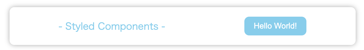
この状態から下のようなスタイルになるようにコードを書いていきましょう
import styled from "styled-components";

// コンテナーのスタイルを記述 変数の先頭にSをつける
const SContainer = styled.div`
  display: flex;
  justify-content: space-around;
  align-items: center;
  border-radius: 8px;
  padding: 16px;
  margin: 16px;
  box-shadow: 0 0 8px #aaa;
`;

// タイトルのスタイルを記述
const STitle = styled.p`
  margin: 0;
  color: skyblue;
`;

// ボタンのスタイルを記述
const SButton = styled.button`
  padding: 8px 16px;
  border: none;
  border-radius: 8px;
  outline: none;
  color: white;
  background-color: skyblue;
  &:hover {
    background-color: lightblue;
    color: #333;
    cursor: pointer;
  }
`;

// コンポーネントのように囲んでスタイルを適用
const StyledComponents = () => {
  return (
    <SContainer>
      <STitle>- Styled Components -</STitle>
      <SButton>Hello World!</SButton>
    </SContainer>
  );
};

export default StyledComponents;
Emotion
EmotinはCSS-in-JSの中では後発のライブラリで、様々な書き方に対応しているのが特徴です。
事前準備として必要なものをインストールしておきましょう。
npm i @emotion/styled @emotion/react
また、importの前に1行下記のコードを追加しなければEmotinは使えません。「JSX pragma」と呼ばれるものです。
/** @jsxImportSource @emotion/react */

では早速、Emotionの主な3つの書き方
- SCSSの構文がそのまま書ける書き方
- インラインスタイルのような書き方
- Styled-componentsのような書き方
を使って上記のスタイルになるように書いていきます。
/** @jsxImportSource @emotion/react */
import { css } from "@emotion/react";
import styled from "@emotion/styled";

const Emotion = () => {
  // SCSSの構文がそのまま書ける書き方
  const containerStyle = css`
    display: flex;
    justify-content: space-around;
    align-items: center;
    border-radius: 8px;
    padding: 16px;
    margin: 16px;
    box-shadow: 0 0 8px #aaa;
  `;
  // インラインスタイルのような書き方
  const titleStyle = css({
    margin: "0",
    color: "skyblue",
  });
  // Styled-componentsのような書き方
  const SButton = styled.button`
    padding: 8px 16px;
    border: none;
    border-radius: 8px;
    outline: none;
    color: white;
    background-color: skyblue;
    &:hover {
      background-color: lightblue;
      color: #333;
      cursor: pointer;
    }
  `;
  // 先ほど書いたスタイルを適用していきます
  return (
    <div css={containerStyle}>
      <p css={titleStyle}>- Emotion -</p>
      <SButton>Hello World!</SButton>
    </div>
  );
};

export default Emotion;
まとめ
この記事では、CSS-in-JSの中でも人気の高い2つのライブラリ、Styled-componentsとEmotionについて解説しました。Reactでは、他にもTailwindCSSやChacra UI、Material-UIなどのコンポーネントライブラリなど、さまざまなスタイルの当て方が存在しています。自分に合ったもの、チームに合ったものを選択するために、一通り触ってみることをおすすめします。この記事が誰かのお役に立てれば幸いです。
Discussion
記事タイトルに誤字がある気がするので念のため。
スライリングになってます!
ほんとですね!今修正しました。ありがとうございます