Next.jsでStorybook入門してみた
はじめに
本記事では、Next.js、shadcn/ui を使って Storybook の環境構築からデプロイまでを紹介します。
フロントエンドは単体テスト・コンポーネントテストを実施したことはありますが、Storybook は触ったことないのでキャッチアップして技術の幅を広げたいというのがモチベーションです。
前提
今回主に使用したフレームワーク/ライブラリです。
- Next.js v15
- Storybook v8.4
- shadcn/ui
手順
今回はユーザー作成フォームを題材にして実装していきます。
環境構築
Next.js・shadncn/ui の環境構築は省略します。
詳しくはこちらをご覧ください。
なお、今回は shadcn/ui のコンポーネントからはbutton、input、formを使用します。
では、Storybook の環境構築をしていきます。
- プロジェクトのルートディレクトリで下記のコマンドを実行して storybook を導入する
npx storybook@latest init
- Storybook を起動して、デフォルト設定の Storybook が表示されるか確認する
pnpm storybook
- config の修正
デフォルト設定ではstoriesフォルダ下が Story の読み込み対象となっているので、拡張子が .stories.* であるファイルにマッチする Story を読み込み対象に修正します。
import type { StorybookConfig } from "@storybook/nextjs";

const config: StorybookConfig = {
-  stories: [
-    "../stories/**/*.mdx",
-    "../stories/**/*.stories.@(js|jsx|mjs|ts|tsx)",
-  ],
+  stories: ["../**/*.mdx", "../**/*.stories.@(js|jsx|mjs|ts|tsx)"],
addons: [
    "@storybook/addon-onboarding",
    "@storybook/addon-essentials",
    "@chromatic-com/storybook",
    "@storybook/addon-interactions",
],
framework: {
    name: "@storybook/nextjs",
    options: {},
},
staticDirs: ["../public"],
};
export default config;
続いて、Tailwind CSS が Storybook で適用されるようにpreview.tsを修正します。
+ import "../app/globals.css"
import type { Preview } from "@storybook/react"

const preview: Preview = {
  parameters: {
    controls: {
      matchers: {
        color: /(background|color)$/i,
        date: /Date$/i,
      },
    },
  },
}

export default preview
また、今回はstoriesフォルダは使用しないので削除しても大丈夫です。
Story の登録
環境構築が完了したら Story を登録します。
基本的にComponent Story Format (CSF)に則り書いていきます。
メタデータを定義
まず、対象コンポーネントのメタデータを定義し、デフォルトエクスポートします。
import type { Meta, StoryObj } from "@storybook/react"
import { Button } from "./button"

import { action } from "@storybook/addon-actions"

const meta: Meta<typeof Button> = {
  title: "Components/UI/Button",
  component: Button,
  tags: ["autodocs"],
  parameters: {
    layout: "centered",
  },
  argTypes: {
    onClick: { action: "clicked" },
    variant: {
      control: "select",
      description: "The variant of the button",
      options: ["default", "outline", "destructive", "secondary", "ghost"],
    },
    size: {
      control: "select",
      description: "The size of the button",
      options: ["sm", "default", "lg", "icon"],
    },
    disabled: {
      control: "boolean",
      description: "If the button is disabled",
    },
    children: {
      control: "text",
      description: "The content of the button",
    },
    className: {
      control: "text",
      description: "Custom tailwind CSS classes to apply to the button",
    },
  },
}
export default meta
- title: Storybook のナビゲーションで表示されるタイトル
- component: 使用するコンポーネント
- tags: タグを指定することで、Story のフィルタリングができたりテストランナーから除外することなどが可能
- parameters: Storybook の機能やアドオンの振る舞いをコントロールする
- argTypes: コンポーネントが受け取る引数(Props)を指定すると、Storybook 上でコンポーネントの挙動を確認することができる。また、
controlで type を指定するとコントロールアドオンをカスタマイズできる。

コントロールアドオン
各 Story を定義
argsに渡すパラメーターを指定し、各 Story を名前付きエクスポートします。
type Story = StoryObj<typeof meta>

export const Default: Story = {
  args: {
    variant: "default",
    size: "sm",
    disabled: false,
    onClick: action("default click"),
    children: "Default Button",
  },
}
完成した Story
完成したbuttonコンポーネントを Story は下記の通りです。
import type { Meta, StoryObj } from "@storybook/react"
import { Button } from "./button"

import { action } from "@storybook/addon-actions"

const meta: Meta<typeof Button> = {
  title: "Components/UI/Button",
  component: Button,
  tags: ["autodocs"],
  parameters: {
    layout: "centered",
  },
  argTypes: {
    onClick: { action: "clicked" },
    variant: {
      control: "select",
      description: "The variant of the button",
      options: ["default", "outline", "destructive", "secondary", "ghost"],
    },
    size: {
      control: "select",
      description: "The size of the button",
      options: ["sm", "default", "lg", "icon"],
    },
    disabled: {
      control: "boolean",
      description: "If the button is disabled",
    },
    children: {
      control: "text",
      description: "The content of the button",
    },
    className: {
      control: "text",
      description: "Custom tailwind CSS classes to apply to the button",
    },
  },
}
export default meta

type Story = StoryObj<typeof meta>

export const Default: Story = {
  args: {
    variant: "default",
    size: "sm",
    disabled: false,
    onClick: action("default click"),
    children: "Default Button",
  },
}

export const Outline: Story = {
  args: {
    variant: "outline",
    size: "sm",
    disabled: false,
    onClick: action("outline click"),
    children: "Outline Button",
  },
}

// 以下、省略
Storybook の画面で Button コンポーネントの Story が登録されていることが確認できました。

コンポーネントの作成
環境構築が完了したら、フォームコンポーネントを実装します。
コンポーネントの実装はメインの内容ではないので、説明は省略化して記載します。
components/form/form-input.tsx
import React from "react"
import { FieldValues, UseControllerProps } from "react-hook-form"
import {
  FormControl,
  FormField,
  FormItem,
  FormLabel,
  FormMessage,
} from "@/components/ui/form"
import { Input, InputProps } from "@/components/ui/input"

export type FormInputProps<T extends FieldValues> = InputProps &
  UseControllerProps<T> & {
    label: string
  }

export function FormInput<T extends FieldValues>({
  name,
  control,
  label,
  ...inputProps
}: FormInputProps<T>) {
  return (
    <FormField
      control={control}
      name={name}
      render={({ field }) => (
        <FormItem>
          <FormLabel>{label}</FormLabel>
          <FormControl>
            <Input
              {...inputProps}
              onChange={field.onChange}
              value={field.value}
              onBlur={field.onBlur}
              disabled={field.disabled}
              name={field.name}
              ref={field.ref}
            />
          </FormControl>
          <FormMessage />
        </FormItem>
      )}
    />
  )
}
app/users/new/\_components/user-create-form/presentation.tsx
import { FormInput } from "@/components/form/form-input"
import { Button } from "@/components/ui/button"
import { Form } from "@/components/ui/form"
import { zodResolver } from "@hookform/resolvers/zod"
import { useForm } from "react-hook-form"
import { z } from "zod"

const createUserSchema = z.object({
  firstName: z.string().nonempty({ message: "名を入力してください" }),
  lastName: z.string().nonempty({
    message: "性を入力してください",
  }),
  email: z.string().email({
    message: "メールアドレスを入力してください",
  }),
  password: z.string().min(8, {
    message: "パスワードは8文字以上で入力してください",
  }),
})

export type CreateUserSchema = z.infer<typeof createUserSchema>

type UserCreateFormPresentationProps = {
  createUser: (params: CreateUserSchema) => Promise<void>
  isLoading: boolean
}

export function UserCreateFormPresentation({
  createUser,
  isLoading,
}: UserCreateFormPresentationProps) {
  const form = useForm<CreateUserSchema>({
    defaultValues: {
      firstName: "",
      lastName: "",
      email: "",
      password: "",
    },
    resolver: zodResolver(createUserSchema),
  })

  const handleSubmit = form.handleSubmit(async (data) => {
    await createUser(data)
  })

  return (
    <Form {...form}>
      <form onSubmit={handleSubmit}>
        <div className="flex flex-col gap-4">
          <div>
            <FormInput control={form.control} name="firstName" label="性" />
          </div>
          <div>
            <FormInput control={form.control} name="lastName" label="名" />
          </div>
          <div>
            <FormInput
              control={form.control}
              name="email"
              label="メールアドレス"
            />
          </div>
          <div>
            <FormInput
              control={form.control}
              name="password"
              label="パスワード"
              type="password"
            />
          </div>
        </div>
        <div className="mt-4 flex justify-end">
          <Button type="submit" disabled={isLoading}>
            作成
          </Button>
        </div>
      </form>
    </Form>
  )
}
インタラクションテスト
フォームのインタラクションテストを実施します。
play()関数を使用すると、Storybook 上でユーザーのクリックやフォーム入力のようなインタラクションな操作を表現できます。
これにより、Storybook 上でインタラクションテストが完結するので vitest や jest でテストしなくても済みます。
メタデータを定義
先ほどの Button コンポーネントと同様にメタデータを定義します。
import type { Meta, StoryObj } from "@storybook/react"
import { UserCreateFormPresentation } from "./presentation"

const meta: Meta<typeof UserCreateFormPresentation> = {
  title: "App/Users/New/Components/UserCreateForm",
  component: UserCreateFormPresentation,
  tags: ["autodocs"],
  parameters: {
    layout: "centered",
  },
  args: {
    createUser: async (params) => {
      await new Promise((resolve) => {
        setTimeout(() => {
          resolve(params)
        }, 1000)
      })
    },
    isLoading: false,
  },
}

export default meta
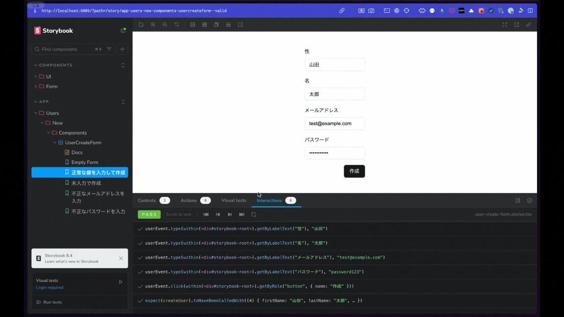
正常系のインタラクションテスト
フォームに正常な値を入力して、作成ボタンを押した時にcreateUser()関数が実行されているかテストします。
import { userEvent, within, expect, fn } from "@storybook/test"
// ...
type Story = StoryObj<typeof meta>

export const Valid: Story = {
  name: "正常な値を入力して作成",
  args: {
    // createUser()をモック
    createUser: fn(
      async (params: {
        firstName: string
        lastName: string
        email: string
        password: string
      }) => {
        console.log(params)
      }
    ),
  },
  play: async ({ canvasElement, args }) => {
    // コンポーネントのroot要素を取得
    const canvas = within(canvasElement)

    //フォームに値を入力
    await userEvent.type(canvas.getByLabelText("性"), "山田")
    await userEvent.type(canvas.getByLabelText("名"), "太郎")
    await userEvent.type(
      canvas.getByLabelText("メールアドレス"),
      "test@example.com"
    )
    await userEvent.type(canvas.getByLabelText("パスワード"), "password123")

    // 作成ボタンをクリック
    await userEvent.click(canvas.getByRole("button", { name: "作成" }))

    // モック関数の引数に入力した値が渡されて呼び出されたことを検証
    await waitFor(() =>
      expect(args.createUser).toHaveBeenCalledWith({
        firstName: "山田",
        lastName: "太郎",
        email: "test@example.com",
        password: "password123",
      })
    )
  },
}
Storybook の画面でテストがパスしていることが確認できました。
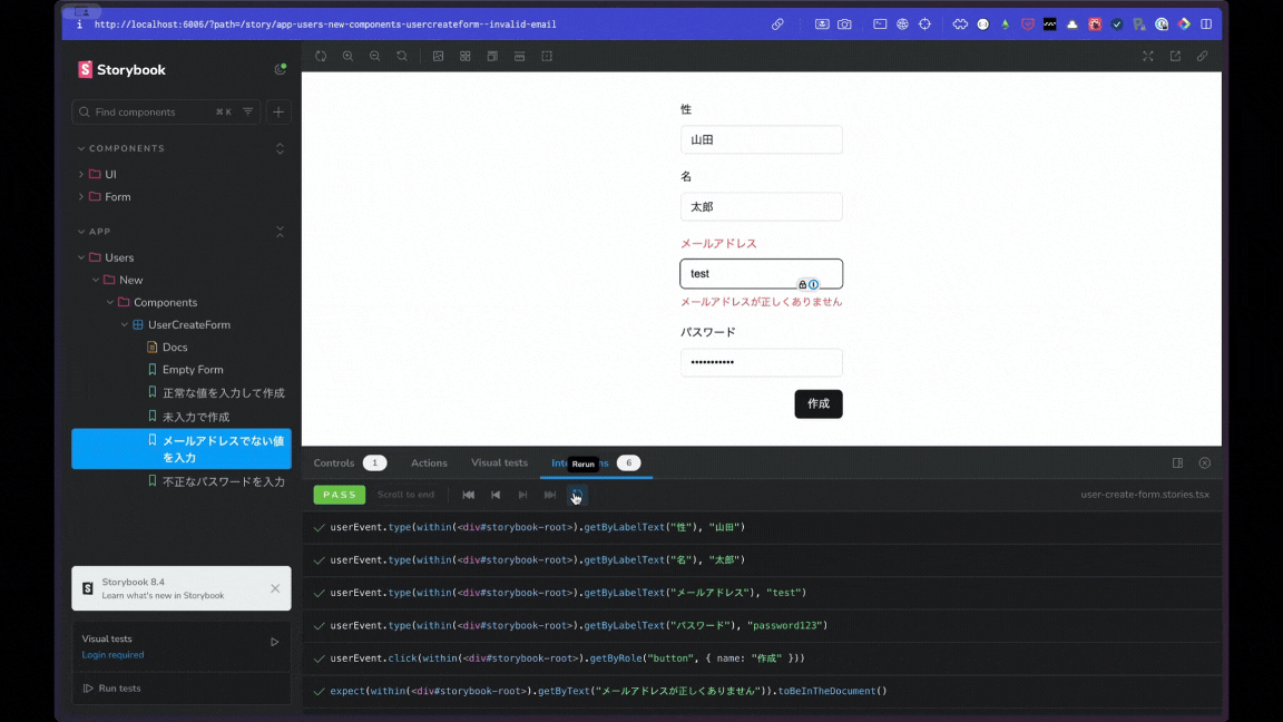
異常系のインタラクションテスト
異常系のテストではメールアドレスでない値をを入力して、エラーメッセージが表示されるかテストしてみます。
import { userEvent, within, expect, fn } from "@storybook/test"
// ...
type Story = StoryObj<typeof meta>

export const InvalidEmail: Story = {
  name: "メールアドレスでない値を入力",
  play: async ({ canvasElement, args }) => {
    const canvas = within(canvasElement)

    await userEvent.type(canvas.getByLabelText("性"), "山田")
    await userEvent.type(canvas.getByLabelText("名"), "太郎")
    //メールアドレスでない値をを入力
    await userEvent.type(canvas.getByLabelText("メールアドレス"), "test")
    await userEvent.type(canvas.getByLabelText("パスワード"), "password123")

    await userEvent.click(canvas.getByRole("button", { name: "作成" }))

    // エラーメッセージが表示されていることを検証
    expect(
      canvas.getByText("メールアドレスが正しくありません")
    ).toBeInTheDocument()
  },
}
Storybook の画面でテストがパスしていることが確認できました。
テストランナーを実行
コマンドや CI でテストを実行できるようにテストランナーを導入します。
-
@storybook/test-runnerをインストール
pnpm add @storybook/test-runner -D
-
playwrightをインストール
pnpm add playwright
pnpm exec playwright install
- package.json にテスト実行用のスクリプトを追加する
{
  "scripts": {
    "test-storybook": "test-storybook"
  }
}
- テストを実行
pnpm test:storybook
- テストランナーのワークフローを追加
pnpm と Playwright はキャッシュしているので、公式ドキュメントのコードは少し異なります。
github/workflows/storybook-tests.yml
name: "Storybook Tests"

on: push

jobs:
  test:
    timeout-minutes: 60
    runs-on: ubuntu-latest
    steps:
      - uses: actions/checkout@v4

      - name: Install pnpm
        uses: pnpm/action-setup@v4
        with:
          version: 9
      - name: Use Node.js
        uses: actions/setup-node@v4
        with:
          node-version-file: ".nvmrc"
          cache: "pnpm"
      - name: Install dependencies
        run: pnpm install

      - name: Cache Playwright Browsers
        uses: actions/cache@v3
        with:
          path: ~/.cache/ms-playwright
          key: ${{ runner.os }}-playwright-${{ hashFiles('package-lock.json') }}
          restore-keys: |
            ${{ runner.os }}-playwright-
      - name: Get Playwright Version For Browser Cache Key
        id: get-playwright-version
        run: |
          echo "playwright-version=$(npx playwright --version | sed 's/ //g')" >> $GITHUB_OUTPUT
        shell: bash
      - name: Restore Cache Playwright Browser
        id: restore-cache-playwright-chromium
        uses: actions/cache@v3
        with:
          path: ~/.cache/ms-playwright
          key: playwright-chromium-${{ steps.get-playwright-version.outputs.playwright-version }}
      - name: Install Playwright Browsers
        run: |
          export PLAYWRIGHT_BROWSERS_PATH=~/.cache/ms-playwright
          pnpm exec playwright install --with-deps
        if: ${{ steps.restore-cache-playwright-chromium.outputs.cache-hit != 'true' }}
      - name: Save Cache Playwright Browser
        uses: actions/cache@v3
        id: save-cache-playwright-chromium
        with:
          path: ~/.cache/ms-playwright
          key: playwright-chromium-${{ steps.get-playwright-version.outputs.playwright-version }}

      - name: Build Storybook
        run: pnpm build-storybook --quiet
      - name: Serve Storybook and run tests
        run: |
          npx concurrently -k -s first -n "SB,TEST" -c "magenta,blue" \
            "npx http-server storybook-static --port 6006 --silent" \
            "npx wait-on tcp:127.0.0.1:6006 && pnpm test-storybook"
デプロイ
最後に GitHub Actions を使用して、プッシュしたら Chromatic 上に自動デプロイされるようにします。
デプロイ方法は、公式ドキュメントに紹介されており簡単にデプロイできました。
- Chromatic をインストール
pnpm add chromatic -D
-
Chromaticにログイン
-
Storybook をデプロイするワークフローを追加
.github/workflows/chromatic.yml
name: "Chromatic"

on: push

jobs:
  chromatic:
    name: Run Chromatic
    runs-on: ubuntu-latest
    steps:
      - name: Checkout code
        uses: actions/checkout@v4
        with:
          fetch-depth: 0
      - name: Install pnpm
        uses: pnpm/action-setup@v4
        with:
          version: 9
    - name: Use Node.js
        uses: actions/setup-node@v4
        with:
          node-version-file: ".nvmrc"
          cache: "pnpm"
      - name: Install dependencies
        run: pnpm install
      - name: Run Chromatic
        uses: chromaui/action@latest
        with:
         # リポジトリのシークレットに`CHROMATIC_PROJECT_TOKEN`を追加する必要あり
          projectToken: ${{ secrets.CHROMATIC_PROJECT_TOKEN }}
- リモートリポジトリにプッシュ
- Chromatic にアクセスして、「View Storybook」をクリック

Storybook がデプロイされていることが確認できました。

所感
- Storybook の一番のメリットだと思いますが、やはりコンポーネントの挙動の確認が簡単だなと思いました。PdM やデザイナーもカバーできているエッジケースを UI 上のインタラクションテストから確認できるので受け入れテストが簡単になりそうです。
- 開発者にとって、特定のページを開かなくても UI を確認しながら実装できることは嬉しいポイントです。ただし、1 ページに複数のコンポーネントを使用するような大規模アプリケーションでない場合は、費用対効果がやや小さいかもしれません。
- Storybook を前提とした開発では、モジュール性の高いコンポーネント設計しやすいなと感じました。「Story」を登録することで、1 ファイルに定義するコンポーネントの粒度が開発者間で揃いやすくなりそうです。
- 実装コストはそれなりにかかるので、まだ市場に売れるかどうかわからないプロダクト立ち上げ期から導入するのはハードル高い印象です。導入タイミングは難しいですが「このプロダクトは売れる」と組織全体で確信が持てた段階で導入しても遅くはないかなと思います。
最後までお読みいただきありがとうございました!
参考
Discussion