React + MUI: 数値入力とマスク入力 に react-number-format が、かなりオススメ!
Reactで MUI(v5) + React-hook-form + yup で入力フォームを作成しています。
今回は 3桁区切りや小数点以下の入力をサポートした数値入力用のコンポーネントと、マスク入力用のコンポーネントが必要になったのですが、MUI には 数値入力用のコンポーネントやマスク入力コンポーネントがありません。
そこで react-number-format ライブラリを試してみたのですが、かなりオススメだったので紹介したいと思います。
数値入力用、マスク入力用のコンポーネントを扱うライブラリ
数値入力用のコンポーネント、マスク入力用のコンポーネント を扱っているライブラリとして、react-number-format のほかに react-imask があります。
たぶん他にもいいライブラリがあると思いますが、今回はこの2つから選びました。
react-number-format
react-imask
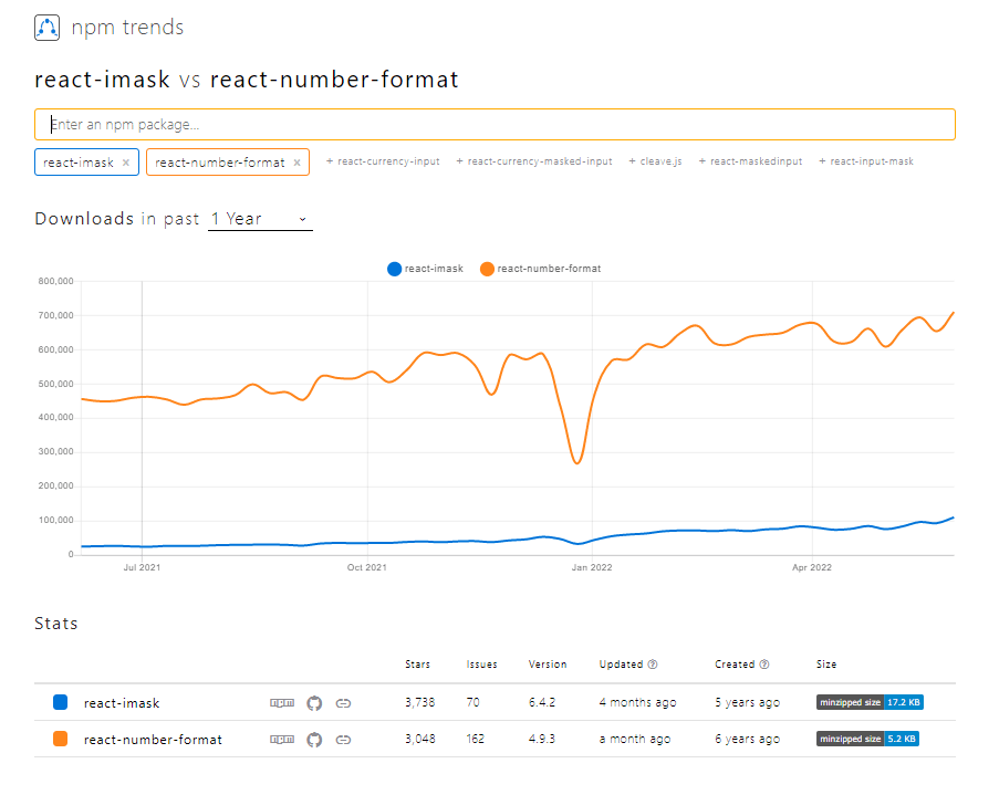
npm trends で比較
react-number-format のほうが優勢です。
git star で比較
僅差ですが、react-imask のほうが多いです。
react-number-format:3079
react-imask:3776
リファレンスの分かりやすさで比較
導入がしやすいこと、リファレンスが分かりやすいこと、コレが一番大事な判断基準だったりします。
react-number-format には デモサイトがあります。
一つ一つのプロパティにもわかりやすいリファレンスに加えて、それぞれのデモが用意されています。
imask のリファレンスサイト
結論
npm trends の比較結果とリファレンスの分かりやすさから react-number-format を導入することにします。
react-number-format
react-number-format は入力された値を指定したフォーマットに従って、入力制御や書式変換してくれる React コンポーネントです。
インストール
npm install react-number-format
typescript の場合は tsconfig.json で esModuleInterop を true に設定する必要があります。
  "compilerOptions": {
    ・・・
    "esModuleInterop": true,
    ・・・
とりあえず使ってみる
import React from "react"
import NumberFormat from "react-number-format"

export default function App() {
  return (
    <div>
      <h2>react-number-format</h2>
      <NumberFormat
          value={123456789}
          thousandSeparator={true}
      />
    </div>
  )
}
見た目はアレですが、とりあえず3桁区切りで数値が表示されています。

見た目を MUI のコンポーネントと揃える
UI ライブラリは MUI を使用しているので、他の MUI のコンポーネントと見た目を揃えます。
下記の画像は MUIのコンポーネントと見た目を揃えた結果です。

サンプルコード全体を MUI コンポーネントを使用するように変えてますが、ポイントは NumberFormat コンポーネントの customInput プロパティです。
NumberFormat コンポーネントの customInput プロパティ に MUI のTextField を指定します。
あとは MUI の TextField で props を指定するように、NumberFormat の Props に MUI の TextField の Props を設定します。
import React from "react"
import NumberFormat from "react-number-format"
import { Stack, Box, Typography, TextField } from "@mui/material"

export default function App() {
  return (
    <Stack spacing={2}>
      <Box>
        <Typography variant="h5" component="h2" sx={{mb:1}}>react-number-format</Typography>
        <NumberFormat value={123456789} thousandSeparator={true} />
      </Box>

      <Box>
      <Typography variant="h5" component="h2" sx={{mb:2}}>react-number-format + MUI</Typography>
        <NumberFormat
            value={123456789}
            thousandSeparator={true}
+            customInput={TextField}
+            size="small"
+            label="数値入力【基本】"
+            variant="outlined"
+            helperText="数値で入力する"
+            InputLabelProps={{ shrink: true }}
+            sx={{width: '30ch'}}
          />
      </Box>
    </Stack>
  )
}
バージョン情報
@mui/material v5.8.2
react-number-format: v4.9.3
NumberFormat コンポーネントの使い方
基本的な使い方 ~値を useState で管理~
ポイントは onChange ではなく onValueChange で入力値を取得します。
onValueChange は propの変更、onChange、onBlur などのイベントによって値が変更されれるたびに呼び出されます。
onValueChange の第一引数 values には value オブジェクト、第二引数 sourceInfo には onValueChange の発生理由がセットされています。
value オブジェクトには、下記の値が設定されています。
value:書式設定前の値
formattedValue: 書式設定後の値
floatValue:指数表記の値
+ const [inputValue, setInputValue] = React.useState<string>("123456789")

      <Box>
        <Typography variant="h5" component="h2" sx={{ mb: 2 }}>
          入力値をStateで管理する
        </Typography>
        <NumberFormat
+          value={inputValue}
          thousandSeparator={true}
+          onValueChange={(values, sourceInfo) => {
            console.log(sourceInfo);
            console.log(values.value); // 数値:1234567890123456789012
            console.log(values.formattedValue); // 整形後の数値文字列:1,234,567,890,123,456,789,012
            console.log(values.floatValue); // 指数表記:1.2345678901234568e+21
+            setInputValue(values.value);
          }}
          customInput={TextField}
          size="small"
          label="数値入力【基本】"
          variant="outlined"
          helperText="数値で入力する"
          InputLabelProps={{ shrink: true }}
          sx={{ width: "30ch" }}
        />
      </Box>
郵便番号 入力

format で入力書式を設定します。
mask でマスク用の文字を指定します。
allowEmptyFormatting は、入力されていないときにマスク文字を表示するかどうかを指定します。
     <Box>
      <Typography variant="h5" component="h2" sx={{mb:2}}>郵便番号</Typography>
        <NumberFormat
+            format="###-####"
+            mask="_"
+            allowEmptyFormatting={true}
           onValueChange={(values, sourceInfo) => {
            console.log(values.value); // 1111111
            console.log(values.formattedValue); // 111-1111
            console.log(values.floatValue); // 1111111
          }}
            customInput={TextField}
            size="small"
            label="郵便番号"
            variant="outlined"
            InputLabelProps={{ shrink: true }}
            sx={{width: '10ch'}}
          />
      </Box>
郵便番号 表示

displayType に "text" を指定すると、表示モードになります。
デフォルトは "input" です
     <Box>
      <Typography variant="h5" component="h2" sx={{mb:2}}>郵便番号</Typography>
        <NumberFormat
+	     value="1234567"
+            displayType="text"
            format="###-####"
            mask="_"
            allowEmptyFormatting={true}
           onValueChange={(values, sourceInfo) => {
            console.log(values.value); // 1111111
            console.log(values.formattedValue); // 111-1111
            console.log(values.floatValue); // 1111111
          }}
            customInput={TextField}
            size="small"
            label="郵便番号"
            variant="outlined"
            InputLabelProps={{ shrink: true }}
            sx={{width: '10ch'}}
          />
      </Box>
カード番号 入力
郵便番号と一緒ですね。

      <Box>
        <Typography variant="h5" component="h2" sx={{ mb: 2 }}>
          カード番号
        </Typography>
        <NumberFormat
          format="#### #### #### ####"
          mask="_"
          allowEmptyFormatting={true}
          onValueChange={(values, sourceInfo) => {
            console.log(values.value); // 1111111111111111
            console.log(values.formattedValue); // 1111 1111 1111 1111
            console.log(values.floatValue); // 1111111111111111
          }}
          customInput={TextField}
          size="small"
          label="カード番号"
          variant="outlined"
          InputLabelProps={{ shrink: true }}
          sx={{ width: "25ch" }}
        />
      </Box>
年月 入力

placeholer を表示する場合、allowEmptyFormatting は false に設定しないと placeholder が表示されません。
mask には 入力する文字位置に応じたマスク文字を配列で指定します。
      <Box>
        <Typography variant="h5" component="h2" sx={{ mb: 2 }}>
          年月
        </Typography>
        <NumberFormat
+          format="##/##"
+          mask={['Y', 'Y','M', 'M' ]}
-          // allowEmptyFormatting={true}
          onValueChange={(values, sourceInfo) => {
            console.log(values.value);
            console.log(values.formattedValue);
            console.log(values.floatValue);
          }}
          customInput={TextField}
          size="small"
          label="年月"
          variant="outlined"
          InputLabelProps={{ shrink: true }}
          sx={{ width: "25ch" }}
+          placeholder="YY/MM"
        />
      </Box>
金額 入力

thousandSeparator で桁区切りを行います。
thousandSeparator に true を指定するとカンマで桁区切りしますが、文字を指定するとその文字で桁区切りを行います。
thousandsGroupStyle は3桁区切りの場合は"thousand"を指定します。
ほかにインド式や中国式の桁区切りを指定できます。
prefix や suffix で接頭辞 や 接尾辞 を指定できます。
allowNegative に true を指定すると負数が入力できます。
decimalScale に 0 を指定して小数以下を入力できないようにします。
      <Box>
        <Typography variant="h5" component="h2" sx={{ mb: 2 }}>
          金額
        </Typography>
        <NumberFormat
+          thousandSeparator={true}
+          thousandsGroupStyle="thousand"
+          suffix="円"
+          allowNegative={true}
+          decimalScale={0}
          onValueChange={(values, sourceInfo) => {
            console.log(values.value);
            console.log(values.formattedValue);
            console.log(values.floatValue);
          }}
          customInput={TextField}
          size="small"
          label="金額"
          variant="outlined"
          InputLabelProps={{ shrink: true }}
          sx={{ width: "25ch" }}
        />
      </Box>
重量 入力

decimalScale で、小数点以下の桁数を指定します。
fixedDecimalScale に true を指定すると、小数点以下の桁数が常に0で表示されます。
      <Box>
        <Typography variant="h5" component="h2" sx={{ mb: 2 }}>
          重量
        </Typography>
        <NumberFormat
          thousandSeparator={true}
          thousandsGroupStyle="thousand"
          suffix="㎏"
          allowNegative={true}
+          decimalScale={3}
+          fixedDecimalScale={true}
          onValueChange={(values, sourceInfo) => {
            console.log(values.value);
            console.log(values.formattedValue);
            console.log(values.floatValue);
          }}
          customInput={TextField}
          size="small"
          label="重量"
          variant="outlined"
          InputLabelProps={{ shrink: true }}
          sx={{ width: "25ch" }}
        />
      </Box>
デフォルト値

defaultValue に 未入力時の時に表示する値を指定します。
      <Box>
        <Typography variant="h5" component="h2" sx={{ mb: 2 }}>
          デフォルト値
        </Typography>
        <NumberFormat
          thousandSeparator={true}
          thousandsGroupStyle="thousand"
+          defaultValue="0"
          decimalScale={0}
          onValueChange={(values, sourceInfo) => {
            console.log(values.value);
            console.log(values.formattedValue);
            console.log(values.floatValue);
          }}
          customInput={TextField}
          size="small"
          label="デフォルト値"
          variant="outlined"
          InputLabelProps={{ shrink: true }}
          sx={{ width: "25ch" }}
        />
      </Box>
入力範囲を制限する
入力できる範囲を -9,999,999 ~ 9,999,999 の範囲に制限するサンプルです。

isAllowed に 入力値が有効なら true を返す関数を指定します。
    <Box>
        <Typography variant="h5" component="h2" sx={{ mb: 2 }}>
          入力値を制限する(-9,999,999 ~ 9,999,999)
        </Typography>
        <NumberFormat
          thousandSeparator={true}
          thousandsGroupStyle="thousand"
          defaultValue="0"
          decimalScale={0}
          onValueChange={(values, sourceInfo) => {
            console.log(values.value);
            console.log(values.formattedValue);
            console.log(values.floatValue);
          }}
+          isAllowed={(values) =>{
+            const numValue = Number(values.value)
+            if (isNaN(numValue)) return true
+            return ( numValue >= -9999999 && numValue <= 9999999)
+          }}
          customInput={TextField}
          size="small"
          label="デフォルト値"
          variant="outlined"
          InputLabelProps={{ shrink: true }}
          sx={{ width: "25ch" }}
        />
      </Box>
ここまでのサンプルのデモサイト
主要な Props
thousandSeparator?: boolean | string;
桁区切りのセパレータを設定します。
true を指定すると、カンマで桁区切りが表示されます。
桁区切り文字を指定すると、その文字で桁区切りが表示されます。
デフォルトは undefined
thousandsGroupStyle?: 'thousand' | 'lakh' | 'wan';
桁区切りのグループ単位を指定します。
thousand: 千単位で区切る。例:123,456,789
lakh: インド式で区切る。例:12,34,56,789
wan:中国式。例:1,2345,6789
デフォルトは 'thousand'
prefix?: string;
接頭辞を指定します。
デフォルトは undefined
suffix?: string;
接尾辞を指定します。
デフォルトは undefined
displayType?: 'input' | 'text';
'input' の場合、入力要素をレンダリングします。
'text' の場合、スパン内のテキストとして、フォーマットした値をレンダリングします。
デフォルトは 'input'
decimalSeparator?: string;
小数点を表す文字を指定します。
デフォルトは .(ピリオド)
decimalScale?: number;
小数点以下の入力可能な桁数を指定します。
decimalScale に 2 を指定すると、小数点以下 2 桁だけ入力できるようになります。
小数点以下を入力しない場合は 0 を指定します。
デフォルトは undefined (制限なしで入力できます)
fixedDecimalScale?: boolean;
true の場合、decimalScale に指定した小数点以下桁数になるように常に 0 を表示します。
デフォルトは false
allowNegative?: boolean;
true の場合、負数の入力を許可します。
デフォルトは true
format?: string | FormatInputValueFunction;
'#,###,###' や '###-###' といった書式文字列を指定します。
関数を指定することもできます。
デフォルトは undefined
mask?: string | string[];
マスク文字を指定します。
文字位置に合わせたマスク文字の配列を指定できます。
デフォルトは ' '(半角スペース)
allowEmptyFormatting?: boolean;
true の場合、入力値がない時に書式設定されているマスク文字を表示します。
デフォルトは false。
allowLeadingZeros?: boolean;
true の場合、数値の先頭に0を許容します。
デフォルトは false。
※ 補足
formatで書式設定されている場合は(つまり数字で構成された文字列の場合) allowLeadingZeros が false でも 先頭 0 が入力できます。
サンプルの郵便番号、カード番号、年月などは、何も指定しなくても先頭 0 が入力できます。
サンプルの金額や重量などは数値と認識されているので、allowLeadingZeros を true に指定した場合だけ 先頭 0 が入力できます。
数値で先頭 0 のシチュエーションが思いつきませんが・・・
renderText
displayType に 'text' を指定している場合、通常は span 要素でレンダリングされます。span 要素以外でレンダリングしたい場合は、レンダリング関数を指定します。
customInput?: React.ComponentType<T>;
displayType に 'input' を指定している場合、通常は input 要素でレンダリングされます。input 要素以外でレンダリングしたい場合は、レンダリング関数を指定します。
defaultValue?: number | string;
値が提供されない場合、デフォルト値として使用される値を指定します。
isAllowed?: (values: NumberFormatValues) => boolean;
入力値が有効かどうかをチェックするためのチェッカー関数です。
入力値が有効な値であれば true を返す関数を指定します。
この関数が false を返した場合、onChange メソッドは実行されません。
isNumericString?: boolean;
value に指定する値が書式変換されていない値の場合は true を指定します。
デフォルトは false。
※ 補足
これチョットわからない。
useState で保存する値が書式変換前の値 values.value とする場合、isNumericString を true に設定するべきの記載があるけど、特に挙動に変化がなかったです。
react-hook-form との連携
素直に実装すると、submit の際に react-hook-form が取得する入力値が、書式付きの値になってしまいますので、少し対応が必要です。
- onValueChange で 書式設定前の値を退避しておきます。
- onChange の event.target.value には初期設定後の値がセットされているので、退避しておいた書式設定前の値を再セットます。
- field.onChange(event) を呼び出します。
import React from 'react'
import NumberFormat, { NumberFormatProps } from 'react-number-format'
import { TextField, TextFieldProps } from '@mui/material'
import { Controller, FieldValues, Control, Path } from 'react-hook-form'

export type MyNumberFieldProps<T> = {
  name: Path<T>
  control: Control<T>
  optional?: boolean
} & NumberFormatProps &
  TextFieldProps

export const MyNumberField = <T extends FieldValues>(props: MyNumberFieldProps<T>) => {
  const {
    name,
    control,
    label,
    size,
    min,
    max,
    step = 1,
    sx,
    InputLabelProps,
    InputProps,
    FormHelperTextProps,
    // -------- NumberFormat の props
    thousandSeparator = true,
    allowNegative = true,
    decimalScale = 0,
    defaultValue = 0
  } = props

  // 入力値の数値
+  let inputValue: string = ''

  return (
    <Controller
      name={name}
      control={control}
      render={({ field, fieldState }) => (
        <NumberFormat
          {...field}
          // -------- NumberFormat の props
          customInput={TextField}
          thousandSeparator={thousandSeparator}
          thousandsGroupStyle="thousand"
          allowNegative={allowNegative}
          decimalScale={decimalScale}
          defaultValue={defaultValue}
          isAllowed={(values) => {
            const numValue = Number(values.value)
            if (Number.isNaN(numValue)) return true
            const minVal = min ?? Number.MIN_SAFE_INTEGER
            const maxVal = max ?? Number.MAX_SAFE_INTEGER
            return numValue >= minVal && numValue <= maxVal
          }}
          value={field.value.toString()}
          onValueChange={(values) => {
            // -- onChange に 書式変換前の値を渡すためにinputValue に退避
+            inputValue = values.value
          }}
          onChange={(event: React.ChangeEvent<HTMLInputElement>) => {
            // -- event.target.value を 書式変換前の値に書き換え
            // eslint-disable-next-line no-param-reassign
+            event.target.value = inputValue
+            field.onChange(event)
          }}
          // --------- TextField の props
          label={label}
          size={size ?? 'small'}
          variant="outlined"
          error={!!fieldState.error}
          helperText={fieldState.error?.message}
          sx={sx}
          InputLabelProps={{
            ...InputLabelProps,
            shrink: true,
          }}
          InputProps={{
            ...InputProps,
            inputProps: { min, max, step, style: { textAlign: 'right' } }
          }}
          FormHelperTextProps={{
            ...FormHelperTextProps,
            classes: {
              root: 'helper-text'
            }
          }}
        />
      )}
    />
  )
}
また、react-number-format と react-hook-form を連携し、NumberFormat コンポーネントでマスクを利用すると、コンポーネントに「1」を入力すると「11」となったり、キー入力が受け付けられなかったりします。
この対策として NumberFormat に type='tel'を設定すると発生しなくなります。
まとめ
使い方がシンプルで、かなり使いやすいです😊
Discussion
react-text-maskライブラリでデモを作ってみました。
簡単ですが、以上です。