Open8
@repo/ui
ピン留めされたアイテム
 ふっけ
ふっけフロントエンド開発時に作成する@repo/uiについての変遷
ふっけ技術スタック
- tailwindcss
- shadcn/ui
ふっけディレクトリ構造
ディレクトリ構造
/
└─ packages
   └─ ui
      ├─ .storybook
      │  ├─ main.ts
      │  └─ preview.ts
      ├─ src
      │  ├─ components
      │  │     └─ ui
      │  │           ├─ button.tsx
      │  │           └─ button.stories.ts
      │  ├─ hooks
      │  │     └─ use-modal.ts
      │  ├─ lib
      │  │     └─ utils.ts
      │  └─ globals.css
      ├─ .eslintrc.js
      ├─ .prettierrc.cjs
      ├─ components.json
      ├─ package.json
      ├─ postcss.config.mjs
      ├─ tailwind.config.ts
      └─ tsconfig.json
利用シーン
@repo/webからの利用
tailwind.config.ts
export * from "@repo/ui/tailwind.config"
postcss.config.mjs
export { default } from '@repo/ui/postcss.config'
layout.tsx
import '@repo/ui/globals.css'
import { Button } from '@repo/ui/components/ui/button'
各ファイル
package.json
package.json
{
  "name": "@repo/ui",
  "version": "1.0.0",
  "private": true,
  "scripts": {
    "test": "echo \"Error: no test specified\" && exit 1",
    "ui": "pnpm dlx shadcn@latest",
    "format": "prettier --config .prettierrc.cjs -w \"src/**/*.{ts,tsx}\"",
    "storybook": "storybook dev -p 6006",
    "build-storybook": "storybook build",
    "chromatic": "npx chromatic --project-token=",
    "typecheck": "tsc --noEmit",
    "lint": "eslint . --max-warnings 0"
  },
  "exports": {
    "./globals.css": "./src/globals.css",
    "./postcss.config": "./postcss.config.mjs",
    "./tailwind.config": "./tailwind.config.ts",
    "./lib/*": "./src/lib/*.ts",
    "./hooks/*": [
      "./src/hooks/*.ts",
      "./src/hooks/*.tsx"
    ],
    "./components/*": [
      "./src/components/*.tsx",
      "./src/components/*.ts"
    ]
  },
  "dependencies": {
    "@repo/prettier-config": "workspace:^",
    "@repo/shared": "workspace:^",
    "@hookform/resolvers": "3.10.0",
    "@radix-ui/react-alert-dialog": "^1.1.2",
    "@radix-ui/react-avatar": "^1.1.2",
    "@radix-ui/react-checkbox": "^1.1.3",
    "@radix-ui/react-dialog": "^1.1.1",
    "@radix-ui/react-dropdown-menu": "^2.1.2",
    "@radix-ui/react-label": "^2.1.0",
    "@radix-ui/react-menubar": "^1.1.6",
    "@radix-ui/react-popover": "^1.1.1",
    "@radix-ui/react-radio-group": "^1.2.3",
    "@radix-ui/react-scroll-area": "^1.2.3",
    "@radix-ui/react-select": "^2.1.3",
    "@radix-ui/react-separator": "^1.1.2",
    "@radix-ui/react-slot": "^1.1.1",
    "@radix-ui/react-switch": "^1.1.1",
    "@radix-ui/react-tabs": "^1.1.1",
    "@radix-ui/react-toast": "^1.2.1",
    "@radix-ui/react-toggle": "^1.1.2",
    "@radix-ui/react-tooltip": "^1.1.4",
    "class-variance-authority": "^0.7.0",
    "clsx": "^2.1.1",
    "cmdk": "1.0.0",
    "date-fns": "^3.6.0",
    "lucide-react": "^0.438.0",
    "next": "^14.2.21",
    "next-themes": "^0.4.6",
    "react": "18.3.1",
    "react-day-picker": "8.10.1",
    "react-hook-form": "^7.53.0",
    "react-icons": "5.4.0",
    "sonner": "^2.0.1",
    "tailwind-merge": "^2.5.2",
    "tailwindcss": "^3.4.10",
    "tailwindcss-animate": "^1.0.7"
  },
  "devDependencies": {
    "@chromatic-com/storybook": "^3.2.5",
    "@repo/eslint-config": "workspace:*",
    "@repo/typescript-config": "workspace:*",
    "@storybook/addon-essentials": "^8.6.4",
    "@storybook/addon-onboarding": "^8.6.4",
    "@storybook/blocks": "^8.6.4",
    "@storybook/experimental-addon-test": "^8.6.4",
    "@storybook/experimental-nextjs-vite": "8.6.4",
    "@storybook/react": "^8.6.4",
    "@storybook/test": "^8.6.4",
    "@types/react": "18.2.6",
    "@vitest/browser": "^3.0.7",
    "@vitest/coverage-v8": "^3.0.7",
    "autoprefixer": "^10.4.21",
    "chromatic": "^11.27.0",
    "playwright": "^1.50.1",
    "storybook": "^8.6.4",
    "tsup": "^8.2.4",
    "typescript": "^5.8.2",
    "vitest": "^3.0.7"
  }
components.json
components.json
{
  "$schema": "https://ui.shadcn.com/schema.json",
  "style": "default",
  "rsc": true,
  "tsx": true,
  "tailwind": {
    "config": "tailwind.config.ts",
    "css": "src/globals.css",
    "baseColor": "slate",
    "cssVariables": true
  },
  "aliases": {
    "components": "@repo/ui/components",
    "ui": "@repo/ui/components/ui",
    "utils": "@repo/ui/lib/utils",
    "lib": "@repo/ui/lib/utils",
    "hooks": "@repo/ui/hooks"
  }
}
postcss.config.mjs
postcss.config.mjs
/** @type {import('postcss-load-config').Config} */
const config = {
  plugins: {
    tailwindcss: {},
    autoprefixer: {}
  }
}

export default config
tailwind.config.ts
tailwind.config.ts
import type { Config } from "tailwindcss"
import { fontFamily }  from 'tailwindcss/defaultTheme'
import plugin from 'tailwindcss/plugin'
import tailwindcssAnimate from "tailwindcss-animate"

const config = {
  darkMode: ['class'],
  content: [
    './pages/**/*.{ts,tsx}',
    './components/**/*.{ts,tsx}',
    './app/**/*.{ts,tsx}',
    './src/**/*.{ts,tsx}',
    '../../packages/ui/src/**/*.{ts,tsx}'
  ],
  theme: {
    container: {
      center: true,
      padding: '2rem',
      screens: {
        '2xl': '1400px'
      }
    },
    extend: {
      colors: {
        border: 'hsl(var(--border))',
        input: 'hsl(var(--input))',
        ring: 'hsl(var(--ring))',
        background: 'hsl(var(--background))',
        foreground: 'hsl(var(--foreground))',
        primary: {
          DEFAULT: 'hsl(var(--primary))',
          foreground: 'hsl(var(--primary-foreground))'
        },
        secondary: {
          DEFAULT: 'hsl(var(--secondary))',
          foreground: 'hsl(var(--secondary-foreground))'
        },
        destructive: {
          DEFAULT: 'hsl(var(--destructive))',
          foreground: 'hsl(var(--destructive-foreground))'
        },
        muted: {
          DEFAULT: 'hsl(var(--muted))',
          foreground: 'hsl(var(--muted-foreground))'
        },
        accent: {
          DEFAULT: 'hsl(var(--accent))',
          foreground: 'hsl(var(--accent-foreground))'
        },
        popover: {
          DEFAULT: 'hsl(var(--popover))',
          foreground: 'hsl(var(--popover-foreground))'
        },
        card: {
          DEFAULT: 'hsl(var(--card))',
          foreground: 'hsl(var(--card-foreground))'
        },
      },
      borderRadius: {
        lg: `var(--radius)`,
        md: `calc(var(--radius) - 2px)`,
        sm: 'calc(var(--radius) - 4px)'
      },
      fontFamily: {
        sans: ['var(--font-sans)', ...fontFamily.sans]
      },
      keyframes: {
        'accordion-down': {
          from: { height: '0' },
          to: { height: 'var(--radix-accordion-content-height)' }
        },
        'accordion-up': {
          from: { height: 'var(--radix-accordion-content-height)' },
          to: { height: '0' }
        }
      },
      animation: {
        'accordion-down': 'accordion-down 0.2s ease-out',
        'accordion-up': 'accordion-up 0.2s ease-out'
      }
    }
  },
  plugins: [
    tailwindcssAnimate,
    plugin(({ addUtilities }) => {
      addUtilities({
        '.field-sizing-content': {
          'field-sizing': 'content'
        }
      })
    })
  ]
} satisfies Config

export default config
tsconfig.json
tsconfig.json
{
  "extends": "@repo/typescript-config/react-library.json",
  "compilerOptions": {
    "baseUrl": ".",
    "paths": {
      "@repo/ui/*": ["./src/*"]
    }
  },
  "include": [
    "src",
    "postcss.config.mjs",
    "tailwind.config.ts",
    "turbo/**/*.ts",
    "custom.d.ts"
  ],
  "exclude": ["node_modules", "dist"]
}
globals.css
globals.css
@tailwind base;
@tailwind components;
@tailwind utilities;

@layer base {
  :root {
    --background: 0 0% 100%;
    --foreground: 222.2 47.4% 11.2%;

    --muted: 210 40% 96.1%;
    --muted-foreground: 215.4 16.3% 46.9%;

    --popover: 0 0% 100%;
    --popover-foreground: 222.2 47.4% 11.2%;

    --border: 214.3 31.8% 91.4%;
    --input: 214.3 31.8% 91.4%;

    --card: 0 0% 100%;
    --card-foreground: 222.2 47.4% 11.2%;

    --primary: 222.2 47.4% 11.2%;
    --primary-foreground: 210 40% 98%;

    --secondary: 210 40% 96.1%;
    --secondary-foreground: 222.2 47.4% 11.2%;

    --accent: 210 40% 96.1%;
    --accent-foreground: 222.2 47.4% 11.2%;

    --destructive: 0 100% 50%;
    --destructive-foreground: 210 40% 98%;

    --ring: 215 20.2% 65.1%;

    --radius: 0.5rem;
  }

  .dark {
    --background: 224 71% 4%;
    --foreground: 213 31% 91%;

    --muted: 223 47% 11%;
    --muted-foreground: 215.4 16.3% 56.9%;

    --accent: 216 34% 17%;
    --accent-foreground: 210 40% 98%;

    --popover: 224 71% 4%;
    --popover-foreground: 215 20.2% 65.1%;

    --border: 216 34% 17%;
    --input: 216 34% 17%;

    --card: 224 71% 4%;
    --card-foreground: 213 31% 91%;

    --primary: 210 40% 98%;
    --primary-foreground: 222.2 47.4% 1.2%;

    --secondary: 222.2 47.4% 11.2%;
    --secondary-foreground: 210 40% 98%;

    --destructive: 0 63% 31%;
    --destructive-foreground: 210 40% 98%;

    --ring: 216 34% 17%;

    --radius: 0.5rem;
  }
}
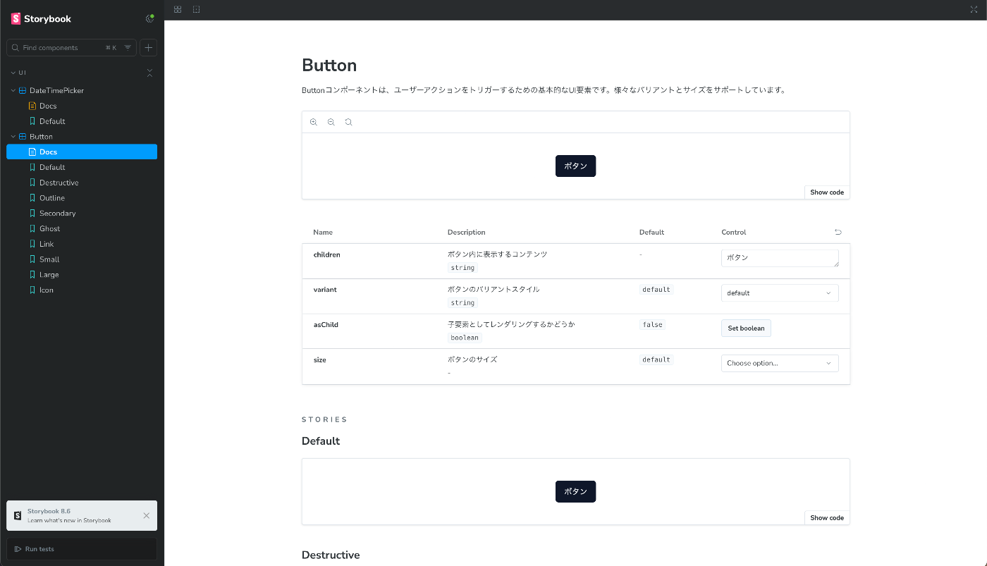
Storybookの導入
Storybookを見るだけの理想のコンポーネント開発を目指して導入。
ページにレンダリングしてモックデータを準備して...の手間を省く。
デザイナーさんとのコミュニケーションの橋渡しにもなる。
package.jsonにビルドコマンドが生える。
package.json
    "storybook": "storybook dev -p 6006",
    "build-storybook": "storybook build",
button.stories.ts
button.stories.ts
import type { Meta, StoryObj } from '@storybook/react'

import { Button } from './button'

// More on how to set up stories at: https://storybook.js.org/docs/writing-stories#default-export
const meta = {
  title: 'UI/Button',
  component: Button,
  parameters: {
    // Optional parameter to center the component in the Canvas. More info: https://storybook.js.org/docs/configure/story-layout
    layout: 'centered',
    docs: {
      description: {
        component:
          'Buttonコンポーネントは、ユーザーアクションをトリガーするための基本的なUI要素です。様々なバリアントとサイズをサポートしています。'
      }
    }
  },
  // This component will have an automatically generated Autodocs entry: https://storybook.js.org/docs/writing-docs/autodocs
  tags: ['autodocs'],
  // More on argTypes: https://storybook.js.org/docs/api/argtypes
  argTypes: {
    variant: {
      control: 'select',
      options: ['default', 'destructive', 'outline', 'secondary', 'ghost', 'link'],
      description: 'ボタンのバリアントスタイル',
      table: {
        defaultValue: { summary: 'default' }
      }
    },
    size: {
      control: 'select',
      options: ['default', 'sm', 'lg', 'icon'],
      description: 'ボタンのサイズ',
      table: {
        defaultValue: { summary: 'default' }
      }
    },
    asChild: {
      control: 'boolean',
      description: '子要素としてレンダリングするかどうか',
      table: {
        defaultValue: { summary: 'false' }
      }
    },
    children: {
      description: 'ボタン内に表示するコンテンツ',
      control: 'text'
    }
  }
} satisfies Meta<typeof Button>

export default meta
type Story = StoryObj<typeof meta>

// More on writing stories with args: https://storybook.js.org/docs/writing-stories/args
export const Default: Story = {
  args: {
    children: 'ボタン',
    variant: 'default'
  }
}

export const Destructive: Story = {
  args: {
    children: '削除',
    variant: 'destructive'
  }
}

export const Outline: Story = {
  args: {
    children: 'アウトライン',
    variant: 'outline'
  }
}

export const Secondary: Story = {
  args: {
    children: 'セカンダリ',
    variant: 'secondary'
  }
}

export const Ghost: Story = {
  args: {
    children: 'ゴースト',
    variant: 'ghost'
  }
}

export const Link: Story = {
  args: {
    children: 'リンク',
    variant: 'link'
  }
}

export const Small: Story = {
  args: {
    children: '小',
    size: 'sm'
  }
}

export const Large: Story = {
  args: {
    children: '大',
    size: 'lg'
  }
}

export const Icon: Story = {
  args: {
    children: '🔍',
    size: 'icon'
  }
}
.storybook/main.ts
main.ts
import type { StorybookConfig } from "@storybook/experimental-nextjs-vite";

import { join, dirname } from "path"

/**
* This function is used to resolve the absolute path of a package.
* It is needed in projects that use Yarn PnP or are set up within a monorepo.
*/
function getAbsolutePath(value: string): any {
  return dirname(require.resolve(join(value, 'package.json')))
}
const config: StorybookConfig = {
  "stories": [
    "../src/**/*.mdx",
    "../src/**/*.stories.@(js|jsx|mjs|ts|tsx)"
  ],
  "addons": [
    getAbsolutePath('@storybook/addon-essentials'),
    getAbsolutePath('@storybook/addon-onboarding'),
    getAbsolutePath('@chromatic-com/storybook'),
    getAbsolutePath("@storybook/experimental-addon-test")
  ],
  "framework": {
    "name": getAbsolutePath("@storybook/experimental-nextjs-vite"),
    "options": {}
  }
};
export default config;
.storybook/preview.ts
preview.ts
import type { Preview } from '@storybook/react'
import '../src/globals.css'

const preview: Preview = {
  parameters: {
    controls: {
      matchers: {
       color: /(background|color)$/i,
       date: /Date$/i,
      },
    },
  },
};

export default preview;
ChromaticでStorybookをデプロイ
ホスティング環境を準備するのはめんどくさいので、chromaticを利用。
無料で運用できて、ホスティング、レビュー、VRT機能付き。

chromaticコマンドが生える。
package.json
"chromatic": "npx chromatic --project-token=",
コンポーネント開発 ディレクトリ戦略
shadcnはcomponents/uiに生成してくる。
/
└─ src
   └─ components
      └─ ui
         ├─ button.tsx
         ├─ button.stories.ts
         └─ avatar.tsx