Open3
Wear Composeを理解する
 下澤健太
下澤健太ScalingLazyColumn
Jetpack Compose: LazyColumn
Wearでリストを作成したいときに使える
@Composable
fun ChatList(messages: List<Message>) {
    ScalingLazyColumn {
        items(20) {
            Chip(
                onClick = { },
                label = { Text("List item $it") },
                colors = ChipDefaults.secondaryChipColors()
            )
        }
    }
}
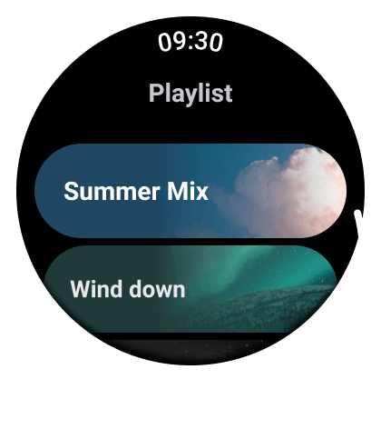
Headerもつけられる
import androidx.compose.foundation.layout.PaddingValues
import androidx.wear.compose.material.Chip
import androidx.wear.compose.material.ListHeader
import androidx.wear.compose.material.ScalingLazyColumn
import androidx.wear.compose.material.Text

ScalingLazyColumn(
    contentPadding = PaddingValues(top = 20.dp, bottom = 20.dp),
    autoCentering = null
) {
    item {
        ListHeader {
            Text(text = "List Header")
        }
    }
    items(20) {
        Chip(
            onClick = { },
            label = { Text("List item $it") },
            colors = ChipDefaults.secondaryChipColors()
        )
    }
}
使い方
ScalingLazyListStateの定義
名前は、「Scaling」の部分を除いてほぼ同じです。LazyListState が LazyColumn の状態を処理するのと同じように、ScalingLazyListState は ScalingLazyColumn の状態を処理します。
val listState = rememberScalingLazyListState()
ScalingLazyColumnの定義
スクロールする手間をほとんどかけずに、画面上部と下部でコンテンツがスケーリングされ、透明度が調整されます。
        ScalingLazyColumn(
            modifier = Modifier.fillMaxSize(),
            contentPadding = PaddingValues(
                top = 32.dp,
                start = 8.dp,
                end = 8.dp,
                bottom = 32.dp
            ),
            verticalArrangement = Arrangement.Center,
            state = listState
        ) {
            item { ButtonExample(contentModifier, iconModifier) }
            item { TextExample(contentModifier) }
            item { CardExample(contentModifier, iconModifier) }
            item { ChipExample(contentModifier, iconModifier) }
            item { ToggleChipExample(contentModifier) }
        }
ToggleChip
codelabの例では
@Composable
fun ToggleChipExample(modifier: Modifier = Modifier) {
    var checked by remember { mutableStateOf(true) }
    ToggleChip(
        modifier = modifier,
        checked = checked,
  // toggleIconとなっているが、IDEでエラーが出る
        toggleIcon = {
            ToggleChipDefaults.SwitchIcon(checked = checked)
        },
        onCheckedChange = {
            checked = it
        },
        label = {
            Text(
                text = "Sound",
                maxLines = 1,
                overflow = TextOverflow.Ellipsis
            )
        }
    )
}
のようにアイコンをtoggleIconで表現しているが、wear-composeの仕様書を見るとtoggleControlとなっている
var checked by remember { mutableStateOf(true) }
// When we have both label and secondary label present limit both to 1 line of text
ToggleChip(
    label = {
        Text("SwitchIcon", maxLines = 1, overflow = TextOverflow.Ellipsis)
    },
    secondaryLabel = {
        Text("With secondary label", maxLines = 1, overflow = TextOverflow.Ellipsis)
    },
    checked = checked,
    // For Switch  toggle controls the Wear Material UX guidance is to set the
    // unselected toggle control color to ToggleChipDefaults.switchUncheckedIconColor()
    // rather than the default.
    colors = ToggleChipDefaults.toggleChipColors(
        uncheckedToggleControlColor = ToggleChipDefaults.SwitchUncheckedIconColor
    ),

 // ここ
    toggleControl = {
        Icon(
            imageVector = ToggleChipDefaults.switchIcon(checked = checked),
            contentDescription = if (checked) "On" else "Off",
        )
    },
    onCheckedChange = { checked = it },
    appIcon = {
        Icon(
            painter = painterResource(id = R.drawable.ic_airplanemode_active_24px),
            contentDescription = "airplane",
            modifier = Modifier.size(24.dp).wrapContentSize(align = Alignment.Center),
        )
    },
    enabled = true,
)
確認したところ、toggleControlを使うっぽい
参考:
下澤健太Scaffold
Scaffold には、アプリバー、FAB、ドロワー、その他のモバイル固有の要素ではなく、モバイルと同様に一般的なパターンで画面を配置するためのレイアウト構造が用意されています。トップレベル コンポーネント(時間、周辺減光、スクロール / 位置インジケーター)を備えた 3 つの Wear 固有のレイアウトをサポートします。
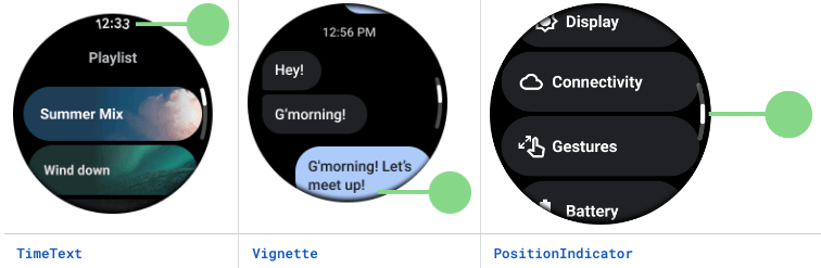
TimeText
スクロールしていないとき、時刻を表示することが求められている(マテリアルガイドライン)
            timeText = {
                if (!listState.isScrollInProgress) {
                    TimeText()
                }
            },
Vignette
スクロールできるとき、時計画面の周りにぼやかしを入れる
            vignette = {
                Vignette(vignettePosition = VignettePosition.TopAndBottom)
            },
PositionIndicator
スクロールバー。現在の場所を示す
            positionIndicator = {
                PositionIndicator(
                    scalingLazyListState = listState
                )
            }
ScalingLazyColumnではなくScaffoldに入れる理由は、ScalingLazyColumnに入れてしまうと画面の湾曲などで正しく表示されないことがあるから。
上記三つの設定をしたScaffoldがこちら
        Scaffold(
            timeText = {
                if (!listState.isScrollInProgress) {
                    TimeText()
                }
            },
            vignette = {
                Vignette(
                    vignettePosition = VignettePosition.TopAndBottom
                )
            },
            positionIndicator = {
                PositionIndicator(
                    scalingLazyListState = listState
                )
            }
        ) {

        }