【Swift】FlutterのコードからSwiftUIを学ぶ
こんにちは、laughtaoneです。
Swift学習中に備忘録として書いていますので、正確な情報でない可能性もありますのでご了承ください。
この記事は、Flutterの経験がある方が、SwiftUIを学び始める際の参考になるように書かれています。
各章の構成として、まず「Flutterコード」と「そのFlutterコードの動作画面」を紹介し、これらと同じ画面や処理をSwiftで書くとどうなるのか紹介します。
そのため、Flutter知識がある方向けのみに書いているため、ご了承ください。
早速、内容に入っていきます。
経緯(読まなくても大丈夫です)
前置き
私は、この記事を書いている時点で 約1年半 の間、Flutter を学習しております。
Flutterを学習し始めた時期は、全く分からず、
「俺プログラミング向いてないわ、、もう1つの夢だった教師に目指すもの変えようかな、、、」
と真剣に考えたこともありました。
ですが、なんとか学んでいくうちに Flutter最高🥹 と思えるほど、Flutterでのアプリ開発が楽しくなっていきました。
そして、Flutterの基礎知識を学び、ある程度のクオリティのアプリ開発を何個かし終えた今、Swiftに興味を持ち出し、色々調べると、
「やっぱSwiftってFlutterと比べて、見た目が綺麗かも?🤔」(個人の感想です)
と感じるようになりました。
確かに、Flutterは1つのコードで、iOSとAndroid、さらにはWebなどにもビルドできるので、かなり便利ではあるのですが、見た目や使い心地で、自分の価値観では少し不満がありました。
そこで、Swiftを少しだけいじってみると、見た目が美しすぎると感じたため、最近はSwiftにめちゃくちゃ興味を持っています(単純にFlutterに飽きただけ説)。
また、Flutterを学んでいる自分なら、「Flutterのコードと同じ見た目・機能を持たすために、Swiftではどう書くのか」を調べながら学習するのがいいと考え、当記事を書くことになりました。
Text
Flutterでの Text は、SwiftUIでは全く同じ「Text」です。
引数に文字列を指定するところも同じです。
例として、次のように全く同じです。
Text("HELLO")
Text("HELLO")
Textのカスタマイズ
しかし、Textのカスタマイズは異なります。
ここでのカスタマイズは、テキストのフォントやサイズ、色などのテキストスタイルの指定方法が異なるということです。
例として、"HELLO"というテキストを、大きさ24・太字・青い文字色にカスタマイズする場合、このようになります。
Text(
  "HELLO",
  style: TextStyle(
    fontSize: 24,
    fontWeight: FontWeight.bold,
    color: Colors.blue
  ),
)
Text("HELLO")
    .font(.system(
        size: 24,
        weight: .bold
    ))
    .foregroundColor(.blue)
Icon
Flutterでの Icon は、SwiftUIでは「Image」に当たります。
例として、家のアイコンを表示させる場合、このようになります。
Icon(Icons.home)
Image(systemName: "house")
なお、Swiftでのアイコンは、次のリンクからダウンロードできるソフトを入れると、簡単に検索できます。
Row
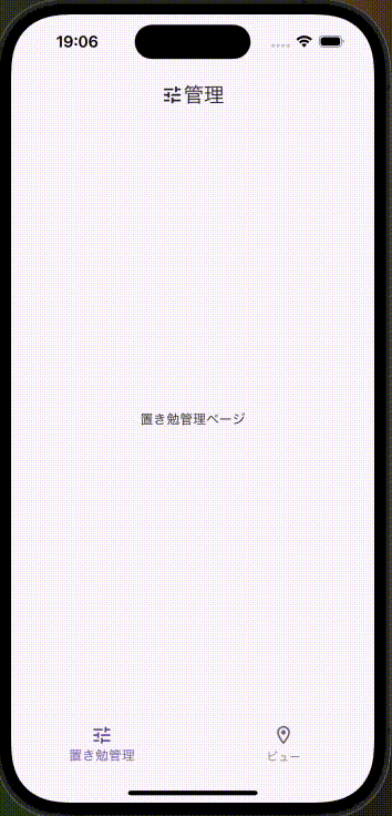
Flutterでの Row は、SwiftUIでは「HStack」に当たります。
例として、アイコンと文字を横に並べるコードは次の通りです。
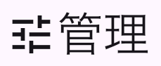
Row(
  children: [
    Icon(Icons.tune),
    Text('管理'),
  ],
)
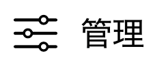
HStack {
    Image(systemName: "slider.horizontal.3")
    Text("Home")
}
Rowのカスタマイズ
Row には、配置を指定することができますが、SwiftUIの HStack でも同様に指定することができます。
例として、先ほどのコードで、配置を中央に指定してみます。
Row(
  mainAxisAlignment: MainAxisAlignment.center,
  children: [
    Icon(Icons.tune),
    Text('管理'),
  ],
)
HStack(alignment: .center) {
    Image(systemName: "slider.horizontal.3")
    Text("Home")
}
SwiftUIでは、HStack の引数に alignment として指定することで、配置の指定を実現することができます。
.center の他にも、.top や .bottom などの配置を指定することもできます。
Column
Flutterでの Column は、SwiftUIでは「VStack」に当たります。
VStack の使い方は、HStackと同じです。
ちなみに、HStack のHは「Horizontal」の頭文字、VStack のVは「Vertical」の頭文字です。
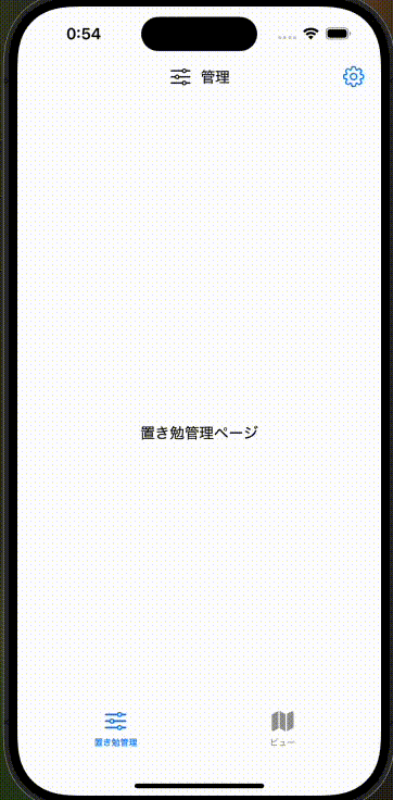
AppBar
Flutterでの AppBar は、SwiftUIでは「NavigationBar」に当たります。
例として、先ほどの Row を AppBar(NavigationBar) の要素としたものを作ってみます。
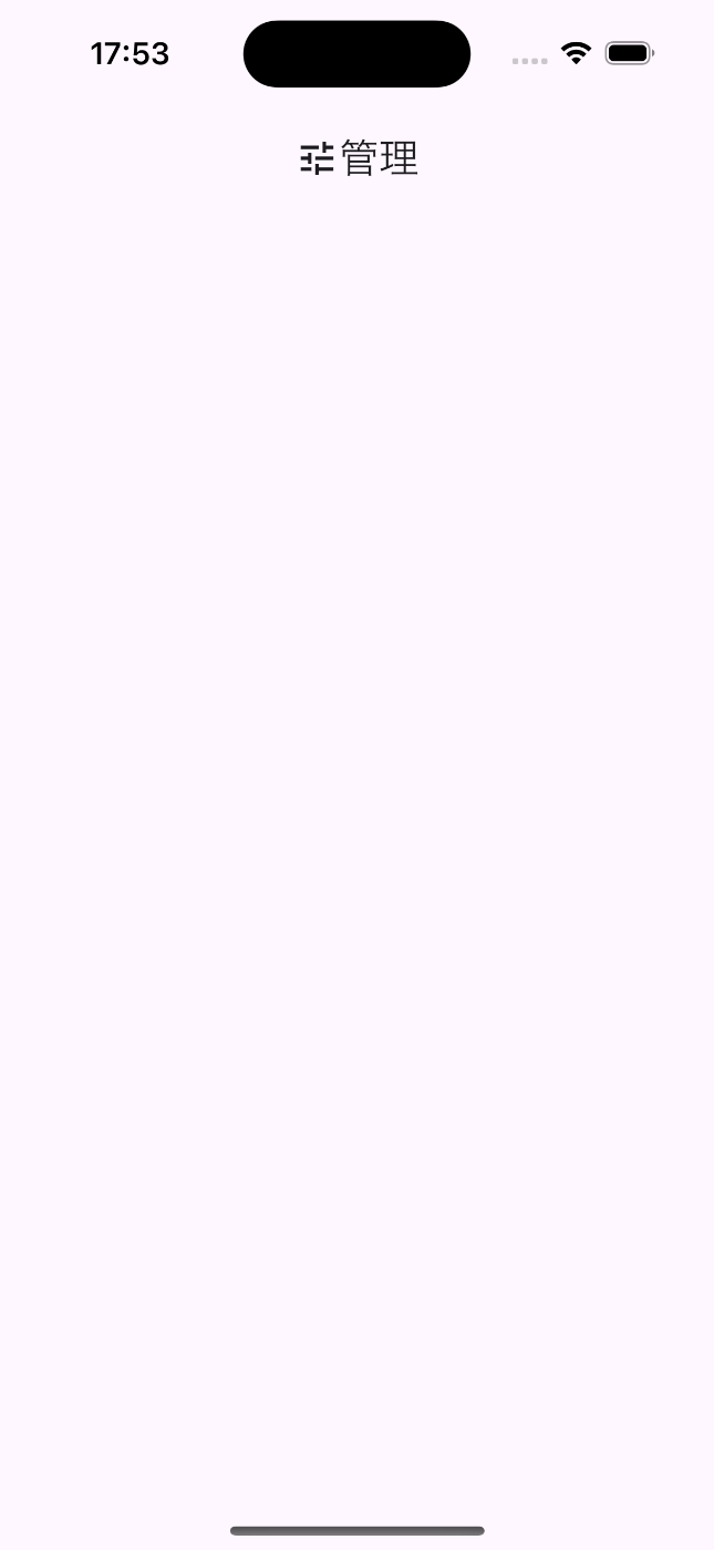
AppBar(
  title: Row(
    mainAxisAlignment: MainAxisAlignment.center,
    children: [
      Icon(Icons.tune),
      Text('管理'),
    ]
  ),
  centerTitle: true,
)
全体コード
import SwiftUI

struct ContentView: View {
    var body: some View {
        NavigationView {
            // ------------ アプリ上部タイトル(=FlutterのAppBar) ------------
            Text("")
                .padding()
                .navigationBarTitleDisplayMode(.inline)
                .toolbar {
                    ToolbarItem(placement: .principal) {
                        HStack {
                            Image(systemName: "slider.horizontal.3")
                            Text("管理")
                        }
                    }
                }
            // -----------------------------------------------------------
        }
    }
}

#Preview {
    ContentView()
}

NavigationView {
    Text("")
        .padding()
        .navigationBarTitleDisplayMode(.inline)
        .toolbar {
            ToolbarItem(placement: .principal) {
                HStack {
                    Image(systemName: "slider.horizontal.3")
                    Text("管理")
                }
            }
        }
}
全体コード
import SwiftUI

struct ContentView: View {
    var body: some View {
        NavigationView {
            // ------------ アプリ上部タイトル(=FlutterのAppBar) ------------
            Text("")
                .padding()
                .navigationBarTitleDisplayMode(.inline)
                .toolbar {
                    ToolbarItem(placement: .principal) {
                        HStack {
                            Image(systemName: "slider.horizontal.3")
                            Text("管理")
                        }
                    }
                }
            // -----------------------------------------------------------
        }
    }
}

#Preview {
    ContentView()
}
AppBarのactions
Flutterの AppBar では、actions を使うことで、AppBar右側にボタンを配置することができると思います。
これをSwiftUIでは、ToolbarItemの引数の placement を .navigationBarTrailing に指定することで、右側に表示させることができます。
例えば、さっきのコードで右側に設定ボタンを配置し、その場ボタンを押したら「ボタンが押されたお」とprintするコードは、次のようになります。
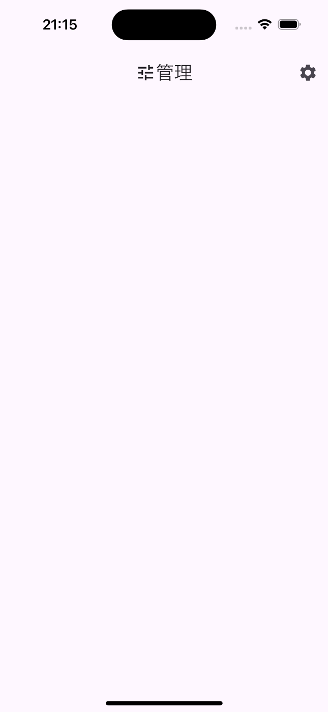
AppBar(
  // - - - - - - 真ん中のタイトル - - - - - -
  title: Row(
    mainAxisAlignment: MainAxisAlignment.center,
    mainAxisSize: MainAxisSize.min,
    children: [
      Icon(Icons.tune),
      Text('管理'),
    ]
  ),
  // - - - - - - - - - - - - - - - - - - -
  centerTitle: true,
  // - - - - - - - 設定ボタン - - - - - - -
  actions: [
    IconButton(
      icon: Icon(Icons.settings),
      onPressed: () {
        debugPrint('ボタンが押されたお');
      },
    )
  ],
  // - - - - - - - - - - - - - - - - - - -
)
全体コード
import 'package:flutter/material.dart';
import 'settings_page.dart';
void main() {
runApp(
const StartPageHome()
);
}
class StartPageHome extends StatelessWidget {
const StartPageHome({super.key});
Widget build(BuildContext context) {
return const MaterialApp(
debugShowCheckedModeBanner: false,
home: StartPage(),
);
}
}
class StartPage extends StatefulWidget {
const StartPage({super.key});
StartPageState createState() => StartPageState();
}
class StartPageState extends State<StartPage> {
Widget build(BuildContext context) {
return Scaffold(
// --------------------- AppBar --------------------
appBar: AppBar(
title: Row(
mainAxisAlignment: MainAxisAlignment.center,
mainAxisSize: MainAxisSize.min,
children: [
Icon(Icons.tune),
Text('管理'),
]
),
centerTitle: true,
actions: [
IconButton(
icon: Icon(Icons.settings),
onPressed: () {
debugPrint('ボタンが押されたお');
},
)
],
),
// ------------------------------------------------
);
}
}

Text("")
    .padding()
    .navigationBarTitleDisplayMode(.inline)
    .toolbar {
        // - - - - - - 真ん中のタイトル - - - - - -
        ToolbarItem(placement: .principal) {
            HStack {
                Image(systemName: "slider.horizontal.3")
                Text("管理")
            }
        }
        // - - - - - - - - - - - - - - - - - - -
        // - - - - - - - 設定ボタン - - - - - - -
        ToolbarItem(placement: .navigationBarTrailing) {
            Button(action: {
                print("ボタンが押されたお")
            }) {
                Image(systemName: "gearshape")
            }
        }
        // - - - - - - - - - - - - - - - - - - -
    }
全体コード
import SwiftUI

struct ContentView: View {
    @State private var selectedTab = 0

    var body: some View {
        NavigationView {
            VStack {
                // ------------ アプリ上部タイトル(=FlutterのAppBar) ------------
                Text("")
                    .padding()
                    .navigationBarTitleDisplayMode(.inline)
                    .toolbar {
		                    // - - - - - - 真ん中のタイトル - - - - - -
                        ToolbarItem(placement: .principal) {
                            HStack {
                                Image(systemName: "slider.horizontal.3")
                                Text("管理")
                            }
                        }
                        // - - - - - - - - - - - - - - - - - - -
                        // - - - - - - - 設定ボタン - - - - - - -
                        ToolbarItem(placement: .navigationBarTrailing) {
                            Button(action: {
                                print("ボタンが押されたお")
                            }) {
                                Image(systemName: "gearshape")
                            }
                        }
                        // - - - - - - - - - - - - - - - - - - -
                    }
                // -----------------------------------------------------------

                // -------- アプリ下部タブ(=FlutterのBottomNavigationBar) --------
                TabView {
                    Text("置き勉管理ページ")
                        .tabItem {
                            Image(systemName: "slider.horizontal.3")
                            Text("置き勉管理")
                        }
                        .tag(0)

                    Text("ビューページ")
                        .tabItem {
                            Image(systemName: "map")
                            Text("ビュー")
                        }
                        .tag(1)
                }
                .frame(maxHeight: .infinity) // TabViewの高さを最大化
                // -----------------------------------------------------------
            }
            .padding()
        }
    }
}

#Preview {
    ContentView()
}
BottomNavigationBar
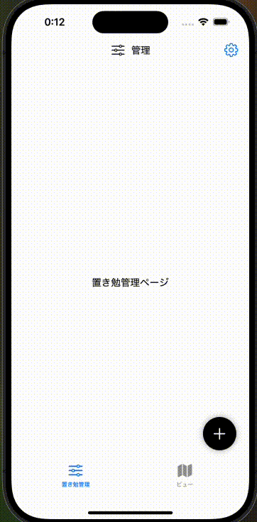
Flutterで画面下部にタブを表示させる BottomNavigationBar は、Swiftでは 「TabView」 に当たります。
例えば、画面下部に2つのタブを用意する場合、次のようになります。
int currentIndex = 0;
// --------------------- body --------------------
body: currentIndex == 0 ? Center(
  child: Text('置き勉管理ページ'),
) : Center(
  child: Text('ビュー管理ページ'),
),
// -------------------------------------------------

// --------------- bottomNavigationBar -------------
bottomNavigationBar: BottomNavigationBar(
  items: const <BottomNavigationBarItem>[
    BottomNavigationBarItem(
      icon: Icon(Icons.tune_outlined),
      label: '置き勉管理',
    ),
    BottomNavigationBarItem(
      icon: Icon(Icons.location_on_outlined),
      label: 'ビュー',
    )
  ],
  currentIndex: currentIndex,
  onTap: (int index) {
    setState(() {
      currentIndex = index;
    });
  },
),
// -------------------------------------------------
全体コード
import 'package:flutter/material.dart';
import 'settings_page.dart';
void main() {
runApp(
const StartPageHome()
);
}
class StartPageHome extends StatelessWidget {
const StartPageHome({super.key});
Widget build(BuildContext context) {
return const MaterialApp(
debugShowCheckedModeBanner: false,
home: StartPage(),
);
}
}
class StartPage extends StatefulWidget {
const StartPage({super.key});
StartPageState createState() => StartPageState();
}
class StartPageState extends State<StartPage> {
int currentIndex = 0;
Widget build(BuildContext context) {
return Scaffold(
// --------------------- AppBar --------------------
appBar: AppBar(
title: Row(
mainAxisAlignment: MainAxisAlignment.center,
mainAxisSize: MainAxisSize.min,
children: [
Icon(Icons.tune),
Text('管理'),
]
),
centerTitle: true,
actions: [
IconButton(
icon: Icon(Icons.settings),
onPressed: () {
debugPrint('ボタンが押されたお');
},
)
],
),
// ------------------------------------------------
// --------------------- body --------------------
body: currentIndex == 0 ? Center(
child: Text('置き勉管理ページ'),
) : Center(
child: Text('ビュー管理ページ'),
),
// -------------------------------------------------
// --------------- bottomNavigationBar -------------
bottomNavigationBar: BottomNavigationBar(
items: const <BottomNavigationBarItem>[
BottomNavigationBarItem(
icon: Icon(Icons.tune_outlined),
label: '置き勉管理',
),
BottomNavigationBarItem(
icon: Icon(Icons.location_on_outlined),
label: 'ビュー',
)
],
currentIndex: currentIndex,
onTap: (int index) {
setState(() {
currentIndex = index;
});
},
),
// -------------------------------------------------
);
}
}
@State private var selectedTab = 0
TabView {
    // 置き勉管理ページ
    PlaceStudyManagementView()
        .tabItem {
            Image(systemName: "slider.horizontal.3")
            Text("置き勉管理")
        }
        .tag(0)

    // ビューページ
    ViewPage()
        .tabItem {
            Image(systemName: "map")
            Text("ビュー")
        }
        .tag(1)
}
.frame(maxHeight: .infinity) // TabViewの高さを最大化
全体コード
import SwiftUI

struct ContentView: View {
    @State private var selectedTab = 0

    var body: some View {
        NavigationView {
            VStack {
                // ------------ アプリ上部タイトル(=FlutterのAppBar) ------------
                Text("")
                    .padding()
                    .navigationBarTitleDisplayMode(.inline)
                    .toolbar {
                        // - - - - - - 真ん中のタイトル - - - - - -
                        ToolbarItem(placement: .principal) {
                            HStack {
                                Image(systemName: "slider.horizontal.3")
                                Text("管理")
                            }
                        }
                        // - - - - - - - - - - - - - - - - - - -
                        // - - - - - - - 設定ボタン - - - - - - -
                        ToolbarItem(placement: .navigationBarTrailing) {
                            Button(action: {
                                print("ボタンが押されたお")
                            }) {
                                Image(systemName: "gearshape")
                            }
                        }
                        // - - - - - - - - - - - - - - - - - - -
                    }
                // -----------------------------------------------------------

                // -------- アプリ下部タブ(=FlutterのBottomNavigationBar) --------
                TabView {
                    // 置き勉管理ページ
                    PlaceStudyManagementView()
                        .tabItem {
                            Image(systemName: "slider.horizontal.3")
                            Text("置き勉管理")
                        }
                        .tag(0)

                    // ビューページ
                    ViewPage()
                        .tabItem {
                            Image(systemName: "map")
                            Text("ビュー")
                        }
                        .tag(1)
                }
                .frame(maxHeight: .infinity) // TabViewの高さを最大化
                // -----------------------------------------------------------
            }
            .padding()
        }
    }
}

struct PlaceStudyManagementView: View {
    var body: some View {
        VStack {
            Text("置き勉管理ページ")
                .padding()
        }
    }
}

struct ViewPage: View {
    var body: some View {
        VStack {
            Text("ビューページ")
                .padding()
        }
    }
}

#Preview {
    ContentView()
}
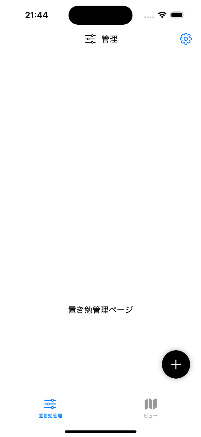
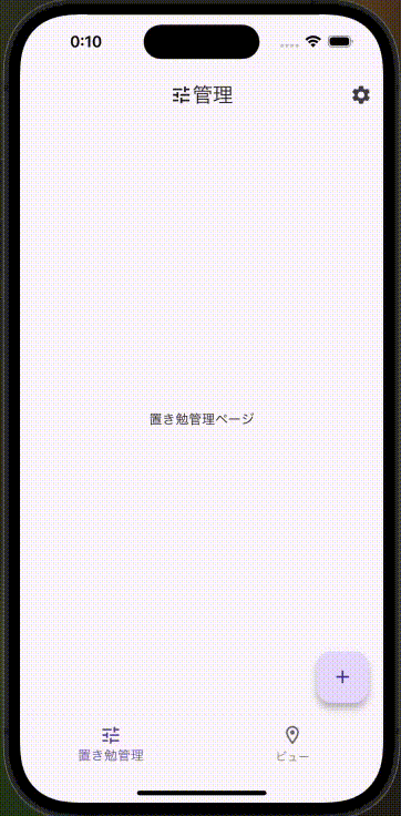
FloatActionButton
Flutterでの FloatActionButton は、Swiftでは直接該当するものはありません。
したがって、FloatActionButtonと同じ動作をするようにSwiftで作成していく必要があります。
まずは、Flutterコードを見ていきます。

floatingActionButton: FloatingActionButton(
  onPressed: () {
    debugPrint('右下の+ボタンが押されたお');
  },
  child: Icon(Icons.add),
),
全体コード
import 'package:flutter/material.dart';
import 'settings_page.dart';

void main() {
  runApp(
    const StartPageHome()
  );
}

class StartPageHome extends StatelessWidget {
  const StartPageHome({super.key});

  @override
  Widget build(BuildContext context) {
    return const MaterialApp(
      debugShowCheckedModeBanner: false,
      home: StartPage(),
    );
  }
}

class StartPage extends StatefulWidget {
  const StartPage({super.key});

  @override
  StartPageState createState() => StartPageState();
}

class StartPageState extends State<StartPage> {
  int currentIndex = 0;


  @override
  Widget build(BuildContext context) {
    return Scaffold(
      // --------------------- AppBar --------------------
      appBar: AppBar(
        title: Row(
          mainAxisAlignment: MainAxisAlignment.center,
          mainAxisSize: MainAxisSize.min,
          children: [
            Icon(Icons.tune),
            Text('管理'),
          ]
        ),
        centerTitle: true,
        actions: [
          IconButton(
            icon: Icon(Icons.settings),
            onPressed: () {
              debugPrint('ボタンが押されたお');
            },
          )
        ],
      ),
      // ------------------------------------------------
      // --------------------- body --------------------
      body: currentIndex == 0 ? Center(
        child: Text('置き勉管理ページ'),
      ) : Center(
        child: Text('ビュー管理ページ'),
      ),
      // -------------------------------------------------

      // --------------- bottomNavigationBar -------------
      bottomNavigationBar: BottomNavigationBar(
        items: const <BottomNavigationBarItem>[
          BottomNavigationBarItem(
            icon: Icon(Icons.tune_outlined),
            label: '置き勉管理',
          ),
          BottomNavigationBarItem(
            icon: Icon(Icons.location_on_outlined),
            label: 'ビュー',
          )
        ],
        currentIndex: currentIndex,
        onTap: (int index) {
          setState(() {
            currentIndex = index;
          });
        },
      ),
      // -------------------------------------------------

      // --------------- floatingActionButton -------------
      floatingActionButton: FloatingActionButton(
        onPressed: () {
          debugPrint('右下の+ボタンが押されたお');
        },
        child: Icon(Icons.add),
      ),
      // -------------------------------------------------
    );
  }
}
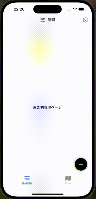
Flutterだと、めちゃくちゃ簡単に右下にボタンを配置することができることがわかると思います。
これをSwiftで実現させると、次のようになります。
ZStack {
    // -------- 画面右下のボタン(=FlutterのFloatActionButton) --------
    VStack {
        Spacer()
        HStack {
            Spacer()
            Button(action: {
                print("右下の+ボタンが押されたお")
            }) {
                Image(systemName: "plus")
                    .font(.system(size: 24))
                    .padding()
                    .background(Color.black)
                    .foregroundColor(.white)
                    .clipShape(Circle())
                    .shadow(radius: 5)
            }
            .padding(.trailing, 20)  // 右側の余白
            .padding(.bottom, 80)    // 下側の余白
        }
    }
    // -----------------------------------------------------------
}
全体コード
import SwiftUI

struct ContentView: View {
    @State private var selectedTab = 0

    var body: some View {
        NavigationView {
            ZStack {
                VStack {
                    // ------------ アプリ上部タイトル(=FlutterのAppBar) ------------
                    Text("")
                        .padding()
                        .navigationBarTitleDisplayMode(.inline)
                        .toolbar {
                            // - - - - - - 真ん中のタイトル - - - - - -
                            ToolbarItem(placement: .principal) {
                                HStack {
                                    Image(systemName: "slider.horizontal.3")
                                    Text("管理")
                                }
                            }
                            // - - - - - - - - - - - - - - - - - - -
                            // - - - - - - - 設定ボタン - - - - - - -
                            ToolbarItem(placement: .navigationBarTrailing) {
                                Button(action: {
                                    print("ボタンが押されたお")
                                }) {
                                    Image(systemName: "gearshape")
                                }
                            }
                            // - - - - - - - - - - - - - - - - - - -
                        }
                    // -----------------------------------------------------------

                    // -------- アプリ下部タブ(=FlutterのBottomNavigationBar) --------
                    TabView {
                        // 置き勉管理ページ
                        ManagePage()
                            .tabItem {
                                Image(systemName: "slider.horizontal.3")
                                Text("置き勉管理")
                            }
                            .tag(0)

                        // ビューページ
                        ViewPage()
                            .tabItem {
                                Image(systemName: "map")
                                Text("ビュー")
                            }
                            .tag(1)
                    }
                    .frame(maxHeight: .infinity) // TabViewの高さを最大化
                    // -----------------------------------------------------------
                }
                .padding()

                // -------- 画面右下のボタン(=FlutterのFloatActionButton) --------
                VStack {
                    Spacer()
                    HStack {
                        Spacer()
                        Button(action: {
                            print("右下の+ボタンが押されたお")
                        }) {
                            Image(systemName: "plus")
                                .font(.system(size: 24))
                                .padding()
                                .background(Color.black)
                                .foregroundColor(.white)
                                .clipShape(Circle())
                                .shadow(radius: 5)
                        }
                        .padding(.trailing, 20)  // 右側の余白
                        .padding(.bottom, 80)    // 下側の余白
                    }
                }
                // -----------------------------------------------------------
            }
        }
    }
}

struct ManagePage: View {
    var body: some View {
        VStack {
            Text("置き勉管理ページ")
                .padding()
        }
    }
}

struct ViewPage: View {
    var body: some View {
        VStack {
            Text("ビューページ")
                .padding()
        }
    }
}

#Preview {
    ContentView()
}
このコードでどのように FloatActionButton を実現しているかというと、
-
ZStackで、画面奥行き方向に要素を重ね、ボタンを画面の最前層に配置させる-
ZStackの引数{}内において、後ろに書いたコードほど手前の層に配置される
-
-
VStackとHStackでボタンを囲み、それぞれの間にSpacer()を入れることで、ボタンが右下に押しやられる - ボタンの右と下に余白を足すことで、ボタンの配置を微調整する
-
.trailingで右側の余白を指定 -
.bottomで下側の余白を指定
-
という感じで実現しています。
この点では、Flutterの方が最初から用意されているので楽ですよね。
画面遷移
次のように、設定アイコンを押して、設定画面 (SettingPage) に遷移する場合を考えます。
Flutterでは、このように書くことができます。
IconButton(
  icon: Icon(Icons.settings),
  onPressed: () {
    Navigator.push(
      context,
      MaterialPageRoute(
        builder: (context) => SettingPage(),
      ),
    );
  },
)
全体コード
import 'package:flutter/material.dart';
import 'setting_page.dart';
void main() {
runApp(
const StartPageHome()
);
}
class StartPageHome extends StatelessWidget {
const StartPageHome({super.key});
Widget build(BuildContext context) {
return const MaterialApp(
debugShowCheckedModeBanner: false,
home: StartPage(),
);
}
}
class StartPage extends StatefulWidget {
const StartPage({super.key});
StartPageState createState() => StartPageState();
}
class StartPageState extends State<StartPage> {
int currentIndex = 0;
Widget build(BuildContext context) {
return Scaffold(
// --------------------- AppBar --------------------
appBar: AppBar(
title: Row(
mainAxisAlignment: MainAxisAlignment.center,
mainAxisSize: MainAxisSize.min,
children: [
Icon(Icons.tune),
Text('管理'),
]
),
centerTitle: true,
actions: [
IconButton(
icon: Icon(Icons.settings),
onPressed: () {
Navigator.push(
context,
MaterialPageRoute(
builder: (context) => SettingPage(),
),
);
},
)
],
),
// ------------------------------------------------
// --------------------- body --------------------
body: currentIndex == 0 ? Center(
child: Text('置き勉管理ページ'),
) : Center(
child: Text('ビュー管理ページ'),
),
// -------------------------------------------------
// --------------- bottomNavigationBar -------------
bottomNavigationBar: BottomNavigationBar(
items: const <BottomNavigationBarItem>[
BottomNavigationBarItem(
icon: Icon(Icons.tune_outlined),
label: '置き勉管理',
),
BottomNavigationBarItem(
icon: Icon(Icons.location_on_outlined),
label: 'ビュー',
)
],
currentIndex: currentIndex,
onTap: (int index) {
setState(() {
currentIndex = index;
});
},
),
// -------------------------------------------------
// --------------- floatingActionButton -------------
floatingActionButton: FloatingActionButton(
onPressed: () {
debugPrint('右下の+ボタンが押されたお');
},
child: Icon(Icons.add),
),
// -------------------------------------------------
);
}
}
import 'package:flutter/material.dart';
class SettingPage extends StatefulWidget {
const SettingPage({super.key});
SettingPageState createState() => SettingPageState();
}
class SettingPageState extends State<SettingPage> {
Widget build(BuildContext context) {
return Scaffold(
appBar: AppBar(
title: Row(
mainAxisAlignment: MainAxisAlignment.center,
mainAxisSize: MainAxisSize.min,
children: [
Icon(Icons.settings),
Text('設定'),
],
),
),
body: Center(
child: Text('設定画面')
),
);
}
}
押した時の動作は、大抵 onPressed に指定してあげればいけますね。
これを、Swiftで書くと次のようになります。
NavigationLink(destination: SettingPage()) {
    Image(systemName: "gearshape")
}
全体コード
import SwiftUI

struct ContentView: View {
    @State private var selectedTab = 0

    var body: some View {
        NavigationView {
            ZStack {
                VStack {
                    // ------------ アプリ上部タイトル(=FlutterのAppBar) ------------
                    Text("")
                        .padding()
                        .navigationBarTitleDisplayMode(.inline)
                        .toolbar {
                            // - - - - - - 真ん中のタイトル - - - - - -
                            ToolbarItem(placement: .principal) {
                                HStack {
                                    Image(systemName: "slider.horizontal.3")
                                    Text("管理")
                                }
                            }
                            // - - - - - - - - - - - - - - - - - - -
                            // - - - - - - - 設定ボタン - - - - - - -
                            ToolbarItem(placement: .navigationBarTrailing) {
                                NavigationLink(destination: SettingPage()) {
                                    Image(systemName: "gearshape")
                                }
                            }
                            // - - - - - - - - - - - - - - - - - - -
                        }
                    // -----------------------------------------------------------

                    // -------- アプリ下部タブ(=FlutterのBottomNavigationBar) --------
                    TabView {
                        // 置き勉管理ページ
                        ManagePage()
                            .tabItem {
                                Image(systemName: "slider.horizontal.3")
                                Text("置き勉管理")
                            }
                            .tag(0)

                        // ビューページ
                        ViewPage()
                            .tabItem {
                                Image(systemName: "map")
                                Text("ビュー")
                            }
                            .tag(1)
                    }
                    .frame(maxHeight: .infinity) // TabViewの高さを最大化
                    // -----------------------------------------------------------
                }
                .padding()

                // -------- 画面右下のボタン(=FlutterのFloatActionButton) --------
                VStack {
                    Spacer()
                    HStack {
                        Spacer()
                        Button(action: {
                            print("右下の+ボタンが押されたお")
                        }) {
                            Image(systemName: "plus")
                                .font(.system(size: 24))
                                .padding()
                                .background(Color.black)
                                .foregroundColor(.white)
                                .clipShape(Circle())
                                .shadow(radius: 5)
                        }
                        .padding(.trailing, 20)  // 右側の余白
                        .padding(.bottom, 80)    // 下側の余白
                    }
                }
                // -----------------------------------------------------------
            }
        }
    }
}

struct ManagePage: View {
    var body: some View {
        VStack {
            Text("置き勉管理ページ")
                .padding()
        }
    }
}

struct ViewPage: View {
    var body: some View {
        VStack {
            Text("ビューページ")
                .padding()
        }
    }
}

#Preview {
    ContentView()
}
import SwiftUI

struct SettingPage: View {
    var body: some View {
        // ------------ アプリ上部タイトル(=FlutterのAppBar) ------------
        Text("設定画面")
            .padding()
            .navigationBarTitleDisplayMode(.inline)
            .toolbar {
                ToolbarItem(placement: .principal) {
                    HStack {
                        Image(systemName: "gearshape")
                        Text("設定")
                    }
                }
            }
        // -----------------------------------------------------------
    }
}


#Preview {
    SettingPage()
}
NavigationLink は 押したら自動で画面遷移するボタン、その引数 destination に遷移先を指定することで、上記のFlutterコードと同じ役割を果たしています。
Flutter の onPressed は、Swiftでは onTapGesture や Button の action に当たりますが、遷移自体は NavigationLink が担っているため、 ここでは別途指定する必要はありません。
ダイアログ
Flutterには、ダイアログにいくつか種類がありますが、ここでは AlertDialog を紹介します。
このようなダイアログを作ってみます。
TextButton(
  onPressed: () {
    showDialog(
      context: context,
      builder: (context) {
        return AlertDialog(
          title: Text('ダイアログ'),
          content: Text('本文'),
          actions: <Widget>[
            TextButton(
              onPressed: () => Navigator.pop(context),
              child: Text('OK'),
            ),
          ],
        );
      },
    );
  },
  child: Text('ダイアログを開く'),
)
全体コード
import 'package:flutter/material.dart';
import 'setting_page.dart';
void main() {
runApp(
const StartPageHome()
);
}
class StartPageHome extends StatelessWidget {
const StartPageHome({super.key});
Widget build(BuildContext context) {
return const MaterialApp(
debugShowCheckedModeBanner: false,
home: StartPage(),
);
}
}
class StartPage extends StatefulWidget {
const StartPage({super.key});
StartPageState createState() => StartPageState();
}
class StartPageState extends State<StartPage> {
int currentIndex = 0;
Widget build(BuildContext context) {
return Scaffold(
// --------------------- AppBar --------------------
appBar: AppBar(
title: Row(
mainAxisAlignment: MainAxisAlignment.center,
mainAxisSize: MainAxisSize.min,
children: [
Icon(Icons.tune),
Text('管理'),
]
),
centerTitle: true,
actions: [
IconButton(
icon: Icon(Icons.settings),
onPressed: () {
Navigator.push(
context,
MaterialPageRoute(
builder: (context) => SettingPage(),
),
);
},
)
],
),
// ------------------------------------------------
// --------------------- body --------------------
body: currentIndex == 0 ? Center(
child: Text('置き勉管理ページ'),
) : Center(
child: Text('ビュー管理ページ'),
),
// -------------------------------------------------
// --------------- bottomNavigationBar -------------
bottomNavigationBar: BottomNavigationBar(
items: const <BottomNavigationBarItem>[
BottomNavigationBarItem(
icon: Icon(Icons.tune_outlined),
label: '置き勉管理',
),
BottomNavigationBarItem(
icon: Icon(Icons.location_on_outlined),
label: 'ビュー',
)
],
currentIndex: currentIndex,
onTap: (int index) {
setState(() {
currentIndex = index;
});
},
),
// -------------------------------------------------
// --------------- floatingActionButton -------------
floatingActionButton: FloatingActionButton(
onPressed: () {
showDialog(
context: context,
builder: (context) {
return AlertDialog(
title: Text('ダイアログ'),
content: Text('本文'),
actions: <Widget>[
TextButton(
onPressed: () => Navigator.pop(context),
child: Text('OK'),
),
],
);
},
);
},
child: Icon(Icons.add),
),
// -------------------------------------------------
);
}
}
@State private var showingAlert = false
Button("ダイアログを開く") {
    showingAlert = true
}
.alert(isPresented: $showingAlert) {
    Alert(
        title: Text("ダイアログ"),
        message: Text("本文"),
        dismissButton: .default(Text("OK"))
    )
}
全体コード
import SwiftUI

struct ContentView: View {
    @State private var selectedTab = 0
    @State private var showingDialog = false

    var body: some View {
        NavigationView {
            ZStack {
                VStack {
                    // ------------ アプリ上部タイトル(=FlutterのAppBar) ------------
                    Text("")
                        .padding()
                        .navigationBarTitleDisplayMode(.inline)
                        .toolbar {
                            // - - - - - - 真ん中のタイトル - - - - - -
                            ToolbarItem(placement: .principal) {
                                HStack {
                                    Image(systemName: "slider.horizontal.3")
                                    Text("管理")
                                }
                            }
                            // - - - - - - - - - - - - - - - - - - -
                            // - - - - - - - 設定ボタン - - - - - - -
                            ToolbarItem(placement: .navigationBarTrailing) {
                                Button(action: {
                                    print("ボタンが押されたお")
                                }) {
                                    Image(systemName: "gearshape")
                                }
                            }
                            // - - - - - - - - - - - - - - - - - - -
                        }
                    // -----------------------------------------------------------

                    // -------- アプリ下部タブ(=FlutterのBottomNavigationBar) --------
                    TabView {
                        // 置き勉管理ページ
                        ManagePage()
                            .tabItem {
                                Image(systemName: "slider.horizontal.3")
                                Text("置き勉管理")
                            }
                            .tag(0)

                        // ビューページ
                        ViewPage()
                            .tabItem {
                                Image(systemName: "map")
                                Text("ビュー")
                            }
                            .tag(1)
                    }
                    .frame(maxHeight: .infinity) // TabViewの高さを最大化
                    // -----------------------------------------------------------
                }
                .padding()

                // -------- 画面右下のボタン(=FlutterのFloatActionButton) --------
                VStack {
                    Spacer()
                    HStack {
                        Spacer()
                        Button(action: {
                            showingDialog = true
                            print("右下の+ボタンが押されたお")
                        }) {
                            Image(systemName: "plus")
                                .font(.system(size: 24))
                                .padding()
                                .background(Color.black)
                                .foregroundColor(.white)
                                .clipShape(Circle())
                                .shadow(radius: 5)
                        }
                        .padding(.trailing, 20)  // 右側の余白
                        .padding(.bottom, 80)    // 下側の余白
                        .alert(isPresented: $showingDialog) {
                            Alert(
                                title: Text("ダイアログ"),
                                message: Text("本文"),
                                dismissButton: .default(Text("OK"))
                            )
                        }
                    }
                }
                // -----------------------------------------------------------
            }
        }
    }
}

struct ManagePage: View {
    var body: some View {
        VStack {
            Text("置き勉管理ページ")
                .padding()
        }
    }
}

struct ViewPage: View {
    var body: some View {
        VStack {
            Text("ビューページ")
                .padding()
        }
    }
}

#Preview {
    ContentView()
}
Swiftの場合、ダイアログを表示しているかどうかの変数を宣言しなければならない点に注意が必要です。また .alert の引数 isPresented において、true になったらダイアログ表示、false になったらダイアログ非表示となり、この引数の値にダイアログを表示しているかどうかの変数を指定しています。
まとめ
今回は、Flutterの基本的なコードを、SwiftUIに例えるとどうなるかまとめました。
まとめておくことで自分が見返すときに超わかりやすいので、少し時間をかけてある程度キレイに整理して書いてみました。
少しでも参考になれば幸いです。
Discussion