1. はじめに
ついに、ProximityPromptのカスタムUIも最終回です。
まだ前回までの記事を読んでいない方は、先にこちらをご覧ください。
前回までで、ボタンを押したらすぐ反応するProximityPromptのUIとして必要な機能は揃いました。
今回は最後に残った要素として、Hold入力中の進捗ゲージの表示を行います。
DefaultのUIと同様の円形のゲージを実装してみようと思います。
バージョン:0.672.0.6720706
2. 円形ゲージの理屈
円形のゲージって、どうやって作ったらいいのかちょっと悩んでしまいますよね。
というわけで、作成中にイメージをしやすいよう、今回の手法を先に説明しておきます。
まず、ClipsDescendantsをtrueにしたFrameの子に半円の画像を置き、範囲外に配置して隠しておきます。
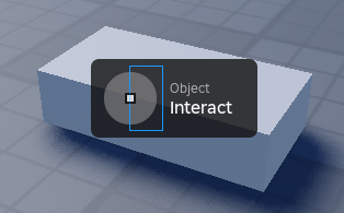
左側に半円が隠れている

ClipsDescendantsをfalseにするとこの状態
ClipsDescendantsとは、trueになっていると子のGuiObjectのはみ出した部分を隠してくれるようになるプロパティです。
そして、その隠れている半円を回転させることで、親のFrameの範囲内に入っている部分だけが見えるようになり、半円の進捗ゲージが徐々に進んでいるように見せることができます。
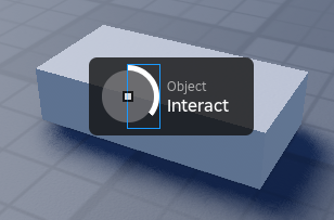
親のFrameの範囲内に入った部分だけが見える
あとはこれを左右二つ分用意すれば、円形のゲージになる、というわけです。
ただし、Robloxの仕様上、ClipsDescendantsは回転しているGuiObjectに対しては機能しません。
ClipsDescendantsする側もされる側も、共にRotationが0でないと機能しないのです。
ダメじゃん!
というわけで回避策を用いるのですが、根本の理屈は変わらないので、その解説は後ほど行います。
3. UIレイアウトを作る
それでは実際に作っていきます。
InputFrameの子にFrameを追加してください。
名前は「CircularProgressBar」としておきます。
このFrame自体はただの枠なので、例によってBackgroundTransparency、AnchorPoint、Positionを設定して透明で真ん中に表示されるFrameにしてください。
SizeはOffsetで(58, 58)に設定してください。
次に、CircularProgressBarの子にNumberValueを追加してください。
名前は「Progress」としておきます。
これは、現在の進捗率を保持するために使います。
そして、CircularProgressBarの子にFrameを追加してください。
名前は「RightFrame」としておきます。
これが先ほど説明した、円形ゲージを隠すためのFrameになります。
BackgroundTransparencyは1にして透明にしてください。
AnchorPointは(0, 0.5)で左端の真ん中が基準になるようにします。
PositionはScaleで(0.5, 0.5)で、AnchorPointが親の中心に来るようにしてください。
SizeはScaleで(0.5, 1)に設定してください。
最後に、ClipsDescendantsをtrueに設定してください。
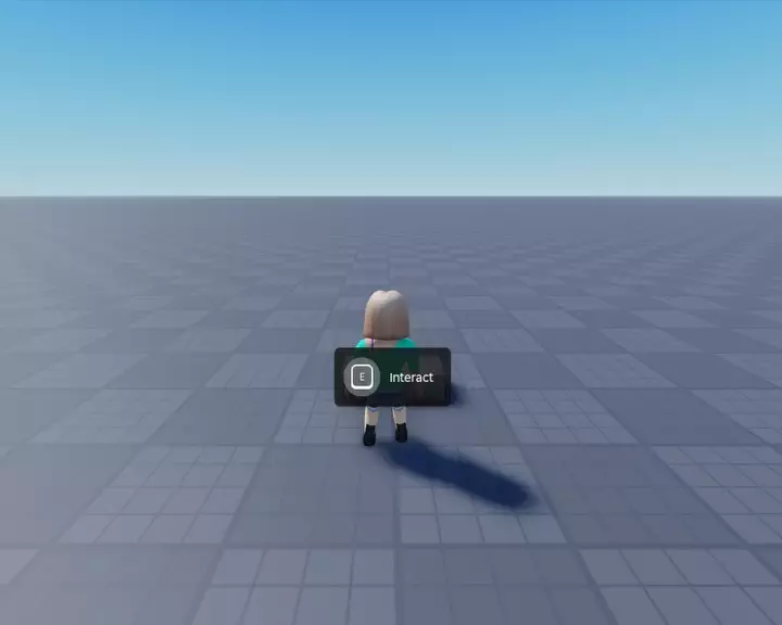
さきほどの、この画像のようになっていればOKです。
続いて、RightFrameの子にImageLabelを追加してください。
名前はそのままで大丈夫です。
まず、SizeをScaleで(2, 1)にし、X方向が親の二倍、つまりCircularProgressBarと同じ大きさにします。
PositionはScaleで(-1, 0)にすることで、左半分を隠します。
そして、Imageは「rbxasset://textures/ui/Controls/RadialFill.png」にしてください。
これは、DefaultのUIの進捗ゲージに使われている、シンプルな円の画像です。
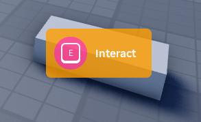
以下の画像のようになっていればOKです。


さて、ここからがClipsDescendantsの例の問題の回避策です。
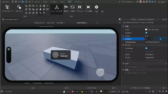
ImageLabelの子にUIGradientを追加してください。

UIGradient
UIGradientとは、GuiObjectに対してグラデーションをかけるためのオブジェクトで、付けているGuiObjectに対して、色や透明度をSequenceを使ってグラデーションで乗せることができます。
ただし、今回はグラデーションのために使うわけではありません。
まず、Transparencyを以下のように、ちょうど半分から透明度1になるように設定してください。

時間0から0.499までは透明度0、時間0.5から1までは透明度1になっている
こうすることで、ImageLabelの左半分は透明度0、右半分は透明度1になります。
左半分はClipsDescendantsによって隠れているので、完全に見えなくなったはずです。
そして、UIGradientにはRotationというプロパティがあります。
これは、グラデーションをかける方向を指定するためのもので、デフォルトの0の場合左から右へかけるわけですが、この値を変更するとその方向が回転します。
例えば90にした場合、90度回転してグラデーションを上から下へかけるようになります。
この数値を適当にいじってみると…
透明度がかかる方向が回転し、当初意図した「半円を回転しつつClipすることで円形ゲージを表現する」ができています!
あくまで透明度を反映する方向が回転しているだけで、ImageLabel自体は回転していないため、ClipsDescendantsを適用できる、というわけです。
さて、改めてRotationを0に戻したら、右側の分については完成です。
これを複製して左側も作成します。
RightFrame以下をコピーして、CircularProgressBarの子に追加し、Frameの名前を「LeftFrame」に変更してください。

そして、LeftFrameのAnchorPoint.Xを1に変更し、今度は右側の真ん中が基準になるようにします。
次に、LeftFrameの子のImageLabelのPosition.X.Scaleを0にしてください。
できたら、そのImageLabelの子のUIGradientのRotationも適当にいじってみましょう。
ゲージの左半分として動くようになっていればOKです。
最後にRotationを180にして隠したら、左側部分も完成です。
最後に、CircularProgressBar以下をPromptUIControllerの子に移動してください。

これで、UIのレイアウトは完了です。
4. Holdで動作させる
次に、入力がHoldされた時の動作を作ります。
PromptUIControllerのCreateメソッドに、以下のコードを追加してください。
 -- UIに対して動作を設定し、破棄関数を返します.
function promptUIController:Create(prompt: ProximityPrompt, promptUI: BillboardGui, inputType: Enum.ProximityPromptInputType)

 	------- 省略 -------

 	-- ボタンアイコンの生成.
	do
 		------- 省略 -------
	end

+	-- Holdが必要なProximityPromptの場合.
+	if prompt.HoldDuration > 0 then
+		-- 進捗バーの生成.
+		local circularProgressBar = script:WaitForChild("CircularProgressBar"):Clone()
+		circularProgressBar.Parent = inputFrame
+
+		-- 各構成要素の取得.
+		local progress = circularProgressBar:FindFirstChild("Progress")
+		local rightBarGradient = circularProgressBar:FindFirstChild("RightFrame"):FindFirstChildWhichIsA("ImageLabel"):FindFirstChildWhichIsA("UIGradient")
+		local leftBarGradient = circularProgressBar:FindFirstChild("LeftFrame"):FindFirstChildWhichIsA("ImageLabel"):FindFirstChildWhichIsA("UIGradient")
+
+		-- Changedイベントに接続し、ゲージの進捗状況に応じてUIGradientのRotationを回転させることでゲージを表現する.
+		progress.Changed:Connect(function(value: number)
+			local angle = math.clamp(value * 360, 0, 360)
+			rightBarGradient.Rotation = math.clamp(angle, 0, 180)
+			leftBarGradient.Rotation = math.clamp(angle, 180, 360)
+		end)
+
+		-- HoldのTweenを配列に追加.
+		table.insert(tweensForButtonHoldBegin, TweenService:Create(progress, TweenInfo.new(prompt.HoldDuration, Enum.EasingStyle.Linear), { Value = 1 }))
+		table.insert(tweensForButtonHoldEnd, TweenService:Create(progress, TweenInfo.new(0.5, Enum.EasingStyle.Quad), { Value = 0 }))
+	end
+
 	-- InputTypeがタッチの場合か、ProximityPromptがクリック可能設定である場合、入力受付用のボタンを設定する.
	if inputType == Enum.ProximityPromptInputType.Touch or prompt.ClickablePrompt then
 		------- 省略 -------
	end

 	------- 省略 -------

end
直接Holdでゲージを動かすのではなく、Holdに応じてProgress.Valueを0~1で変動させ、Progress.ChangedのイベントでUIGradientのRotationに反映してゲージを動かしています。
math.clampはnumber型の値に対して最大値、最小値を適用する関数で、引数で指定した最小値以下なら最小値を、最大値以上なら最大値を、どちらでもなければ値をそのまま返します。
これを使って、ゲージの右側は0~180、左側は180~360に収めることで、常に適切な位置にゲージが来るようにしています。
これで動作もできたはずです。
最後に、動作確認用にProximityPrompt.HoldDurationを3など、適当な数字にしてください。
それではさっそく実行して確認してみましょう。
これで、Hold時の進捗ゲージができました!
今回は簡易的な対応なので、入力を離してからゲージが減りきる前に押し直したり、UIが出ている時にHoldDurationの値が変更された場合には対応していない点には注意してください。
5. サンプルコード
今回作成した最終的なサンプルコードを掲載しておきます。
PromptUIDispatcher(前回から変更ありません)
--!strict

-- Service
local ProximityPromptService = game:GetService("ProximityPromptService")
local Players = game:GetService("Players")

-- Variable
local LocalPlayer = Players.LocalPlayer

local PlayerGui = LocalPlayer:WaitForChild("PlayerGui")
local Folder = game:GetService("ReplicatedStorage"):WaitForChild("PromptUIFolder")

-- プロンプト用のScreenGuiを取得する関数.
local function getScreenGui()
	-- プロンプト用のScreenGui取得.
	local screenGui = PlayerGui:FindFirstChild("ProximityPrompts")

	-- 存在しなかったら作成.
	if screenGui == nil then
		screenGui = Instance.new("ScreenGui")
		screenGui.Name = "ProximityPrompts"
		screenGui.ResetOnSpawn = false
		screenGui.Parent = PlayerGui
	end

	-- 取得ないし作成したScreenGuiを返す.
	return screenGui
end

-- PromptのUIを作成し、破棄関数を返します.
local function createPrompt(prompt: ProximityPrompt, inputType: Enum.ProximityPromptInputType, gui: ScreenGui)
	-- UIを複製.
	local promptUI = Folder:WaitForChild("PromptUI"):Clone()

	-- BillboardGuiのターゲットと親を設定.
	promptUI.Adornee = prompt.Parent
	promptUI.Parent = gui

	-- PromptUIControllerをrequire
	local promptController = require(Folder:WaitForChild("PromptUIController"))

	-- 動作を設定して破棄関数を返す.
	return promptController:Create(prompt, promptUI, inputType)
end

-- ProximityPromptService.PromptShownに、カスタムUIの表示を接続します.
local function onLoad()
	-- ProximityPromptService.PromptShownに接続.
	ProximityPromptService.PromptShown:Connect(function(prompt: ProximityPrompt, inputType: Enum.ProximityPromptInputType)
		-- デフォルトだったら(カスタムじゃなかったら)処理しない.
		if prompt.Style == Enum.ProximityPromptStyle.Default then
			return
		end

		-- プロンプト用のScreenGuiを取得.
		local gui = getScreenGui()

		-- カスタムUI作成、戻り値で破棄関数が渡される.
		local cleanupFunction = createPrompt(prompt, inputType, gui)

		-- PromptHidden待ち.
		-- PromptHiddenはProximityPromptから離れた時等だけではなく、InputTypeが切り替わった時にも発火する.
		prompt.PromptHidden:Wait()

		-- 破棄関数を実行.
		cleanupFunction()
	end)
end

-- 実行.
onLoad()
PromptUIController
--!strict
-- PromptUIの動作を設定するModule

local TweenService = game:GetService("TweenService")
local RunService = game:GetService("RunService")
local Folder = script.Parent

local ButtonImageProvider = require(Folder:WaitForChild("ButtonImageProvider"))

local promptUIController = {}

-- Tweenの配列を全てPlayする関数.
local function tweenPlayAll(tweens: {Tween})
	for _, v in ipairs(tweens) do
		v:Play()
	end
end

-- UIに対して動作を設定し、破棄関数を返します.
function promptUIController:Create(prompt: ProximityPrompt, promptUI: BillboardGui, inputType: Enum.ProximityPromptInputType)
	-- 各Tweenを一斉実行するための配列.
	local tweensForButtonHoldBegin = {}
	local tweensForButtonHoldEnd = {}
	local tweensForFadeOut = {}
	local tweensForFadeIn = {}

	local fadeDuration = 0.2
	local tweenInfoFast = TweenInfo.new(fadeDuration)


	-- BaseFrameの設定.
	local baseFrame = promptUI:FindFirstChild("BaseFrame")::Frame
	do
		-- Tweenの作成.
		local fadeOut = TweenService:Create(baseFrame, tweenInfoFast, {BackgroundTransparency = 1})
		local fadeIn = TweenService:Create(baseFrame, tweenInfoFast, {BackgroundTransparency = baseFrame.BackgroundTransparency})

		-- リストに追加.
		table.insert(tweensForButtonHoldBegin, fadeOut)
		table.insert(tweensForButtonHoldEnd, fadeIn)
		table.insert(tweensForFadeOut, fadeOut)
		table.insert(tweensForFadeIn, fadeIn)

		-- 初期の透明度を1に.
		baseFrame.BackgroundTransparency = 1
	end

	-- TextFrameを取得.
	local textFrame = baseFrame:FindFirstChild("TextFrame")::Frame
	local paddingFrame = baseFrame:FindFirstChild("PaddingFrame")::Frame

	-- ActionTextの設定.
	local actionText = textFrame:FindFirstChild("ActionText")::TextLabel
	do
		-- Tweenの作成.
		local fadeOut = TweenService:Create(actionText, tweenInfoFast, {TextTransparency = 1})
		local fadeIn = TweenService:Create(actionText, tweenInfoFast, {TextTransparency = actionText.TextTransparency})

		-- リストに追加.
		table.insert(tweensForButtonHoldBegin, fadeOut)
		table.insert(tweensForButtonHoldEnd, fadeIn)
		table.insert(tweensForFadeOut, fadeOut)
		table.insert(tweensForFadeIn, fadeIn)

		-- 初期の透明度を1に.
		actionText.TextTransparency = 1
	end

	-- ObjectTextの設定.
	local objectText = textFrame:FindFirstChild("ObjectText")::TextLabel
	do
		-- Tweenの作成.
		local fadeOut = TweenService:Create(objectText, tweenInfoFast, {TextTransparency = 1})
		local fadeIn = TweenService:Create(objectText, tweenInfoFast, {TextTransparency = objectText.TextTransparency})

		-- リストに追加.
		table.insert(tweensForButtonHoldBegin, fadeOut)
		table.insert(tweensForButtonHoldEnd, fadeIn)
		table.insert(tweensForFadeOut, fadeOut)
		table.insert(tweensForFadeIn, fadeIn)

		-- 初期の透明度を1に.
		objectText.TextTransparency = 1
	end

	-- RoundFrameのUIの表示と終了のTweenを作成しリストに追加.
	local inputFrame = baseFrame:FindFirstChild("InputFrame")::Frame
	do
		local roundFrame = inputFrame:FindFirstChild("RoundFrame")::Frame
		table.insert(tweensForFadeOut, TweenService:Create(roundFrame, tweenInfoFast, { BackgroundTransparency = 1 }))
		table.insert(tweensForFadeIn, TweenService:Create(roundFrame, tweenInfoFast, { BackgroundTransparency = roundFrame.BackgroundTransparency }))

		-- 初期の透明度を1に.
		roundFrame.BackgroundTransparency = 1
	end

	-- ボタンアイコンの生成.
	do
		-- ボタンアイコンとそのTweenを取得.
		local buttonTable = ButtonImageProvider:GetButtonImage(prompt, inputType, tweenInfoFast)

		if buttonTable then
			-- ボタンアイコンの親をInputFrameに.
			buttonTable.ButtonImage.Parent = inputFrame

			-- FadeのTweenを配列に追加.
			table.move(buttonTable.TweensForFadeIn, 1, #buttonTable.TweensForFadeIn, #tweensForFadeIn + 1, tweensForFadeIn)
			table.move(buttonTable.TweensForFadeOut, 1, #buttonTable.TweensForFadeOut, #tweensForFadeOut + 1, tweensForFadeOut)
		end
	end

	-- Holdが必要なProximityPromptの場合.
	if prompt.HoldDuration > 0 then
		-- 進捗バーの生成.
		local circularProgressBar = script:WaitForChild("CircularProgressBar"):Clone()
		circularProgressBar.Parent = inputFrame

		-- 各構成要素の取得.
		local progress = circularProgressBar:FindFirstChild("Progress")
		local rightBarGradient = circularProgressBar:FindFirstChild("RightFrame"):FindFirstChildWhichIsA("ImageLabel"):FindFirstChildWhichIsA("UIGradient")
		local leftBarGradient = circularProgressBar:FindFirstChild("LeftFrame"):FindFirstChildWhichIsA("ImageLabel"):FindFirstChildWhichIsA("UIGradient")

		-- Changedイベントに接続し、ゲージの進捗状況に応じてUIGradientのRotationを回転させることでゲージを表現する.
		progress.Changed:Connect(function(value: number)
			local angle = math.clamp(value * 360, 0, 360)
			rightBarGradient.Rotation = math.clamp(angle, 0, 180)
			leftBarGradient.Rotation = math.clamp(angle, 180, 360)
		end)

		-- HoldのTweenを配列に追加.
		table.insert(tweensForButtonHoldBegin, TweenService:Create(progress, TweenInfo.new(prompt.HoldDuration, Enum.EasingStyle.Linear), { Value = 1 }))
		table.insert(tweensForButtonHoldEnd, TweenService:Create(progress, TweenInfo.new(0.5, Enum.EasingStyle.Quad), { Value = 0 }))
	end

	-- InputTypeがタッチの場合か、ProximityPromptがクリック可能設定である場合、入力受付用のボタンを設定する.
	if inputType == Enum.ProximityPromptInputType.Touch or prompt.ClickablePrompt then
		-- TextButtonを複製.
		local button = script:WaitForChild("TextButton"):Clone()::TextButton
		button.Parent = promptUI

		local buttonDown = false	-- 入力状態を示すフラグ.

		-- 入力時の処理.
		button.InputBegan:Connect(function(input: InputObject)
			if (input.UserInputType == Enum.UserInputType.Touch
				or input.UserInputType == Enum.UserInputType.MouseButton1)
				and input.UserInputState ~= Enum.UserInputState.Change
			then
				-- 入力の開始をProximityPromptに伝える.
				prompt:InputHoldBegin()
				buttonDown = true
			end
		end)

		-- 入力終了時の処理.
		button.InputEnded:Connect(function(input: InputObject)
			if input.UserInputType == Enum.UserInputType.Touch
				or input.UserInputType == Enum.UserInputType.MouseButton1
			then
				if buttonDown then
					-- 入力の終了をProximityPromptに伝える.
					buttonDown = false
					prompt:InputHoldEnd()
				end
			end
		end)

		-- BillboardGuiが入力を受付けるようにActiveをtrueに.
		promptUI.Active = true
	end


	-- イベントを接続.
	local connections = {}

	-- Holdが必要なProximityPromptの場合.
	if prompt.HoldDuration > 0 then
		table.insert(connections, prompt.PromptButtonHoldBegan:Connect(function(playerWhoTriggered: Player)
			tweenPlayAll(tweensForButtonHoldBegin)
		end))
		table.insert(connections, prompt.PromptButtonHoldEnded:Connect(function(playerWhoTriggered: Player)
			tweenPlayAll(tweensForButtonHoldEnd)
		end))
	end

	table.insert(connections, prompt.Triggered:Connect(function(playerWhoTriggered: Player)
		tweenPlayAll(tweensForFadeOut)
	end))
	table.insert(connections, prompt.TriggerEnded:Connect(function(playerWhoTriggered: Player)
		tweenPlayAll(tweensForFadeIn)
	end))


	-- ProximityPromptの情報を元にUIを更新する関数を定義.
	local function updateUIFromPrompt()
		local hasActionText = (prompt.ActionText ~= nil and prompt.ActionText ~= "")
		local hasObjectText = (prompt.ObjectText ~= nil and prompt.ObjectText ~= "")
		textFrame.Visible = hasActionText or hasObjectText
		paddingFrame.Visible = textFrame.Visible

		if textFrame.Visible then
			-- ActionTextの設定.
			actionText.Text = prompt.ActionText
			actionText.AutoLocalize = prompt.AutoLocalize
			actionText.RootLocalizationTable = prompt.RootLocalizationTable

			-- ObjectTextの設定.
			objectText.Visible = hasObjectText
			if hasObjectText then
				objectText.Text = prompt.ObjectText
				objectText.AutoLocalize = prompt.AutoLocalize
				objectText.RootLocalizationTable = prompt.RootLocalizationTable
			end
		end

		-- AutomaticSizeが反映されるのはRenderStepped直前のため、次のRenderSteppedまで待機する.
		RunService.RenderStepped:Wait()

		-- Size.XはBaseFrameのXに合わせる.
		promptUI.Size = UDim2.fromOffset(baseFrame.AbsoluteSize.X, promptUI.Size.Y.Offset)

		-- Prompt.UIOffsetを反映.
		-- ProximityPrompt.UIOffsetはピクセル単位の値だが、BillboardGui.SizeOffsetはBillboardGui自体の大きさを基準としたScaleの値なので、BillboardGuiのサイズで割ることで変換している.
		promptUI.SizeOffset = Vector2.new(prompt.UIOffset.X / promptUI.Size.X.Offset, prompt.UIOffset.Y / promptUI.Size.Y.Offset)
	end

	-- Changedイベントに接続し、ProximityPromptプロパティが変更された際にUIを更新.
	table.insert(connections, prompt.Changed:Connect(updateUIFromPrompt))

	-- 一度実行しておき、UIを更新.
	updateUIFromPrompt()


	-- 開幕のFadeInを実行.
	tweenPlayAll(tweensForFadeIn)


	-- 後始末を行う関数を定義.
	local function cleanup()
		-- イベント接続を破棄.
		for _, v in ipairs(connections) do
			v:Disconnect()
		end

		-- FadeOut.
		tweenPlayAll(tweensForFadeOut)
		task.wait(fadeDuration)

		-- 破棄.
		promptUI:Destroy()
	end

	-- 破棄関数を返す.
	return cleanup
end

return promptUIController
ButtonImageProvider(前回から変更ありません)
--!strict

-- ProximityPromptとProximityPromptInputTypeの情報から、適切なボタンアイコンを複製して、
-- FadeのTweenと一緒に返すメソッドを持つモジュールです.

-- Service
local TweenService = game:GetService("TweenService")
local UserInputService = game:GetService("UserInputService")

-- ボタンアイコン画像.
local GamepadButtonImage = {
	[Enum.KeyCode.ButtonX] = "rbxasset://textures/ui/Controls/xboxX.png",
	[Enum.KeyCode.ButtonY] = "rbxasset://textures/ui/Controls/xboxY.png",
	[Enum.KeyCode.ButtonA] = "rbxasset://textures/ui/Controls/xboxA.png",
	[Enum.KeyCode.ButtonB] = "rbxasset://textures/ui/Controls/xboxB.png",
	[Enum.KeyCode.DPadLeft] = "rbxasset://textures/ui/Controls/dpadLeft.png",
	[Enum.KeyCode.DPadRight] = "rbxasset://textures/ui/Controls/dpadRight.png",
	[Enum.KeyCode.DPadUp] = "rbxasset://textures/ui/Controls/dpadUp.png",
	[Enum.KeyCode.DPadDown] = "rbxasset://textures/ui/Controls/dpadDown.png",
	[Enum.KeyCode.ButtonSelect] = "rbxasset://textures/ui/Controls/xboxView.png",
	[Enum.KeyCode.ButtonStart] = "rbxasset://textures/ui/Controls/xboxmenu.png",
	[Enum.KeyCode.ButtonL1] = "rbxasset://textures/ui/Controls/xboxLB.png",
	[Enum.KeyCode.ButtonR1] = "rbxasset://textures/ui/Controls/xboxRB.png",
	[Enum.KeyCode.ButtonL2] = "rbxasset://textures/ui/Controls/xboxLT.png",
	[Enum.KeyCode.ButtonR2] = "rbxasset://textures/ui/Controls/xboxRT.png",
	[Enum.KeyCode.ButtonL3] = "rbxasset://textures/ui/Controls/xboxLS.png",
	[Enum.KeyCode.ButtonR3] = "rbxasset://textures/ui/Controls/xboxRS.png",
	[Enum.KeyCode.Thumbstick1] = "rbxasset://textures/ui/Controls/xboxLSDirectional.png",
	[Enum.KeyCode.Thumbstick2] = "rbxasset://textures/ui/Controls/xboxRSDirectional.png",
}

-- キーボードアイコン画像.
local KeyboardButtonImage = {
	[Enum.KeyCode.Backspace] = "rbxasset://textures/ui/Controls/backspace.png",
	[Enum.KeyCode.Return] = "rbxasset://textures/ui/Controls/return.png",
	[Enum.KeyCode.LeftShift] = "rbxasset://textures/ui/Controls/shift.png",
	[Enum.KeyCode.RightShift] = "rbxasset://textures/ui/Controls/shift.png",
	[Enum.KeyCode.Tab] = "rbxasset://textures/ui/Controls/tab.png",
}

-- キーボード特殊文字アイコン画像.
local KeyboardButtonIconMapping = {
	["'"] = "rbxasset://textures/ui/Controls/apostrophe.png",
	[","] = "rbxasset://textures/ui/Controls/comma.png",
	["`"] = "rbxasset://textures/ui/Controls/graveaccent.png",
	["."] = "rbxasset://textures/ui/Controls/period.png",
	[" "] = "rbxasset://textures/ui/Controls/spacebar.png",
}

-- 一部キーコードとテキストのマッピング.
local KeyCodeToTextMapping = {
	[Enum.KeyCode.LeftControl] = "Ctrl",
	[Enum.KeyCode.RightControl] = "Ctrl",
	[Enum.KeyCode.LeftAlt] = "Alt",
	[Enum.KeyCode.RightAlt] = "Alt",
	[Enum.KeyCode.F1] = "F1",
	[Enum.KeyCode.F2] = "F2",
	[Enum.KeyCode.F3] = "F3",
	[Enum.KeyCode.F4] = "F4",
	[Enum.KeyCode.F5] = "F5",
	[Enum.KeyCode.F6] = "F6",
	[Enum.KeyCode.F7] = "F7",
	[Enum.KeyCode.F8] = "F8",
	[Enum.KeyCode.F9] = "F9",
	[Enum.KeyCode.F10] = "F10",
	[Enum.KeyCode.F11] = "F11",
	[Enum.KeyCode.F12] = "F12",
}

local ButtonIconProvider = {}

export type ButtonImageTable = {
	ButtonImage: ImageLabel,
	TweensForFadeIn: {Tween},
	TweensForFadeOut: {Tween}
}

-- 適切なボタンアイコンを複製し、FadeのTweenと一緒に返すメソッド.
function ButtonIconProvider:GetButtonImage(prompt: ProximityPrompt, inputType: Enum.ProximityPromptInputType, tweenInfo: TweenInfo): ButtonImageTable?
	local buttonImage
	local tweensForFadeOut = {}
	local tweensForFadeIn = {}

	-- ボタンアイコンの生成.
	-- タッチ入力の場合.
	if inputType == Enum.ProximityPromptInputType.Touch then
		-- タッチ入力用のボタンアイコンを作成.
		buttonImage = script:WaitForChild("TouchButtonImage"):Clone()

	-- ゲームパッド入力の場合.
	elseif inputType == Enum.ProximityPromptInputType.Gamepad then
		-- ProximityPromptに紐づけられているGamepadのKeyCodeに応じた画像のボタンアイコンを作成.
		if GamepadButtonImage[prompt.GamepadKeyCode] then
			buttonImage = script:WaitForChild("GamepadButtonImage"):Clone()
			buttonImage.Image = GamepadButtonImage[prompt.GamepadKeyCode]
		end

	-- それ以外(キーボード入力)の場合.
	else
		-- キーボード入力用のボタンアイコンのベースを作成.
		buttonImage = script:WaitForChild("KeyButtonImage"):Clone()

		-- ProximityPromptに紐づけられているKeyCodeを文字列で取得.
		local buttonTextString = UserInputService:GetStringForKeyCode(prompt.KeyboardKeyCode)

		-- 専用画像を用いるキーボード用ボタンアイコン画像を取得.
		local buttonTextImage = KeyboardButtonImage[prompt.KeyboardKeyCode]

		-- 取得できなかった場合、特殊文字用のボタンアイコン画像を取得.
		if buttonTextImage == nil then
			buttonTextImage = KeyboardButtonIconMapping[buttonTextString]
		end

		-- さらに取得できなかった場合、専用画像を用いないキーとしての処理を行う.
		if buttonTextImage == nil then
			-- Ctrlなどの一部のキーコード用の文字列を取得しなおす.
			if KeyCodeToTextMapping[prompt.KeyboardKeyCode] then
				buttonTextString = KeyCodeToTextMapping[prompt.KeyboardKeyCode]
			end
		end

		-- この時点で画像が取得できている(専用画像を用いるキーコードだった)場合.
		if buttonTextImage then
			local icon = script:WaitForChild("KeyIconImage"):Clone()
			icon.Image = buttonTextImage

			-- アイコン部分用の表示と終了のTweenを作成.
			table.insert(tweensForFadeOut, TweenService:Create(icon, tweenInfo, { ImageTransparency = 1 }))
			table.insert(tweensForFadeIn, TweenService:Create(icon, tweenInfo, { ImageTransparency = icon.ImageTransparency }))

			-- 初期の透明度を1に.
			icon.ImageTransparency = 1

			-- ButtonImageの子にする.
			icon.Parent = buttonImage

		-- 専用画像を用いないキーで、文字列が取得できている場合.
		elseif buttonTextString ~= nil and buttonTextString ~= "" then
			local buttonText = script:WaitForChild("KeyIconText"):Clone()
			buttonText.Text = buttonTextString

			-- 二文字以上ならTextSizeを12に下げる.
			if string.len(buttonTextString) > 2 then
				buttonText.TextSize = 12
			end

			-- アイコン部分用の表示と終了のTweenを作成.
			table.insert(tweensForFadeOut, TweenService:Create(buttonText, tweenInfo, { TextTransparency = 1 }))
			table.insert(tweensForFadeIn, TweenService:Create(buttonText, tweenInfo, { TextTransparency = buttonText.TextTransparency }))

			-- 初期の透明度を1に.
			buttonText.TextTransparency = 1

			-- ButtonImageの子にする.
			buttonText.Parent = buttonImage

		else
			-- 非対応のキーコードなので破棄して終了.
			buttonImage:Destroy()
			return nil
		end
	end

	-- ボタンアイコン用の表示と終了のTweenを作成.
	if buttonImage then
		table.insert(tweensForFadeOut, TweenService:Create(buttonImage, tweenInfo, { ImageTransparency = 1 }))
		table.insert(tweensForFadeIn, TweenService:Create(buttonImage, tweenInfo, { ImageTransparency = buttonImage.ImageTransparency }))

		-- 初期の透明度を1に.
		buttonImage.ImageTransparency = 1

	else
		-- ボタンアイコンを生成できていなかったら終了.
		return nil
	end

	-- tableにして返す.
	local result = {
		ButtonImage = buttonImage,
		TweensForFadeIn = tweensForFadeIn,
		TweensForFadeOut = tweensForFadeOut
	}::ButtonImageTable

	return result
end

return ButtonIconProvider
6. まとめ
- ClipsDescendantsをtrueにすると、子のGuiObjectのはみ出した部分を隠すことができる
- 円形のゲージは、ClipsDescendantsを使って半円を隠し、回転させてゲージを表現する
- ただし、ClipsDescendantsは回転したGuiObjectには対応していないので、UIGradientで透明になる方向を回転させることで実装する
- NumberValueを使って進捗率を保持し、Hold入力に応じてNumberValue.Valueを変動させる
- NumberValue.Changedイベントで、進捗率をUIGradient.Rotationに反映する
- math.clampは、number型の値に対して最大値と最小値を適用する関数
今回は、円形の進捗ゲージを実装しました。
ちなみに、DefaultのUIと比べると、テキスト部分が横にスライドする動作や、Hold時の拡大表示などは省略していますが、ここまでにご紹介した内容を応用すれば実装できると思います!
また、これまでのカスタムUIの記事では説明のためDefaultの再現を行ってきましたが、当然カスタムUIなので自由な構成で作る事ができます。
第一回でもご紹介した作例のように、ゲームに合わせてさまざまなUIを作ってみてください!
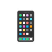
ポップな色にしてみたり…

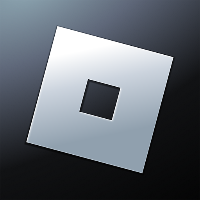
ロックオンマーカーっぽくしてみたり…
最後までご覧いただき、ありがとうございました!
7. 参考

当社ではRobloxを活用したゲームの開発、 また企業の商品やサービスの認知度拡大に寄与する3Dワールドの制作など、 Robloxにおける様々な活用支援を行っております。 Robloxのコンテンツ開発をご検討されている企業様は、お気軽にご相談ください。 landho.co.jp/
Discussion