🙌
【CSS】mix-blend-modeで色の反転を実装
実現したいこと
画像と文章を重ねたとき、重ねた部分だけ色を反転させたい。
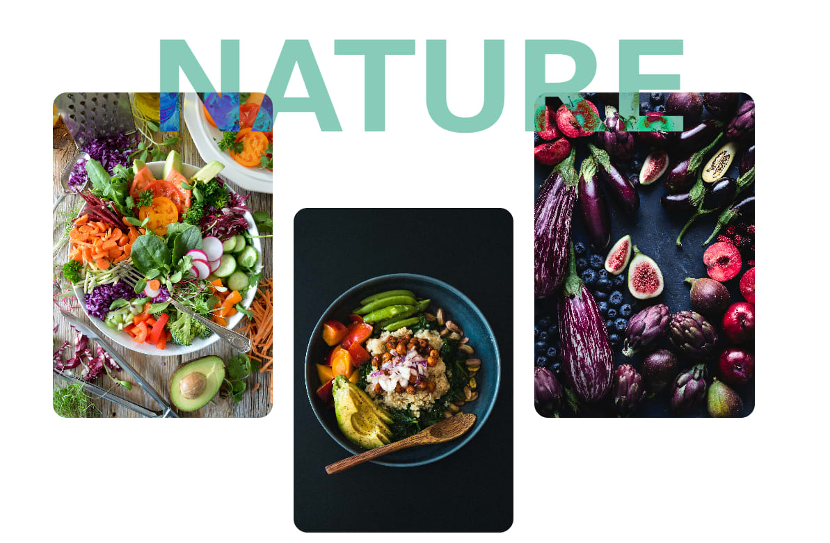
上記の画像を実現するために、mix-blend-mode プロパティを使用します。
- mix-blend-mode:2つの要素を組み合わせたとき、どのように混合するかを設定するプロパティ
mix-blend-mode では、16 つキーワードがありますが、今回は、difference (差分) キーワードで実現します。
色の反転を実装
HTML
<div class="top">
    <h2>NATURE</h2>
    <div class="garelly">
        <figure class="photoA"><img src="images/test1.jpg" alt=""></figure>
        <figure class="photoB"><img src="images/test2.jpg" alt=""></figure>
        <figure class="photoC"><img src="images/test3.jpg" alt=""></figure>
    </div>
</div>
h2に mix-blend-mode を設定します。
CSSグリッドを使ったレイアウトですが、flex や position を使った方法でも可能です。
CSS
.top {
    display: grid;
    grid-template-columns: 1fr 1088px 1fr;
    justify-items: center;
}

/* ここでmix-blend-mode を使用 */
h2 {
    grid-column: 2;
    grid-row: 1;
    font-size: 180px;
    color: #87CBB9;
    mix-blend-mode: difference;
}

.garelly {
    grid-row: 1;
    grid-column: 2;

    display: grid;
    grid-template-columns: 30% 30% 30%;
    grid-template-rows: 20% 20% 20% 20% 20%;
    grid-template-areas:
        ". . ."
        "A . C"
        "A B C"
        "A B C"
        ". B .";
    gap: 30px;

    margin-top: -30px;
}

figure {
    grid-column: 2;
    grid-row: 1;
    margin-top: 0;
}

img {
    width: 100%;
    height: 100%;
    object-fit: cover;
    border-radius: 20px;
}

.garelly .photoA {
    grid-area: A;
}

.garelly .photoB {
    grid-area: B;
}

.garelly .photoC {
    grid-area: C;
}
これだけだと分かりずらいので、他のレイアウトも作成してみます。
他のレイアウト
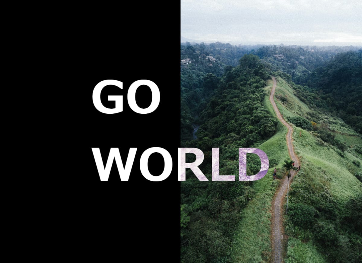
HTML
<div class="top">
    <h2>GO<br>WORLD</h2>
    <figure><img src="images/test4.jpg" alt=""></figure>
</div>
CSS
.top {
    display: grid;
    grid-template-columns: 1fr 1fr;
    height: 100%;
    background-color: black;
}

h2 {
    grid-column: 2;
    grid-row: 1;
    font-size: 150px;
    color: #fff;
    mix-blend-mode: difference;
    align-self: center;

    margin-left: -500px;
}

figure {
    grid-column: 2;
    grid-row: 1;
    justify-self: end;
    height: 100vh;
}

img {
    width: 100%;
    height: 100%;
    object-fit: cover;
}
以上になります。
Discussion