👩🎨
pqoqubbw/iconsで簡単にオシャレなアニメーションアイコンを実装しよう!
はじめに
Xでたまたま発見したpqoqubbw/iconsを紹介します!
pqoqubbw/iconsとは
デザインエンジニアのdmytroさんが手掛けたオープンソースのアニメーションアイコンコンポーネントです。
個人から商用まで、制限なく自由に使用することができます。
何が良いのか?
まず、シンプルにオシャレです。
非常に滑らかな心地よい動きがとてもいいです。
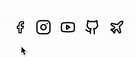
いくつかサンプルを貼っておきます(GitHubの猫ちゃんの手を振る姿がとても可愛いです)。
155アイコンと代表的なアイコンライブラリと比べたら数は少なめですが、よく使いそうなアイコンは一通りある印象です。
さらに、最近ではshadcn/uiのCLIからインストールできるようになりました!
実装方法
まず、shadcn/uiの環境構築を行うために以下コマンドを実行します。
$ npx shadcn-ui@latest init
コマンドを実行したら以下の質問に答えます。
1. Which style would you like to use? › New York
デフォルトかNew Yorkどちらのスタイルを使いたいか?

2. Which color would you like to use as base color? › Neutral
ベースカラーは何にするか?(後から変更不可)

3. Do you want to use CSS variables for colors? › no / yes
CSS変数で色を設定するか?(後から変更不可)
これでshadcn/uiの環境構築は完了です。
次にpqoqubbw/iconsで使用したいアイコンコンポーネントをインストールします。
GitHubのアイコンを使用する場合は、以下のコマンドを実行します。
npx shadcn@latest add "https://icons.pqoqubbw.dev/c/github.json"
問題なく実行できれば、以下のコンポーネントが指定したフォルダにインストールされます。
// /components/github.tsx
'use client';

import type { Variants } from 'motion/react';
import { motion, useAnimation } from 'motion/react';

const bodyVariants: Variants = {
  normal: {
    opacity: 1,
    pathLength: 1,
    scale: 1,
    transition: {
      duration: 0.3,
    },
  },
  animate: {
    opacity: [0, 1],
    pathLength: [0, 1],
    scale: [0.9, 1],
    transition: {
      duration: 0.4,
    },
  },
};

const tailVariants: Variants = {
  normal: {
    pathLength: 1,
    rotate: 0,
    transition: {
      duration: 0.3,
    },
  },
  draw: {
    pathLength: [0, 1],
    rotate: 0,
    transition: {
      duration: 0.5,
    },
  },
  wag: {
    pathLength: 1,
    rotate: [0, -15, 15, -10, 10, -5, 5],
    transition: {
      duration: 2.5,
      ease: 'easeInOut',
      repeat: Infinity,
    },
  },
};

const GithubIcon = () => {
  const bodyControls = useAnimation();
  const tailControls = useAnimation();

  const handleMouseEnter = async () => {
    bodyControls.start('animate');
    await tailControls.start('draw');
    tailControls.start('wag');
  };

  const handleMouseLeave = () => {
    bodyControls.start('normal');
    tailControls.start('normal');
  };

  return (
    <div
      className="cursor-pointer select-none p-2 hover:bg-accent rounded-md transition-colors duration-200 flex items-center justify-center"
      onMouseEnter={handleMouseEnter}
      onMouseLeave={handleMouseLeave}
    >
      <svg
        xmlns="http://www.w3.org/2000/svg"
        width="28"
        height="28"
        viewBox="0 0 24 24"
        fill="none"
        stroke="currentColor"
        strokeWidth="2"
        strokeLinecap="round"
        strokeLinejoin="round"
      >
        <motion.path
          variants={bodyVariants}
          initial="normal"
          animate={bodyControls}
          d="M15 22v-4a4.8 4.8 0 0 0-1-3.5c3 0 6-2 6-5.5.08-1.25-.27-2.48-1-3.5.28-1.15.28-2.35 0-3.5 0 0-1 0-3 1.5-2.64-.5-5.36-.5-8 0C6 2 5 2 5 2c-.3 1.15-.3 2.35 0 3.5A5.403 5.403 0 0 0 4 9c0 3.5 3 5.5 6 5.5-.39.49-.68 1.05-.85 1.65-.17.6-.22 1.23-.15 1.85v4"
        />
        <motion.path
          variants={tailVariants}
          initial="normal"
          animate={tailControls}
          d="M9 18c-4.51 2-5-2-7-2"
        />
      </svg>
    </div>
  );
};

export { GithubIcon };
これでインストールは完了です。
あとはインストールしたコンポーネントを呼び出すだけです。
import { GithubIcon } from "@/components/ui/github";

export default function Home() {
  return (
    <div className="flex items-center justify-center m-10">
      <GithubIcon />
    </div>
  );
}
以上です!
簡単にオシャレなアニメーションアイコンを実装することができますね。
終わりに
今1番hotなUIライブラリであるshadcn/uiに対応されたのは熱いですね🔥
shadcn/uiユーザーはぜひ使用してみてください!
Discussion