[Jetpack Compose] Surfaceを使おう
MaterialThemeをもとに Dark Modeを考慮した Theme を実装しても、Surface (やScaffold )を使用しないと、適切なcontenColorが選択されないケースがあります。
TLDR
-
SurfaceもしくはScaffoldを Theme の root に使用しよう。 -
Surfaceで囲まないと、DarkMode時に文字色が黒くなったりするよ
一見動いているように見えるコード
このようなコードがあるとします。(こんなコードをプロダクションで書くことはまずないと思いますが)
class MainActivity : ComponentActivity() {
  ...
  setContent {
    ...
    Column {
      // TextField①
      MaterialTheme(
        colors = if (isSystemInDarkTheme()) darkColors() else lightColors(),
      ) {
        Surface {
          TextField(...)
        }
      }

      Spacer(modifier = Modifier.height(8.dp))

      // TextField②
      MaterialTheme(
        colors = if (isSystemInDarkTheme()) darkColors() else lightColors(),
      ) {
        TextField(...)
      }
    }
  }
  ...
}
見ての通り、TextField① とTextField②の違いは Surface があるかないかです。
どちらもisSystemInDarkTheme を使用して、適切な色を選択しているように見えます。
これをRunすると、次のような見た目になります。
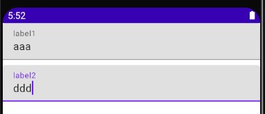
一見、おかしな点はないように見えています。
DarkModeで見てみる
先のコードをDarkModeで試してみましょう。
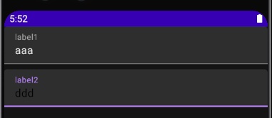
このように isSystemInDarkTheme を使用して色の指定を変えているにもかかわらず、 TextField② での文字色が黒文字となり、視認性が大変悪いです。
Surfaceは content colorを決める役割がある
Android Develoer では Surface には次の役割があるとしています。
- Clipping: Surface clips its children to the shape specified by shape
- Elevation: Surface draws a shadow to represent depth, where elevation represents the depth of this surface. If the passed shape is concave the shadow will not be drawn on Android versions less than 10.
- Borders: If shape has a border, then it will also be drawn.
- Background: Surface fills the shape specified by shape with the color. If color is Colors.surface, the ElevationOverlay from LocalElevationOverlay will be used to apply an overlay - by default this will only occur in dark theme. The color of the overlay depends on the elevation of this Surface, and the LocalAbsoluteElevation set by any parent surfaces. This ensures that a Surface never appears to have a lower elevation overlay than its ancestors, by summing the elevation of all previous Surfaces.
- Content color: Surface uses contentColor to specify a preferred color for the content of this surface - this is used by the Text and Icon components as a default color.
- Blocking touch propagation behind the surface.
今回は特に ⑤ Content color の部分に注目で、Surface は TextやIconでデフォルトで使用する色を決めます。
デフォルト色をどこで決めているか?
TextFieldの色は何も指定しない場合、次のように TextFieldDefaults.textFieldColors() が指定されます。
@Composable
fun TextField(
  ...,
  colors: TextFieldColors = TextFieldDefaults.textFieldColors()
) {...}
そのため、実際には LocalContentColor.current に alphaを考慮したものが文字色に指定されます。
fun textFieldColors(
  textColor: Color = LocalContentColor.current.copy(LocalContentAlpha.current),
  ...
)
LocalContentColor は何もしなければ、黒が指定されています。
val LocalContentColor = compositionLocalOf { Color.Black }
先ほどの TextField② の文字色はこの黒色が使われていました。
Surface は下記のようなコードになっています。
@Composable
private fun Surface(
  ...
  contentColor: Color = contentColorFor(color),
  content: @Composable () -> Unit
) {
  CompositionLocalProvider(
    LocalContentColor provides contentColor,
    ...
  ) {
    Box(...) {
      content()
    }
  }
}
上記のコードを見るに、 LocalContentColor には contentColor が指定されています。
抽出すると下記コードです。
CompositionLocalProvider(
  LocalContentColor provides contentColor,
  ...
) {...}
contentColor は下記のようになっており、ここで MaterialTheme に従った適切な文字色などがしていされています。
fun contentColorFor(backgroundColor: Color) =
  MaterialTheme.colors.contentColorFor(backgroundColor).takeOrElse { LocalContentColor.current }
よって、 先ほどのSurface を使用したTextField①では適切な文字色が指定されるようになるわけです。
ここでは詳細は書きませんが、 Scaffold では内部で Surface が使用されています。
Discussion