Closed4
flexboxを理解したい
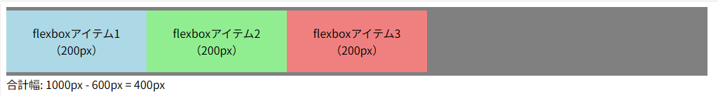
 たたた
たたたflexbox 要素幅自動算出コード
html
<!DOCTYPE html>
<html lang="ja">
<head>
<meta charset="UTF-8" />
<meta name="viewport" content="width=device-width, initial-scale=1.0" />
<title>Document</title>
<style>
.flexbox-container {
background-color: gray;
display: flex;
padding-block: 5px;
width: 1000px;
}
.flexbox-item {
padding-block: 20px;
text-align: center;
/* flex-shrink: 1; */
flex: 0 1 auto;
flex-basis: 200px;
}
.flexbox-item-1 {
/* flex-grow: 1; */
background-color: lightblue;
}
.flexbox-item-2 {
/* flex-grow: 1; */
background-color: lightgreen;
}
.flexbox-item-3 {
background-color: lightcoral;
/* flex-grow: 1; */
}
</style>
</head>
<body>
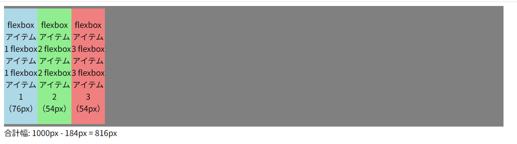
<section class="flexbox-container">
<div class="flexbox-item flexbox-item-1">
flexboxアイテム1<br />(<span class="js-value">200px</span>)
</div>
<div class="flexbox-item flexbox-item-2">
flexboxアイテム2<br />(<span class="js-value"></span>)
</div>
<div class="flexbox-item flexbox-item-3">
flexboxアイテム3<br />(<span class="js-value"></span>)
</div>
</section>
<div>
合計幅: 1000px - <span class="js-all"></span> =
<span class="js-answer"></span>
</div>
<script>
// 各flexbox-item要素を取得
const items = document.querySelectorAll(".flexbox-item");
let totalWidth = 0;
// 各要素の横幅を取得して表示、合計値を計算
items.forEach((item) => {
const width = item.clientWidth; // 横幅を取得
totalWidth += width; // 横幅を合計
const jsValueElement = item.querySelector(".js-value");
if (jsValueElement) {
jsValueElement.textContent = `${width}px`; // 横幅を挿入
}
});
// 合計幅をjs-all要素に挿入
const jsAllElement = document.querySelector(".js-all");
const jsAnswerElement = document.querySelector(".js-answer");
if (jsAllElement) {
jsAllElement.textContent = `${totalWidth}px`; // 合計幅を挿入
}
if (jsAnswerElement) {
jsAnswerElement.textContent = `${1000 - totalWidth}px`; // 合計幅を挿入
}
</script>
</body>
</html>
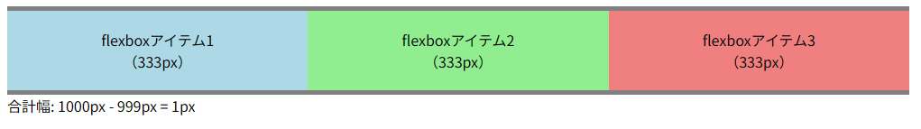
flex-grow
初期値
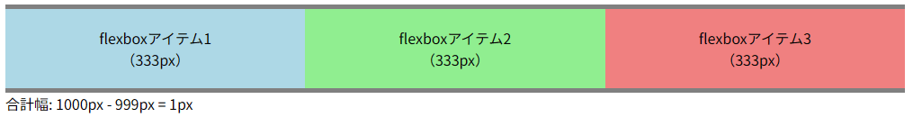
パターン1
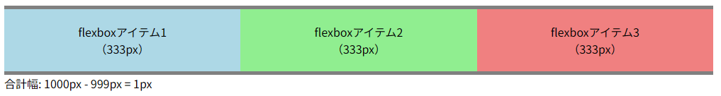
全てのflexbox-itemにflex-grow: 1;を設定
400px / 3 + 200px(余り / 要素数 + 要素幅) = 333px
css
  .flexbox-item {
    padding-block: 20px;
    text-align: center;
    flex-grow: 1;
    flex-basis: 200px;
  }
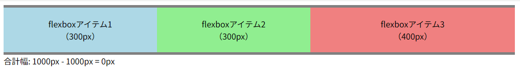
パターン2
余り幅の400pxを1:1:2(100px:100px:200px)に分割
css
  .flexbox-item-1 {
    flex-grow: 1;
    background-color: lightblue;
  }
  .flexbox-item-2 {
    flex-grow: 1;
    background-color: lightgreen;
  }
  .flexbox-item-3 {
    background-color: lightcoral;
    flex-grow: 2;
  }
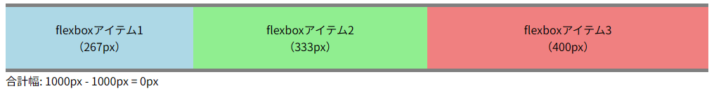
パターン3
余りの400pxを1:2:3(67px:133px:200px)に分割
css
  .flexbox-item-1 {
    flex-grow: 1;
    background-color: lightblue;
  }
  .flexbox-item-2 {
    flex-grow: 2;
    background-color: lightgreen;
  }
  .flexbox-item-3 {
    background-color: lightcoral;
    flex-grow: 3;
  }
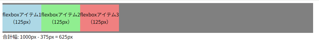
たたたflex-shrink
初期値
css
  .flexbox-item {
    flex-shrink: 1;
  }
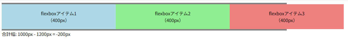
パターン1
css
  .flexbox-item {
    flex-shrink: 0;
  }
パターン2
全体幅1000px - 合計1200px = -200px
item1は、400px - 200px = 200px となる。
css
  .flexbox-item-1 {
    flex-shrink: 1;
  }
  .flexbox-item-2 {
    flex-shrink: 0;
  }
  .flexbox-item-3 {
    flex-shrink: 0;
  }
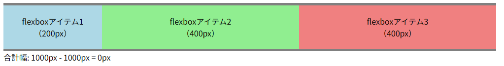
パターン3
全体幅1000px - 合計1200px = -200px
item1とitem2はそれぞれ、400px - 100px(-200 / 2) = 200px となる。
css
  .flexbox-item-1 {
    flex-shrink: 1;
  }
  .flexbox-item-2 {
    flex-shrink: 1;
  }
  .flexbox-item-3 {
    flex-shrink: 0;
  }
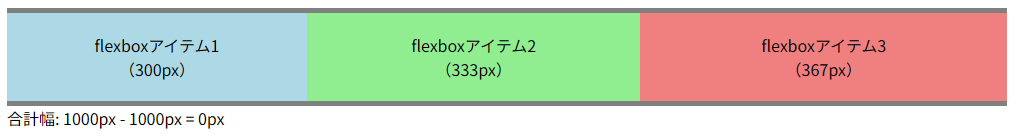
パターン4
全体幅1000px - 合計1200px = -200px
余り200pxの3:2:1それぞれ、200px:67px:33pxとなる。
item1 400px - 100px = 300px
item2 400px - 67px = 333px
item3 400px - 3px = 367px
css
  .flexbox-item-1 {
    flex-shrink: 3;
    background-color: lightblue;
  }
  .flexbox-item-2 {
    flex-shrink: 2;
    background-color: lightgreen;
  }
  .flexbox-item-3 {
    flex-shrink: 1;
    background-color: lightcoral;
  }
たたたflex-basis
初期値(auto)
指定なし
flex-basis: 0;
パターン1
css
  .flexbox-item {
    flex-basis: auto; // or flex-basis: 0;
    flex-grow: 1;
  }
パターン2
css
  .flexbox-item {
    flex-basis: auto;
    flex-shrink: 1;
  }
パターン3
css
  .flexbox-item {
    flex-basis: 0;
    flex-grow: 0;
  }
パターン4
css
  .flexbox-item {
    flex-basis: auto;
    flex-shrink: 0;
  }

このスクラップは2024/09/04にクローズされました