Zodとshadcn/uiで超簡単にフォーム作成ができるライブラリ「AutoForm」
AutoForm とは何か?
README より ↓
AutoForm は、zod スキーマに基づいて@shadcn/ui フォームを自動的に作成する React コンポーネントです。
AutoForm は以下 3 つのライブラリを元に作られています。
- フォームライブラリ React Hook Form
- バリデーションライブラリ Zod
- Radix UI と Tailwind CSS を使用して構築された UI コンポーネントライブラリ shadcn/ui
実際の挙動は以下のツイートを見てもらえれば分かると思います。
シンプルで直感的な記述でフォーム作成をすることが可能です。
実際のデモはこちら
AutoForm を試してみる
それでは実際に AutoForm を試してみます。
ドキュメントは GitHub の README に詳しく書かれています。
インストール
AutoForm コンポーネントは shadcn/ui のコンポーネントと依存関係にあるので、まずは shadcn/ui から必要なコンポーネントをインストールします。
npx shadcn-ui@latest add accordion button calendar card checkbox form input label popover radio-group select separator switch textarea toggle
肝心の AutoForm コンポーネントに関しては GitHub から手動でコピーして持ってくる必要があります。
auto-form.tsx と date-picker.tsx を ダウンロードして、自分のプロジェクトの ui フォルダ(src/components/ui)に入れましょう。
余談
auto-form.tsxを確認してみると React Hook Form が使われていることが分かりますね。
import {
  ControllerRenderProps,
  DefaultValues,
  FieldValues,
  useForm,
} from "react-hook-form";
基本的な使い方
// ※'/src'を@でエイリアスしています。
import AutoForm, { AutoFormSubmit } from "@/components/ui/auto-form";
import * as z from "zod";

export default function Home() {
  return (
    <div className="max-w-lg mx-auto my-6">
      <AutoForm
        onSubmit={(data) => console.log(data)}
        formSchema={z.object({
          name: z.string().min(3),
          pass: z.string().min(8),
          terms: z.literal(true),
        })}
        fieldConfig={{
          pass: {
            inputProps: {
              type: "password",
            },
          },
          terms: {
            fieldType: "switch",
            description: "Accept our terms and conditions.",
          },
        }}
      >
        <AutoFormSubmit>Submit</AutoFormSubmit>
      </AutoForm>
    </div>
  );
}
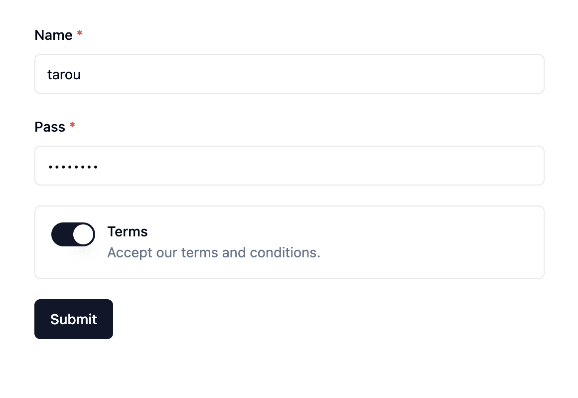
あっという間にフォームができました
各プロップス
formSchema
Zod を使ってフォームのスキーマを定義します。
エラーメッセージなど色々カスタムするとコード量が多くなるので、基本的には変数で定義してから AutoForm に渡したほうが見やすいかと思います。
// .describe()でラベルを設定することができます。
// 未設定の場合はフィールド名がそのまま表示されます。
const formSchema = z.object({
  name: z
    .string({
      required_error: "名前は必須です。",
    })
    .min(3, {
      message: "名前は3文字以上である必要があります。",
    })
    .describe("名前"),
  pass: z
    .string({
      required_error: "パスワードは必須です。",
    })
    .min(8, {
      message: "パスワードは8文字以上である必要があります。",
    })
    .describe("パスワード"),
  terms: z.literal(true).describe("利用規約に同意する"),
});


export default function Home() {
  return (
    <div className="max-w-lg mx-auto my-6">
      <AutoForm
        onSubmit={(data) => console.log(data)}
        formSchema={formSchema}
        fieldConfig={{
          pass: {
            inputProps: {
              type: "password",
            },
          },
          terms: {
            fieldType: "switch",
            description: "Accept our terms and conditions.",
          },
        }}
      >
        <AutoFormSubmit>送信</AutoFormSubmit>
      </AutoForm>
    </div>
  );
}
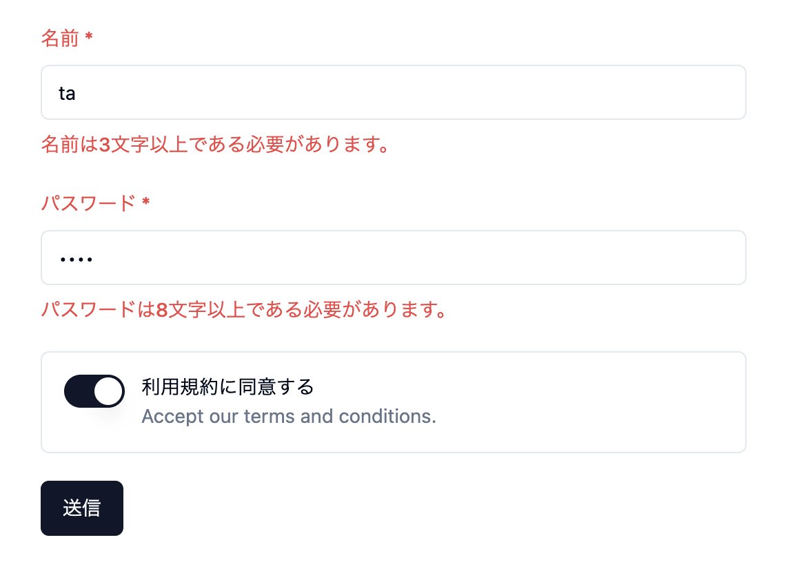
バリデーションとエラーメッセージが効いているのが確認できます。
fieldConfig
各フィールドの設定を追加することができます。
// descriptionはjsx形式で書くことが可能です。
export default function Home() {
  return (
    <div className="max-w-lg mx-auto my-6">
      <AutoForm
        onSubmit={(data) => console.log(data)}
        formSchema={formSchema}
        fieldConfig={{
          pass: {
            inputProps: {
              type: "password",
              placeholder: "••••••••",
            },
            description: "8文字以上で入力してください。",
          },
          terms: {
            fieldType: "switch",
            description: (
              <>
                こちらのリンクからご確認ください。{" "}
                <a href="#" className="text-primary underline">
                  利用規約
                </a>
              </>
            ),
          },
        }}
      >
        <AutoFormSubmit>送信</AutoFormSubmit>
      </AutoForm>
    </div>
  );
}
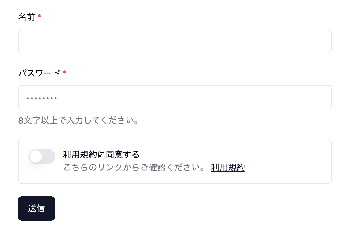
プレースホルダや説明文のカスタムを確認できます。
補足
上記の書き方だと、Console に以下の警告が出ます。
Warning: A component is changing an uncontrolled input to be controlled. This is likely caused by the value changing from undefined to a defined value, which should not happen.
Decide between using a controlled or uncontrolled input element for the lifetime of the component. More info: https://reactjs.org/link/controlled-components
簡単に言うと、「入力値の管理方法が途中で変わっている」と指摘されています。
これは初期値を設定することで回避できます。
// .default()で初期値を設定する
const formSchema = z.object({
  name: z
    .string({
      required_error: "名前は必須です。",
    })
    .min(3, {
      message: "名前は3文字以上である必要があります。",
    })
    .describe("名前")
    .default(""),    // 追加
  pass: z
    .string({
      required_error: "パスワードは必須です。",
    })
    .min(8, {
      message: "パスワードは8文字以上である必要があります。",
    })
    .describe("パスワード")
    .default(""),    // 追加
  terms: z.literal(true).describe("利用規約に同意する"),
});

// required: true をつけて必須だと分かるようにする
export default function Home() {
  return (
    <div className="max-w-lg mx-auto my-6">
      <AutoForm
        onSubmit={(data) => console.log(data)}
        formSchema={formSchema}
        fieldConfig={{
          name: {
            inputProps: {
              required: true,    // 追加
            },
          },
          pass: {
            inputProps: {
              type: "password",
              placeholder: "••••••••",
              required: true,    // 追加
            },
            description: "8文字以上で入力してください。",
          },
          terms: {
            fieldType: "switch",
            description: (
              <>
                こちらのリンクからご確認ください。{" "}
                <a href="#" className="text-primary underline">
                  利用規約
                </a>
              </>
            ),
          },
        }}
      >
        <AutoFormSubmit>送信</AutoFormSubmit>
      </AutoForm>
    </div>
  );
}
他のスタイル例
// プレースホルダなど一部 shadcn/ui(src/components/ui) コンポーネントをカスタムしています。
const formSchema = z.object({
  birthday: z.coerce.date().optional().describe("誕生日"),
  color: z
    .enum(["赤", "緑", "青"], {
      required_error: "選択してください。",
    })
    .describe("色"),
  marshmallows: z
    .enum(
      [
        "少ない: 1-5個",
        "普通: 6-10個",
        "多い: 11-15個",
        "とても多い: 16個以上",
      ],
      {
        required_error: "選択してください。",
      }
    )
    .describe("口に入るマシュマロの数は?"),
  bio: z
    .string()
    .min(10, {
      message: "10文字以上で入力してください。",
    })
    .max(150, {
      message: "150文字以内で入力してください。",
    })
    .optional()
    .describe("経歴"),
});

export default function Home() {
  return (
    <>
      <div className="max-w-lg mx-auto my-6">
        <AutoForm
          onSubmit={(data) => console.log(data)}
          formSchema={formSchema}
          fieldConfig={{
            birthday: {
              description: "プレゼントを送るには誕生日が必要です。",
            },
            color: {
              inputProps: {
                required: true,
              },
            },
            marshmallows: {
              fieldType: "radio",
              inputProps: {
                required: true,
              },
            },
            bio: {
              fieldType: "textarea",
            },
          }}
        >
          <AutoFormSubmit>送信</AutoFormSubmit>
        </AutoForm>
      </div>
    </>
  );
}
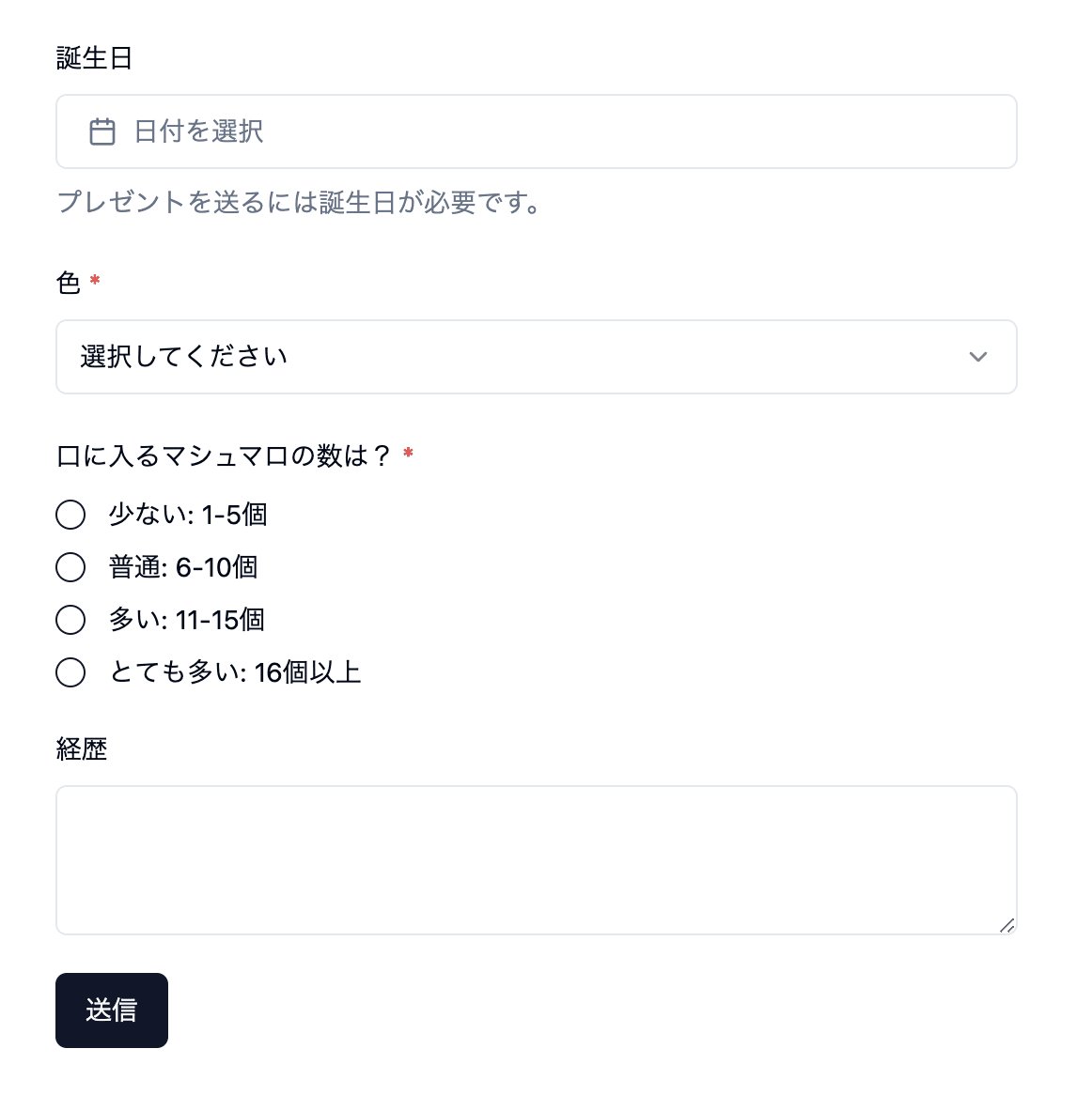
こんな感じ
shadcn/ui の話になりますが、現状 DatePicker コンポーネントは年を選択する方法がなく、ひたすらポチポチするしかありません。(なのにドキュメントの例が誕生日なのはちょっと疑問🤔)
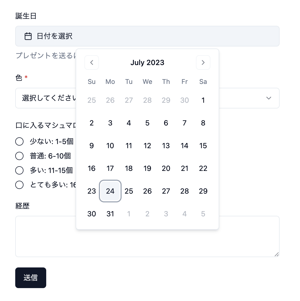
年の選択がない
一応 Issue はあったので自分でカスタムするかアップデートを待ちましょう。
おわりに
Tailwind CSS を使っているなら選択肢として結構ありだと思いました。
Initial commit が 最近(2023/7/21)ということもあり今後どうなっていくか期待です!
参考
Discussion