Playwrightを用いてWindows環境でSafariをエミュレートする
はじめに
困った。なぜWindows環境のみでモバイルSafariのことを考えなければならないのか。Macと実機のiPhone SEが欲しい。そしてXcodeとAndroid Studioを導入したい。しかしそうはいかないのだ。
ともかくないものはないので、Windows環境で可能な限り頑張る方法を模索する。
方法
Playwrightを用いる。
AWS Device Farmを利用するという手段もあるが、今回は事情によりパス。
Webkitと実際のSafariとはバージョン差異があるようなので注意が必要だが、基本的にWebkitのエミュレートができれば良いはずなので。
イントロに従い、
npm init playwright@latest
を実行する。
質問されるので、各自対応する回答をする。私の場合は以下のデフォルト設定。
√ Where to put your end-to-end tests? · tests
√ Add a GitHub Actions workflow? (y/N) · false
√ Install Playwright browsers (can be done manually via 'npx playwright install')? (Y/n) · true
インストールバージョンは以下。
"@playwright/test": "1.50.1",
不要ならば、生成されたtests配下のファイル、tests-examplesディレクトリを削除する。
生成されたplaywright.config.tsのprojectsを以下に書き換える。
  projects: [
    {
      name: "chromium",
      use: {
        ...devices["Desktop Chrome"],
        deviceScaleFactor: 1,
      },
    },

    {
      name: "firefox",
      use: {
        ...devices["Desktop Firefox"],
        deviceScaleFactor: 1,
      },
    },

    {
      name: "webkit",
      use: {
        ...devices["Desktop Safari"],
        deviceScaleFactor: 1,
      },
    },

    /* Test against mobile viewports. */
    {
      name: "Mobile-Chrome",
      use: { ...devices["Pixel 5"], deviceScaleFactor: 1 },
    },
    {
      name: "Mobile-Safari",
      use: {
        ...devices["iPhone SE"],
        deviceScaleFactor: 1,
      },
    },

    /* Test against branded browsers. */
    {
      name: "Microsoft-Edge",
      use: {
        ...devices["Desktop Edge"],
        channel: "msedge",
        deviceScaleFactor: 1,
      },
    },
    {
      name: "Google-Chrome",
      use: {
        ...devices["Desktop Chrome"],
        channel: "chrome",
        deviceScaleFactor: 1,
      },
    },
  ]
モバイル端末のdeviceScaleFactorがデフォルトで2だったので、画面拡大されていた。1にする。
testsディレクトリにbrowser.test.tsを作成し、以下を記載する。ページに遷移し、ポーズする処理。
import { test } from "@playwright/test";

test("test browser", async ({ page }) => {
  // ブラウザが起動した時に表示されるページ
  await page.goto("http://localhost:3000/");

  await page.pause();
});
package.jsonのscriptsに以下を追加する。
"browser:chrome": "playwright test browser.test.ts --headed --project=chromium",
"browser:firefox": "playwright test browser.test.ts --headed --project=firefox",
"browser:safari": "playwright test browser.test.ts --headed --project=webkit",
"browser:mobile-chrome": "playwright test browser.test.ts --headed --project=Mobile-Chrome",
"browser:mobile-safari": "playwright test browser.test.ts --headed --project=Mobile-Safari",
"browser:local-edge": "playwright test browser.test.ts --headed --project=Microsoft-Edge",
"browser:local-chrome": "playwright test browser.test.ts --headed --project=Google-Chrome"
PC Safari
npm run browser:safari
iPhone SE Safari
npm run browser:mobile-safari
上記のように実行すると対応する端末設定でブラウザが起動する。事前にテストしたいアプリケーションを起動しておくと良い。URL直打ちで遷移もできる。
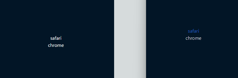
検証
左がmobile-chrome、右がmobile-safari
safariの際に色を付けるようにするコード
@layer components {
  .safari-text {
    @apply text-white;
  }

  .safari-bg {
    @apply bg-gray-200;
  }
}

/* Safari-specific styles */
@media screen and (min-color-index: 0) and (-webkit-min-device-pixel-ratio: 0) {
  @supports (-webkit-hyphens: none) {
    .safari-text {
      color: #2563eb !important; /* blue-600 */
    }

    .safari-bg {
      background-color: #dbeafe !important; /* blue-100 */
    }
  }
}
const Demo = () => {
  return (
    <div className=" flex h-full flex-col items-center justify-center">
      <div className="safari-text">safari</div>
      <div>chrome</div>
    </div>
  );
};

export default Demo;
おそらく検証できないこと
・lvh,svh,dvh(モバイル端末でのアドレスバーが隠れる挙動を再現できなかったので実機検証が必要)
・実機側での設定による差異
一番確認したいのは、上記なのだが......。
個人開発環境のXcodeとAndroid Studioでは検証できる。できるのになぜ(略)
終わりに
Playwrightはとても便利だ。レグレッションテストもできる。今まで簡単にしか触れてこなかったが、いよいよそうもいかなくなってきた。もう少し馴染みたい。
恨んでやるからな!(ただし、Playwrightを除く)
参考文献
Discussion