bunでTAMAGUIを使ってみた
What TAMAGUI?
Introduction
Tamagui makes styling React easy and fast on web, Android, and iOS. It focuses on platform-native output, with an optional optimizing compiler that significantly improves your app or site performance.
はじめに
TamaguiはWeb、Android、iOS上でReactのスタイリングを簡単かつ高速にします。オプションの最適化コンパイラにより、アプリやサイトのパフォーマンスを大幅に向上させることができます。
Core only has one dependency - React - but supports the full React Native View and Text API, a superset of the React Native Style API, styled(), powerful hooks, and the typed design system helpers in ~28Kb on web.
A smart, partial-evaluating compiler gives 0-runtime performance with the ergonomics of writing your code however you want - even inline, logic-filled code is optimized.
Every feature works at runtime and compile-time, so none of the usual limits of 0-runtime libraries, while optionally getting the same great performance.
useTheme and useMedia hooks with signal-like granularity and dirty tracking.
Unstyled and styled versions of all components.
Coreの依存関係はReactだけですが、完全なReact Native ViewとText API、React Native Style APIのスーパーセット、styled()、強力なフック、型付けされたデザイン・システム・ヘルパーをサポートしています。
スマートな部分評価コンパイラーは、コードを好きなように書ける人間工学と0ランタイムのパフォーマンスを提供します。
すべての機能がランタイムとコンパイルタイムで動作するため、0ランタイム・ライブラリにありがちな制限はありません。
useThemeフックとuseMediaフックは、シグナルのような粒度とダーティ・トラッキングを備えています。
すべてのコンポーネントのスタイルなしバージョンとスタイル付きバージョン。
ログインページでも作ってみるか
Login UIを作ってみて使い方を学んでいこうと思います。styleSheetだけだと限界がありそう😅
プロジェクト作成:
bunx create-expo-app expo-tamagui -t expo-template-blank-typescript
tamaguiを追加:
bun add @tamagui/babel-plugin@1.120.1 @tamagui/config@1.120.1 @tamagui/core@1.120.1 @tamagui/lucide-icons@1.120.1 expo@52.0.18 expo-status-bar@2.0.0 react@18.3.1 react-native@0.76.5 tamagui@1.120.1
全体のコード
import { TamaguiProvider, YStack, XStack, Text, Button, Input, Form } from 'tamagui'
import { useState } from 'react'
import config from './tamagui.config'
import { Lock, Mail } from '@tamagui/lucide-icons'

export default function App() {
  const [email, setEmail] = useState('')
  const [password, setPassword] = useState('')

  const handleLogin = () => {
    console.log('Login attempt with:', { email, password })
    // ここにログイン処理を実装
  }

  return (
    <TamaguiProvider config={config} defaultTheme="light">
      <YStack f={1} bg="white" padding="$4" gap="$4">
        <YStack gap="$4" marginTop="$10">
          <Text color="black" fontSize="$8" fontWeight="bold" textAlign="center">
            Welcome Back
          </Text>
          <Text color="$gray11" fontSize="$4" textAlign="center">
            Please sign in to continue
          </Text>
        </YStack>

        <Form onSubmit={handleLogin} marginTop="$8">
          <YStack gap="$4" maxWidth={400} width="100%" alignSelf="center">
            <XStack gap="$2" alignItems="center" backgroundColor="$gray3" borderRadius="$4" padding="$2">
              <Mail size={20} color="$gray11" />
              <Input
                flex={1}
                size="$4"
                borderWidth={0}
                backgroundColor="transparent"
                placeholder="Email"
                keyboardType="email-address"
                autoCapitalize="none"
                value={email}
                onChangeText={setEmail}
              />
            </XStack>

            <XStack gap="$2" alignItems="center" backgroundColor="$gray3" borderRadius="$4" padding="$2">
              <Lock size={20} color="$gray11" />
              <Input
                flex={1}
                size="$4"
                borderWidth={0}
                backgroundColor="transparent"
                placeholder="Password"
                secureTextEntry
                value={password}
                onChangeText={setPassword}
              />
            </XStack>

            <Button
              theme="blue"
              size="$4"
              marginTop="$2"
              onPress={handleLogin}
              backgroundColor="$blue10"
              pressStyle={{ opacity: 0.8 }}
            >
              Sign In
            </Button>

            <XStack justifyContent="center" marginTop="$2">
              <Text color="$gray11">
                Forgot password?
              </Text>
            </XStack>
          </YStack>
        </Form>
      </YStack>
    </TamaguiProvider>
  );
}
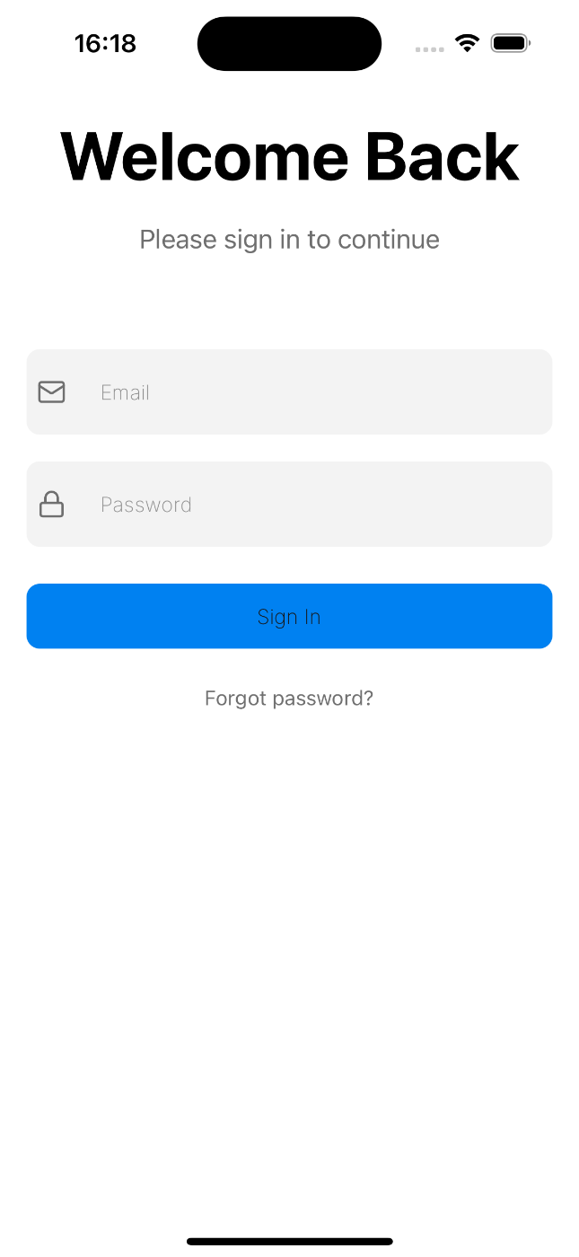
こんなUIが作れます。
Expo Tamagui Sample App
このプロジェクトは、Expo と Tamagui を使用したモダンなモバイルアプリケーションのサンプルです。
下の方に解説を書いてみました。こちらを読みながら学習してみてください。
環境構築
必要条件
セットアップ手順
# プロジェクトのクローン
git clone https://github.com/sakurakotubaki/expo-tamagui
cd expo-tamagui

# 依存関係のインストール
bun install

# 開発サーバーの起動
bun start
Tamaguiレイアウトガイド
Tamaguiは直感的なレイアウトシステムを提供します。主要なレイアウトコンポーネントと使用方法を説明します。
基本的なレイアウトコンポーネント
- YStack - 垂直方向のスタックレイアウト
<YStack gap="$4">  // 子要素間の間隔を設定
  <Component1 />
  <Component2 />
</YStack>
- XStack - 水平方向のスタックレイアウト
<XStack gap="$2">  // 子要素間の間隔を設定
  <Component1 />
  <Component2 />
</XStack>
スペーシング
-
gap- 要素間の間隔を設定 -
padding- 内側の余白 -
margin- 外側の余白
<YStack
  gap="$4"         // 子要素間の間隔
  padding="$4"     // 内側の余白
  marginTop="$10"  // 上部の余白
>
フレックスボックスのプロパティ
-
f={1}- flex: 1 と同等(空きスペースを埋める) -
alignItems="center"- 横方向の配置 -
justifyContent="center"- 縦方向の配置
<XStack
  f={1}
  alignItems="center"
  justifyContent="center"
>
サイズ設定
-
width="100%"- 幅の設定 -
maxWidth={400}- 最大幅の設定 -
height={200}- 高さの設定
<YStack
  width="100%"
  maxWidth={400}
  alignSelf="center"
>
スタイリング
-
bg="white"- 背景色の設定 -
borderRadius="$4"- 角丸の設定 -
borderWidth={1}- ボーダーの設定
<XStack
  bg="$gray3"
  borderRadius="$4"
  padding="$2"
>
プロジェクト構造
expo-tamagui/
├── App.tsx          # メインアプリケーションファイル
├── tamagui.config.ts # Tamaguiの設定ファイル
├── babel.config.js   # Babelの設定
└── package.json     # プロジェクトの依存関係
Discussion