asset_manager_cli試してみた!
assetsの設定を自動でやってくれる!
pubspec.yamlから、画像やフォントを読み込むときにする設定をやったことあるのですが、インデントがずれると失敗したり、毎回調べながら設定していたのですが、こちらの便利なDartのパッケージを使うと自動でやってくれるようです!
Readmeを参考に環境構築
まずは、ターミナルを開いてホームディレクトリからこちらのコマンドを実行すると環境構築ができます。パスを通す設定は必要ないようです?
他ので設定しているからだと思われます。
dart pub global activate asset_manager_cli
pub.devのinstallのところを見て、Flutterで使うにはこちらのコマンドでpubspec.yamlに追加する必要があります。
flutter pub add asset_manager_cli
追加に成功したら、こちらに表示されます。
画像を追加する
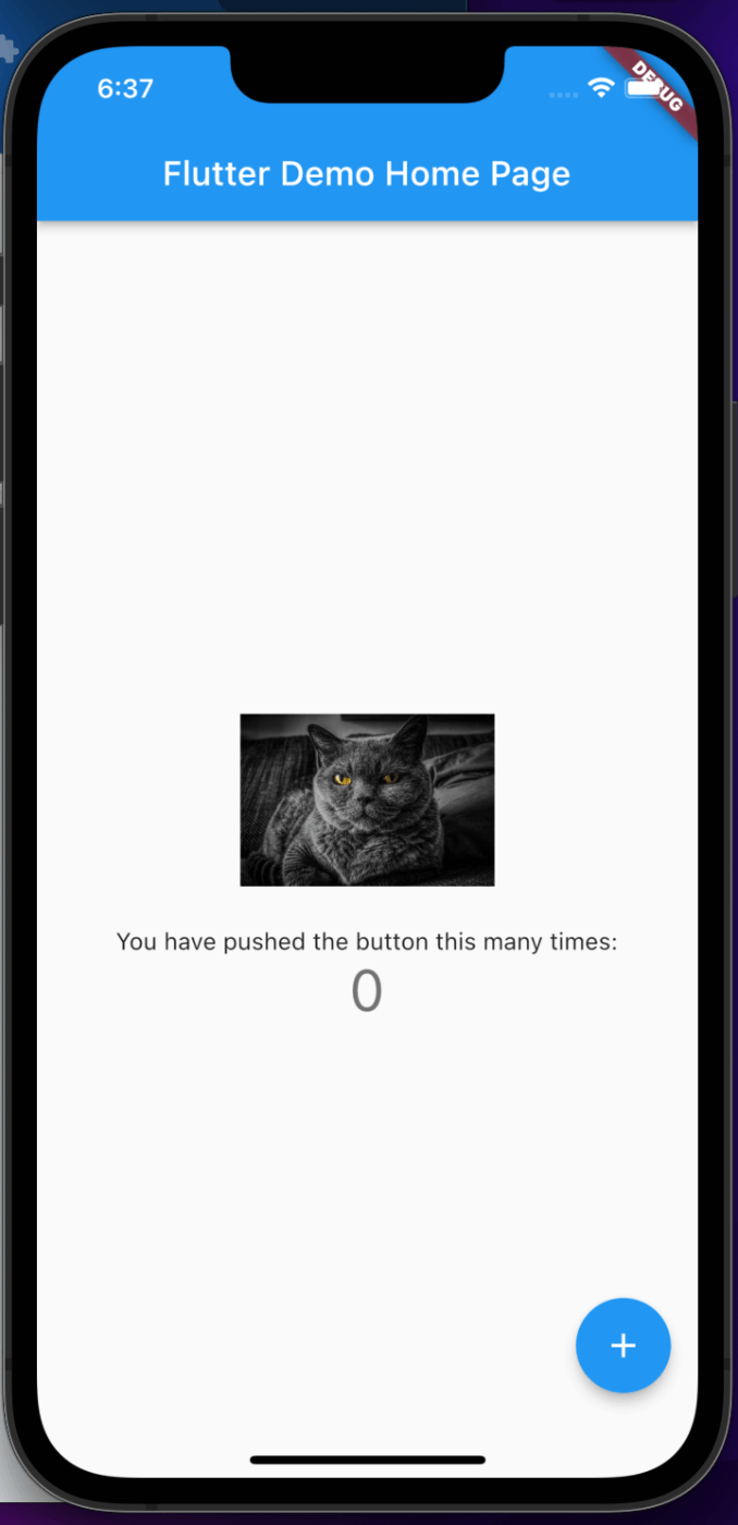
Flutterプロジェクト内に、assetsディレクトリを作成して、その中にimagesディレクトリを作成し、その中に今回は猫のjpeg画像を配置しました。
こちらの画像の相対パスはコピーしておいて、Flutter側に設定に使います。

で、便利なコマンドをこれから使います。最初は失敗したのか何度かコマンドを打ってしまって、pubspec.yamlに画像を読み込むコードを無駄に生成させてしまいました😅
削除すればやり直せるので、失敗したらコードを消してコマンドを使いましょう。
こちらのコマンドをプロジェクトのディレクトリでターミナルから実行するとassetsディレクトリの設定コードを自動生成してくれます。
asset_manager add
こちらが、自動生成されたコードが書かれたファイルです。
name: assets_manager_app
description: A new Flutter project.
# The following line prevents the package from being accidentally published to
# pub.dev using `flutter pub publish`. This is preferred for private packages.
publish_to: 'none' # Remove this line if you wish to publish to pub.dev
# The following defines the version and build number for your application.
# A version number is three numbers separated by dots, like 1.2.43
# followed by an optional build number separated by a +.
# Both the version and the builder number may be overridden in flutter
# build by specifying --build-name and --build-number, respectively.
# In Android, build-name is used as versionName while build-number used as versionCode.
# Read more about Android versioning at https://developer.android.com/studio/publish/versioning
# In iOS, build-name is used as CFBundleShortVersionString while build-number is used as CFBundleVersion.
# Read more about iOS versioning at
# https://developer.apple.com/library/archive/documentation/General/Reference/InfoPlistKeyReference/Articles/CoreFoundationKeys.html
# In Windows, build-name is used as the major, minor, and patch parts
# of the product and file versions while build-number is used as the build suffix.
version: 1.0.0+1
environment:
sdk: '>=2.18.0 <3.0.0'
# Dependencies specify other packages that your package needs in order to work.
# To automatically upgrade your package dependencies to the latest versions
# consider running `flutter pub upgrade --major-versions`. Alternatively,
# dependencies can be manually updated by changing the version numbers below to
# the latest version available on pub.dev. To see which dependencies have newer
# versions available, run `flutter pub outdated`.
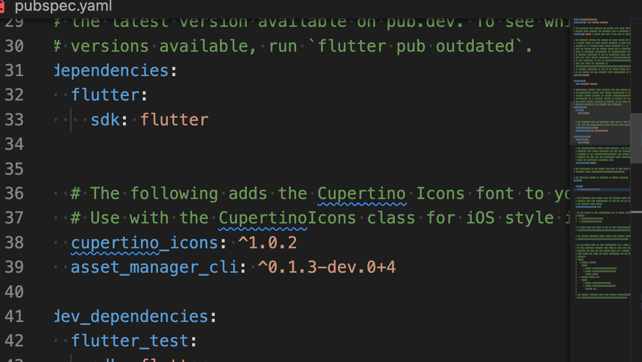
dependencies:
flutter:
sdk: flutter
# The following adds the Cupertino Icons font to your application.
# Use with the CupertinoIcons class for iOS style icons.
cupertino_icons: ^1.0.2
asset_manager_cli: ^0.1.3-dev.0+4
dev_dependencies:
flutter_test:
sdk: flutter
# The "flutter_lints" package below contains a set of recommended lints to
# encourage good coding practices. The lint set provided by the package is
# activated in the `analysis_options.yaml` file located at the root of your
# package. See that file for information about deactivating specific lint
# rules and activating additional ones.
flutter_lints: ^2.0.0
# For information on the generic Dart part of this file, see the
# following page: https://dart.dev/tools/pub/pubspec
# The following section is specific to Flutter packages.
flutter:
assets:
- assets/images/cat.jpg
# The following line ensures that the Material Icons font is
# included with your application, so that you can use the icons in
# the material Icons class.
uses-material-design: true
# To add assets to your application, add an assets section, like this:
# assets:
# - images/a_dot_burr.jpeg
# - images/a_dot_ham.jpeg
# An image asset can refer to one or more resolution-specific "variants", see
# https://flutter.dev/assets-and-images/#resolution-aware
# For details regarding adding assets from package dependencies, see
# https://flutter.dev/assets-and-images/#from-packages
# To add custom fonts to your application, add a fonts section here,
# in this "flutter" section. Each entry in this list should have a
# "family" key with the font family name, and a "fonts" key with a
# list giving the asset and other descriptors for the font. For
# example:
# fonts:
# - family: Schyler
# fonts:
# - asset: fonts/Schyler-Regular.ttf
# - asset: fonts/Schyler-Italic.ttf
# style: italic
# - family: Trajan Pro
# fonts:
# - asset: fonts/TrajanPro.ttf
# - asset: fonts/TrajanPro_Bold.ttf
# weight: 700
#
# For details regarding fonts from package dependencies,
# see https://flutter.dev/custom-fonts/#from-packages
こちらが、アプリ側のコードです。
import 'package:flutter/material.dart';
void main() {
runApp(const MyApp());
}
class MyApp extends StatelessWidget {
const MyApp({super.key});
// This widget is the root of your application.
Widget build(BuildContext context) {
return MaterialApp(
title: 'Flutter Demo',
theme: ThemeData(
// This is the theme of your application.
//
// Try running your application with "flutter run". You'll see the
// application has a blue toolbar. Then, without quitting the app, try
// changing the primarySwatch below to Colors.green and then invoke
// "hot reload" (press "r" in the console where you ran "flutter run",
// or simply save your changes to "hot reload" in a Flutter IDE).
// Notice that the counter didn't reset back to zero; the application
// is not restarted.
primarySwatch: Colors.blue,
),
home: const MyHomePage(title: 'Flutter Demo Home Page'),
);
}
}
class MyHomePage extends StatefulWidget {
const MyHomePage({super.key, required this.title});
// This widget is the home page of your application. It is stateful, meaning
// that it has a State object (defined below) that contains fields that affect
// how it looks.
// This class is the configuration for the state. It holds the values (in this
// case the title) provided by the parent (in this case the App widget) and
// used by the build method of the State. Fields in a Widget subclass are
// always marked "final".
final String title;
State<MyHomePage> createState() => _MyHomePageState();
}
class _MyHomePageState extends State<MyHomePage> {
int _counter = 0;
void _incrementCounter() {
setState(() {
// This call to setState tells the Flutter framework that something has
// changed in this State, which causes it to rerun the build method below
// so that the display can reflect the updated values. If we changed
// _counter without calling setState(), then the build method would not be
// called again, and so nothing would appear to happen.
_counter++;
});
}
Widget build(BuildContext context) {
// This method is rerun every time setState is called, for instance as done
// by the _incrementCounter method above.
//
// The Flutter framework has been optimized to make rerunning build methods
// fast, so that you can just rebuild anything that needs updating rather
// than having to individually change instances of widgets.
return Scaffold(
appBar: AppBar(
// Here we take the value from the MyHomePage object that was created by
// the App.build method, and use it to set our appbar title.
title: Text(widget.title),
),
body: Center(
// Center is a layout widget. It takes a single child and positions it
// in the middle of the parent.
child: Column(
// Column is also a layout widget. It takes a list of children and
// arranges them vertically. By default, it sizes itself to fit its
// children horizontally, and tries to be as tall as its parent.
//
// Invoke "debug painting" (press "p" in the console, choose the
// "Toggle Debug Paint" action from the Flutter Inspector in Android
// Studio, or the "Toggle Debug Paint" command in Visual Studio Code)
// to see the wireframe for each widget.
//
// Column has various properties to control how it sizes itself and
// how it positions its children. Here we use mainAxisAlignment to
// center the children vertically; the main axis here is the vertical
// axis because Columns are vertical (the cross axis would be
// horizontal).
mainAxisAlignment: MainAxisAlignment.center,
children: <Widget>[
// ContainerでWrapして、画像の幅と高さを設定する。
Container(
width: 150,
height: 150,
// 画像のあるフォルダの相対パスを設定する
child: Image.asset('assets/images/cat.jpg')),
const Text(
'You have pushed the button this many times:',
),
Text(
'$_counter',
style: Theme.of(context).textTheme.headline4,
),
],
),
),
floatingActionButton: FloatingActionButton(
onPressed: _incrementCounter,
tooltip: 'Increment',
child: const Icon(Icons.add),
), // This trailing comma makes auto-formatting nicer for build methods.
);
}
}
スクリーンショット
使ってみた感想
今までだと、コメントを解除して、インデントを整えてyamlのコードのルールに基づいて設定していたのですが、面倒臭いと感じていることがありました。
これからは画像やフォントの設定をすることがあれば自動化できるので、作業の簡略化ができそうですね。
Discussion