SolidJS で使える CSS in JS の調査
 jay-es
まとめ
(ライブラリ名はページ内リンクになっています)
2021年9月時点
-
-
solid-styled-jsx
❌npx degitで作ったプロジェクトには非対応。
-
solid-styled-jsx
-
-
solid-styled-components
⭕️ 調べた中では唯一、styledの機能が使えた。
-
solid-styled-components
-
-
Emotion
⚠️@emotion/cssだけ使える。@emotion/styledは非対応。
-
Emotion
-
-
Linaria
❌ おそらく現時点では Solid 非対応。
-
Linaria
-
-
Stitches
⚠️@stitches/coreは使えた。
-
Stitches
-
-
LightwindCSS
⭕️ ここまでのうち、唯一 CSS ファイルの書き出しができる。
-
LightwindCSS
2021年12月追加
-
-
vanilla-extract
⭕️ これも CSS ファイルの書き出しが可能。
-
vanilla-extract
jay-es動機
Solid プロジェクトを以下のように作成すると CSS Modules が使えるようになっている。
npx degit solidjs/templates/ts my-solid-project
(これは Vite によるもの https://ja.vitejs.dev/guide/features.html#css-modules)
Vue や Svelte のようにスタイルとテンプレートが同一ファイルにあった方が作業効率が上がりそうなので、CSS in JS のライブラリを探してみた。
(筆者は CSS in JS 自体が今回初体験です)
jay-es1. solid-styled-jsx
まずは公式パッケージを試す。
README に Note: Does not work with Create Solid App とあるがとりあえず入れてみる。
インストール(styled-jsx も入れないとエラーになる)
npm install solid-styled-jsx styled-jsx
/src/index.tsx(エントリーファイル)に追加。
import "solid-styled-jsx";
JSX に style タグを追加したらスタイル反映された。
<style jsx>{`
  p {
    color: orange;
  }
`}</style>
と思いきや、普通に HTML 上に style タグが挿入されているだけだった。グローバルなスタイルになっているのでコンポーネント外の要素にも影響してしまう。
(これは solid-styled-jsx を入れなくても同じ挙動だった)
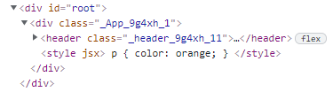
↑header などにクラスがついているのは、元の CSS Modules によるもの
ライブラリからエクスポートされているコンポーネントを使ったところ、head 内に style タグが書き出されるようになったが、相変わらずグローバルなまま。また、VSCode で「JSX コンポーネントとして使えない」というようなエラーが出ている(型定義が原因。トランスパイルはできる)
import JSXStyle from 'solid-styled-jsx'

...略

<JSXStyle>{`
  p {
    color: orange;
  }
`}</JSXStyle>
やはり現時点では正しく動作しなそうだ。
jay-es2. solid-styled-components
こちらも公式パッケージ。
goober という軽量な CSS in JS ライブラリをラップしているらしい。
インストール
npm install solid-styled-components
styled()
styled 関数に HTML タグ名を指定してスタイルのテンプレートリテラルを渡すと、そのスタイルを持ったコンポーネントができる。
import { styled } from "solid-styled-components";

const Btn = styled("button")`
  border-radius: 4px;
`;

...略

<Btn>click</Btn>
ユニークなクラス名を持った要素としてレンダリングされ、<head> 内に <style> タグも書き出されている。
<button class="go2793489743">click</button>
スタイル部分に関数を使う場合、README のコードだと TypeScript エラーになる(props に size プロパティはない、と怒られる)ので、styled 関数のあとに props の型を指定する必要があった(<{ size: number }> の部分)。コンポーネントの props は children 等を持った固有の型との交差型になる。
const Btn2 = styled("button")<{ size: number }>`
  border-radius: ${(props) => props.size}px;
`;
const Btn3 = styled("button")<{ size: number }>(
  (props) => `
  border-radius: ${props.size}px;
`
);
const Btn4 = styled("button")<{ size: number }>((props) => ({
  borderRadius: props.size + "px",
}));

<Btn2 size={20}>click</Btn2>
SCSS のようなネストも可能。
const Btn = styled("button")`
  border-radius: 4px;

  &:hover {
    padding: 1em;
  }

  .otherClass {
    margin: 0;
  }
`;
引数にタグ名ではなく、コンポーネントを渡すこともできる。
(コンポーネントのルート要素に className={props.className} を指定しておく必要がある)
const MyButton: Component<{ className: string }> = (props) => (
  <button className={props.className}>click</button>
);

const StyledButton = styled(MyButton)`
  border-radius: 4px;
`;
タグひとつひとつを styled-component 化してコンポーネントを組むのではなく、普通の HTML タグ(や他のコンポーネント)を組み合わせてコンポーネントを作り、最後に全体を styled-component 化するのがよさそうか。
jay-essolid-styled-components の続き
css()
こちらはクラス名だけを生成する関数。
import { css } from "solid-styled-components";

const BtnClassName = css`
  border-radius: 4px;
`;
// オブジェクト形式
const BtnClassName2 = css({ borderRadius: "4px" })

...略

<button className={BtnClassName}>click</button>
styled 関数と同様にユニークなクラス名としてレンダリングされる。
<button class="go2793489743">click</button>
JSX に直書きして、動的にすることも可能。
<button
  className={css`
    border-radius: ${props.size}px;
  `}
>
  click
</button>
さらに goobar の README にはこんな例もあった(引数の型は筆者が追加)。
const BtnClassName = (props: { size: number }) => css`
  border-radius: ${props.size}px;
`;

...略

<button className={BtnClassName({ size: 20 })}>click</button>
README には書かれていないが、styled 関数と同様にネストも可能。
const BtnClassName = css`
  border-radius: 4px;

  &:hover {
    padding: 1em;
  }
`;
3. Emotion
Framework Agnostic という見出しがあるので試してみる。
@emotion/css
インストール
npm install --save @emotion/css
solid-styled-components の css() と同様、クラス名を生成する関数。
import { css } from '@emotion/css'

const myStyle = css`
  color: rebeccapurple;
`

...略

<button className={myStyle}>click</button>
ユニークなクラス名となってレンダリングされた。
<button class="css-1573ub6">click</button>
ネストや変数も使える。
<div
  className={css`
    background-color: hotpink;
    &:hover {
      color: ${color};
    }
  `}
>
  This has a hotpink background.
</div>
オブジェクト記法も。
css({
  backgroundColor: "hotpink",
  "&:hover": {
    color,
  },
});
@emotion/styled
ドキュメントに to create React components とあるがダメ元で試してみる。
インストール
npm i @emotion/styled
solid-styled-components の styled() と同様、スタイル付きコンポーネントを生成する関数。
import styled from "@emotion/styled";

const Button = styled.button`
  color: turquoise;
`;

...略

<Button>This my button component.</Button>
出来上がったコンポーネントを JSX に置いたら以下の TypeScript エラーが出た(@emotion/react パッケージを入れても変わらず)。
JSX element type 'Button' does not have any construct or call signatures.
このパッケージはやはり React じゃないと使えなそう。
jay-es4. Linaria
ビルド時に通常の CSS ファイルとして書き出してくれるライブラリ。
Solid 対応の issue が立っているのでダメっぽいが一応試してみる。
パッケージインストール
npm i @linaria/core @linaria/shaker
import { css } from "@linaria/core";

const flower = css`
  display: inline;
  color: violet;
`;

...略

<button class={flower}>click</button>
ユニークなクラス名でレンダリングされている。もちろん style は書き出されていない。
<button class="f12cs6sz">click</button>
Vite に Rollup プラグインを追加。
npm i -D rollup-plugin-css-only @linaria/rollup
import linaria from "@linaria/rollup";
import css from "rollup-plugin-css-only";

...略

  plugins: [
    solidPlugin(),
    linaria({
      sourceMap: process.env.NODE_ENV !== "production",
    }),
    css({
      output: "styles.css",
    }),
  ],
dev の出力は変わらず。build コマンドでエラーが出るようになった。エラースタックのパスに node_modules/@babel/parser とあるので Babel プラグインを追加してみる。
npm i -D @linaria/babel-preset
{
  "presets": ["@linaria"]
}
build コマンドで dist/styles.css が書き出されるようになった。しかし Linaria の css() で定義した分は含まれておらず、Solid プロジェクトに最初から入っている CSS だけが書き出されてる。それらの CSS を読み込まないようにしたら dist/styles.css も書き出されなくなった。
@rollup/plugin-babel を追加してみても変わらず。やはり Solid では使えないということだろうか。
冒頭の issue に +1 しておいた。
jay-es番外編
Solid プロジェクト作成時のテンプレートで Windi CSS 入りのものが用意されている。
npx degit solidjs/templates/ts-windicss my-solid-project
5. Stitches
near-zero runtime[1] を謳う CSS-in-JS ライブラリ。
これにも Framework-agnostic という項目があるので試していく。
パッケージインストール
npm i @stitches/core
オブジェクトスタイルで記述。ネストも可能。
import { css } from "@stitches/core";

const button = css({
  backgroundColor: 'gainsboro',
  borderRadius: '9999px',
  fontSize: '13px',
  padding: '10px 15px',
  '&:hover': {
    backgroundColor: 'lightgray',
  },
});

...略

<button className={button()}>Button</button>
レンダリング結果。
<button class="c-jjZzQc">Button</button>
div にはきちんとスタイルが当たっているのだが、head 内に書き出される style タグの中身は空になっている(いったん書き出した後にクリアしてるっぽい)。
<style></style>
オプションの定義を可能なのが特徴的か。
const button = css({
  // base styles

  variants: {
    color: {
      violet: {
        backgroundColor: 'blueviolet',
        color: 'white',
        '&:hover': {
          backgroundColor: 'darkviolet',
        },
      },
      gray: {
        backgroundColor: 'gainsboro',
        '&:hover': {
          backgroundColor: 'lightgray',
        },
      },
    },
  },
});


// `color` や `violet | gray` のコード補完が効く
<button className={button({ color: 'violet' })}>Button</button>
また、呼び出し時に css プロパティによってスタイルの追加や上書き可能。
<button
  className={button({
    css: {
      borderRadius: '0',
      '&:hover': {
        backgroundColor: 'black',
        color: 'white',
      },
    },
  })}
>
  Button
</button>
-
Linaria のように事前ビルドされるのかと思ったがそうではなかった。スタイル付きコンポーネントで動的なスタイルを指定する場合、Emotion などは props を使う(= コンポーネントの props が増える)が、
@stitches/reactは variant で指定するのでランタイムに影響しない、という感じか。 ↩︎
jay-es6. LightwindCSS
@uhyo さんのライブラリ。紹介記事はこちら
パッケージインストール
npm i -D lightwindcss
css 関数に CSS を記述する。
import { css } from "lightwindcss";

...略

<div
  className={css`
    min-height: 100vh;
    padding: 0 0.5rem;
    display: flex;
    flex-direction: column;
    justify-content: center;
    align-items: center;
  `}
>
  Hello, world!
</div>
レンダリング結果。ユニークなクラス名が生成される。
<div class="c-3bf126654b822a6fd2c07feba1462bee">Hello, world!</div>
head 内には data-lightwind 属性を持った style タグが書き出されていた。
<style data-lightwind="c-3bf126654b822a6fd2c07feba1462bee">.c-3bf126654b822a6fd2c07feba1462bee{min-height:100vh;padding:0 0.5rem;display:flex;flex-direction:column;justify-content:center;align-items:center;}</style>
ビルド用コマンド & 設定
まず analyze コマンドでプロジェクトルートに lightwindcss.json が生成され、次に generate すると lightwind.css が出力された(ファイル名は引数で変更できる)。
クラス名は 1 文字になっている。
npx lightwindcss analyze src/
npx lightwindcss generate
.babelrc.js を作成。
module.exports = (api) => ({
  plugins: api.env("production")
    ? [
        [
          "lightwindcss/babel",
          {
            analysisFile: "./lightwindcss.json",
          },
        ],
      ]
    : [],
});
ビルドするとクラス名が変わるようになった(先ほどの CSS ファイルに対応している)。
<div class="a">Hello, world!</div>
index.html で CSS を読み込むようにして、再ビルドしたらスタイルが反映された🎉
jay-es7. vanilla-extract
これも静的 CSS ファイルを出力するタイプ。
トップページに Framework agnostic と書いてある。
導入
Setup → Vite を参考に導入していく
パッケージインストールして、
npm install @vanilla-extract/css @vanilla-extract/vite-plugin
Vite にプラグイン設定を追加。
  import { defineConfig } from "vite";
  import solidPlugin from "vite-plugin-solid";
+ import { vanillaExtractPlugin } from "@vanilla-extract/vite-plugin";

  export default defineConfig({
-   plugins: [solidPlugin()],
+   plugins: [solidPlugin(), vanillaExtractPlugin()],
    build: {
      target: "esnext",
      polyfillDynamicImport: false,
    },
  });
スタイル作成方法
.css.ts に CSS を記載するのが特徴的。プロパティ名や値に補完が効く。
import { style } from "@vanilla-extract/css";

export const buttonClass = style({
  borderRadius: 4,
});
.tsx にクラスをインポートして className に指定
import { buttonClass } from "./styles.css";

...略

<button className={buttonClass}>click</button>
レンダリング結果。ユニークなクラス名が生成される。
<button class="styles__ckfzh00">click</button>
head 内にはこのような style タグが書き出されていた。
<style data-package="vite-template-solid" data-file="src/styles.css.ts" type="text/css">.styles__ckfzh00 {
  border-radius: 4px;
}</style>
ビルド
ビルドしたら dist/assets/index.ad140332.css として、以下のファイルが出力された。
.ckfzh00{border-radius:4px}
起動すると、HTML はこのようになっていた。
<button class="ckfzh00">click</button>
vanilla-extract も SolidJS で問題なく使える 👏