iOS Safariのセーフエリアの対応を行う
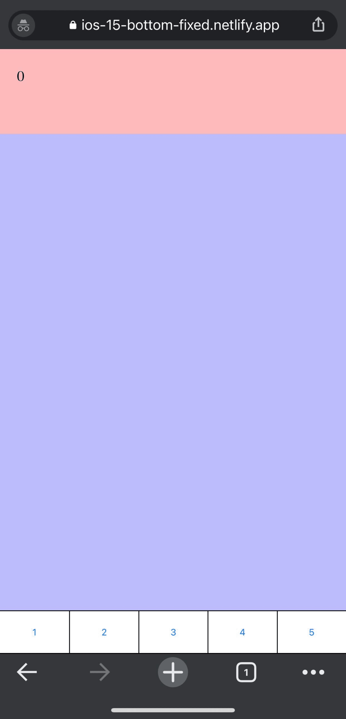
ios15でアドレスバーを「シングルタブ」に変更して、下固定のボタンをクリックするとボタンが反応しないでsafariのメニューボタンが出てきてしまうため、その時に対応したことになります。(状態については下の画像のような状態です。)

制作物について
今回、検証用として制作したものは以下になります。
手順
1. htmlのmetaタグにviewport-fit=coverを追加
デフォルトだとviewport-fit=autoのため、ページの全部分に対応させたい場合はviewport-fit=coverに変更することでページの端から端まで表示されるようになります。
<meta name='viewport' content='initial-scale=1, viewport-fit=cover'>
2. cssで下に余白分の追加
2-1. safe-areaの追加
iOS11からsafe-area-inset-{top | right | bottom | left}の値が追加されたため、以下の追加
.hoge {
  bottom: env(safe-area-inset-bottom);
}
2-2. 44pxの追加
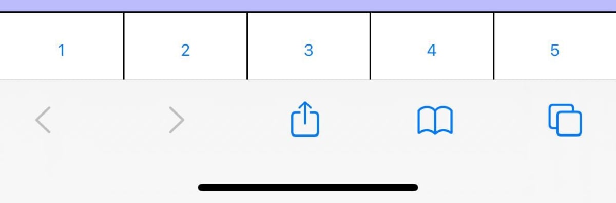
2-1の方法のみだと以下のような状態でクリックできるエリアがほとんどないため、padding-bottom: 44pxを追加
(黒線とsafariのナビメニューの間の1pxくらいがクリックできる場所です。)

.hoge {
  padding-bottom: calc(env(safe-area-inset-bottom) + 44px);
}
変更後はこのようなイメージになります。
3. iphone, safariの確認を行う
2-2までの対応の場合、safari以外のブラウザだと以下の問題・状態になってしまうため、safariのみに適応できるようにする。
-
env(safe-area-inset-bottom)の値は0だが、44pxの固定分が追加されてしまうため、無駄な余白が発生する

3-1. iPhoneのデバイス検出
const isIphone = navigator.userAgent.match(/iPhone/i) ? true : false;
3-2. safariのブラウザ検出
他の人がすでに指摘しているように、特定のブラウザをチェックするよりも機能の検出が優先されます。1つの理由は、ユーザーエージェント文字列を変更できることです。もう1つの理由は、新しいバージョンでは文字列が変更され、コードが破損する可能性があることです。
それでもそれを実行してSafariのバージョンをテストしたい場合は、これを使用することをお勧めします
これは、Mac、iPhone、iPod、iPadなどのすべてのデバイスのSafariのすべてのバージョンで機能します。
const isSafari = navigator.vendor && navigator.vendor.indexOf('Apple') > -1 &&
                 navigator.userAgent &&
                 navigator.userAgent.indexOf('CriOS') == -1 &&
                 navigator.userAgent.indexOf('FxiOS') == -1;
3-3. safari用にスタイルを変更
3-1, 3-2で取得したものがtrueの時、htmlタグにiphoneだとわかるようにdata属性,class名などを付与
3-3-1. JavaScirptでiphone & safariの判定
// HTMLタグの取得
const elemHtml = document.documentElement
// iphoneかつsafariの
if (isIphone && isSafari) {
  // data属性付与の場合
  elemHtml.setAttribute('data-device', 'iphone')
  // class属性で付与したい場合
  // elemHtml.classList.add('is-device-iphone')
}
3-3-2. safariの時のみcssの適応
3-3-1で追加した属性値を元にcssを変更
- .hoge {
+ [data-device='iphone'] .hoge {
  padding-bottom: calc(env(safe-area-inset-bottom) + 44px);
}
chomreのメニューが表示されている時
chromeのメニューが表示されていない時

補足
上記の対応の場合、safariのアドレスバーの表示・非表示反映までは行っていないため、以下のようなUIになってしまうため、使用する際には注意してください。
シングルタブ通常の時

タブバー通常の時

その他の対応
以下の場合、html, bodyの高さを100%にして、safariのボタンエリアを常に表示するように対応している。
After much blood, sweat, and tears (or dogged investigation), I stumbled onto a CSS solution. If I set the following styles onto an element containing the button – in our case, <html> and <body> – the button would remain at the bottom of the page and the Safari nav would remain.
/* Allows content to fill the viewport and go beyond the bottom */
height: 100%;

/* Allows you to scroll below the viewport; default value is visible */
overflow-y: scroll;

/* To smooth any scrolling behavior */
-webkit-overflow-scrolling: touch;
参考にした記事一覧
iOS Safariのシングルタブの切り替え方について
iOSのsafe areaについて
iOS safariのデバイス・ブラウザ検出について
Discussion