はじめに
最近、業務委託でdaisyUIを扱うことが多く、個人開発でも使用する予定ができてテーマコントローラーのような機能が欲しかったので、それについてまとめました。
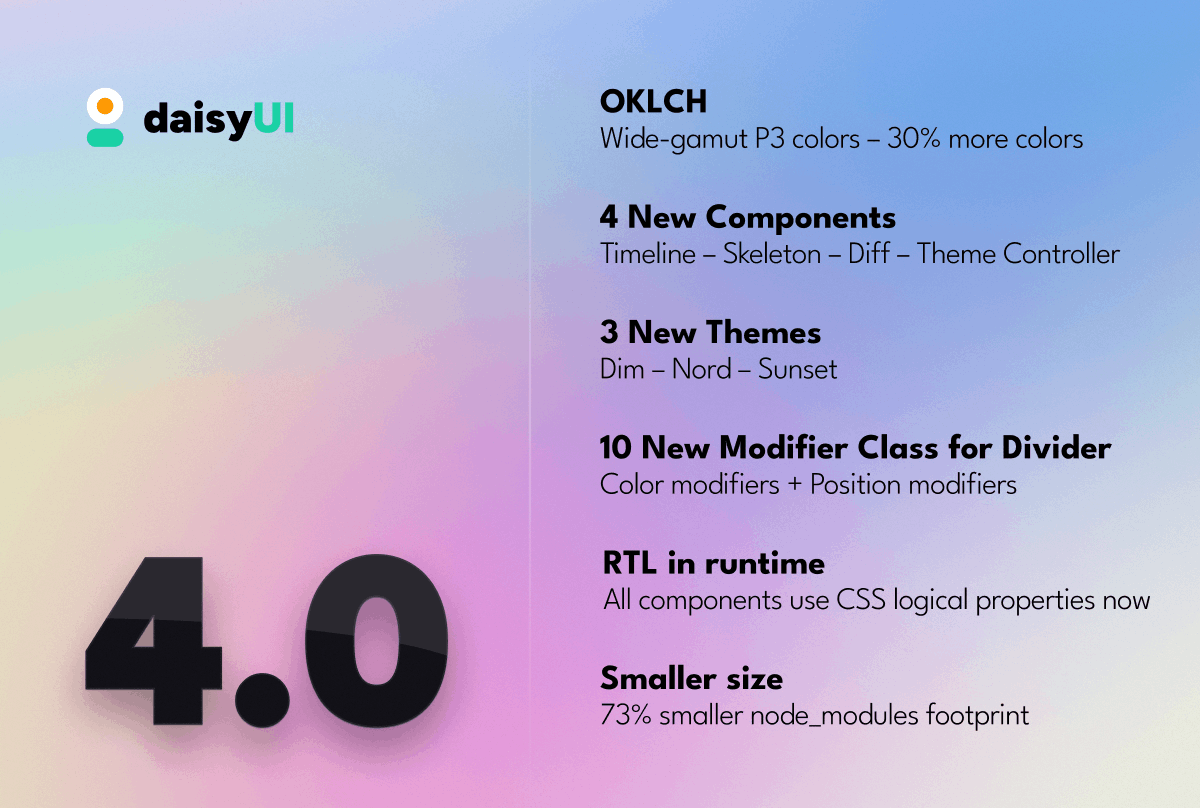
daisyUIとは?
Tailwind CSS をコンポネント化したライブラリーです。Tailwindを直接使うよりも、daisyUI を使ったほうがクラス名が減ったりするので個人開発でとても扱いやすいです。また、開発も頻繁に行われていて、気づいたら新しいバージョンが来ています。
新しくやってきたtheme-controller
2023年の11月に、新しいテーマ数個とともに、新しくtheme-controllerがやってきました!
<input type="checkbox" value="synthwave" className="toggle theme-controller"/>
checkbox radio, inputのうちのどれか使用してテーマが変更できるのですがあまりにもnextjsとの相性が悪いです。
そこでドキュメントを見てみると、htmlにdata-themeという属性を与えることによって、そのコンポネントのテーマが変更できるということがわかりました。
next-themesを使用して、daisyUIのテーマを制御する
next-themesを読んでみると、ThemeProviderを介して、daisyUIと同様にhtmlの属性にdata-themeを入れることによって制御できるみたいなので実際にこれで実装してみます。
1. 使用したいテーマを定数として扱う
static/theme.ts
export const supportedTheme: string[] = [
  "light", "dark", "cupcake", "bumblebee",
  "emerald", "corporate", "synthwave", "retro",
  "cyberpunk", "valentine", "halloween", "garden",
  "forest", "aqua", "lofi", "pastel",
  "fantasy", "wireframe", "black", "luxury",
  "dracula", "cmyk", "autumn", "business",
  "acid", "lemonade", "night", "coffee",
  "winter", "dim", "nord", "sunset",
] as const;
export type themeType = typeof supportedTheme[number];
2. 定数を設定に追加
tailwind.config.ts
import type { Config } from 'tailwindcss'
import { supportedTheme } from './static/theme'

const config: Config = {
  daisyui: {
    themes: supportedTheme
  },
  content: [
    './pages/**/*.{js,ts,jsx,tsx,mdx}',
    './components/**/*.{js,ts,jsx,tsx,mdx}',
    './app/**/*.{js,ts,jsx,tsx,mdx}',
  ],
  theme: {
    extend: {
      backgroundImage: {
        'gradient-radial': 'radial-gradient(var(--tw-gradient-stops))',
        'gradient-conic':
          'conic-gradient(from 180deg at 50% 50%, var(--tw-gradient-stops))',
      },
    },
  },
  plugins: [require("daisyui")],
}
export default config
Pages Router
3. ThemeProviderを追加する
_app.tsx
import { supportedTheme } from '@/static/themes'
import '@/styles/globals.css'
import { ThemeProvider } from 'next-themes'
import type { AppProps } from 'next/app'

export default function App({ Component, pageProps }: AppProps) {
  return (
    <ThemeProvider themes={supportedTheme}>
      <Component {...pageProps} />
    </ThemeProvider>
  )
}
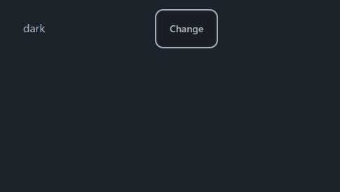
4. テーマ変更するトリガーを作成する
ここは、next-themesの使用に従って、テーマ変更する処理を書くだけなので、ドキュメントを読んで作ってください。
index.tsx
import { useState } from 'react'
import { useTheme } from 'next-themes'

export default function Home() {
  const { setTheme } = useTheme()
  const [themeName, setThemeName] = useState('');
  return (
    <div className="m-4">
      <input
        value={themeName}
        onChange={(e) => {setThemeName(e.target.value)}}
        className='input'
      />
      <button className='btn' onClick={() => {
        setTheme(themeName)
      }}>
        Change
      </button>
    </div>
  )
}
App Router
3. providers.tsxを作成する
app/providers.tsx
'use client'

import { ThemeProvider } from 'next-themes'

export function Providers({ children }) {
  return (
    <ThemeProvider>
      {children}
    </ThemeProvider>
  )
}
4. Providersを追加する
layout.tsx
import './globals.css'
import type { Metadata } from 'next'
import { Inter } from 'next/font/google'
import { Providers } from './providers'

const inter = Inter({ subsets: ['latin'] })

export const metadata: Metadata = {
  title: 'Create Next App',
  description: 'Generated by create next app',
}

export default function RootLayout({
  children,
}: {
  children: React.ReactNode
}) {
  return (
    <html lang="ja">
      <body className={inter.className}>
        <Providers>
          {children}
        </Providers>
      </body>
    </html>
  )
}
5. テーマ変更するトリガーを作成する
ここは、next-themesの使用に従って、テーマ変更する処理を書くだけなので、ドキュメントを読んで作ってください。
app/page.tsx
'use client'

import { useState } from 'react'
import { useTheme } from 'next-themes'

export default function Home() {
  const { setTheme } = useTheme()
  const [themeName, setThemeName] = useState('');
  return (
    <div className="m-4">
      <input
        value={themeName}
        onChange={(e) => {setThemeName(e.target.value)}}
        className='input'
      />
      <button className='btn' onClick={() => {
        setTheme(themeName)
      }}>
        Change
      </button>
    </div>
  )
}
最後に
もし他にいい方法があればぜひ教えてほしいです。
Discussion