📆
React 19×shadcn uiで日時入力可能なカレンダーコンポーネントを作る
1.はじめに
今回はReact 19 × shadcn uiで日時入力可能なカレンダーコンポーネントを作成してみました。
イメージは以下の通り、クリックすると日時入力が選択できるようなコンポーネントです。

■ 経緯:react-day-picker(8.10.1)がReact 19に対応してない
React 19 × shadcn uiでカレンダーのコンポーネントを使おうと思い
公式ドキュメント通りに「react-day-picker」のインストールを試みたところ以下エラーが出ました。
どうやら、react-day-pickerの8.10.1がReact 19に対応していないそうです。(2025/6時点)
$ npm install react-day-picker@8.10.1 date-fns
npm error code ERESOLVE
npm error ERESOLVE unable to resolve dependency tree
npm error While resolving: react-tutorial@0.1.0
npm error Found: react@19.1.0
npm error node_modules/react
npm error   react@"^19.0.0" from the root project
npm error Could not resolve dependency:
npm error peer react@"^16.8.0 || ^17.0.0 || ^18.0.0" from react-day-picker@8.10.1
npm error node_modules/react-day-picker
npm error   react-day-picker@"8.10.1" from the root project
npm error Fix the upstream dependency conflict, or retry
npm error this command with --force or --legacy-peer-deps
npm error to accept an incorrect (and potentially broken) dependency resolution.
■ 手順
前述の経緯のため、以下手順で日時入力可能なカレンダーコンポーネントを作ることになりました。
- React 19に対応している「react-day-picker」を入れる
- 上記「react-day-picker」をshadcnのCalendarコンポーネントに対応させる(=日付入力まで)
- 日時が入力できるようにカスタマイズ
2.React 19に対応した「react-day-picker」を導入する
どうやら同じ現象に悩まされている人がいるみたいで、
React 19に対応している「react-day-picker」のバージョンは「9.6.7」ということが分かりました。
ということでインストール。(npmの場合)
npm install react-day-picker@9.6.7 date-fns
3.「react-day-picker@9.6.7」をshadcn uiに対応させる
公式ドキュメント通りに、「components/ui/calender.tsx」を作成していきます。
そのままコピペすると、以下のように見た目が崩れます。(2025/06時点)
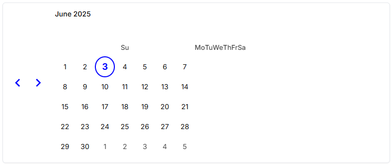
なので、以下のように修正します。
components/ui/calender.tsx
全体のコード
import * as React from "react";
import { DayPicker, getDefaultClassNames } from "react-day-picker";

import { cn } from "@/lib/utils";
import { buttonVariants } from "./button";

function Calendar({
  className,
  classNames,
  showOutsideDays = true,
  ...props
}: React.ComponentProps<typeof DayPicker>) {
  const defaultClassNames = getDefaultClassNames();
  return (
    <DayPicker
      showOutsideDays={showOutsideDays}
      className={cn("p-3", className)}
      classNames={{
        months: `relative flex ${defaultClassNames.month}`,
        month_caption: `relative mx-10 flex h-7 items-center justify-center ${defaultClassNames.month_caption}`,
        weekdays: cn("flex flex-row", classNames?.weekdays),
        weekday: cn(
          "w-8 text-sm font-normal text-muted-foreground",
          classNames?.weekday
        ),
        month: cn("w-full", classNames?.month),

        caption_label: cn(
          "truncate text-sm font-medium",
          classNames?.caption_label
        ),
        button_next: cn(
          buttonVariants({ variant: "outline" }),
          "h-7 w-7 bg-transparent p-0 opacity-50 hover:opacity-100 absolute right-1 [&_svg]:fill-foreground",
          classNames?.button_next
        ),
        button_previous: cn(
          buttonVariants({ variant: "outline" }),
          "h-7 w-7 bg-transparent p-0 opacity-50 hover:opacity-100 absolute left-1 [&_svg]:fill-foreground",
          classNames?.button_previous
        ),
        nav: cn("flex items-start", classNames?.nav),
        month_grid: cn("mx-auto mt-4", classNames?.month_grid),
        week: cn("mt-2 flex w-max items-start", classNames?.week),
        day: cn(
          "flex size-8 flex-1 items-center justify-center p-0 text-sm",
          classNames?.day
        ),
        day_button: cn(
          "size-8 rounded-md p-0 font-normal transition-none aria-selected:opacity-100",
          classNames?.day_button
        ),
        range_start: cn(
          "bg-accent [&>button]:bg-primary [&>button]:text-primary-foreground [&>button]:hover:bg-primary [&>button]:hover:text-primary-foreground day-range-start rounded-s-md",
          classNames?.range_start
        ),
        range_middle: cn(
          "bg-accent !text-foreground [&>button]:bg-transparent [&>button]:!text-foreground [&>button]:hover:bg-transparent [&>button]:hover:!text-foreground",
          classNames?.range_middle
        ),
        range_end: cn(
          "bg-accent [&>button]:bg-primary [&>button]:text-primary-foreground [&>button]:hover:bg-primary [&>button]:hover:text-primary-foreground day-range-end rounded-e-md",
          classNames?.range_end
        ),
        selected: cn(
          "[&>button]:bg-primary [&>button]:text-primary-foreground [&>button]:hover:bg-primary [&>button]:hover:text-primary-foreground",
          classNames?.selected
        ),
        today: cn(
          "[&>button]:bg-accent [&>button]:text-accent-foreground",
          classNames?.today
        ),
        outside: cn(
          "day-outside text-muted-foreground opacity-50 aria-selected:bg-accent/50 aria-selected:text-muted-foreground aria-selected:opacity-30",
          classNames?.outside
        ),
        disabled: cn("text-muted-foreground opacity-50", classNames?.disabled),
        hidden: cn("invisible flex-1", classNames?.hidden),
        ...classNames,
      }}
      {...props}
    />
  );
}
Calendar.displayName = "Calendar";

export { Calendar };
上記のように修正すると以下の形で利用できるかと思います。
<Calendar
  mode="single"
  selected={date}
  onSelect={setDate}
  className="rounded-md border shadow-sm"
/>

4.日時入力可能なコンポーネントを作成する
作成した「Calender」コンポーネントと他のshadcnコンポーネントを組み合わせて、日時入力可能なコンポーネントを作成します。
components/ui/date-time-picker.tsx
全体のコード
"use client";

import { Button } from "@/components/ui/button";
import { Calendar } from "@/components/ui/calender";

import {
  Popover,
  PopoverContent,
  PopoverTrigger,
} from "@/components/ui/popover";
import { cn } from "@/lib/utils";
import { format } from "date-fns";
import { CalendarIcon } from "lucide-react";
import * as React from "react";

export function DatetimePicker({
  value,
  onChange,
  className,
}: {
  value: Date | undefined;
  onChange: (date: Date) => void;
  className?: string;
}) {
  const [open, setOpen] = React.useState(false);

  return (
    <div className={cn("flex flex-col space-y-1", className)}>
      <Popover open={open} onOpenChange={setOpen}>
        <PopoverTrigger asChild>
          <Button
            variant="outline"
            className={cn(
              "justify-start text-left font-normal",
              !value && "text-muted-foreground"
            )}
          >
            <CalendarIcon className="mr-2 h-4 w-4" />
            {value ? format(value, "yyyy/MM/dd HH:mm") : "yyyy/mm/dd --:--"}
          </Button>
        </PopoverTrigger>
        <PopoverContent className="w-auto p-0">
          <Calendar
            mode="single"
            selected={value}
            onSelect={(date) => {
              if (date) {
                const current = value ?? new Date();
                const newDate = new Date(
                  date.getFullYear(),
                  date.getMonth(),
                  date.getDate(),
                  current.getHours(),
                  current.getMinutes()
                );
                onChange(newDate);
                setOpen(false);
              }
            }}
            showOutsideDays
          />
          <div className="p-4 flex items-center space-x-2 border-t">
            <input
              type="time"
              className="border rounded px-2 py-1 text-sm"
              value={value ? format(value, "HH:mm") : ""}
              onChange={(e) => {
                if (value) {
                  const [h, m] = e.target.value.split(":").map(Number);
                  const updated = new Date(value);
                  updated.setHours(h);
                  updated.setMinutes(m);
                  onChange(updated);
                }
              }}
            />
          </div>
        </PopoverContent>
      </Popover>
    </div>
  );
}
上記作成すると以下の形で利用できます。
<DatetimePicker
  value={start}
  onChange={setStart}
/>
見た目は最初に紹介したものになります。
Discussion