【Flutter】お絵描きアプリを作ってみた - InheritedNotifier / CustomPainter
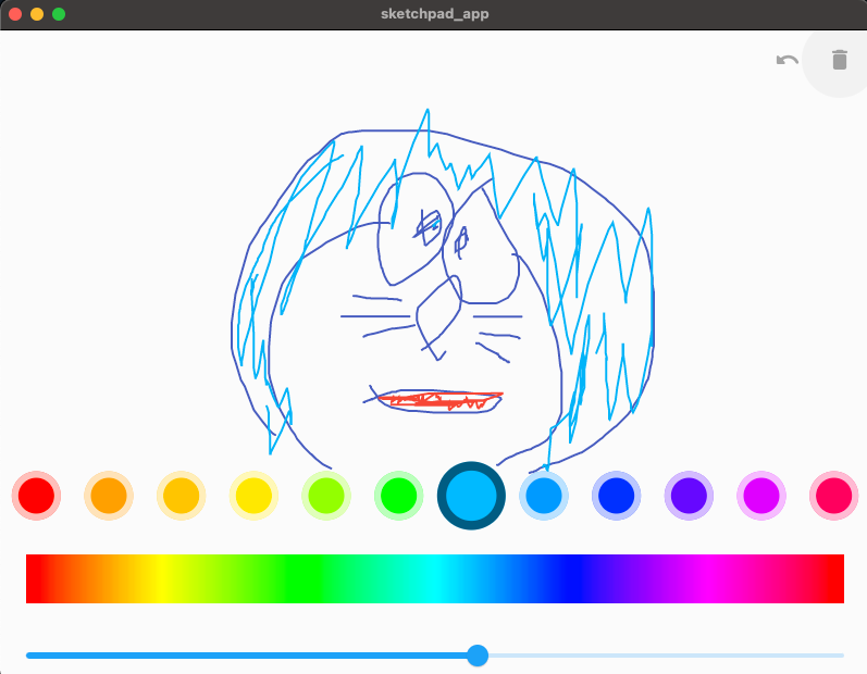
完成イメージ
絵おかきアプリを作って以下の項目について学びました。
- InheritedNotifier(Listenable系クラスに特化したInheritedWidgetのようなもの)
- CustomPainter(複雑な図系やパスなどを任意の設定で描ける)
👇 完成コード(実行可)
Inherited Notifierとは
InheritedWidgetの親戚(実際に継承している)。なぜかあまりネット上で文献を見かけない気がします。
InheritedWidgetとChangeNotifier/ValueNotifierを組み合わせようとすると少し冗長な感じになってしまいますが、InheritedNotifierを使うと以下のようにProviderチックに書けます。
カウンターアプリでの使用例
class Counter extends ValueNotifier<int> {
  Counter(int value) : super(value);

  void increment() {
    super.value++;
  }
}

class CounterNotifier extends InheritedNotifier {
  CounterNotifier({
    Key? key,
    Counter? counter,
    required Widget child,
  }) : super(key: key, child: child, notifier: counter);

  static Counter of(BuildContext context) {
    return context
        .dependOnInheritedWidgetOfExactType<CounterNotifier>()!
        .notifier as Counter;
  }
}
class MyApp extends StatelessWidget {
Widget build(BuildContext context) {
return MaterialApp(
home: CounterNotifier(
counter: Counter(0),
child: MyHomePage(),
),
);
}
}
class MyHomePage extends StatelessWidget {
Widget build(BuildContext context) {
final counter = CounterNotifier.of(context);
return Scaffold(
body: Center(
child: Text(
counter.value.toString(),
style: Theme.of(context).textTheme.headline4,
),
),
floatingActionButton: FloatingActionButton(
onPressed: counter.increment,
child: Icon(Icons.add),
),
);
}
}
CustomPainterとは
CustomPainterはCustomPaint/Paint/Pathなどと一緒に使います。
クラス名がややこしいですが、ものすごく雑に言ってしまうと、、CustomPainterが絵を描く人、CustomPaintが画用紙、Paintがブラシ、Pathが絵の筆跡です。
CustomPainterは抽象クラスなので継承してクラスをカスタムする必要があります。
おおまかなアプリ構成
部品クラス
- 絵を描ける真っ白なキャンバス
- 色を選べる丸い形の絵の具パレット
- パレットの色を自由に変えられるカラーピッカー
- 履歴を一つ前に戻る、クリアするボタン
状態管理クラス
- パレットの12色と選択色のステータスはInheritedNotifierで管理・伝播
その他クラス
- Color <-> HSV を変換するヘルパークラス
- CustomPainterのモデルクラス
- Pathに色情報を付け足したモデルクラス(Pathにはcolorプロパティがない)
状態管理クラス
class ColorPalleteNotifier extends ChangeNotifier {
  List<Color> colors = [
    Colors.red, // 他 計12色(省略)
  ];

  int selectedIndex = 0;

  Color get selectedColor => colors[selectedIndex];

  void changeColor(Color newColor) {
    colors[selectedIndex] = newColor;
    notifyListeners();
  }

  void select(int index) {
    selectedIndex = index;
    notifyListeners();
  }

  void rebuild() {
    notifyListeners();
  }
}

class ColorPallete extends InheritedNotifier<ColorPalleteNotifier> {
  ColorPallete({
    Key? key,
    required ColorPalleteNotifier notifier,
    required Widget child,
  }) : super(key: key, notifier: notifier, child: child);

  static ColorPalleteNotifier of(BuildContext context) {
    return context
        .dependOnInheritedWidgetOfExactType<ColorPallete>()!
        .notifier!;
  }
}
Notifierはコンパクトにまとめるのを優先してChangeNotifierを選択。ColorPalleteをWidgetツリーの上の方に置いて、状態をlistenしているWidgetに伝播する。
ColorPalleteNotifierのrebuild()は状態が変わっていないけどWidgetをリフレッシュしたい場合に使用します。(後述しますが、ブラシの色がうまく変更されない場合があったので、それで使いました)
その他クラス
Color <-> HSV を変換するヘルパークラス
class ColorHelper {
  static Color hueToColor(double hueValue) =>
      HSVColor.fromAHSV(1.0, hueValue, 1.0, 1.0).toColor();

  static double colorToHue(Color color) => HSVColor.fromColor(color).hue;
}
カラーピッカーの虹を表現するのにHSV形式で色情報をやり取りする必要があるので作成。
HSVとは色相(Hue)、彩度(Saturation)、明度(Value)だそうです。Flutterではこれを表現するものとしてHSVColorクラスがあります。
名前付きコンストラクタ HSVColor.fromAHSV() にはalpha, hue, saturation, valueのパラメータがあり、hue以外は 0.0 - 1.0 の値、hueは 0.0 - 360.0 の値を取ります。今回はhueの値を変更することで虹を表現します。
CustomPainterのモデルクラス
class PathPainter extends CustomPainter {
final ColorPath colorPath;
PathPainter(this.colorPath);
Paint get paintBrush {
return Paint()
..strokeCap = StrokeCap.round
..isAntiAlias = true
..color = colorPath.color
..strokeWidth = 2
..style = PaintingStyle.stroke;
}
void paint(Canvas canvas, Size size) {
canvas.drawPath(colorPath.path, paintBrush);
}
bool shouldRepaint(PathPainter old) {
return true;
}
}
CustomPainterを継承すると、paintとshouldRepaintの2つのインスタンスメソッドを上書きする必要があります。
paintは何をどのように描画するかを指定します。Canvasのメソッドにはパスを描画するdrawPath以外にもdrawCircleなど便利なものがたくさんあります。筆の太さや色が指定できるPaintはdrawPathで使用するので、getter paintBrush で設定しています。
shouldRepaintは再描画の条件を設定。今回はお絵描きアプリで筆の動きに合わせてキャンバスを再描画する必要があるので、常にtrueにしています。
Pathに色情報を付け足したモデルクラス
class ColorPath {
  final Path path = Path();
  final Color color;
  ColorPath(this.color);

  static List<ColorPath> paths = [];

  void setFirstPoint(Offset point) {
    path.moveTo(point.dx, point.dy);
  }

  void updatePath(Offset point) {
    path.lineTo(point.dx, point.dy);
  }
}
Pathクラスには色のプロパティがないうえ、いろいろな色のパス(筆跡)の履歴をキャンバスに残す必要があるのでこのようなクラスが必要になります。
このColorPathクラスを一筆ごとにインスタンスにしてstatic変数 pathsに配列として残していきます。(この配列のデータを読み込ませて、CustomPaintに描画)
setFirstPointメソッドは筆をキャンバスに置いたタイミングで呼び出され、パスの最初の点を作ってくれます。
updatePathメソッドは筆を走らせる瞬間瞬間に呼び出され、点と点を結んでパスを更新する作業をしてくれます。
部品クラス
絵を描ける真っ白なキャンバス
class CanvasArea extends StatefulWidget {
_CanvasAreaState createState() => _CanvasAreaState();
}
class _CanvasAreaState extends State<CanvasArea> {
late ColorPath _colorPath;
void _onPanStart(DragStartDetails details) {
_colorPath.setFirstPoint(details.localPosition);
}
void _onPanUpdate(DragUpdateDetails details) {
_colorPath.updatePath(details.localPosition);
setState(() {});
}
void _onPanEnd(DragEndDetails details) {
ColorPath.paths.add(_colorPath);
setState(() {
_colorPath = ColorPath(ColorPallete.of(context).selectedColor);
});
}
void didChangeDependencies() {
super.didChangeDependencies();
_colorPath = ColorPath(ColorPallete.of(context).selectedColor);
}
Widget build(BuildContext context) {
return GestureDetector(
onPanStart: _onPanStart,
onPanUpdate: _onPanUpdate,
onPanEnd: _onPanEnd,
child: Stack(
children: [
for (final colorPath in ColorPath.paths)
CustomPaint(
size: Size.infinite,
painter: PathPainter(colorPath),
),
CustomPaint(
size: Size.infinite,
painter: PathPainter(_colorPath),
),
],
),
);
}
}
パスと色情報の組み合わせであるColorPathを状態として持たせたStatefulWidgetです。StackのCustomPaintで、前述のPathPainterをpainterとして指定してパスを描画。collection-forが使われいてる方のCustomPaintは過去のColorPathです。
GestureDetectorの _onPanUpdate() が実際の描画をしてくれます。onPanUpdateはポインタドラッグ中に発火するコールバックです。ColorPathに用意したupdatePathメソッドでパスの線を更新し続けます。
updatePathにはローカルOffset(GestureDetectorの画面開始位置をOffset.zeroとした場合の位置情報)を渡す必要がある点ご注意を。グローバルOffsetだとPaddingやSizedBoxをツリーの上に使っている場合に描画位置がずれます。
_onPanEnd() はドラッグをやめると呼び出されます。ここで直近のColorPath情報を履歴として配列に記録。記録後は新たなColorPathを_colorPath変数に代入してパス情報をリセットしています。
また色を変更したときもColorPathをリセットする必要があるため、didChangeDependencies()の中でその処理をしています。didChangeDependenciesはColorPalleteクラスのofメソッドにある、context.dependOnInheritedWidgetOfExactType()が実行されると呼び出されます。(つまりlistenしているColorPalleteNotifierの色情報が変わったタイミング)
色を選べる丸い形の絵の具パレット
class ColorCircle extends StatelessWidget {
final int index;
final double width;
ColorCircle({
Key? key,
required this.index,
required this.width,
}) : super(key: key);
static final Matrix4 _transform = Matrix4.identity()..scale(1.4);
Widget build(BuildContext context) {
final colorPallete = ColorPallete.of(context);
final selected = colorPallete.selectedIndex == index;
return GestureDetector(
onTap: selected ? null : () => colorPallete.select(index),
child: TweenAnimationBuilder<double>(
tween: Tween<double>(
begin: 0,
end: ColorHelper.colorToHue(colorPallete.colors[index]),
),
duration: Duration(milliseconds: 600),
builder: (context, value, child) {
return Container(
width: width,
height: width,
transformAlignment: Alignment.center,
transform: selected ? _transform : null,
decoration: BoxDecoration(
shape: BoxShape.circle,
color: ColorHelper.hueToColor(value),
border: Border.all(
color: selected ? Colors.black54 : Colors.white70,
width: 6,
),
),
);
},
),
);
}
}
色情報と、選択状態にあるか否かの情報はColorPalleteNotifierをwatchして引っ張ってきています。このWidgetが情報として持つのは自身のindex番号とサイズ情報だけです。
選択状態のときはボーダー色が白から黒に変化すると同時にサイズが1.4倍になります。ContainerのtransformプロパティにMatrix4を指定することでサイズ変更。
width: selected ? width * 1.4 : width,
などとしても良かったのですが、この場合は円の真ん中を起点にサイズ変更させることができない上に、隣り合う他のパレットの位置がサイズ変更の分ずれてしまうためtransformさせる方法を取りました。こうしたボタン系Widgetのサイズ変更の場合はTransformクラスなどを利用する方がいいかと思います。
またTweenAnimationBuilderを使って色の変化をアニメーションさせています。
パレットの色を自由に変えられるカラーピッカー
class ColorSlider extends StatelessWidget {
void _onChanged(BuildContext context, double value) {
final colorPallete = ColorPallete.of(context);
colorPallete.changeColor(ColorHelper.hueToColor(value));
}
Widget build(BuildContext context) {
final colorPallete = ColorPallete.of(context);
return Column(
mainAxisSize: MainAxisSize.min,
children: [
Padding(
padding: const EdgeInsets.all(24),
child: Container(
height: 45,
decoration: BoxDecoration(
gradient: LinearGradient(
colors: [
for (var i = 0; i <= 360; i++)
HSVColor.fromAHSV(1.0, i.toDouble(), 1.0, 1.0).toColor(),
],
stops: [
for (var i = 0; i <= 360; i++) (i / 360).toDouble(),
],
),
),
),
),
Slider(
value: ColorHelper.colorToHue(colorPallete.selectedColor),
onChanged: (value) => _onChanged(context, value),
min: 0,
max: 360,
),
],
);
}
}
Sliderに0から360の値を持たせて、その上にhue値(色相)0から360のグラデーションを施したContainerを配置。
Sliderの現在値は選択中のパレットの色のHue値になるようColorPalleteインスタンスから現在色を取得。値を変更するとColorPalleteの色情報も変わり、アプリ全体に反映されます。
履歴を一つ前に戻る、クリアするボタン
class UndoButtonBar extends StatelessWidget {
Widget build(BuildContext context) {
return ButtonBar(
children: [
IconButton(
icon: Icon(Icons.undo_rounded),
color: Colors.black38,
onPressed: () => _undo(context),
),
IconButton(
icon: Icon(Icons.delete_rounded),
color: Colors.black38,
onPressed: () => _clear(context),
),
],
);
}
void _clear(BuildContext context) {
ColorPath.paths.clear();
ColorPallete.of(context).rebuild();
}
void _undo(BuildContext context) {
ColorPath.paths.removeLast();
ColorPallete.of(context).rebuild();
}
}
ひとつ前のパスを消すにはColorPathクラスが持っているパス履歴の一番最後を消すだけ([].removeLast)。削除は[].clear()です。
ButtonBar()はボタンを並べて使うときにSizedBoxなどを使わなくてもいい感じに並べてくれるので便利です。
HomePage
class MyApp extends StatelessWidget {
Widget build(BuildContext context) {
return MaterialApp(
debugShowCheckedModeBanner: false,
title: 'Flutter Demo',
theme: ThemeData(
primarySwatch: Colors.blue,
),
home: ColorPallete(
notifier: ColorPalleteNotifier(),
child: MyHomePage(),
),
);
}
}
class MyHomePage extends StatelessWidget {
Widget build(BuildContext context) {
return Scaffold(
body: Stack(
children: [
CanvasArea(),
Align(
alignment: Alignment.bottomCenter,
child: ColorSelectionWidget(),
),
Align(
alignment: Alignment.topRight,
child: UndoButtonBar(),
)
],
),
);
}
}
最後はMyHomePageをColorPalleteのスコープに入れて、Stackで部品を並べるだけ。
最後に
inspired by:
Discussion