【Flutter】Curveのチートシートアプリを作ってみた - Explicit Animation
最初に
FlutterでAnimationを導入するときにお世話になるCurveは41種類もあり、どれを使えばどういう動きが実現できるのか、いまいちわからないときがあります。そこで学習がてら全てのCurveアニメーションの動き方をパッと見で把握できるアプリを作ってみることにしました。
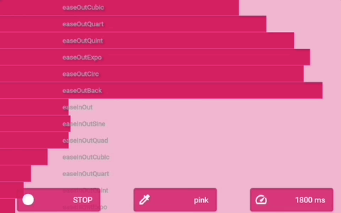
完成イメージ
各行のアニメーションバーがそれぞれ記載のCurveで動きます。バーをタップすることでアニメーションのオンオフ切り替えができ、画面下部のボタンでアニメーションの長さなど全体設定の切り替えができます。
DartPadで動かしたかったので外部パッケージを使用しない縛りを自身に課しました。状態管理にはInherited Widgetを利用しています。
完成コード ↓ (実行して動かせます)
以下、アプリを作成する中で学んだことを雑に書き連ねます。
Curveとは
ある時間の一区切り(Duration)の開始を0、終了を1として横軸(t)にとる。そしてある値の割合を開始0、終了1として縦軸(v)にとる。その開始と終了の間の値の増減具合を二次元グラフに表したものがCurveです。
お約束として、t = 0.0 のときは必ず v = 0.0、t = 1.0 のときは必ず v = 1.0 になります。
Animationについて
ご存知の通り、Animationを導入するときのアプローチはExplicit Animation(明示的) とImplicit Animation(暗示的)の2つがあります。前者はAnimationControllerクラスを直接操作して細かい指定ができるもの、後者はバックエンドでFlutterが諸々制御してくれる比較的お手軽なものという理解です。
今回はメインのアニメーションにExplicit Animationのアプローチを採用しています。
アプリの作成
クラス構成を考える
◆Widget系クラス
①AppStateProvider
アプリのホーム。④のInherited Widgetをインスタンス化して、ここから状態を以降のcontextに伝える。
②HomePage
AnimationControllerの派生元。
- body: CurveListView()
完成イメージ各行のアニメーションバーをListViewにしたWidget。 - floatingActionButton: Row(ToggleButton()...)
バーの色やフラグ、Durationを切り替えるためのカスタムボタンを並べる。
③CurveListTile
完成イメージのアニメーションバーの部分。ここでHomePageから伝えられたAnimationControllerにCurveの要素を加える。
◆その他クラス
④AppState extends InheritedWidget
Inherited Widgetのモデルを定義。
⑤AppCurves, AppColors, AppDurations
アプリで利用するCurve、色、Durationの値をまとめたクラス。
実際のコード
まずは「その他クラス」から。
⑤AppCurves, AppColors, AppDurations
class AppDurations {
  static const all = <String, int>{
    ' 600 ms': 600,
    '1200 ms': 1200,
    '1800 ms': 1800,
    '2400 ms': 2400,
  };

  static List<String> get keys => all.keys.toList();
  static List<int> get values => all.values.toList();
  static int get length => all.length;
  static int get initial => all.values.first;
}
このような感じでアプリで使う値とgetterを定義。Mapのkeyは切り替えボタンのテキストに使用、valueはボタンのコールバックのパラメーターとして、実際のアニメーションに反映させます。
④AppState extends InheritedWidget
class AppState extends InheritedWidget {
final Color color;
final bool animateAll;
final ValueChanged<Color> updateColor;
final ValueChanged<bool> updateAnimateAll;
final ValueChanged<int> updateAnimationDuration;
const AppState({
Key? key,
required this.color,
required this.animateAll,
required this.updateColor,
required this.updateAnimateAll,
required this.updateAnimationDuration,
required Widget child,
}) : super(key: key, child: child);
static AppState of(BuildContext context) {
return context.dependOnInheritedWidgetOfExactType<AppState>()!;
}
bool updateShouldNotify(AppState oldWidget) {
return color != oldWidget.color || animateAll != oldWidget.animateAll;
}
}
アプリの出発点であるAppStateProviderで使うInherited Widgetのモデル定義。
colorはアニメーションバーの色(ThemeDataのprimarySwatchを利用)。animateAllはすべての行をアニメーションさせるか、個別にアニメーションさせるかのモードを切り替えるフラグです。
DurationはAnimationController自身が値を保持しているのでここでは定義していません。
③CurveListTile
class CurveListTile extends StatefulWidget {
final String title;
final Curve curve;
final Animation<double> curvedAnimation;
final bool animateAll;
  CurveListTile({
    Key? key,
    required this.title,
    required this.curve,
    required Animation<double> animation,
    required this.animateAll,
  })  : curvedAnimation = CurveTween(curve: curve).animate(animation),
        super(key: key);
_CurveListTileState createState() => _CurveListTileState();
}
class _CurveListTileState extends State<CurveListTile> {
bool isSelected = false;
void select() {
setState(() {
isSelected = !isSelected;
});
}
static const barHeight = 30.0;
Widget build(BuildContext context) {
return Container(
height: barHeight,
color: isSelected || widget.animateAll
? Theme.of(context).primaryColorLight
: null,
child: Stack(
alignment: Alignment.centerLeft,
children: [
if (isSelected || widget.animateAll)
            AnimatedBuilder(
              animation: widget.curvedAnimation,
              child: Container(
                color: Theme.of(context).primaryColor,
              ),
              builder: (context, child) {
                return FractionallySizedBox(
         widthFactor: min(max(0.0, widget.curvedAnimation.value), 1.0),
         child: child!,
                );
              },
            ),
Padding(
padding: EdgeInsets.only(left: 120),
child: Text(
widget.title,
style: Theme.of(context).textTheme.caption!.copyWith(
fontWeight: FontWeight.bold,
color: Colors.grey,
),
),
),
GestureDetector(
onTap: widget.animateAll ? null : select,
child: Container(
height: barHeight,
color: Colors.transparent,
),
)
],
),
);
}
}
- AnimatedBuilder(このビルダーでContainerをアニメーションさせる)
- Text(Curve名がテキスト)
- GestureDetector(タップを検知)
を下から順に重ねたStack Widgetです。
CurveListTile({
Key? key,
required this.title,
required this.curve,
required Animation<double> animation,
required this.animateAll,
}) : curvedAnimation = CurveTween(curve: curve).animate(animation),
super(key: key);
このようにコンストラクタで受け取ったanimation(AnimationController)にcurveの設定を加えて、新たなAnimation<double>を生成。それをAnimatedBuilderで利用しています。
AnimationControllerは、親WidgetのCurveListViewで定義しています。Curve同士の比較をしたいアプリなので、アニメーションのタイミングをすべてのバーで合わせるためです。
if (isSelected || widget.animateAll)
AnimatedBuilder(
animation: widget.curvedAnimation,
child: Container(
color: Theme.of(context).primaryColor,
),
builder: (context, child) {
return FractionallySizedBox(
widthFactor: min(max(0.0, widget.curvedAnimation.value), 1.0),
child: child!,
);
},
),
AnimatedBuilderがこのアプリの肝です。アニメーションが進行する度にbuilderが走ります。collection-ifによりアニメーションバーが選択状態か、「すべてアニメーションさせるモード(animateAll)」のときのみ表示するようにしています。FractionallySizedBoxのwidthFactorパラメーターをcurvedAnimation.valueとすることでアニメーションする仕組みです。(0.0でchildであるContainerが非表示、1.0でフル表示)
widthFactorを min(max(0.0, widget.curvedAnimation.value), 1.0) としているのはCurveの中にはvalueがマイナスに振れたり、1.0を超えるものがあるからです。その範囲を超えるとFractionallySizedBoxの場合は描画エラーになってしまいます。
②HomePage
class HomePage extends StatefulWidget {
const HomePage({Key? key}) : super(key: key);
HomePageState createState() => HomePageState(
Duration(milliseconds: AppDurations.initial),
);
}
class HomePageState extends AnimationControllerState<HomePage> {
HomePageState(Duration duration) : super(duration);
void initState() {
super.initState();
animationController.repeat();
}
Widget build(BuildContext context) {
return Scaffold(
body: Tooltip(
message: 'Tap on each row to animate',
showDuration: Duration(seconds: 1),
child: CurveListView(
animation: animationController,
),
),
floatingActionButton: Row(
mainAxisAlignment: MainAxisAlignment.end,
children: [
ToggleButton<bool>(
values: [false, true],
labels: ['Animate All', 'STOP'],
icons: [Icons.play_circle, Icons.stop_circle],
onPressed: AppState.of(context).updateAnimateAll,
),
SizedBox(width: 60),
ToggleButton<Color>(
values: AppColors.values,
labels: AppColors.keys,
icons: [
for (var i = 0; i < AppColors.length; i++) Icons.colorize,
],
onPressed: AppState.of(context).updateColor,
),
SizedBox(width: 60),
ToggleButton<int>(
values: AppDurations.values,
labels: AppDurations.keys,
icons: [
for (var i = 0; i < AppDurations.length; i++) Icons.speed,
],
onPressed: AppState.of(context).updateAnimationDuration,
),
],
),
);
}
}
目に見えるUIとしてはツリーの一番上にあるWidgetです。
bodyにはCurveListTileをCurveの数だけ描画するCurveListView(ListView.separatedをカスタムしただけのwidget)、floatingActionButtonにはElevatedButtonをカスタムしたToggleButtonをRowで並べています。このボタンでアニメーションモード、色、Durationの切り替えができます。
AnimataionControllerはこのWidgetから派生してます。ここでは抽象クラスであるStateクラスをカスタムして継承という形でAnimationControllerを仕込んでいます。たくさんアニメーションする部品があり、ボイラープレートを少しでも減らしたい場合で、かつ外部パッケージを使いたくない場合はこの方法がいいかもしれません。
abstract class AnimationControllerState<T extends StatefulWidget>
extends State<T> with SingleTickerProviderStateMixin {
final Duration duration;
AnimationControllerState(this.duration);
late final AnimationController animationController;
void initState() {
super.initState();
animationController = AnimationController(
vsync: this,
duration: duration,
);
}
void dispose() {
animationController.dispose();
super.dispose();
}
}
②ToggleButton<T>
class ToggleButton<T> extends StatefulWidget {
final List<T> values;
final List<String> labels;
final List<IconData> icons;
final ValueChanged<T>? onPressed;
const ToggleButton({
Key? key,
required this.values,
required this.labels,
required this.icons,
this.onPressed,
}) : super(key: key);
_ToggleButtonState<T> createState() => _ToggleButtonState<T>();
}
class _ToggleButtonState<T> extends State<ToggleButton<T>> {
int index = 0;
void onPressed() {
setState(() {
if (index < widget.values.length - 1) {
index++;
} else {
index = 0;
}
});
final value = widget.values[index];
widget.onPressed?.call(value);
}
Widget build(BuildContext context) {
if (widget.values.length != widget.labels.length ||
widget.icons.length != widget.labels.length) {
throw Exception('All lengths of lists need to match');
}
final label = widget.labels[index];
final iconData = widget.icons[index];
return SizedBox(
width: 150,
child: ElevatedButton(
onPressed: onPressed,
style: ElevatedButton.styleFrom(
primary: Theme.of(context).primaryColor.withOpacity(0.75),
),
child: Padding(
padding: const EdgeInsets.fromLTRB(0, 9, 6, 9),
child: Row(
mainAxisSize: MainAxisSize.min,
children: [
Icon(iconData),
Spacer(),
Text(label),
],
),
),
),
);
}
}
カスタムのボタンです。ボタンを押す度にMapに格納したデータをエントリー順に取り出して、それらを利用するようなボタンが標準のAPIには見当たらなかったため作りました。これでボタンを押すだけで設定の切り替えができます。
ToggleButton<T>の<T>にはボタンのコールバックでパラメーターとして利用するvalueのTypeが入ります。
①AppStateProvider
class AppStateProvider extends StatefulWidget {
const AppStateProvider({Key? key}) : super(key: key);
_AppStateProvider createState() => _AppStateProvider();
}
class _AppStateProvider extends State<AppStateProvider> {
final homePageKey = GlobalKey<HomePageState>();
Color color = AppColors.initial;
bool animateAll = false;
int animationDuration = AppDurations.initial;
void updateColor(Color color) {
setState(() => this.color = color);
}
void updateAnimateAll(bool animateAll) {
setState(() => this.animateAll = animateAll);
}
  void updateAnimationDuration(int animationDuration) {
    // for AnimatedTheme
    setState(() => this.animationDuration = animationDuration);
    // for AnimationController
    homePageKey.currentState?.animationController.duration =
        Duration(milliseconds: animationDuration);
    homePageKey.currentState?.animationController.repeat();
  }
Widget build(BuildContext context) {
return AppState(
color: color,
animateAll: animateAll,
updateColor: updateColor,
updateAnimateAll: updateAnimateAll,
updateAnimationDuration: updateAnimationDuration,
      child: AnimatedTheme(
        data: ThemeData(
          primarySwatch: color as MaterialColor,
        ),
        duration: Duration(milliseconds: animationDuration),
        child: HomePage(key: homePageKey),
      ),
);
}
}
MetrialAppのhomeに設定したWidgetです。ToggleButtonのコールバックからupdate~のメソッドを呼び出し、値を更新。Inherited WidgetであるAppStateが以降のcontextに変更を伝えています(変数colorとanimateAllのみ)。
変数animationDurationはAnimatedThemeでしか使用しないため、他Widgetへの変更通知対象(updateShouldNotify)にする必要がなく、AppStateのメンバーにしていません。
ではアニメーションバーのDurationはどこで初期値を設定しているのかというと、HomePageクラスのコンストラクタです。そこからAnimationControllerに伝えています。(更新は両者ともupdateAnimationDurationで行っています)
void updateAnimationDuration(int animationDuration) {
// for AnimatedTheme
setState(() => this.animationDuration = animationDuration);
// for AnimationController
homePageKey.currentState?.animationController.duration =
Duration(milliseconds: animationDuration);
homePageKey.currentState?.animationController.repeat();
}
今回テーマ変更のアニメーションに利用しているAnimatedThemeがImplicit Animationであり、アニメーションバーのExplicit AnimationとはAnimation Controllerのインスタンスが異なるため、このように2つのDurationを更新する必要があります。
Explicit AnimationのAnimationControllerにはGlobalKeyを利用してアクセスしています。
また、HomePageStateのinitState()でアニメーションをrepeat()しているにもかかわらず、ここで再度repeat()しているのは、そうしないと新しくControllerに設定したDurationの値が実際のアニメーションに反映されないためです。
child: AnimatedTheme(
data: ThemeData(
primarySwatch: color as MaterialColor,
),
duration: Duration(milliseconds: animationDuration),
child: HomePage(key: homePageKey),
),
AnimatedThemeはThemeDataの変更をアニメーション(Implicit)してくれます。MaterialAppのthemeでcolorを変更しても勝手にアニメーションしてくれるのですが、どうやらそちらではDurationが設定できないようなので、このようにしています。
最後に
inspired by:
Discussion