shadcn/uiのDialogをカスタマイズする
shadcn/uiのDialogを使って色々とカスタマイズしてみた時のメモです。
デフォルトの右上の閉じるボタンをカスタマイズする
shadcn/uiのDialogは、DialogCloseを使って閉じるボタンを自前で作成することができます。(参考)
しかし、デフォルトで表示されている右上の❌ボタンを非表示にすることや、カスタマイズする機能は提供されていません。
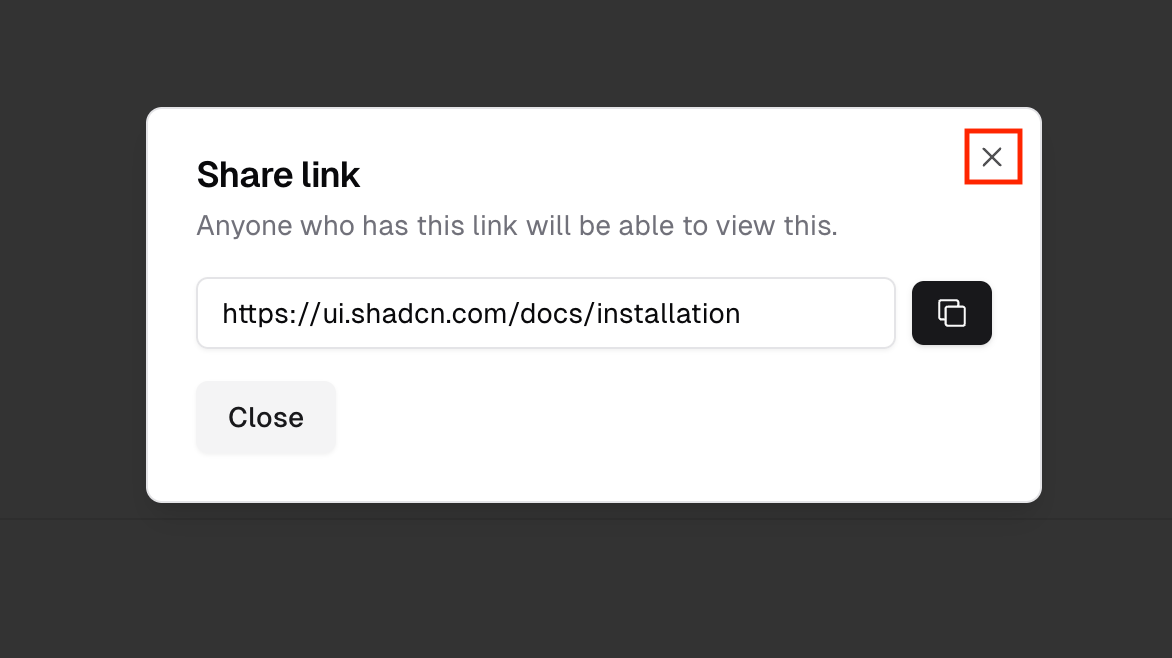
そこで、 npx shadcn-ui@latest add dialog 等でプロジェクトにインストールされた DialogContentを修正します。
const DialogContent = React.forwardRef<
  React.ElementRef<typeof DialogPrimitive.Content>,
  React.ComponentPropsWithoutRef<typeof DialogPrimitive.Content>
>(({ className, children, ...props }, ref) => (
  <DialogPortal>
    <DialogOverlay />
    <DialogPrimitive.Content
      ref={ref}
      className={cn(
        "fixed left-[50%] top-[50%] z-50 grid w-full max-w-lg translate-x-[-50%] translate-y-[-50%] gap-4 border bg-background p-6 shadow-lg duration-200 data-[state=open]:animate-in data-[state=closed]:animate-out data-[state=closed]:fade-out-0 data-[state=open]:fade-in-0 data-[state=closed]:zoom-out-95 data-[state=open]:zoom-in-95 data-[state=closed]:slide-out-to-left-1/2 data-[state=closed]:slide-out-to-top-[48%] data-[state=open]:slide-in-from-left-1/2 data-[state=open]:slide-in-from-top-[48%] sm:rounded-lg",
        className
      )}
      {...props}
    >
      {children}
      {/* 👇 固定で閉じるボタンが記述されている */}
      <DialogPrimitive.Close className="absolute right-4 top-4 rounded-sm opacity-70 ring-offset-background transition-opacity hover:opacity-100 focus:outline-none focus:ring-2 focus:ring-ring focus:ring-offset-2 disabled:pointer-events-none data-[state=open]:bg-accent data-[state=open]:text-muted-foreground">
        <X className="h-4 w-4" />
        <span className="sr-only">Close</span>
      </DialogPrimitive.Close>
    </DialogPrimitive.Content>
  </DialogPortal>
))
DialogContent.displayName = DialogPrimitive.Content.displayName
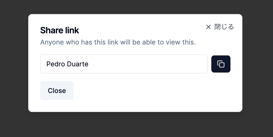
自前の閉じるボタンをダイアログの右上に表示する
DialogPrimitive.Close 内を修正して自前で閉じるボタンを作成します。今回はデフォルトで表示されている❌アイコンの右に「閉じる」というテキストを表示するように実装しています。
    <DialogPrimitive.Content
      // ・・・
    >
      {children}
      <DialogPrimitive.Close className="・・・">
-        <X className="h-4 w-4" />
+        <div className="flex space-x-1">
+          <X className="h-4 w-4 my-auto" />
+          <span className="text-sm">閉じる</span>
+        </div>
        <span className="sr-only">Close</span>
      </DialogPrimitive.Close>
    </DialogPrimitive.Content>
閉じるボタンの表示・非表示を切り替えられるようにする
DialogContentにshowCloseというpropsを追加して右上の閉じるボタンを非表示にできるようにします。
const DialogContent = React.forwardRef<
  React.ElementRef<typeof DialogPrimitive.Content>,
-  React.ComponentPropsWithoutRef<typeof DialogPrimitive.Content>
- >(({ className, children, ...props }, ref) => (
+  React.ComponentPropsWithoutRef<typeof DialogPrimitive.Content> & {
+    showClose?: boolean;
+  }
+ >(({ className, children, showClose = true, ...props }, ref) => (
// ・・・
    <DialogPrimitive.Content
      ref={ref}
      className={cn(
        "fixed left-[50%] top-[50%] z-50 grid w-full max-w-lg translate-x-[-50%] translate-y-[-50%] gap-4 border bg-background p-6 shadow-lg duration-200 data-[state=open]:animate-in data-[state=closed]:animate-out data-[state=closed]:fade-out-0 data-[state=open]:fade-in-0 data-[state=closed]:zoom-out-95 data-[state=open]:zoom-in-95 data-[state=closed]:slide-out-to-left-1/2 data-[state=closed]:slide-out-to-top-[48%] data-[state=open]:slide-in-from-left-1/2 data-[state=open]:slide-in-from-top-[48%] sm:rounded-lg",
        className
      )}
      {...props}
    >
      {children}
+     {showClose && (
        <DialogPrimitive.Close className="・・・">
          <X className="h-4 w-4" />
          <span className="sr-only">Close</span>
        </DialogPrimitive.Close>
+     )}
      </DialogPrimitive.Content>
これで呼び出し側で showClose をfalseにして非表示にできるようになりました。
<DialogContent className="・・・" showClose={false}>
  // ・・・
</DialogContent>
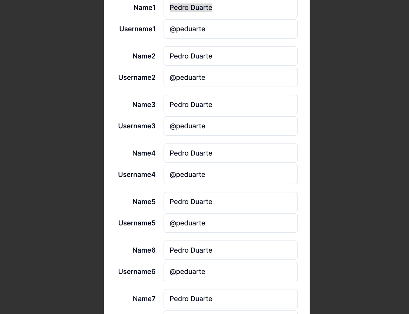
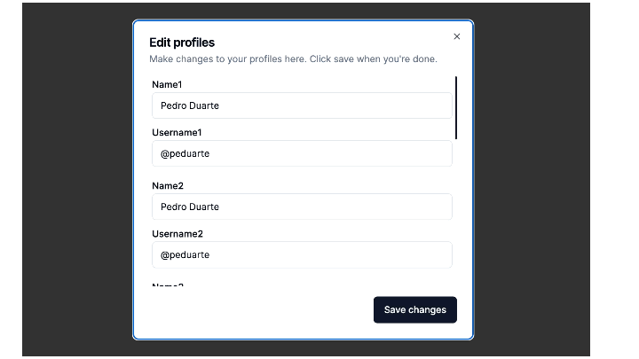
ダイアログ内をスクロールできるようにする
デフォルトだとダイアログの中身が画面サイズより大きくなってしまう場合、ダイアログ内がスクロールできません。
export default function Example() {
const ids = [1, 2, 3, 4, 5, 6, 7];
return (
<main>
<Dialog>
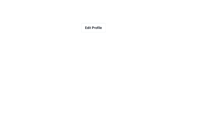
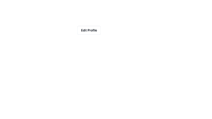
<DialogTrigger asChild>
<Button variant="outline">Edit Profiles</Button>
</DialogTrigger>
<DialogContent>
<DialogHeader>
<DialogTitle>Edit profiles</DialogTitle>
<DialogDescription>
{"Make changes to your profiles here. Click save when you're done."}
</DialogDescription>
</DialogHeader>
<div className="space-y-4">
{ids.map(id => (
<ProfileForm key={id} id={id} />
))}
</div>
<DialogFooter>
<Button type="submit">Save changes</Button>
</DialogFooter>
</DialogContent>
</Dialog>
</main>
)
}
ダイアログ内をスクロールできるようにするためにはまず、ダイアログが画面外に突き抜けないように、DialogContentにmax-heightと overflow-hiden を設定します。
今回は、画面サイズの縦幅90%以上の大きさにならないようにmax-height: 90%;で表示するように設定します。
      ・・・
      <Dialog>
        ・・・
-       <DialogContent>
+       <DialogContent className="max-h-[90%] overflow-hidden">
          <DialogHeader>
           ・・・
          </DialogHeader>
          <div className="space-y-4">
            ・・・
          </div>
          <DialogFooter>
            ・・・
          </DialogFooter>
        </DialogContent>
      </Dialog>
    </main>
  )
}
次に、npx shadcn-ui@latest add dialog 等でプロジェクトにインストールされた DialogContentを修正します。
DialogPrimitive.Content に設定されているdisplay: grid; を display:flex;、flex-direction: column;に変更します。
const DialogContent = React.forwardRef<
  React.ElementRef<typeof DialogPrimitive.Content>,
  React.ComponentPropsWithoutRef<typeof DialogPrimitive.Content>>
  (({ className, children, ...props }, ref) => (
  <DialogPortal>
    <DialogOverlay />
    <DialogPrimitive.Content
      ref={ref}
      className={cn(
-        "fixed left-[50%] ・・・ grid ・・・",
+        "fixed left-[50%] ・・・ flex flex-col ・・・",
        className
      )}
      {...props}
    >
      {children}
最後にスクロールさせたい要素にoverflow-y: scroll;を設定し、修正してズレた余白の調整をすることでうまくダイアログ内をスクロールすることができます。
export default function Example() {
  const ids = [1, 2, 3, 4, 5, 6, 7];
  return (
    <main>
      <Dialog>
        <DialogTrigger asChild>
          <Button variant="outline">Edit Profiles</Button>
        </DialogTrigger>
-       <DialogContent>
+       <DialogContent className="max-h-[90%] overflow-hidden">
          <DialogHeader>
            <DialogTitle>Edit profiles</DialogTitle>
            <DialogDescription>
              {"Make changes to your profiles here. Click save when you're done."}
            </DialogDescription>
          </DialogHeader>
-         <div className="space-y-4">
+         <div className="flex flex-col space-y-4 overflow-y-scroll">
            {ids.map(id => (
              <ProfileForm key={id} id={id} />
            ))}
          </div>
          <DialogFooter>
            <Button type="submit">Save changes</Button>
          </DialogFooter>
        </DialogContent>
      </Dialog>
    </main>
  )
}

ダイアログのスクロールバーの見た目をカスタマイズする
まず、global.cssに@layerディレクティブでスクロールバーのスタイル用のutilitiesクラスを定義します。今回はdialog-scrollというクラス名で定義しています。
@tailwind base;
@tailwind components;
@tailwind utilities;

@layer base {
  ・・・
}
・・・
@layer utilities {
  .dialog-scroll::-webkit-scrollbar {
     /* スクロールバーの幅を3pxに設定する */
    width: 3px;
  }

  .dialog-scroll::-webkit-scrollbar-track {
    /* スクロールバーの背景色を透明にする */
    background-color: transparent;
    border-radius: 5px;
  }

  .dialog-scroll::-webkit-scrollbar-thumb {
    /* スクロールバーの色をshadcn/uiで設定されたglobal.cssで定義されているprimaryと同じ色に設定する */
    background-color: hsl(var(--primary));
    border-radius: 5px;
  }
}
ダイアログ内をスクロールできるようにするでoverflow-y: scroll;を指定した箇所に上記で定義したクラス(dialog-scroll)を設定すれば完成です。
export default function Example() {
  const ids = [1, 2, 3, 4, 5, 6, 7];
  return (
    <main>
      <Dialog>
        <DialogTrigger asChild>
          <Button variant="outline">Edit Profiles</Button>
        </DialogTrigger>
        <DialogContent className="max-h-[90%] overflow-hidden">
          <DialogHeader>
            <DialogTitle>Edit profiles</DialogTitle>
            <DialogDescription>
              {"Make changes to your profiles here. Click save when you're done."}
            </DialogDescription>
          </DialogHeader>
-         <div className="flex flex-col space-y-4 overflow-y-scroll">
+         <div className="dialog-scroll px-1 flex flex-col space-y-4 overflow-y-scroll">
            {ids.map(id => (
              <ProfileForm key={id} id={id} />
            ))}
          </div>
          <DialogFooter>
            <Button type="submit">Save changes</Button>
          </DialogFooter>
        </DialogContent>
      </Dialog>
    </main>
  )
}
ダイアログの外側をクリックしてもダイアログが閉じないようにしたい
DialogContentのonInteractOutsideでダイアログの外側をクリックしたイベントの伝搬をブロックすることで実現できます。
<DialogContent
  onInteractOutside={(e) => {
    e.preventDefault();
  }}
>
  ・・・
</DialogContent>
ダイアログを表示した時の自動フォーカスをやめたい
ダイアログの外側をクリックしてもダイアログが閉じないようにしたいと同様に、DialogContentのonOpenAutoFocusでイベントの伝搬をブロックすることで実現できます。
<DialogContent
  onOpenAutoFocus={(e) => {
    e.preventDefault();
  }}
>
  ・・・
</DialogContent>
| before | after |
|---|---|
 |
 |
雑感
カスタマイズ性が高く、サクっとUIの実装ができるshadcn/uiですが、インストールしたコンポーネントの中身を確認・修正したい時に激長classNameを読むのが結構辛いなと少し感じました。(tailwindあるあるですが)
こういう場面に直面するたびにtailwindもう少し可読性良くならないかな〜と思ったりしています。
Discussion