HIGのつまみ食い
 hajimism
社内認定試験に合格するためにHIGをところどころ読む
hajimismAction sheets
hajimism- 破壊的アクションは目立たせ、キャンセルオプションをつける
- 非破壊的アクションしか無いならプルダウンメニューを使う
- スクロール非推奨
- 短い文言で
- ユーザーの動作を妨げるので積極的には使用しないように
iPhoneはページ下部に、iPadはページ中央に表示。
hajimism
hajimismyou must be transparent about the privacy
こういう表現なんだな
hajimism- 必要な場合にのみ、起動時に要求
- 必要になる具体的な理由を明記
- キャンセルの選択肢を用意
- アラートは標準デザインを使用
hajimismInclude only one button and make it clear that it opens the system alert. People can feel manipulated when a custom screen also includes a button that doesn’t open the alert because the experience diverts them from making their choice. Another type of manipulation is using a term like “Allow” to title the custom screen’s button. If the screen’s button seems similar in meaning and visual weight to the allow button in the alert, people can be more likely to choose the alert’s allow button without meaning to. Use a term like “Continue” or “Next” to title your custom screen’s single button, clarifying that its action is to open the system alert.
Allowと言うと選択肢が一つしか無いみたいなので、NextやContinueを使う
hajimismデータ保護ガイドライン
- Avoid relying solely on passwords for authentication. Take advantage of other technologies like Touch ID, which lets people authenticate with a fingerprint. For developer guidance, see Local Authentication.
- Store sensitive information in a keychain. A keychain provides a secure, predictable user experience when handling someone’s private information. For developer guidance, see Keychain Services.
- Never store passwords or other secure content in plain-text files. Even if you restrict access using file permissions, sensitive information is much safer in an encrypted keychain.
- Avoid inventing custom authentication schemes. If your app requires authentication, prefer system-provided features like Sign in with Apple or Password AutoFill. For guidance, see Managing accounts.
- 認証にパスワードのみを使用することは避ける
- 機密情報をキーチェーンに保存する
- パスワードやその他の安全なコンテンツは、プレーンテキストのファイルには絶対に保存しない
- 独自の認証方式を作らない
hajimism
hajimismBest Practice
- Provide a launch screen if the platform requires it
- Ask for initial setup information only when necessary
- Give people time to start enjoying your app before showing supplementary information, asking for a review, or making permission requests
- Restore the previous state when your app restarts so people can continue where they left off
hajimismLaunch Screen
iOS, iPadOS, and tvOS apps must supply a launch screen. watchOS and macOS apps don’t need a launch screen.
たしかに
- Design a launch screen that’s nearly identical to the first screen of your app
- Avoid including text on your launch screen
- Downplay the launch experience
- Don’t advertise
任天堂のゲームとかも起動時の画面はロゴだったりするよね
hajimism
hajimismBest practices
- Use a sidebar to enable quick navigation to key areas of your app or top-level collections of content, like folders and playlists
- When possible, let people customize the contents of a sidebar
- Consider letting people hide the sidebar
- In general, show no more than two levels of hierarchy in a sidebar
- If you need to include two levels of hierarchy in a sidebar, use succinct, descriptive labels to title each group
hajimism
hajimismBest practices
- Use the title area to describe the current screen if it provides useful context
- Write a concise screen title
- Consider temporarily hiding the navigation bar to provide a more immersive experience
- Use the standard back button
- Make sure buttons that use text labels have enough room
hajimismPlatform Consideration - iOS, iPadOS
- Consider using a segmented control in a navigation bar to flatten the information hierarchy
- Use a large title to help people stay oriented as they navigate and scroll
segmented controlってなによと思ったら、Tab的なUIだった

hajimism
hajimismBest practices
- Use a tab bar only to enable navigation, not to help people perform actions
- Make sure the tab bar is visible when people navigate to different areas in your app
- Use the minimum number of tabs required to help people navigate your app
- Keep tabs visible even when their content is unavailable
- Use concrete nouns or verbs as tab titles
- Be cautious of overcrowding tabs with functionality
hajimismPlatform Consideration - iOS, iPadOS
- Avoid overflow tabs whenever possible
- In an iPadOS app, consider using a sidebar instead of a tab bar
- Ensure that tabs affect the view that’s attached to the tab bar, not views elsewhere onscreen
- Use a badge to communicate unobtrusively
- Consider using SF Symbols to provide scalable, visually consistent tab bar items
これSF symbokゆーねや
hajimism
hajimismBest practices
- Consider providing hints to help guide searching
- Consider providing helpful shortcuts and other content near a search field
- Start the search at an appropriate time
- Include a Clear button
- Take privacy into consideration before displaying search history
hajimismScope barってなんだと思ったらFilter的なUIか
Favor improving search results over including a scope bar. A scope bar can be useful when there are clearly defined categories for the search, but it’s generally better to improve search results so scoping isn’t necessary.
厳しいけど的を射てる
hajimism
hajimismBest practices
- Use a text field to request a small amount of information, such as a name or an email address
- Show a hint in a text field to help communicate its purpose
- Use secure text fields to hide private data
- To the extent possible, match the size of a text field to the quantity of anticipated text
- Evenly space multiple text fields
- Ensure that tabbing between multiple fields flows as people expect
- Validate fields when it makes sense
- Use a number formatter to help with numeric data
- Adjust line breaks according to the needs of the field
- Consider using an expansion tooltip to show the full version of clipped or truncated text
- In iOS, iPadOS, and tvOS apps, show the appropriate keyboard type
- Minimize text entry in your tvOS and watchOS apps
hajimismPlatform Consideration - iOS, iPadOS
- Display a Clear button in the trailing end of a text field to help people erase their input
- Use images and buttons to provide clarity and functionality in text fields
クリアボタンってWebで普段実装してるっけ?
hajimism
hajimismBest practices
- Use alerts sparingly
- Avoid using an alert merely to provide information
- Avoid displaying alerts for common, undoable actions, even when they’re destructive(メールの削除とか)
hajimismContent
- In all alert copy, be direct, and use a neutral, approachable tone
- Write a title that clearly and succinctly describes the situation
- Include informative text only if it adds value
- Avoid explaining alert buttons
Succinct(ly)めっちゃよく使うな。Simple(Simply)じゃないんだな
hajimismButtons
- Create succinct, logical button titles
- Avoid using OK as the default button title unless the alert is purely informational
- Place buttons where people expect
- Identify destructive buttons
- Include a Cancel button when there’s a destructive action
- Enable alternative ways to cancel an alert when it makes sense (Home画面に行くなど)
hajimismPlatform Consideration - iOS, iPadOS
- Use an action sheet — not an alert — to offer choices related to an intentional action
- When possible, avoid displaying an alert that scrolls
hajimism
hajimismBest Practice
- Present content modally only when there’s a clear benefit
- Aim to keep modal tasks simple, short, and narrowly focused
- Take care to avoid creating a modal experience that feels like an app within your app
- Consider using a full-screen modal style for immersive content or a complex task
- Always give people an obvious way to dismiss a modal view
- When necessary, help people avoid data loss by getting confirmation before closing a modal view
- Make it easy to identify a modal view’s task
- Avoid presenting a modal view on top of another modal view
hajimism
hajimismBest practices
- Design a consistent layout that adapts gracefully to context changes, while displaying the same content as much as possible
- Respect key display and system features in each platform
- Use placement to convey relative importance
- Elevate essential information by giving it sufficient space
- Create visual groupings to help people find the information they want
- Use alignment to ease visual scanning and to communicate organization and hierarchy.
- Be mindful of aspect ratio
- Be prepared for text-size changes
- When possible, consider alluding to hidden content by partially displaying offscreen elements
- On touch screens, provide ample touch targets for interactive components
- Preview your app on multiple devices, using different orientations, localizations, and text sizes
hajimismPlatform Consideration - iOS, iPadOS
- Aim to support both portrait and landscape orientations
- If your app runs on a specific device, make sure it runs on every screen size for that device.
- Inset full-width buttons(?)
- Extend visual content to fill the screen
- On iPad, consider placing controls on the sides of the screen in landscape orientation
- Avoid placing interactive controls at the bottom edge of the screen when possible
- Be prepared for different status bar heights
- Hide the status bar only when it adds value or enhances your experience
hajimismSafe Area
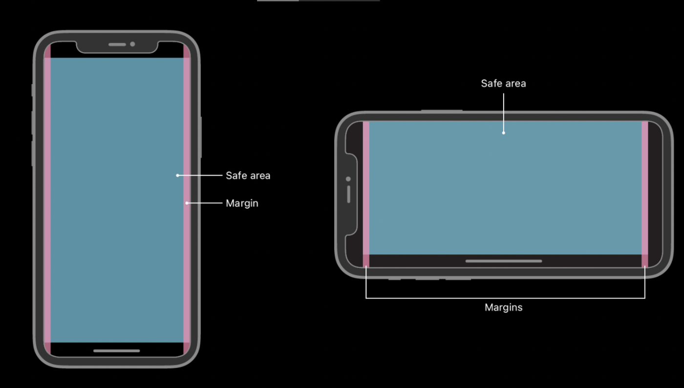
FlutterのWidgetにSafeareaってあったんよなたしか
hajimism
hajimismBest practices
- Use color sparingly in nongame apps
- Avoid using the same color to mean different things
- Make sure your app’s colors work well in both light and dark appearance modes
- Test your app’s color scheme under a variety of lighting conditions
- Test your app on devices with different displays
- Consider how artwork and translucency affect nearby colors
- If your app lets people choose colors, prefer system-provided color controls where available
hajimismInclusive color
- Avoid relying solely on color to differentiate between objects, indicate interactivity, or communicate essential information
- Avoid using colors that make it hard to perceive content in your app
- Consider how the colors you use might be perceived in other countries and cultures
日本だと日本以外の国で使われる想定ってあんましないよね
hajimismSystem colors
- Avoid hard-coding system color values in your app
- Avoid replicating dynamic system colors
- Avoid redefining the semantic meanings of dynamic system colors
hajimismFor foreground content, iOS defines the following dynamic colors:
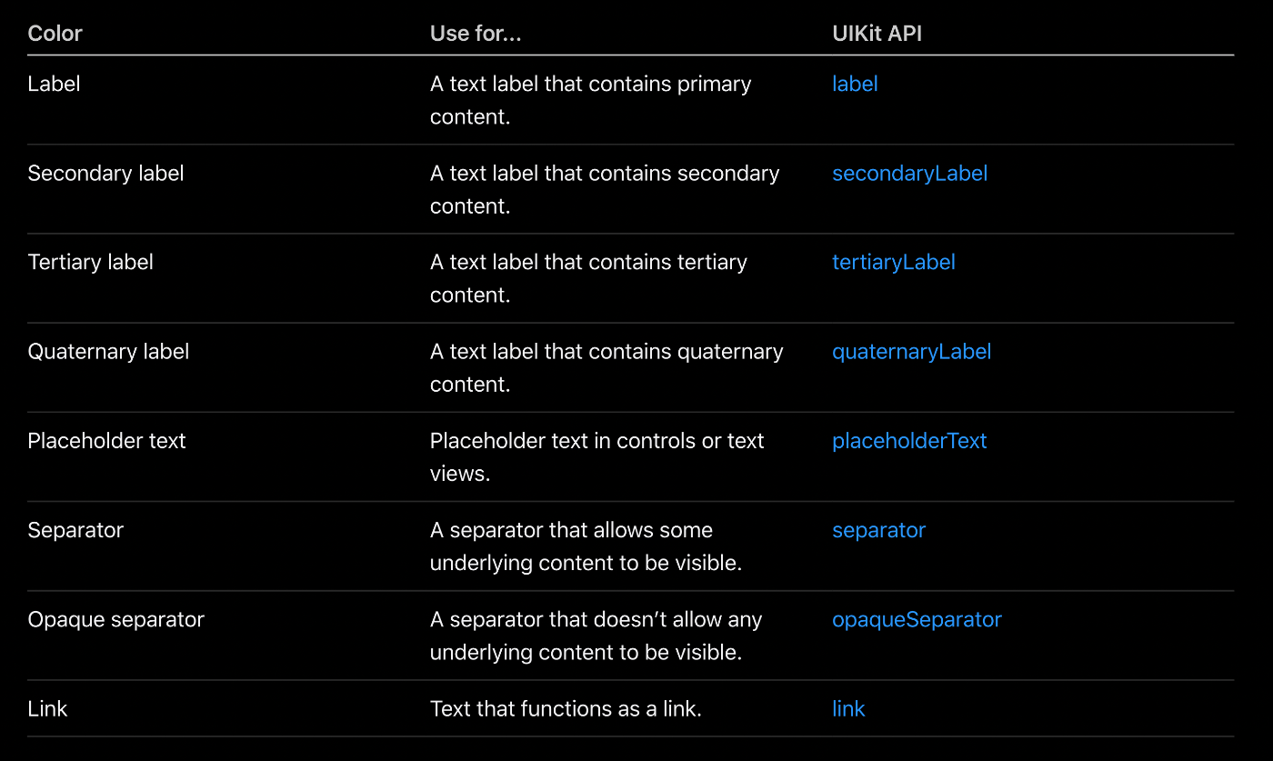
hajimism要するに標準で提供されているものをどんどん使いなさいということですよね。
そのほうが作り手も楽だしね。
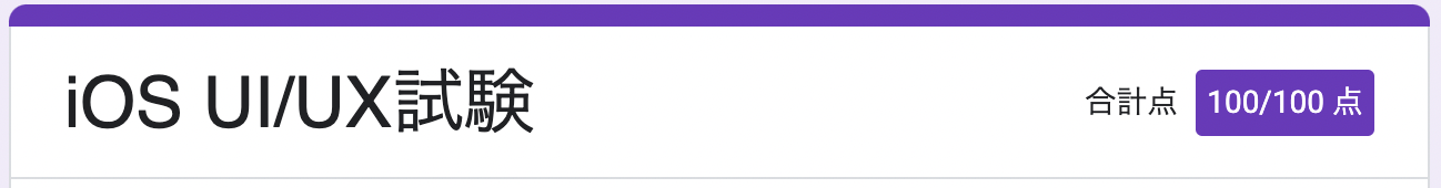
hajimism無事合格🎉