NotionのTypographyはなぜあんなにも美しいのか
そっくりそのまま真似すればこの美しさはある程度手に入れられると思うのだけれど、なぜこれを美しいと思うのかまではたどり着けなかった。神経科学とかそっちなのかなあ。
LexicalでWYSIWYGっぽいエディタを作ることになって、やっぱりNotionエディタを参考として意識してしまう。あのエディタの機能を全部再現するのは大変だから、せめてTypographyのバランス感覚を取り入れたいなあと思って調べる。
ぐぐっても”How to change font in Notion”ばっかり出てくるな
一旦ざっくりと思想から見よう
Google Docs made typewriters multiplayer. Dropbox brought file cabinets to the cloud. But conceptually, they evolved little beyond their Industrial Revolution ancestors.
As a first step, we are blending much of your workflow into an all-in-one workspace. Want a task list? A product roadmap? A design repository? They are now all in one place. You can even customize your own workspace from dozens of LEGO-style building blocks.
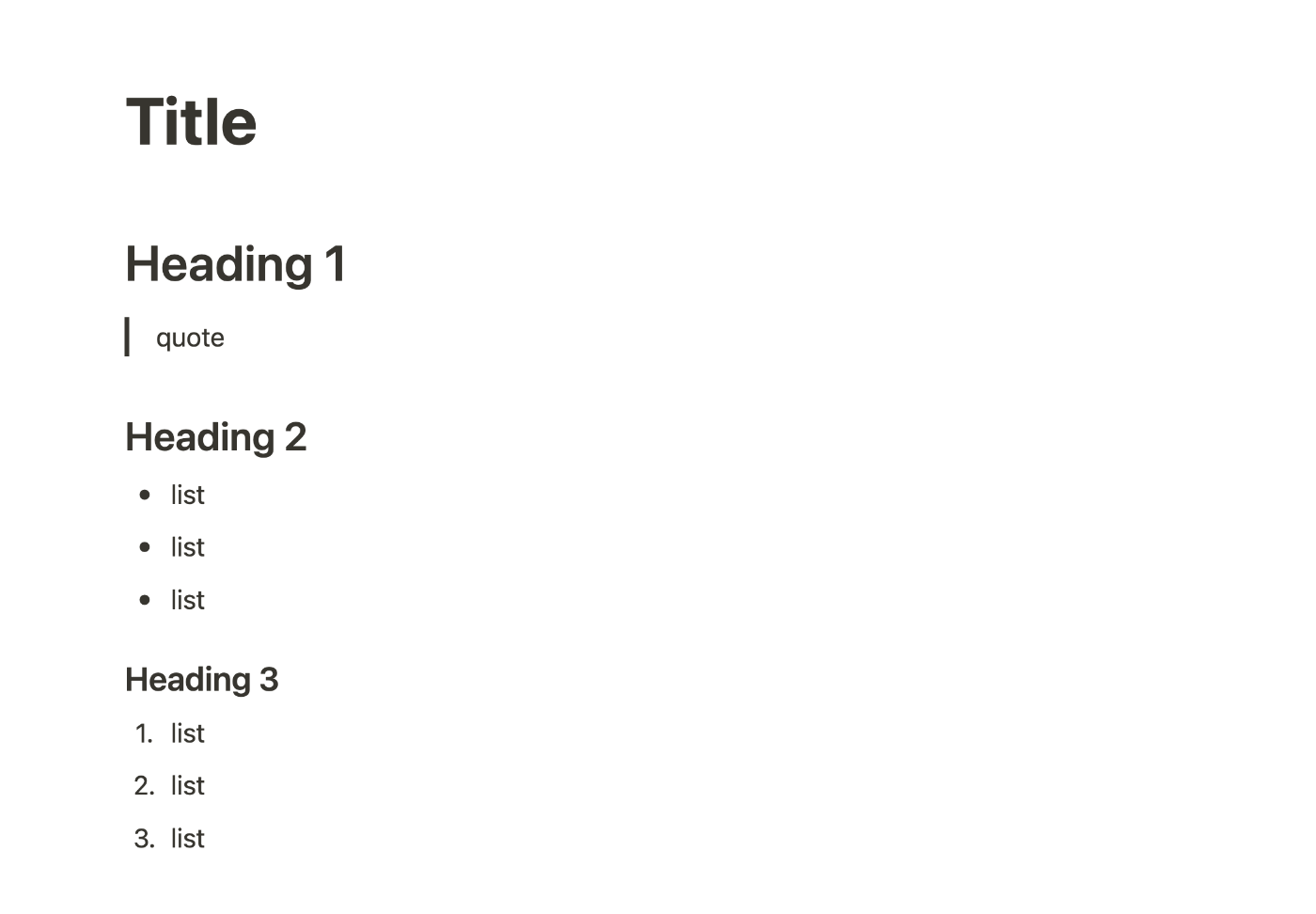
ここらへん
イマイチ
開発者ツールで見ていったほうがはやいか
Title
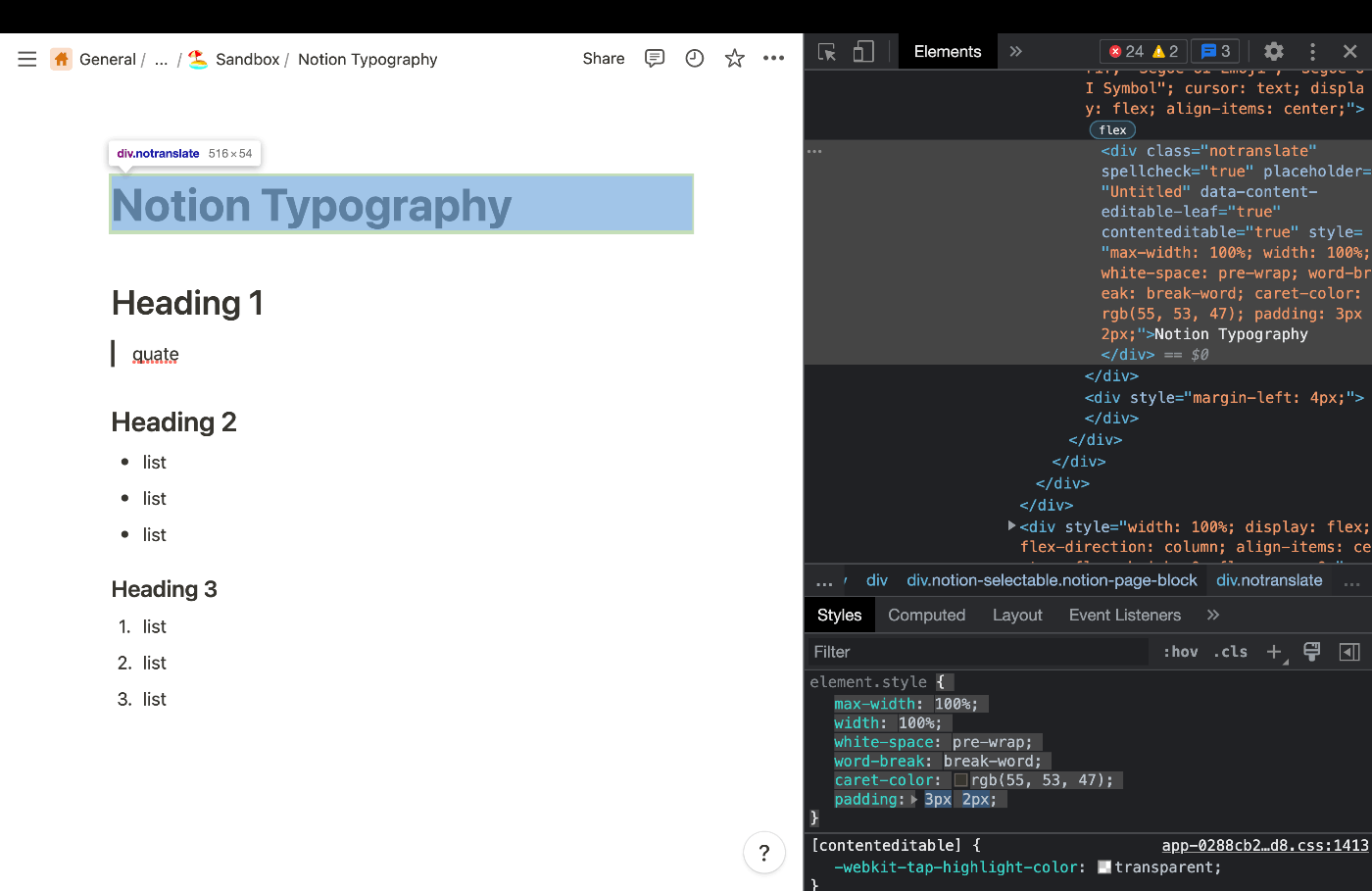
/* element style*/
{
    max-width: 100%;
    width: 100%;
    white-space: pre-wrap;
    word-break: break-word;
    caret-color: rgb(55, 53, 47);
    padding: 3px 2px;
}

/* style attribute  */
{
    color: rgb(55, 53, 47);
    font-weight: 700;
    line-height: 1.2;
    font-size: 40px;
    font-family: ui-sans-serif, -apple-system, BlinkMacSystemFont, "Segoe UI", Helvetica, "Apple Color Emoji", Arial, sans-serif, "Segoe UI Emoji", "Segoe UI Symbol";
    cursor: text;
    display: flex;
    align-items: center;
}
特に気になるのはここらへんかな。font familyはいい意味でベーシックなやつよね。
    color: rgb(55, 53, 47);
    padding: 3px 2px;
    font-weight: 700;
    line-height: 1.2;
    font-size: 40px;
Heading 1
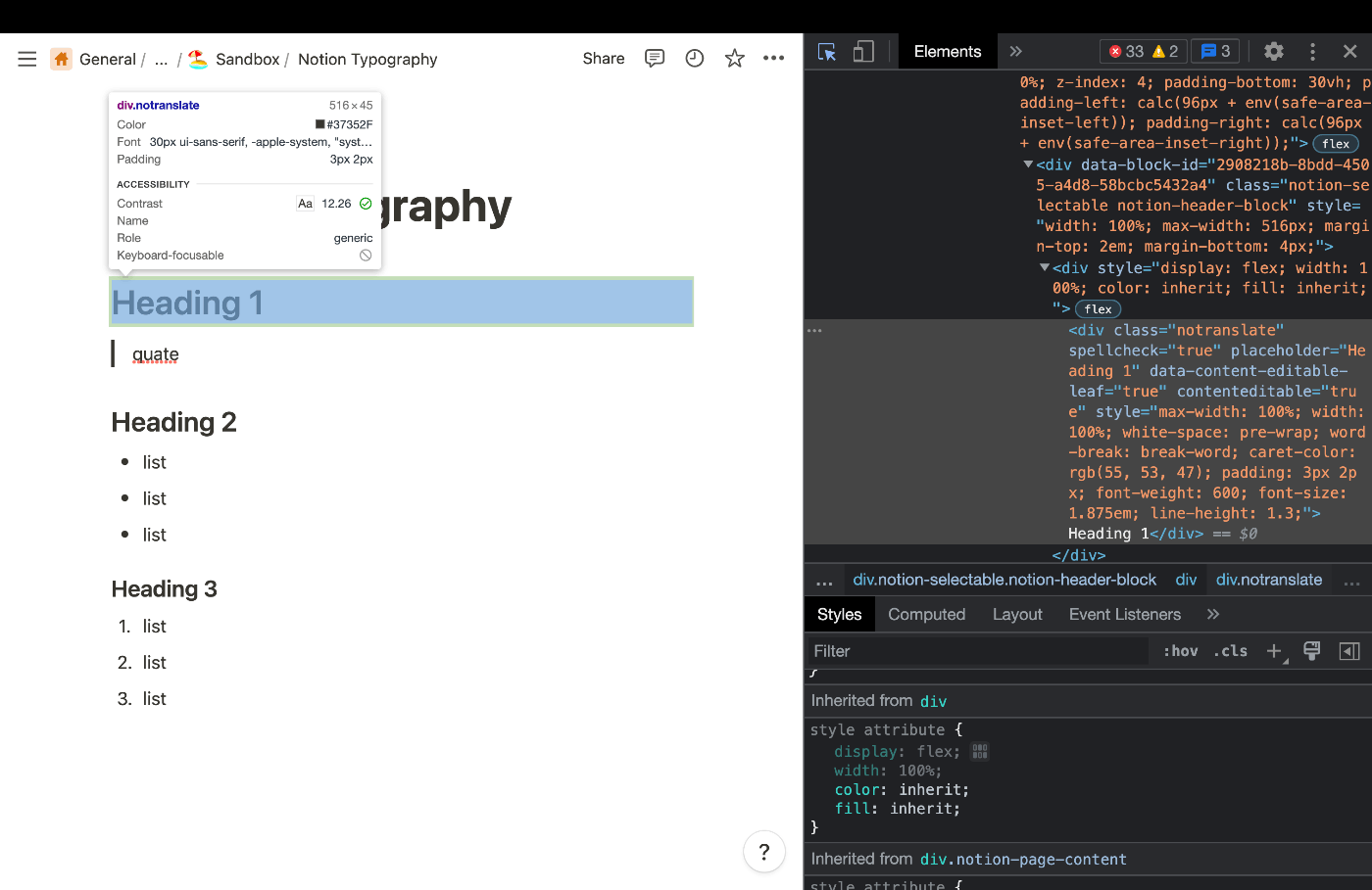
element.style {
    max-width: 100%;
    width: 100%;
    white-space: pre-wrap;
    word-break: break-word;
    caret-color: rgb(55, 53, 47);
    padding: 3px 2px;
    font-weight: 600;
    font-size: 1.875em;
    line-height: 1.3;
}
こっちはfont-sizeがem指定なんだな。
よく見たらHeadingそのものではなくてWrapperにmarginがついている。
element.style {
    width: 100%;
    max-width: 516px;
    margin-top: 2em;
    margin-bottom: 4px;
}
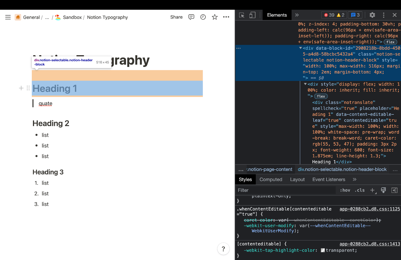
Heading 2

element.style {
    max-width: 100%;
    width: 100%;
    white-space: pre-wrap;
    word-break: break-word;
    caret-color: rgb(55, 53, 47);
    padding: 3px 2px;
    font-weight: 600;
    font-size: 1.5em;
    line-height: 1.3;
}
Wrapper
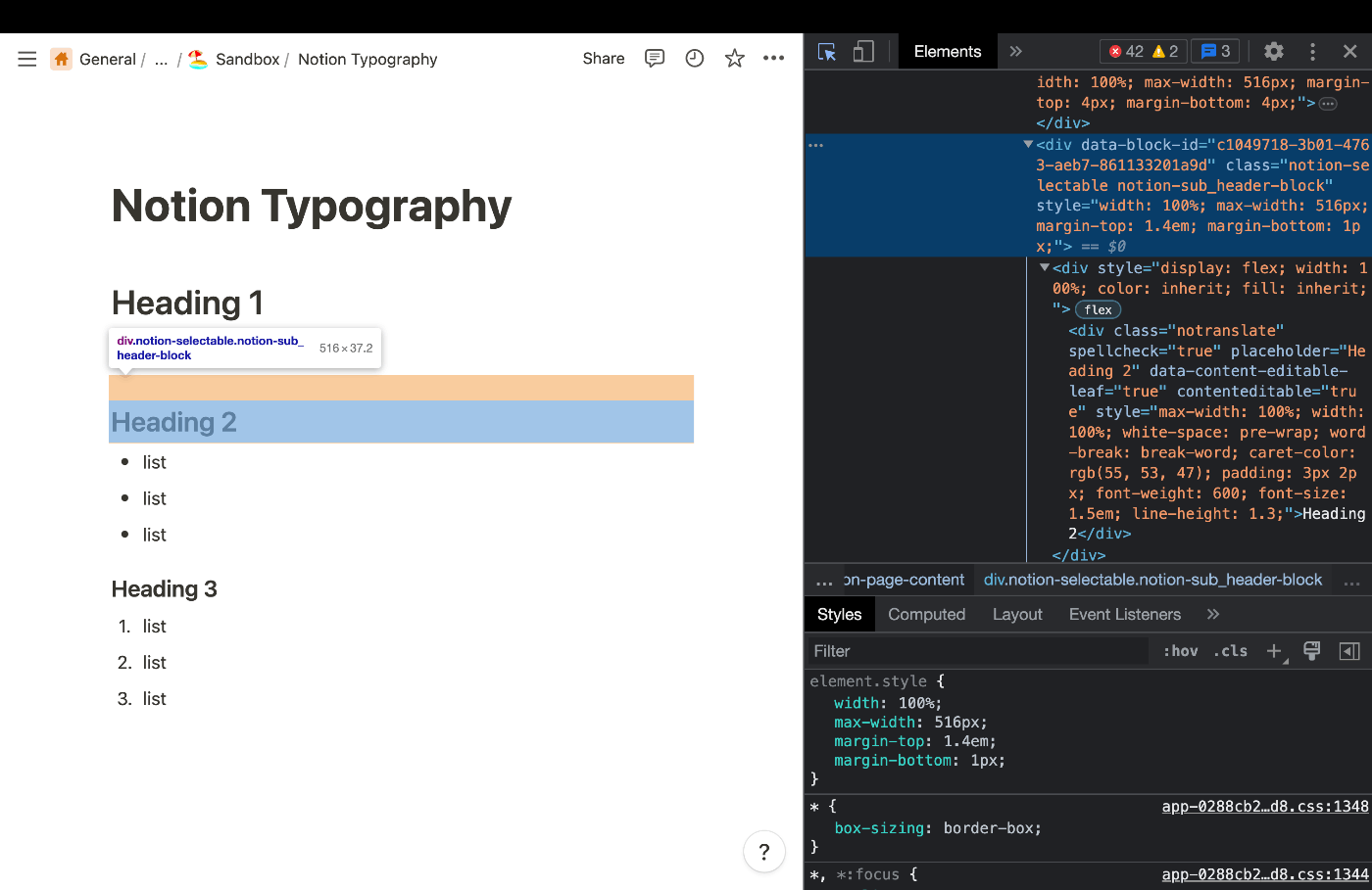
element.style {
    width: 100%;
    max-width: 516px;
    margin-top: 1.4em;
    margin-bottom: 1px;
}
下でテキスト自体のスタイルは手に入ったので、marginを中心に調べる
Heading 3

element.style {
    width: 100%;
    max-width: 480px;
    margin-top: 1em;
    margin-bottom: 1px;
}
quote
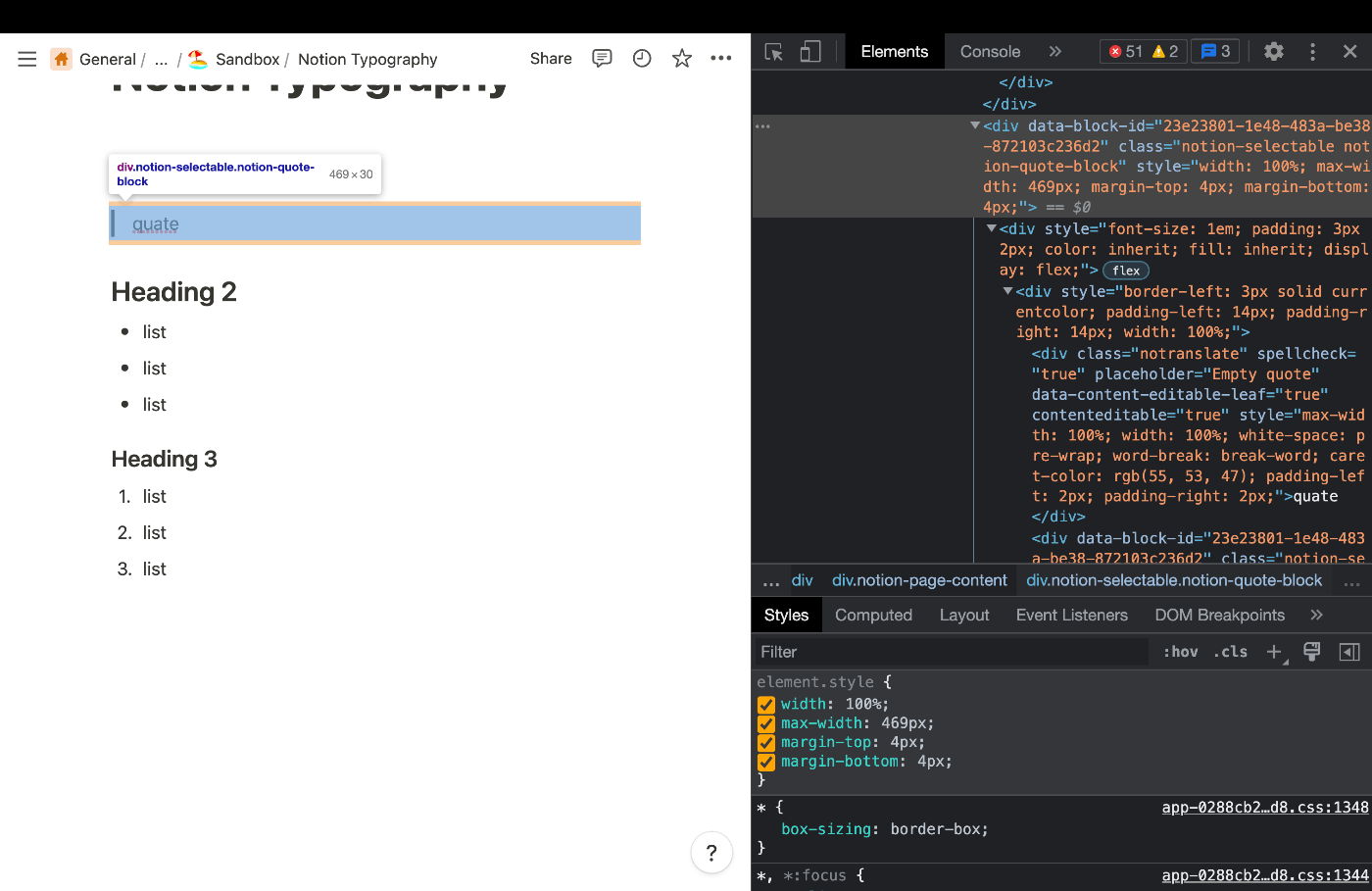
element.style {
    width: 100%;
    max-width: 469px;
    margin-top: 4px;
    margin-bottom: 4px;
}
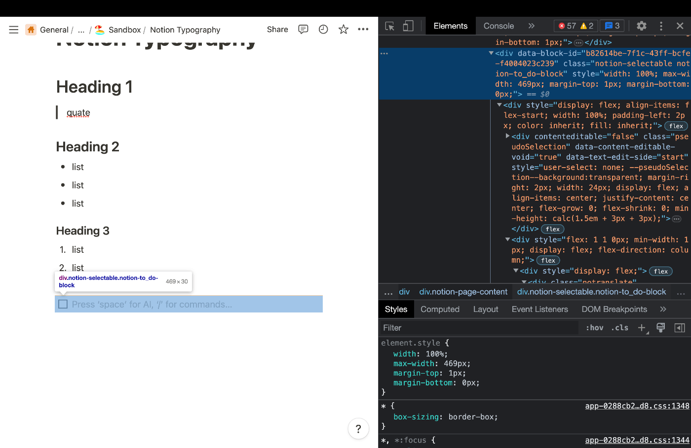
list item
ul/ol どちらも同じ

element.style {
    width: 100%;
    max-width: 469px;
    margin-top: 1px;
    margin-bottom: 1px;
}
すげえな、まとめて適当につけてるとかないんだな。一個一個違うわ。
ちなみにNotionのlistはdivなのでulタグ相当のものは存在しない。
あ!check listは若干違うぞ!margin-bottomがない!
element.style {
    width: 100%;
    max-width: 469px;
    margin-top: 1px;
    margin-bottom: 0px;
}
check listはふつうのparagraphと同じなんだわ
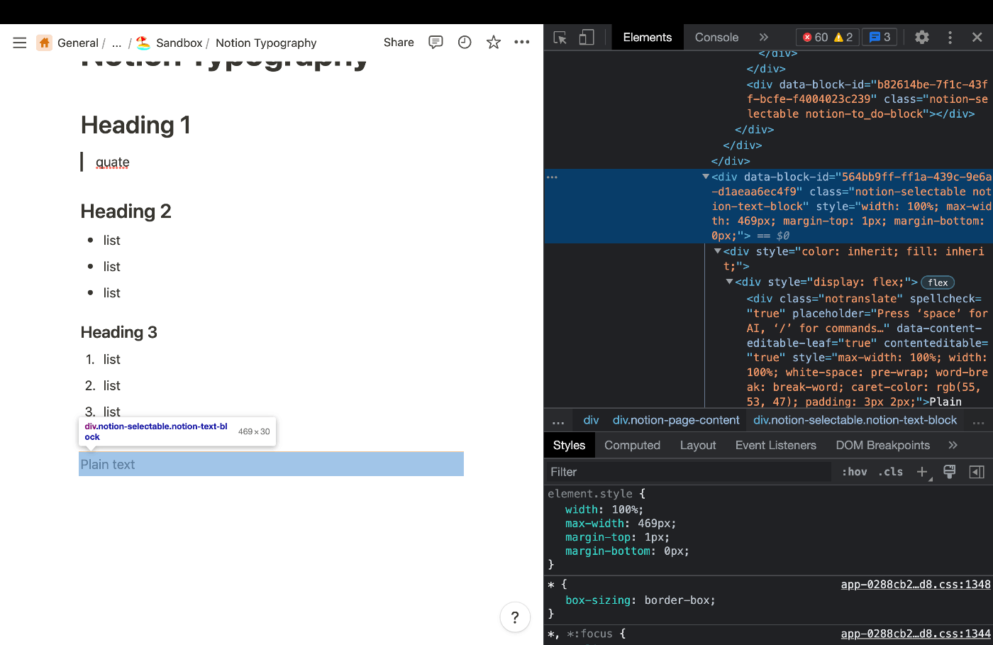
element.style {
    width: 100%;
    max-width: 469px;
    margin-top: 1px;
    margin-bottom: 0px;
}
上下3px 左右2pxのpaddingがついているのはすべてのテキストに共通。
たぶんBlockNodeみたいなClassで定義されている
この作業なんかやったことあるな...と思って調べたらいいもん見つけてしまった
大体こんな感じな気がする
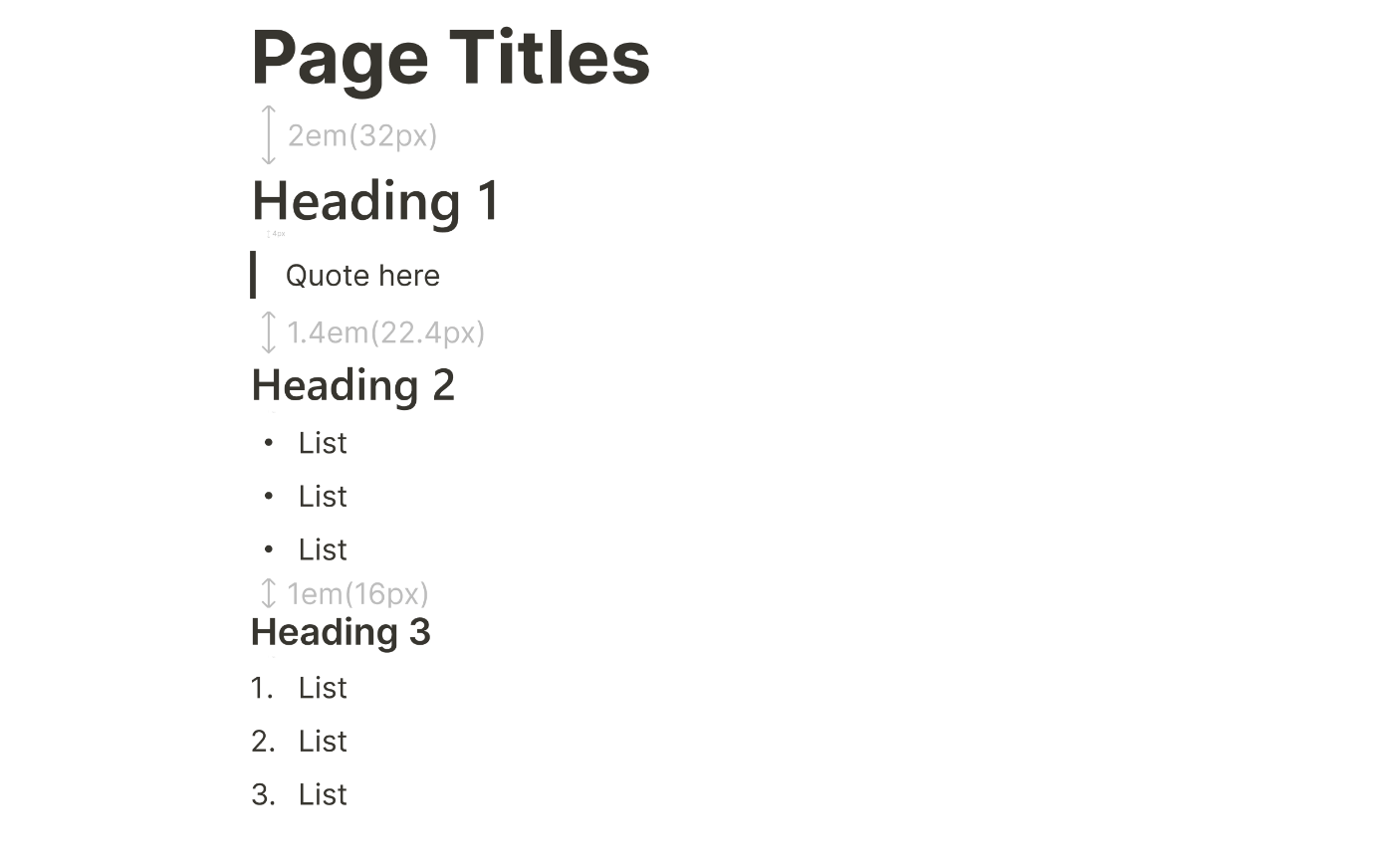
本家と並べてみる。Titleの下の空間がちょっと違うね。でも大体あってそう。

1em→1.4em→2emってあれかなーやっぱ、√2倍ずつってことかな
白銀比的なこと?
とりあえず一定のスケール則はありそう
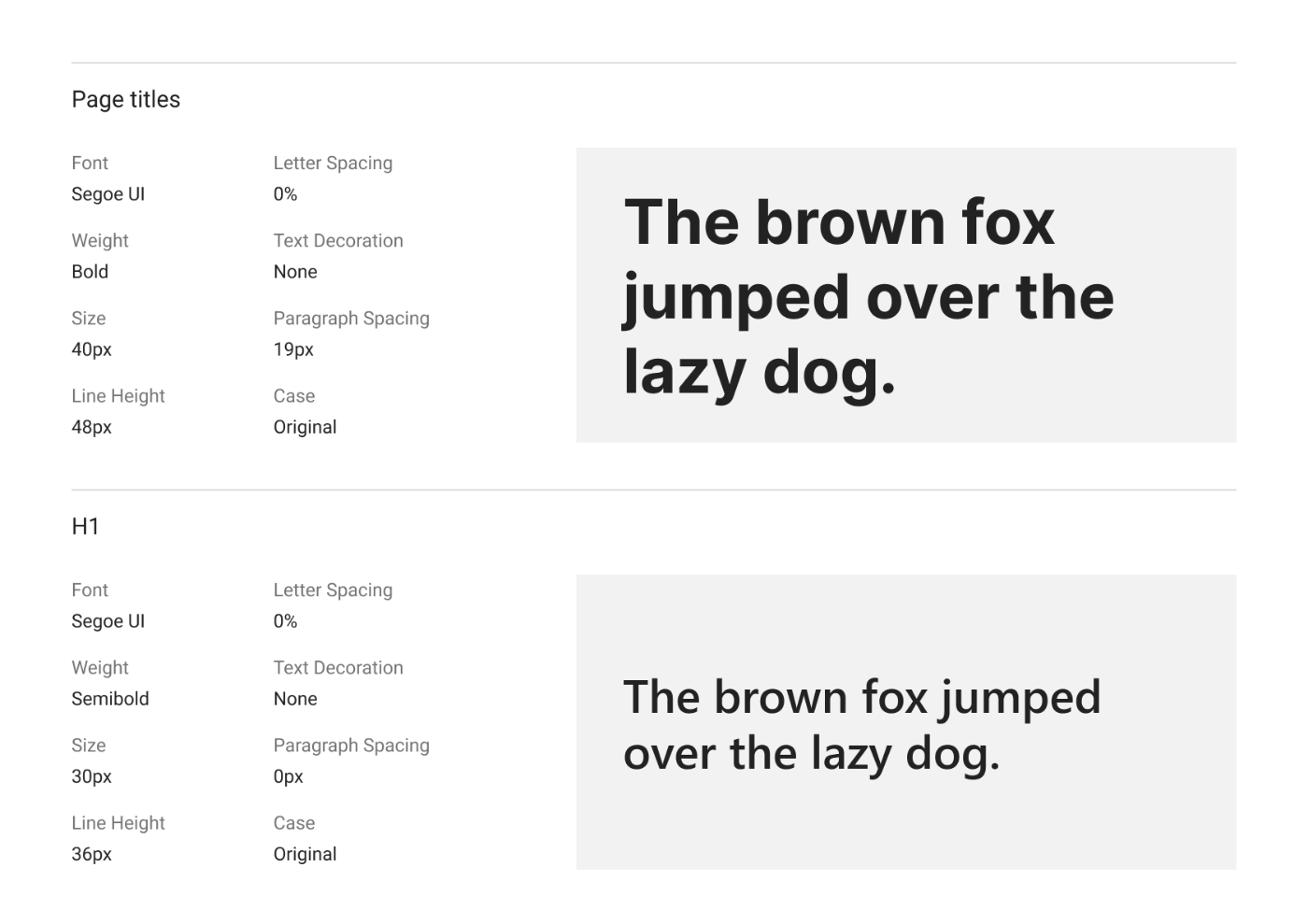
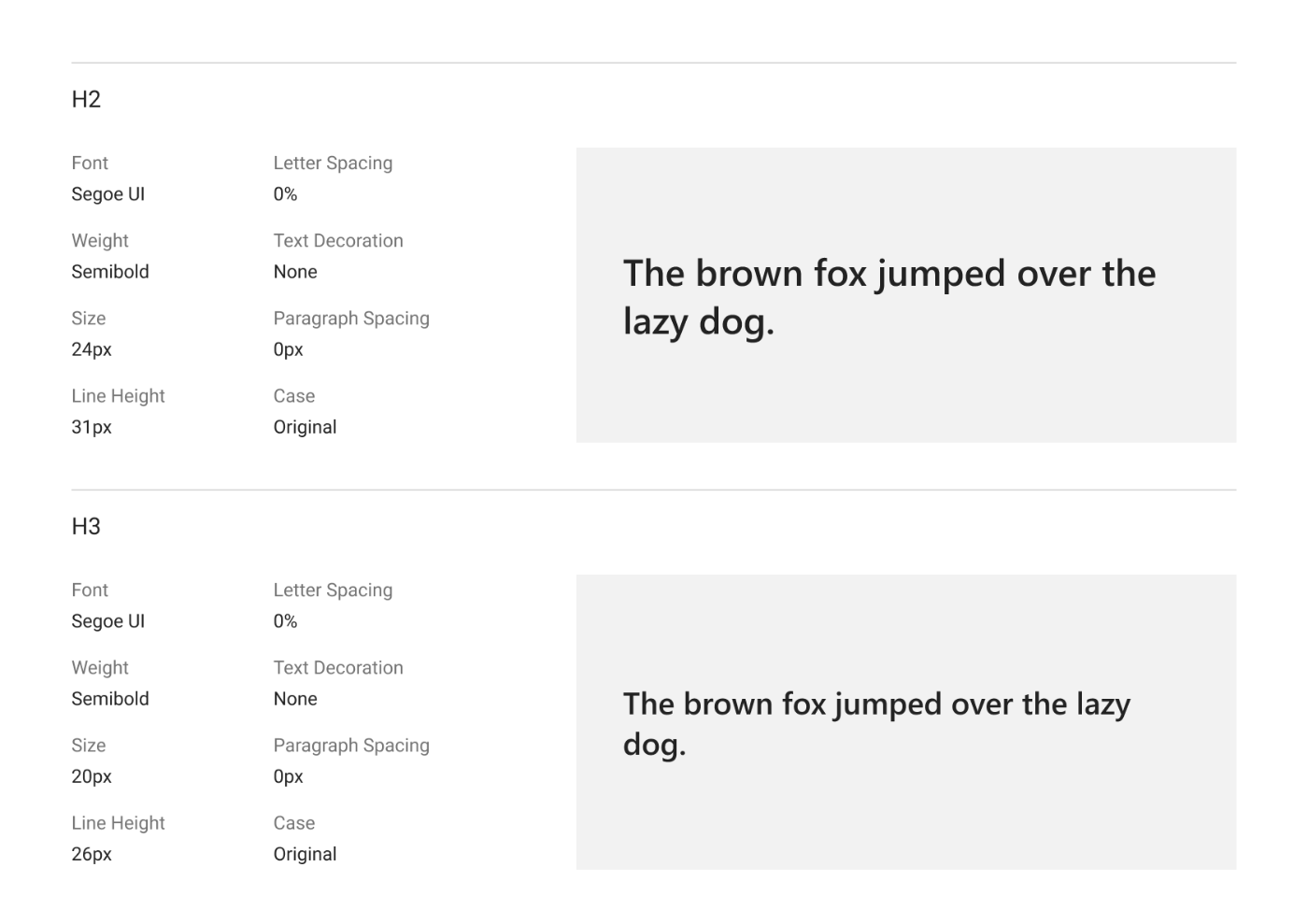
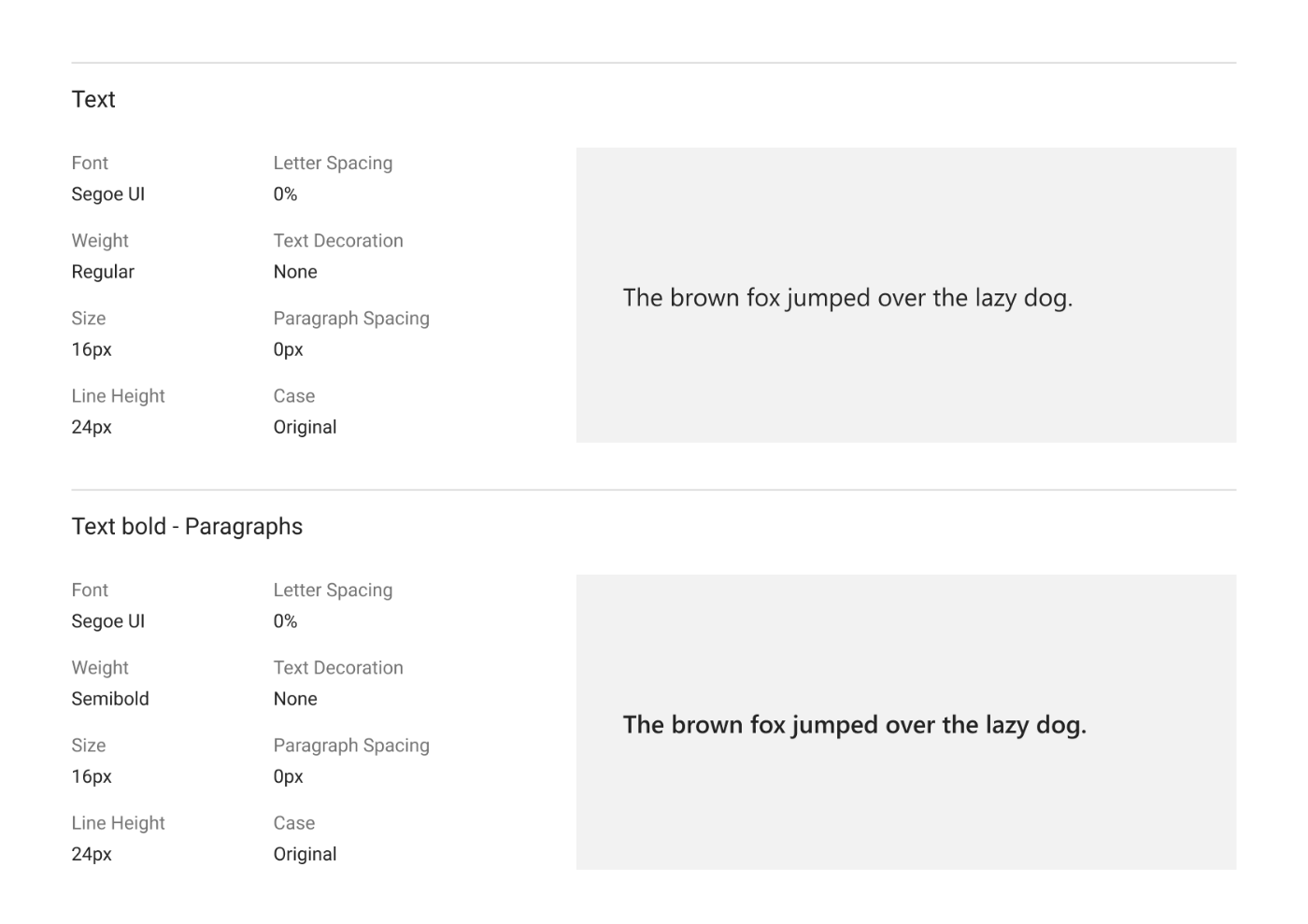
font-size
h1: 1.875em
h2: 1.5em
h3: 1.25em
p-x1.25→h3-x1.2→h2-x1.25→h1
「タイポグラフィ 美しい」的な検索すると「この定番フォントを抑えとけ!」みたいな記事ばっかり出てくるナ
そういえば昔読んだこれ面白かったな。proseはちょくちょく使うし。
色々読み漁ったけど全然関係ないこの2つのnoteがぶっちぎりで面白かったくらいしか収穫がなかった
美しいというのは相対的な概念であって、たまたまおれがNotionのタイポグラフィのバランスを美しいと思うだけである、というのはありそう。
表現したいコンセプトによってデザインが決められるのは当然なので。たまたまハマっているだけ感。