Radix UI探訪
 hajimism
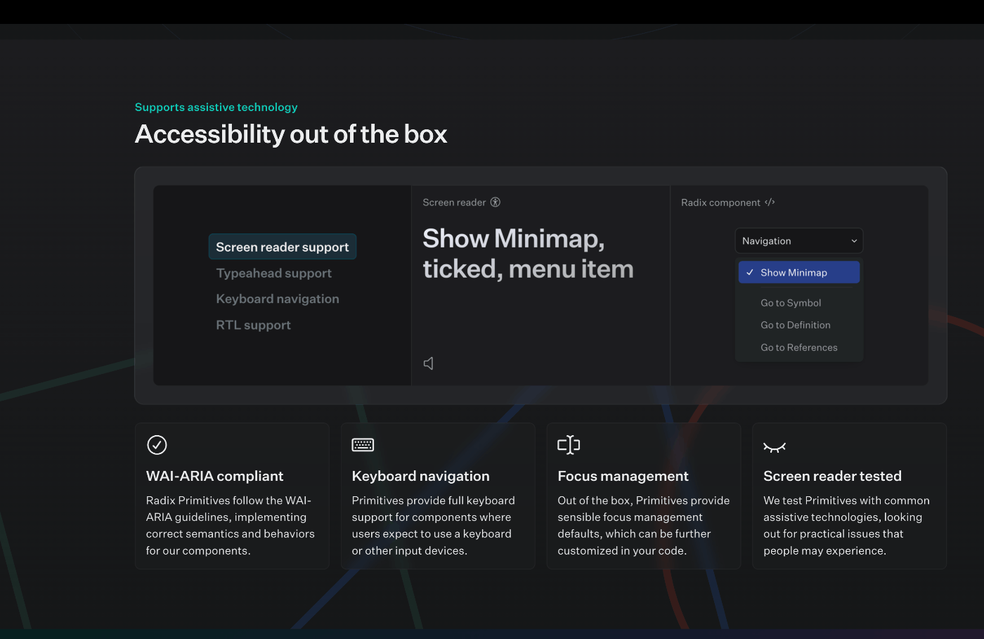
hajimismアクセシビリティの勉強をして、Radix UIなどのUIライブラリの価値を再確認した。
お手軽デザインシステム作成ができそうかどうか確認したい。
hajimismVercelでも使われているのか。アツいな。
hajimismこれこれ
hajimismEach component is its own independently versioned package, so new components can be added alongside your existing code. No need to disrupt feature work with a huge rewrite—you can start small and add more components one by one.
なるほど、移行期に対応しやすいようにコンポーネントごとにpackagingされているのか
hajimism思想が良い

hajimism
hajimismRadix Primitives is a low-level UI component library with a focus on accessibility, customization and developer experience. You can use these components either as the base layer of your design system, or adopt them incrementally.
デザインシステムのベースレイヤーに使用したいのです。
hajimismOur goal is to create a well-funded, open-source component library that the community can use to build accessible design systems.
まさに欲していたものです。
hajimism
hajimismclassNameでstylingしてもいいのね
hajimism
hajimismData attributes
When components are stateful, their state will be exposed in a data-state attribute. For example, when an Accordion Item is opened, it includes a data-state="open" attribute.
これをTailiwindで取り扱えるようにしたライブラリあったな
hajimismCSS in JSライブラリとしてStitchesを用意している
hajimismこんな感じで書く
import { styled } from '@stitches/react';
import * as Accordion from '@radix-ui/react-accordion';

const StyledItem = styled(Accordion.Item, {
  borderBottom: '1px solid gainsboro',

  '&[data-state=open]': {
    borderBottomWidth: '2px',
  },
});
All component parts that render a DOM element have an asChild prop. This is useful when you want a part to attach its accessibility and functional requirements onto your own element instead.
If you decide to change the underlying node rendered by Radix (e.g. change a button to a div) then it is up to you to ensure the correct accessibility and functionality of your chosen node type.
なるほど、設計の妙だな
hajimism公式では、DOM変更を伴うanimationはreact-springを使った例が載っている。
import * as Dialog from '@radix-ui/react-dialog';
import { useTransition, animated, config } from 'react-spring';

function Example() {
  const [open, setOpen] = React.useState(false);
  const transitions = useTransition(open, {
    from: { opacity: 0, y: -10 },
    enter: { opacity: 1, y: 0 },
    leave: { opacity: 0, y: 10 },
    config: config.stiff,
  });
  return (
    <Dialog.Root open={open} onOpenChange={setOpen}>
      <Dialog.Trigger>Open Dialog</Dialog.Trigger>
      {transitions((styles, item) =>
        item ? (
          <>
            <Dialog.Overlay forceMount asChild>
              <animated.div
                style={{
                  opacity: styles.opacity,
                }}
              />
            </Dialog.Overlay>
            <Dialog.Content forceMount asChild>
              <animated.div style={styles}>
                <h1>Hello from inside the Dialog!</h1>
                <Dialog.Close>close</Dialog.Close>
              </animated.div>
            </Dialog.Content>
          </>
        ) : null
      )}
    </Dialog.Root>
  );
}
SSR, SSGにも対応
ただし、React18以上を推奨
hajimismComponentsは見だしたらきりないから、Radix Primitivesを用いて作成されたデザインシステムの実装内容を見ていきたいな。それこそVercelのとかあったらうれしいな。Radixグループのやつはあったきがする。
hajimismコードは非公開みたい
hajimism
hajimismカタログ
hajimismstitchesのvariants強力だわ
hajimismIconを組み込んでいる例
hajimismStitchesが強力すぎるんだな。$付きtokenとかshorthandの機能は全部Stitchesが提供している。
tokenの対応表が読解に重要になる
hajimismほとんどスタイリングをつけて返すだけのコンポーネントもある
hajimismこういう感じでXXPrimitiveとしてimportして、styleをつけるときに普通の名前にしてexportしている
import * as TabsPrimitive from '@radix-ui/react-tabs';
stitchesでつけたstyleがclassNameによって上書きできるのかどうかが気になる。
cssプロパティで一応上書きできるみたい
hajimismなんだかんだ使用時にスタイル拡張するのは常だが、cssプロパティみたいにオブジェクトによる定義はjsxの見通しが悪くなるのでなるべくclassName(Tailwind)でつけたい
hajimismstitchesのconfigにTailwindのthemingをそのまま書いている人もいる
どちらかというと、stitchesのconfigからtailwindのconfigを生成してほしいのよね
hajimismTailwind in stitchesはライブラリとして提供されている。逆がほしい。
hajimismRadix colorsをTailwindに持ち込んでいるのを見つけた。
上のライブラリと合わせてこれで十分か?
hajimism整理すると、
- デザインシステム定義の段階では積極的にstichesを用いて拡張する
- ただしその際のconfigurationはTailwindなものにする
- 使用時の拡張はTailwind classNameやtwin.macroを用いて行う
- colorはRadix colorsをベースにするため、client側はwindy-radix-paletteで拡張する
 hajimism
展望:Radix x Stitches x Radix Colors x Tailwindでぷちデザインシステム
- コンポーネント定義時は可読性の高いStitchesを使用
- 使用時にはTailwindで拡張できるように(なので定義時にもTailwindっぽくスタイリング)
- next themeを用いてdark theme対応 on Next.js(できれば13)
- Storybookで一覧に(Primitivesと見比べられるとなお良い)
- a11y testとかいろいろやりたい