🪶
【matplotlib】よく使うグラフ8選【Python】
タイトルのとおりです。備忘録
0. はじめに
0.1 import
import matplotlib.pyplot as plt
import pandas as pd  # DataFrameはよく使う
import numpy as np  # データ・乱数生成
from matplotlib.ticker import MultipleLocator  # axの目盛り設定
plt.rcParams["font.family"] = "Meiryo"  # 日本語使えるフォントにする
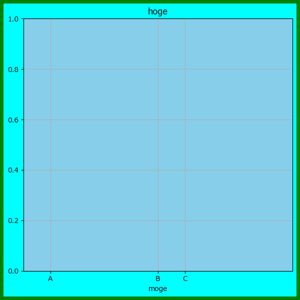
0.2 figureなどの設定
プログラム例
def example_axes_setting():
    """
    subplotでの引数の説明
    """
    xtick_dict = {1: "A", 5: "B", 6: "C"}  # x=1に"A", x=2に"B", ... と表示する目盛りに対応したdictを作成しておく
    # print(xtick_dict.keys())  # 1, 2, 3 を取得する参照方法
    # print(xtick_dict.values())  # "A", "B", "C" を取得する参照方法
    fig = plt.figure(figsize=(6, 6),
                     layout="tight",  # 文字が被らないように自動調整
                     facecolor="cyan",  # axの外の部分の色
                     edgecolor="green",  # 画像外側の枠線の色
                     linewidth=10,  # 外側の枠線の太さ(0だとedgecolorが反映されない)
                     )
    ax = fig.add_subplot(111,
                         facecolor="skyblue",  # axの描画領域の背景色(通常無色)
                         alpha=0.5,  # 透過度
                         title="hoge",  # ax上部に表示される文字
                         xlabel="moge", xlim=(0, 10),  # x軸目盛の下に表示する文字
                         xticks=list(xtick_dict.keys()),  # x軸の目盛り設定
                         xticklabels=list(xtick_dict.values()))  # x軸の目盛り設定
    ax.grid(True)  # grid線を表示する
    # ax.legend(title="piyo")  # 必要に応じて
    plt.savefig("0_example_axes_setting.png")  # png画像ファイルとして出力
    # plt.show()  # デバッグ時以外はコメントアウト

example_axes_setting()
表示結果
1. plot:折れ線グラフ
- plt.plotは「折れ線グラフ」を描画できる
https://matplotlib.org/stable/api/_as_gen/matplotlib.pyplot.plot.html
1.1 シンプルにプロットする
- シンプルに描画するためには、list等配列を引数に入れるだけでよい
- 公式にあるParametersのarray-likeは、numpyのarrayやpandasのseriesなど配列のことを示す
プログラム例
timestamp = pd.date_range(start="2025/01/01", periods=30, freq="1D")
df_example = pd.DataFrame({"X": np.random.randn(len(timestamp))},
                           index=timestamp)

def simple_plot(dataframe):
    """
    simple_plot
    """
    fig = plt.figure()
    ax = fig.add_subplot(111, title="1. simple plot")
    ax.plot(dataframe["X"])
    plt.savefig("1. simple plot.png")

simple_plot(df_example)
表示結果(グラフ)

1.2 いろいろな引数
- marker:折れ線グラフにマーカーを描画する(デフォルトは表示しない設定)
- ms:marker_size 上記マーカーの大きさを設定する
- linestyle:線のスタイル(破線など)を設定する
- c:color 折れ線グラフ(+マーカー)の色を指定する
- label:plt.legendで表示される名称を設定する
プログラム例
def plot_keywords(dataframe):
    step = 20  # step毎にmajor目盛りを間引く
    xtick_dict = { k:v for k, v in zip(dataframe[::step].index, dataframe[::step].index)}
    fig = plt.figure()
    ax = fig.add_subplot(111, title="1a. plot",
                         xlabel="Timestamp", ylabel="value", ylim=(-1, +1),
                         xticks=list(xtick_dict.keys()),
                         xticklabels=list(xtick_dict.values()))
    ax.plot(dataframe["X"], marker="*", ms=10, linestyle="--", c="orange", label="lineplot")
    ax.legend()
    plt.savefig("1a. keyword plot.png")

plot_keywords(df_example)
表示結果(グラフ)

2. bar:棒グラフ
2.1 シンプルに描画する
- plt.barでは、xとyの両方に配列を指定する必要がある
基本、range(len(【yで指定している配列)) とするパターンが多い
プログラム例
df_example = pd.DataFrame({"A": np.random.randint(1, 10, size=10),
                           "B": np.random.randint(1, 10, size=10),
                           "C": np.random.randint(1, 10, size=10)})

def bar_simple(dataframe):
    fig = plt.figure()
    ax = fig.add_subplot(111, title="2a. bar", ylabel="value", xlabel="hoge")
    ax.bar(range(len(dataframe)), dataframe["A"])
    ax.legend()
    plt.savefig("2a. bar simple.png")

bar_simple(df_example)
表示結果(グラフ)

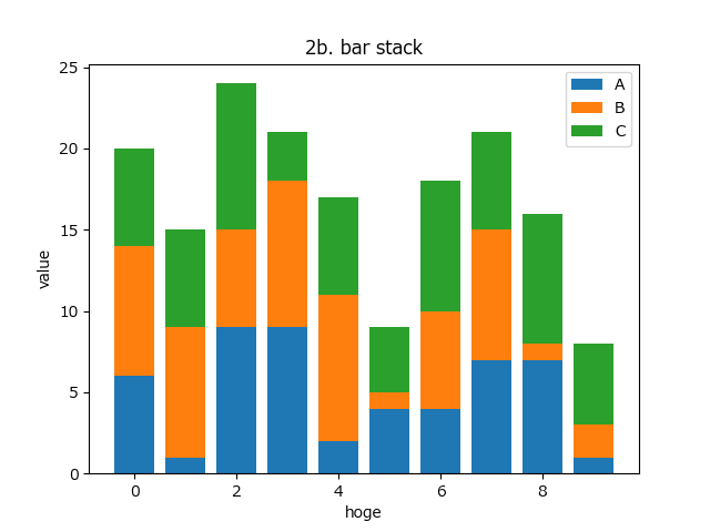
2.2 積み上げ棒グラフ
- 複数の棒グラフを盾に積み上げる場合は、bottomのパラメータに配列を指定すればよい
プログラム例
df_example = pd.DataFrame({"A": np.random.randint(1, 10, size=10),
                           "B": np.random.randint(1, 10, size=10),
                           "C": np.random.randint(1, 10, size=10)})

def bar_stack(dataframe):
    fig = plt.figure()
    ax = fig.add_subplot(111, title="2b. bar stack", ylabel="value", xlabel="hoge")
    x_loc = range(len(dataframe))
    ax.bar(dataframe.index, dataframe["A"], label="A")
    ax.bar(dataframe.index, dataframe["B"], bottom=dataframe["A"], label="B")
    ax.bar(dataframe.index, dataframe["C"], bottom=dataframe["A"]+dataframe["B"], label="C")
    ax.legend()
    plt.savefig("2b. bar stack.png")

# bar_stack(df_example)
表示結果(グラフ)
2.3 横に並べる
- 棒グラフを複数横に並べるには、widthとxの座標を少しずらせばよい
プログラム例
df_example = pd.DataFrame({"A": np.random.randint(1, 10, size=10),
                           "B": np.random.randint(1, 10, size=10),
                           "C": np.random.randint(1, 10, size=10)})
def bar_side(dataframe):
    fig = plt.figure()
    ax = fig.add_subplot(111, title="2c. bar side", ylabel="value", xlabel="hoge")
    w = 0.25  # 0~1で指定
    ax.bar(dataframe.index, dataframe["A"], width=w, label="A")
    ax.bar(dataframe.index+w, dataframe["B"], width=w, label="B")
    ax.bar(dataframe.index+w*2, dataframe["C"], width=w, label="C")
    ax.legend()
    plt.savefig("2c. bar side.png")

bar_side(df_example)
表示結果(グラフ)

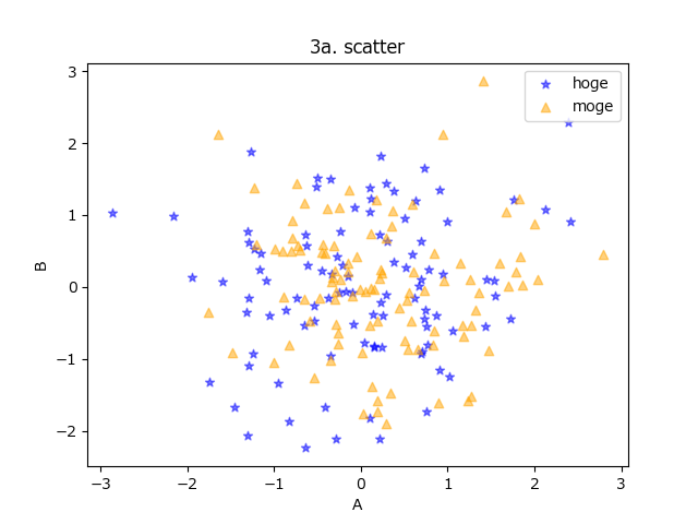
3. scatter:散布図
3.1 シンプルに描画する
- カテゴリ別に複数描画したい場合は、plt.scatterを複数回呼べばよい
- これも、markerやcでマーカーの形や色を指定できる
プログラム例
df_example = pd.DataFrame({"A": np.random.randn(100),
                           "B": np.random.randn(100)})

df_example_2 = pd.DataFrame({"C": np.random.randn(100),
                             "D": np.random.randn(100)})

def scatter_keywords(dataframe, dataframe2):
    fig = plt.figure()
    ax = fig.add_subplot(111, title="3a. scatter", xlabel="A", ylabel="B")
    ax.scatter(dataframe["A"], dataframe["B"], c="blue", alpha=0.5, marker="*", label="hoge")
    ax.scatter(dataframe2["C"], dataframe2["D"], c="orange", alpha=0.5, marker="^", label="moge")
    ax.legend()
    plt.savefig("3a. scatter.png")

# scatter_keywords(df_example, df_example_2)
表示結果(グラフ)
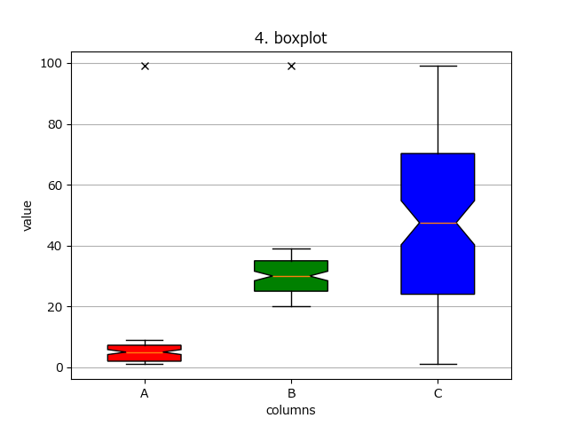
4. boxpot:箱ひげ図
4.1 カスタム箱ひげ図
- 箱ひげ図は、DataFrameなど2次元配列を直接入れることが可能
- その場合は、tick_labels=dataframe.columns を指定すると、列ごとの表示名を指定できる
- patch_artistは、Trueにするとplot.boxplotの返値に、後で箱ひげ図の色を塗るなどの設定ができる変数を返すようになる(視覚的にこだわりがある人は使おう)
df_example = pd.DataFrame({"A": np.random.randint(1, 10, size=100),
                           "B": np.random.randint(20, 40, size=100),
                           "C": np.random.randint(0, 100, size=100)})
df_example.iloc[0] = 99  # 適当に外れ値を追加

def boxplot_keywords(dataframe):
    fig = plt.figure()
    ax = fig.add_subplot(111, title="4. boxplot", xlabel="columns", ylabel="value")
    bplot = ax.boxplot(dataframe, tick_labels=dataframe.columns,
                       notch=True,  # Trueだと砂時計型になる
                       sym="x",  # 外れ値を描画する際のマーカー
                       widths=0.5,  # 箱ひげの幅
                       meanline=True,  # 平均線をはkひげ図に描画する
                       label="hoge",
                       patch_artist=True  # 内部の色指定などする際に使う
               )

    colors = ["r", "g", "b"]
    for patch, color in zip(bplot["boxes"], colors):
        patch.set_facecolor(color)

    ax.yaxis.grid(True)  # y軸のみgrid線の描画
    plt.savefig("4. boxplot.png")

boxplot_keywords(df_example)
表示結果(グラフ)
5. table:表
5.1 シンプル
- シンプルに描画すると、デフォルトだとaxの真下に表が描画される
- 目盛り線も被るので、消す方法は5.2参照のこと
- cellText(第一引数)は、DataFrameは受け付けないので、to_numpy()でnumpy配列に変換する
プログラム例
df_example = pd.DataFrame({"A": np.random.randint(1, 10, size=10),
                           "B": np.random.randint(1, 10, size=10),
                           "C": np.random.randint(1, 10, size=10)})

def simple_table(dataframe):
    fig = plt.figure()
    ax = fig.add_subplot(111, title="5. table")
    ax.table(dataframe.to_numpy())
    plt.savefig("5. table_simple.png")

simple_table(df_example)
描画結果(グラフ)

5.2 表だけ表示する
- 目盛りや枠線を消して、axの中央に表だけ描画するサンプル(これが欲しかった)
プログラム例
def custom_table(dataframe):
    fig = plt.figure()
    ax = fig.add_subplot(111, title="5a. table custom")
    ax.tick_params(labelbottom=False, labelleft=False, labelright=False, labeltop=False,
                   bottom=False, left=False, right=False, top=False) # 目盛り線の削除
    [ ax.spines[loc].set_visible(False) for loc in ("top", "bottom", "right", "left") ]  # 枠線の削除

    ax.table(cellText=dataframe.to_numpy(), loc="center",
             colLabels=dataframe.columns, rowLabels=dataframe.index)
    plt.savefig("5a. table custom.png")

custom_table(df_example)
グラフ

6. hist:ヒストグラム
6.1 シンプル
- 最もシンプルには、xにヒストグラムを作成したい生のデータ配列を指定する
- 階級値の数(棒グラフの数)は、デフォルトだと最大値~最小値を10個に分割する
- numpy.histogramとplt.barでもヒストグラフは作成できるが、
こっちのほうがプログラム中で「ヒストグラム作成してるのね」と意図が明確になると思う
df_example = pd.DataFrame({"A": np.random.randn(1000),
                           "B": np.random.randn(1000)+1})

def hist_simple(dataframe):
    fig = plt.figure()
    ax = fig.add_subplot(111, title="6. simple histogram", ylabel="value", xlabel="hoge")
    ret = ax.hist(dataframe["A"])
    plt.savefig("6. simple histogram.png")

    print(type(ret))  # 返値は[tuple]
    print(type(ret[0]), ret[0])  # binsと同じ [numpy.ndarray]
    print(type(ret[1]), ret[1])  # histの値 [numpy.ndarray']

hist_simple(df_example)
グラフ

6.2 透過して重ねる
- よくあるパターンのAとBの分布の違いを見たい場合、alphaで透過しつつ2回描画すればよい
- ただし、この時binsを同じ範囲にしないと、1つ目と2つ目で棒グラフの位置がずれる可能性があるので、先にbinsに入れる変数を作成しておくとよい(プログラム例では、np.arangeで指定)
プログラム例
def hist_over(dataframe):
    fig = plt.figure()
    ax = fig.add_subplot(111, title="6a. over histogram", ylabel="value", xlabel="hoge")

    bins = np.arange(-3.0, +3.1, 0.1)
    ax.hist(dataframe["A"], bins=bins, color="blue", alpha=0.5, label="A")
    ax.hist(dataframe["B"], bins=bins, color="orange", alpha=0.5, label="B")
    ax.legend()
    ax.grid()
    plt.savefig("6a. over histogram.png")

hist_over(df_example)
描画グラフ

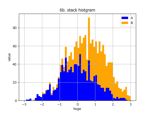
6.3 縦に積む
- 縦に積む場合は、bottomに値をhistogramの階級値の配列を指定する
- plt.histの返り値(ret)は、(階級値, bins)のtuple形式なので、それをそのまま使うとシンプル
def hist_stack(dataframe):
    fig = plt.figure()
    ax = fig.add_subplot(111, title="6b. stack histogram", ylabel="value", xlabel="hoge")

    bins = np.arange(-3.0, +3.1, 0.1)
    ret = ax.hist(dataframe["A"], bins=bins, color="blue", label="A")
    ax.hist(dataframe["B"], bottom=ret[0], bins=ret[1], color="orange", label="B")
    ax.legend()
    ax.grid()
    plt.savefig("6b. stack histogram.png")

hist_stack(df_example)
グラフ
7. pie:円グラフ
7.1 シンプル
- 情報少ないグラフ その2
- 第1引数には、配列を指定する(Seriesはダメ)
- 第1引数の値の比率は自動で計算してくれるので、合計が1になるように正規化する必要はない
- plt.pieのキーワード引数:labelsは、配列の各要素が「何の値か?」を示すもの
他のplotとは異なるので注意
プログラム例
- デフォルトだと、3時の方向から始まって時計回りとなる
日本でなじみ深い(と思う)円グラフを描画するには、counterclock=False, startangle=90で
明示的に指定する必要がある
df_example = pd.DataFrame({"A": [1, 5],
                           "B": [2, 6],
                           "C": [3, 7],
                           "D": [4, 8]}).T
print(df_example)

def simple_pie(dataframe):
    fig = plt.figure()
    ax = fig.add_subplot(111, title="7. simple pie")

    ax.pie(dataframe[0].to_numpy(), labels=dataframe.index)
    ax.legend()
    ax.grid()
    plt.savefig("7. simple pie.png")

simple_pie(df_example)
描画グラフ

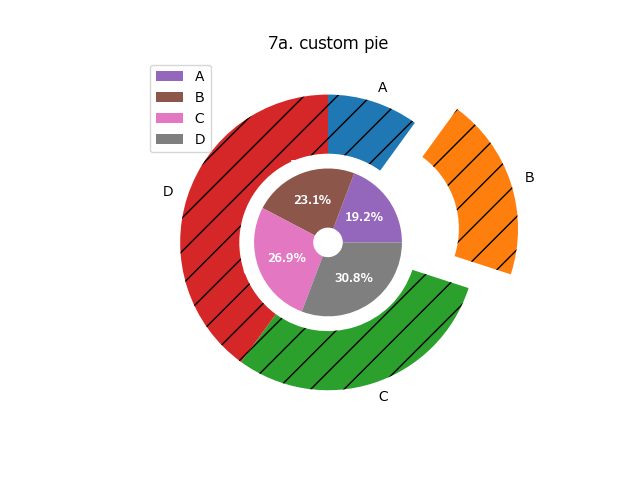
7.2 カスタムする
- この記事の本題
- plt.pieのカスタマイズは非常にややこしい
Nested pie charts
https://matplotlib.org/stable/gallery/pie_and_polar_charts/nested_pie.html#sphx-glr-gallery-pie-and-polar-charts-nested-pie-py
A pie and a donut with labels
https://matplotlib.org/stable/gallery/pie_and_polar_charts/pie_and_donut_labels.html#sphx-glr-gallery-pie-and-polar-charts-pie-and-donut-labels-py
プログラム例
- テキストを円グラフに描画する
- キーワード引数:autopct ではlambda式を指定して、plt.pieの返値(3つ目)をplt.setpの引数に指定すれば描画される
- lambda式内でpctはpercentage(正確には割合)を示しており、任意の関数(プログラム中ではtext_on_pie(pct))で返したstr型の表示テキストが描画される
- radius:円グラフそのものの大きさ
- wedgeprops:辞書型でwidth(円グラフの半径のイメージ)等が指定できる
これとradiusの差が、中央のドーナツの穴部分の半径に相当する - textprops:辞書型で文字の描画色(円グラフ上にある文字)等が指定できる
- hatch:円グラフ内の模様を設定する
- explode:円グラフを少し外に出して目立たせる。配列で値を指定する
def custom_pie(dataframe):
    fig = plt.figure()
    ax = fig.add_subplot(111, title="7a. custom pie")

    ax.pie(dataframe[0].to_numpy(), labels=dataframe.index,
           radius=1,
           counterclock=False,
           startangle=90,
           explode=[0, 0.3, 0, 0],
           wedgeprops={"width":0.4},
           hatch="/")

    def text_on_pie(pct):
        print(pct)  # 割合が順次格納されている
        show_text = f"{pct:.1f}%"  # 割合を%表示にする
        return show_text

    wedges, texts, autotexts = ax.pie(dataframe[1].to_numpy(), labels=dataframe.index,
                                      radius=0.5,
                                      wedgeprops={"width":0.4},
                                      textprops={"color": "white"},
                                      autopct=lambda pct : text_on_pie(pct))

    plt.setp(autotexts, size=8, weight="bold")
    ax.legend(wedges, dataframe.index)
    ax.grid()
    plt.savefig("7a. custom pie.png")

custom_pie(df_example)
グラフ
8. imshow:画像を表示
8.1 シンプル
- 第1引数に画素の2次元配列(グレースケールの場合)か、3次元配列(RGBカラーの場合)を指定すれば自動的に画像として描画してくれる
- 余談だがheatmap的に2次元配列を描画するものとして、plt.matshowがある
各列の相関係数とか可視化する場合は、そっちを使ったほうが良い
images = np.random.randint(0, 255, size=(28, 28, 3))  # RGB画像を想定

def simple_imshow(images):
    fig = plt.figure()
    ax = fig.add_subplot(111, title="8. simple imshow")

    ax.imshow(images)
    plt.savefig("8. imshow.png")

simple_imshow(images)
表示グラフ

まとめ
- matplotlibの個人的に使うサンプルコードをまとめた
- 表や円グラフ、箱ひげ図の情報が少なく困っていたのでまとめた
- matplotlibの公式サンプルはわかりづらいが、すらすら読めるようになりたい
Discussion