Next.jsにshadcn/uiを導入する
はじめに
本記事ではNext.jsにshadcn/uiを導入する手順を記載します
shadcn/uiとは
shadcn/uiは、2023 JavaScript Rising StarsのReact Ecosystemで1位を獲得した今注目のUIコンポーネント集です。
これまでのUIコンポーネント違うのはライブラリとして導入するのではなく、コピー&ペースとして使うことを特徴としています。
Beautifully designed components that you can copy and paste into your apps. Accessible. Customizable. Open Source.
This is NOT a component library. It's a collection of re-usable components that you can copy and paste into your apps.
FAQには以下のように記載されています
Why copy/paste and not packaged as a dependency?
The idea behind this is to give you ownership and control over the code, allowing you to decide how the components are built and styled.
Start with some sensible defaults, then customize the components to your needs.
One of the drawback of packaging the components in an npm package is that the style is coupled with the implementation. The design of your components should be separate from their implementation.
導入手順
前提条件
使用しているライブラリは以下のバージョンで動作確認しています。
- Next.js: 14.1.0
- shadcn/ui: 0.8.0
- Tailwind CSS: 3.3.0
- Storybook: 7.6.13
Next.jsプロジェクトの作成
Next.js公式サイトのInstallationの手順に従い、Next.jsアプリケーションを作成します。
npx create-next-app@latest
Tailwindは利用します。
Would you like to use Tailwind CSS? Yes
shadcn/uiの導入
shadcn/uiを導入します。
shadcn/uiのGetting Startedの手順を参考に進めます。
下記のコマンドを実行します。
npx shadcn-ui@latest init
プロジェクトのルートフォルダにcomponent.jsonというファイルが作成されます。
{
  "$schema": "https://ui.shadcn.com/schema.json",
  "style": "default",
  "rsc": false,
  "tsx": true,
  "tailwind": {
    "config": "tailwind.config.ts",
    "css": "src/app/globals.css",
    "baseColor": "slate",
    "cssVariables": true,
    "prefix": ""
  },
  "aliases": {
    "components": "@/components",
    "utils": "@/lib/utils"
  }
}
コンポーネントを追加します。
npx shadcn-ui@latest add button
src/components/uiフォルダにbutton.tsxというファイルが生成されました。
button.tsx
import * as React from "react"
import { Slot } from "@radix-ui/react-slot"
import { cva, type VariantProps } from "class-variance-authority"

import { cn } from "@/lib/utils"

const buttonVariants = cva(
  "inline-flex items-center justify-center whitespace-nowrap rounded-md text-sm font-medium ring-offset-background transition-colors focus-visible:outline-none focus-visible:ring-2 focus-visible:ring-ring focus-visible:ring-offset-2 disabled:pointer-events-none disabled:opacity-50",
  {
    variants: {
      variant: {
        default: "bg-primary text-primary-foreground hover:bg-primary/90",
        destructive:
          "bg-destructive text-destructive-foreground hover:bg-destructive/90",
        outline:
          "border border-input bg-background hover:bg-accent hover:text-accent-foreground",
        secondary:
          "bg-secondary text-secondary-foreground hover:bg-secondary/80",
        ghost: "hover:bg-accent hover:text-accent-foreground",
        link: "text-primary underline-offset-4 hover:underline",
      },
      size: {
        default: "h-10 px-4 py-2",
        sm: "h-9 rounded-md px-3",
        lg: "h-11 rounded-md px-8",
        icon: "h-10 w-10",
      },
    },
    defaultVariants: {
      variant: "default",
      size: "default",
    },
  }
)

export interface ButtonProps
  extends React.ButtonHTMLAttributes<HTMLButtonElement>,
    VariantProps<typeof buttonVariants> {
  asChild?: boolean
}

const Button = React.forwardRef<HTMLButtonElement, ButtonProps>(
  ({ className, variant, size, asChild = false, ...props }, ref) => {
    const Comp = asChild ? Slot : "button"
    return (
      <Comp
        className={cn(buttonVariants({ variant, size, className }))}
        ref={ref}
        {...props}
      />
    )
  }
)
Button.displayName = "Button"

export { Button, buttonVariants }
Storybookの導入
Storybookを導入します。
npx storybook@latest init
これでStorybookを実行すると以下のようなエラーが発生します。
ERROR in ./src/components/ui/button.tsx 10:0-33
Module not found: Error: Can't resolve '@/lib/utils' in '/project/src/components/ui'
importのaliasの設定が正しくないようです。
StorybookのTypeScript modules are not resolved within Storybookの内容に従って設定を追加します。
const config: StorybookConfig = {
  ...
  webpackFinal: async (config) => {
    if (config.resolve) {
      config.resolve.alias = {
        ...config.resolve.alias,
        '@': path.resolve(__dirname, '../src'),
      };
    }
    return config;
  },
  ...
};
export default config;
これでimportのエラーは解消しました。
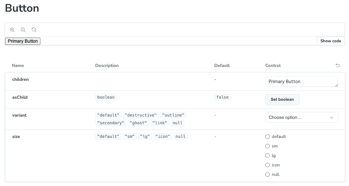
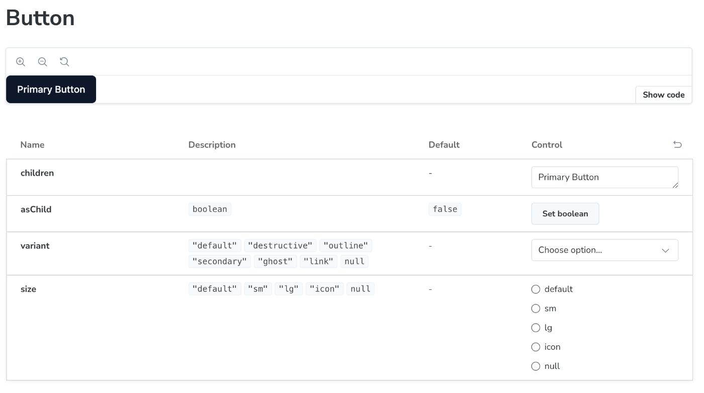
このあとStorybookを実行するとButtonコンポーネントは表示できましたが、Styleが正しく適用されていないようです。
Integrate Tailwind CSS and Storybookの内容に従ってTailwindのCSSを読み込むようにします。
  import type { Preview } from "@storybook/react";
+ import '../src/app/globals.css';

  const preview: Preview = {
    parameters: {
      actions: { argTypesRegex: "^on[A-Z].*" },
      controls: {
        matchers: {
          color: /(background|color)$/i,
          date: /Date$/i,
        },
      },
    },
  };

  export default preview;
これで無事にStyleが適用されました。
Discussion