ミニカーコレクションSNSサービス開発11▶️開発205日目開発 - TALLスタックを使ってモダンなUIへ! -
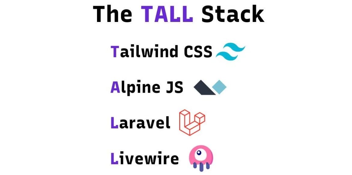
ずっと「もっとモダンで、かっこいいUIにしたいなあ」と思いながら、ミニカーやプラモデルなど自動車模型を飾れるオンラインギャラリーサービスをコツコツ開発してきました。これまではLaravel中心で作っていたんですが、最近になって思い切ってTALLスタック(Tailwind CSS、Alpine.js、Laravel、Livewire)に乗り換えました。ようやく、頭の中にあった“理想のカタチ”に少しずつ近づいてきた気がします。今回はそんな技術まわりの話を、少しゆるめに書いてみようと思います。
モーダルの追加
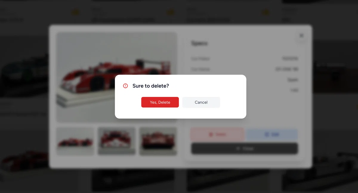
削除確認モーダルの追加
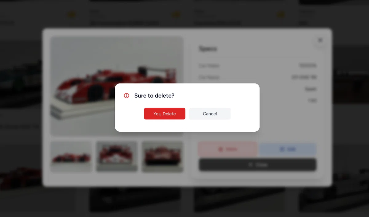
削除時の確認モーダル
これまでは、ログインしているユーザーが投稿した投稿を削除する時は、ゴミ箱マークのDeleteボタンを押すとそのまま削除される仕様となっていました。しかし、間違えて指が触れてしまった時など、そのまま削除されてしまうのも怖いなと思い、Deleteボタンを一度押しても「本当に削除していいですか?」の確認を行うために、削除確認モーダルを追加しました。
Deleteボタンを押すと
削除確認モーダルが立ち上がる!
削除確認モーダルは上記のデザインでシンプルな内容とし、LivewireのコンポーネントのBladeファイルの中身は以下です。
<!-- Deleteの確認用モーダル -->
<div x-show="open" x-cloak
    class="fixed inset-0 z-50 flex items-center justify-center bg-black/40 backdrop-blur-sm transition-opacity duration-300">

    <div class="bg-white w-full max-w-md mx-auto rounded-2xl shadow-xl p-6 space-y-6 animate-fade-in min-h-[150px]">
        <!-- ヘッダー -->
        <div class="flex items-center gap-3">
            <svg class="w-6 h-6 text-red-500" fill="none" viewBox="0 0 24 24" stroke="currentColor"
                stroke-width="2">
                <path stroke-linecap="round" stroke-linejoin="round"
                    d="M12 9v2m0 4h.01M12 19a7 7 0 100-14 7 7 0 000 14z" />
            </svg>
            <h2 class="text-lg font-semibold text-gray-900">Sure to delete?</h2>
        </div>

        <!-- アクションボタン(中央寄せ & 間隔調整) -->
        <div class="flex justify-center items-center gap-3">
            <!-- 削除 -->
            <form x-ref="form" action="{{ route('add.destroy', $add->id) }}" method="POST">
                @csrf
                @method('DELETE')
                <button type="submit"
                class="w-32 px-4 py-2 rounded-md text-sm bg-red-600 text-white hover:bg-red-700 transition shadow-sm">
                    Yes, Delete
                </button>
            </form>

            <!-- キャンセル -->
            <button @click="open = false"
            class="w-32 px-4 py-2 rounded-md text-sm bg-gray-100 text-gray-700 hover:bg-gray-200 transition shadow-sm">
                Cancel
            </button>
        </div>
    </div>
</div>
これで投稿したカードを誤って削除してしまうことが防げる仕様になりました!
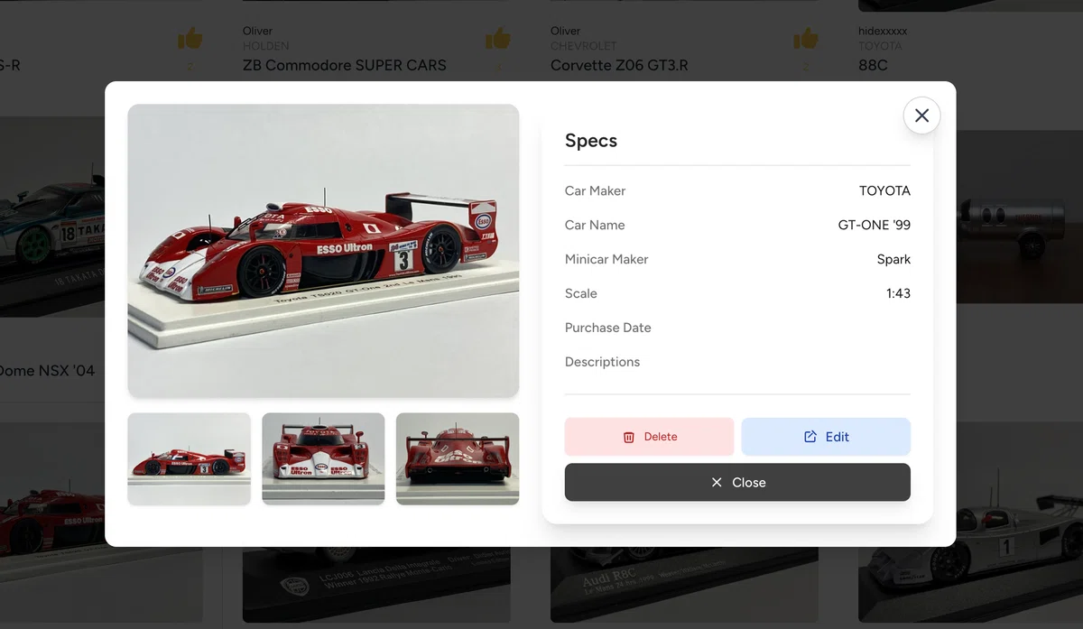
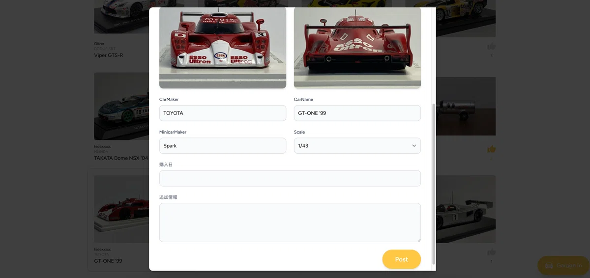
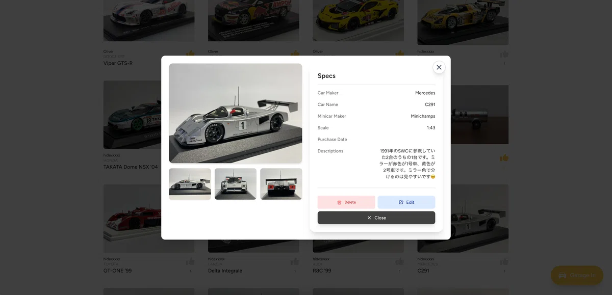
投稿編集モーダルの追加
また、これまではユーザーが投稿した投稿を編集する際のEditボタンを押すと編集用の画面へ遷移してしまう仕様になっていました。画面遷移するストレスを無くしたかったので、こちらもモーダル表示に変えました。
編集モーダル
投稿がカード形式で一覧表示される様になっており、カードをクリックするとモーダルで詳細が見れる仕様。モーダル内では、同じモーダルで「投稿の詳細内容」と「編集画面」を条件分岐で分けています。以下はモーダル内の「編集画面」の場合のコードを書いています。@else以降に「詳細内容」の内容を書き分けることにより、同じモーダル内で表示内容を切り替える様にしています。
--- bladeファイル ---

<div
    class="fixed inset-0 z-50 overflow-y-auto bg-black/50 flex items-center justify-center px-4 sm:px-6"
    x-show="openModal" x-cloak
    x-transition:enter="transition ease-out duration-300"
    x-transition:enter-start="opacity-0 scale-95"
    x-transition:enter-end="opacity-100 scale-100"
    x-transition:leave="transition ease-in duration-200"
    x-transition:leave-start="opacity-100 scale-100"
    x-transition:leave-end="opacity-0 scale-95"
>

    <!-- モーダルの枠 (モバイル・PC両対応) -->
    <div class="relative bg-white rounded-xl shadow-xl overflow-hidden w-full max-w-[85%] sm:max-w-lg lg:max-w-4xl mx-auto my-12 sm:my-16 max-h-[90vh] overflow-y-auto"
        x-transition:enter="transition ease-out duration-300 transform"
        x-transition:enter-start="translate-y-8 opacity-0"
        x-transition:enter-end="translate-y-0 opacity-100"
        x-transition:leave="transition ease-in duration-200 transform"
        x-transition:leave-start="translate-y-0 opacity-100"
        x-transition:leave-end="translate-y-8 opacity-0"
    >

        <!-- ❌ バツマークボタン(右上) -->
        <button @click="openModal = false"
            class="absolute top-4 right-4 w-10 h-10 flex items-center justify-center bg-white/80 border border-gray-300 rounded-full shadow-lg hover:bg-gray-300 active:bg-gray-400 transition duration-200 z-50">
            <svg xmlns="http://www.w3.org/2000/svg" class="w-6 h-6 text-gray-700" fill="none" viewBox="0 0 24 24"
                stroke="currentColor" stroke-width="2">
                <path stroke-linecap="round" stroke-linejoin="round" d="M6 18L18 6M6 6l12 12" />
            </svg>
        </button>

        {{-- 編集中か否かのフラグ --}}
        @if ($isEditing)
            {{-- 編集画面の場合 --}}
            {{-- 編集フォーム --}}
            <div class="p-6 sm:p-8">
                <form wire:submit.prevent="update" class="space-y-6" enctype="multipart/form-data">

                    {{-- 画像アップロード --}}
                    <div class="grid grid-cols-1 sm:grid-cols-2 gap-6">
                        @foreach (['CarImageA', 'CarImageB', 'CarImageC', 'CarImageD'] as $imageField)
                            <div class="flex flex-col">
                                <label for="{{ $imageField }}" class="text-sm font-medium text-gray-700 mb-2">
                                    {{ __($imageField) }}
                                </label>

                                <input id="{{ $imageField }}" type="file" wire:model="{{ $imageField }}"
                                    class="block w-full text-sm border border-gray-300 rounded-xl bg-gray-50 p-2.5 focus:border-customYellow focus:ring-customYellow"
                                    accept="image/*">

                                {{-- アップロード or 既存画像プレビュー --}}
                                @if (${$imageField})
                                    <div class="mt-2">
                                        <img src="{{ ${$imageField}->temporaryUrl() }}" alt="Preview" class="w-full h-64 object-cover rounded-xl shadow-md">
                                    </div>
                                @elseif (!empty($add->{$imageField}))
                                    <div class="mt-2">
                                        <img src="{{ asset('storage/CarImages/' . $add->{$imageField}) }}" alt="{{ $imageField }}" class="w-full h-64 object-cover rounded-xl shadow-md">
                                    </div>
                                @endif

                                @error($imageField)
                                    <span class="text-red-500 text-xs mt-1">{{ $message }}</span>
                                @enderror
                            </div>
                        @endforeach
                    </div>

                    {{-- テキスト系入力 --}}
                    <div class="grid grid-cols-1 md:grid-cols-2 gap-6">
                        <div class="flex flex-col">
                            <label for="CarMaker" class="text-sm font-medium text-gray-700 mb-2">{{ __('CarMaker') }}</label>
                            <input wire:model.defer="CarMaker" id="CarMaker" type="text"
                                class="w-full border border-gray-300 rounded-xl bg-gray-50 p-3 focus:border-customYellow focus:ring-customYellow">
                            @error('CarMaker') <span class="text-red-500 text-xs mt-1">{{ $message }}</span> @enderror
                        </div>

                        <div class="flex flex-col">
                            <label for="CarName" class="text-sm font-medium text-gray-700 mb-2">{{ __('CarName') }}</label>
                            <input wire:model.defer="CarName" id="CarName" type="text"
                                class="w-full border border-gray-300 rounded-xl bg-gray-50 p-3 focus:border-customYellow focus:ring-customYellow">
                            @error('CarName') <span class="text-red-500 text-xs mt-1">{{ $message }}</span> @enderror
                        </div>

                        <div class="flex flex-col">
                            <label for="MinicarMaker" class="text-sm font-medium text-gray-700 mb-2">{{ __('MinicarMaker') }}</label>
                            <input wire:model.defer="MinicarMaker" id="MinicarMaker" type="text"
                                class="w-full border border-gray-300 rounded-xl bg-gray-50 p-3 focus:border-customYellow focus:ring-customYellow">
                            @error('MinicarMaker') <span class="text-red-500 text-xs mt-1">{{ $message }}</span> @enderror
                        </div>

                        <div class="flex flex-col">
                            <label for="Scale" class="text-sm font-medium text-gray-700 mb-2">{{ __('Scale') }}</label>
                            <select wire:model.defer="Scale" id="Scale"
                                class="w-full border border-gray-300 rounded-xl bg-gray-50 p-3 focus:border-customYellow focus:ring-customYellow">
                                <option value="">-- Select Scale --</option>
                                <option value="1:18">1/18</option>
                                <option value="1:24">1/24</option>
                                <option value="1:43">1/43</option>
                                <option value="1:64">1/64</option>
                            </select>
                            @error('Scale') <span class="text-red-500 text-xs mt-1">{{ $message }}</span> @enderror
                        </div>

                        <div class="flex flex-col md:col-span-2">
                            <label for="PurchaseDate" class="text-sm font-medium text-gray-700 mb-2">{{ __('購入日') }}</label>
                            <input wire:model.defer="PurchaseDate" id="PurchaseDate" type="text"
                                class="w-full border border-gray-300 rounded-xl bg-gray-50 p-3 focus:border-customYellow focus:ring-customYellow">
                            @error('PurchaseDate') <span class="text-red-500 text-xs mt-1">{{ $message }}</span> @enderror
                        </div>

                        <div class="flex flex-col md:col-span-2">
                            <label for="Descriptions" class="text-sm font-medium text-gray-700 mb-2">{{ __('追加情報') }}</label>
                            <textarea wire:model.defer="Descriptions" id="Descriptions" rows="4"
                                class="w-full border border-gray-300 rounded-xl bg-gray-50 p-3 focus:border-customYellow focus:ring-customYellow"></textarea>
                            @error('Descriptions') <span class="text-red-500 text-xs mt-1">{{ $message }}</span> @enderror
                        </div>
                    </div>

                    {{-- Submitボタン --}}
                    <div class="flex justify-end mt-8">
                        <button type="submit"
                            class="inline-flex items-center px-10 py-4 bg-customYellow hover:bg-yellow-500 text-white font-bold text-xl rounded-full shadow-md transition-all duration-300 transform hover:scale-105 active:scale-95">
                            {{ __('Post') }}
                        </button>
                    </div>
                </form>
            </div>

        @else


     <<<<<<<<<<<<<<<  編集以外のモーダル内容をここに記述  >>>>>>>>>>>>>>>


                    <!-- Closeボタン -->
                    <div class="w-full">
                        <button @click="openModal = false"
                            class="h-10 w-full inline-flex items-center justify-center gap-2 px-4 rounded-lg bg-neutral-700 text-white text-sm font-medium shadow-lg hover:bg-neutral-800 hover:shadow-lg focus:outline-none focus:ring-2 focus:ring-neutral-500 transition-all duration-200">
                            <svg class="w-4 h-4" fill="none" stroke="currentColor" stroke-width="2" viewBox="0 0 24 24">
                                <path d="M6 18L18 6M6 6l12 12" stroke-linecap="round" stroke-linejoin="round"/>
                            </svg>
                            Close
                        </button>
                    </div>
                </div>

            </div>
        </div>

        @endif

    </div>
</div>
モーダルコンポーネントで生成されたクラスファイル(コントローラ)には以下の様に詳細画面と編集画面を切り替えられる様なフラグ判定を行うコードを追記させます。
--- クラスファイル ---

    // -- 編集中か否かのフラグ trueで編集モードへ切り替え--
    public function startEditing()
    {
        $this->isEditing = true;
    }
フォロー機能のLivewire化
新たなユーザーをフォローする際、フォローしたいユーザーのダッシュボードページで「Follow」ボタンを押すと、ページリロードが発生しページが再表示された後にフォローステータスが完了していました。しかし、ページリロードが発生してしまうことが地味にストレスだったので、Livewireを使った非同期処理でこちらも実装してみました。
Follow / Unfollowボタンを非同期処理で実装
"FollowFunction"という名前でLivewire用のコンポーネントを作ります。ターミナルなどで以下のコマンドを叩きます。
php artisan make:livewire FollowFunction
FollowFunctionコンポーネントが生成されると、Bladeファイルとクラスファイルがセットで生成されます。Follow機能を実装するために、Bladeファイル内に以下のコードを記述します。デザインはとりあえずシンプルに作ってみます。
<div class="flex justify-center mb-4" x-data>
    <button
        wire:click="toggleFollow"
        class="flex items-center gap-2 px-4 py-1.5 text-sm font-semibold rounded-full shadow-sm transition-all duration-200
            {{ $isFollowing
                ? 'bg-red-500 hover:bg-red-600 text-white'
                : 'bg-zinc-900 text-white hover:border hover:border-customYellow hover:shadow-md' }}">
        <svg class="h-4 w-4" fill="currentColor" viewBox="0 0 24 24">
            <path d="M12 17.75l-6.172 3.245 1.179-6.873-4.993-4.867 6.9-1.002L12 2l3.086 6.253 6.9 1.002-4.993 4.867 1.179 6.873z"/>
        </svg>
        {{ $isFollowing ? 'Unfollow' : 'Follow' }}
    </button>
</div>
併せてクラスファイルに以下の内容を記述します。
<?php

namespace App\Livewire;

use Livewire\Component;
use App\Models\User;
use Illuminate\Support\Facades\Auth;


class FollowFunction extends Component
{
    public User $user;
    public bool $isFollowing;

    public function mount(User $user)
    {
        $this->user = $user;
        $this->isFollowing = Auth::user()->followings()->where('users.id', $user->id)->exists();
    }

    public function toggleFollow()
    {
        logger('toggleFollow fired'); // ここでログ確認
        $authUser = Auth::user();

        if ($this->isFollowing) {
            $authUser->followings()->detach($this->user->id);
        } else {
            $authUser->followings()->attach($this->user->id);
        }

        $this->isFollowing = !$this->isFollowing;
    }


    public function render()
    {
        return view('livewire.follow-function');
    }
}
これでFollow機能を実装することができました。
また、Livewire V3を使うときは、Alpine.jsを自分で app.blade.php に書き足さなくても大丈夫です。Alpine.jsはLivewire側でちゃんと読み込んでくれるので、そこにさらに自分で追加してしまうと、読み込みが重なってちょっと複雑な処理をしようとすると、エラーが出て動かなくなったりするので注意が必要です。僕は最初の数時間このことを知らずにエラーにハマっていました💦
Garage In(投稿)機能を常に画面上に配置
メニューバー内のGarage In機能タブを廃止し、タイムラインを見ている途中でも投稿しやすい様に、右下に常に「Garage In(投稿)ボタン」があらわれる様に変更しました。
右下(画面右下の黄色のボタン)に投稿ボタンを配置
また、投稿されたカードをクリックしてモーダルを表示させた際に、Garage Inが最前面に出てこない様に調整しました。これはz-indexを使って、モーダルよりもGarage Inボタンが後ろになる様にタグ内のclassにz-indexを追加するだけで実装完了できました。
モーダルのz-index > Garage Inのz-index
こちらのnoteでは、ミニカーやプラモデルなどのクルマ模型特化型のオンラインディスプレイサービス" The Garage "の開発に関する記事の発信を行っています。

⬇️The GarageはこちらのURL先よりご利用いただけます。
今後も開発記事について記事を更新していけたらと思っています。
今後ともよろしくお願いします🚘
Discussion