shadcn/uiで新しくリリースされたDrawerを触ってみる
はじめに
本記事では、shadcn/ui で新しくリリースされた Drawer を触ってみます。
結論
shadcn/ui は、@shadcnが開発しているコンポーネントライブラリーです。コンポーネントはプロジェクトにコピー&ペーストして使うことができることが特徴です。shadcn/ui から新しく Drawer がリリースされました。
Drawer は裏側ではVaulをベースにしています。Vaul の詳細機能について知りたい場合は、以下のサイトでデモを見ることができます。
Vaul の公式 API リファレンスはこちらです。
shadcn/ui の Drawer を利用することで、画面サイズが 768px 未満の場合は Drawer を表示し、画面サイズが 768px 以上の場合は Dialog コンポーネントを表示することもできます。本記事ではその実装について触っていきます。
作業結果は以下のリポジトリーで公開しています。
作業環境を構築
作業するための Next.js のプロジェクトを新規に作成していきます。長いので畳みます。
新規プロジェクト作成と初期環境構築の手順詳細
プロジェクトを作成
create next-app@latestでプロジェクトを作成します。
$ pnpm create next-app@latest next-shadcnui-vaul-sample --typescript --eslint --import-alias "@/*" --src-dir --use-pnpm --tailwind --app
$ cd next-shadcnui-vaul-sample
Peer Dependenciesの警告を解消
Peer dependenciesの警告が出ている場合は、pnpm installを実行し、警告を解消します。
 WARN  Issues with peer dependencies found
.
├─┬ autoprefixer 10.0.1
│ └── ✕ unmet peer postcss@^8.1.0: found 8.0.0
├─┬ tailwindcss 3.3.0
│ ├── ✕ unmet peer postcss@^8.0.9: found 8.0.0
│ ├─┬ postcss-js 4.0.1
│ │ └── ✕ unmet peer postcss@^8.4.21: found 8.0.0
│ ├─┬ postcss-load-config 3.1.4
│ │ └── ✕ unmet peer postcss@>=8.0.9: found 8.0.0
│ └─┬ postcss-nested 6.0.0
│   └── ✕ unmet peer postcss@^8.2.14: found 8.0.0
└─┬ next 14.0.4
  ├── ✕ unmet peer react@^18.2.0: found 18.0.0
  └── ✕ unmet peer react-dom@^18.2.0: found 18.0.0
以下を実行することで警告が解消されます。
$ pnpm i postcss@latest react@^18.2.0 react-dom@^18.2.0
クリーンアップ
不要な設定を削除し、プロジェクトを初期化します。
styles
CSSなどを管理するstylesディレクトリを作成します。globals.cssを移動します。
$ mkdir src/styles
$ mv src/app/globals.css src/styles/globals.css
globals.cssの内容を以下のように上書きします。
@tailwind base;
@tailwind components;
@tailwind utilities;
初期ページ
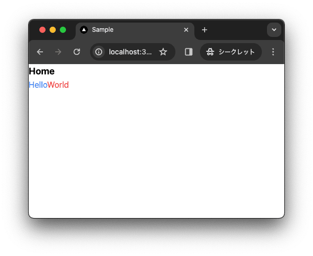
app/page.tsxを上書きします。
import { type FC } from "react";

const Home: FC = () => {
  return (
    <div className="">
      <div className="text-lg font-bold">Home</div>
      <div>
        <span className="text-blue-500">Hello</span>
        <span className="text-red-500">World</span>
      </div>
    </div>
  );
};

export default Home;
レイアウト
app/layout.tsxを上書きします。
import "@/styles/globals.css";
import { type FC } from "react";
type RootLayoutProps = {
  children: React.ReactNode;
};

export const metadata = {
  title: "Sample",
  description: "Generated by create next app",
};

const RootLayout: FC<RootLayoutProps> = (props) => {
  return (
    <html lang="ja">
      <body className="">{props.children}</body>
    </html>
  );
};

export default RootLayout;
TailwindCSSの設定
TailwindCSSの設定を上書きします。
import type { Config } from 'tailwindcss'

const config: Config = {
  content: [
    './src/pages/**/*.{js,ts,jsx,tsx,mdx}',
    './src/components/**/*.{js,ts,jsx,tsx,mdx}',
    './src/app/**/*.{js,ts,jsx,tsx,mdx}',
  ],
  plugins: [],
}
export default config
TypeScriptの設定
baseUrlを追加します。
{
  "compilerOptions": {
    "target": "es5",
    "lib": ["dom", "dom.iterable", "esnext"],
    "allowJs": true,
    "skipLibCheck": true,
    "strict": true,
    "forceConsistentCasingInFileNames": true,
    "noEmit": true,
    "esModuleInterop": true,
    "module": "esnext",
    "moduleResolution": "node",
    "resolveJsonModule": true,
    "isolatedModules": true,
    "jsx": "preserve",
    "incremental": true,
    "plugins": [
      {
        "name": "next"
      }
    ],
+   "baseUrl": ".",
    "paths": {
      "@/*": ["./src/*"],
    }
  },
  "include": ["next-env.d.ts", "**/*.ts", "**/*.tsx", ".next/types/**/*.ts"],
  "exclude": ["node_modules"]
}
動作確認
ローカルで動作確認します。
$ pnpm dev
コミットして作業結果を保存しておきます。
$ pnpm build
$ git add .
$ git commit -m "feat:新規にプロジェクトを作成し, 作業環境を構築"
shadcn/ui
shadcn/ui は、@shadcnが開発しているコンポーネントライブラリーです。コンポーネントはアプリケーションにコピー&ペーストして使うことができます。
主な特徴
- 美しいデザイン: コンポーネントは見た目が良く、現代的な UI のニーズに適応しています。
- 簡単な統合: コンポーネントはコピー&ペーストするだけで使うことができ、迅速にプロジェクトに統合可能です。
- アクセシビリティ: すべてのユーザーがアクセスしやすいように設計されています。
- カスタマイズ可能: さまざまなニーズに合わせてカスタマイズできます。
- オープンソース: GitHub でソースコードが公開されており、コミュニティによる貢献が可能です。
shadcn/uiを導入
shadcn/ui を導入します。
$ pnpm dlx shadcn-ui@latest init
✔ Would you like to use TypeScript (recommended)? … no / yes
✔ Which style would you like to use? › Default
✔ Which color would you like to use as base color? › Slate
✔ Where is your global CSS file? … src/styles/globals.css
✔ Would you like to use CSS variables for colors? … no / yes
✔ Are you using a custom tailwind prefix eg. tw-? (Leave blank if not) …
✔ Where is your tailwind.config.js located? … tailwind.config.ts
✔ Configure the import alias for components: … @/components
✔ Configure the import alias for utils: … @/lib/utils
✔ Are you using React Server Components? … no / yes
✔ Write configuration to components.json. Proceed? … yes

✔ Writing components.json...
✔ Initializing project...
✔ Installing dependencies...

Success! Project initialization completed.
作業結果を保存しておきます。
$ pnpm build
$ git add .
$ git commit -m "feat:shadcn/uiを設定"
shadcn/uiのDrawer
shadcn/ui の Drawer はVaulをベースにしています。
Vaulとは
Vaul は、Vercelで働いている Design Engineer の@emilkowalski_が開発しているライブラリーです。
以下のサイトでデモを見ることができます。
また、以前、別記事でも紹介させていただきました。
それでは触っていきたいと思います。
Drawerを導入
shadcn/ui の Drawer を導入します。
$ pnpm dlx shadcn-ui@latest add drawer
デモで利用するために、他のコンポーネントも追加しておきます。
$ pnpm dlx shadcn-ui@latest add dialog button input label
デモではスマホサイズとデスクトップサイズで Drawer を使い分けます。スマホサイズでは Drawer コンポーネントを、デスクトップサイズでは Dialog ンポーネントを利用します。画面サイズを判定するためのフックを @react-hookz/web を利用します。
@react-hookz/web とは、React のカスタムフックを提供するライブラリーです。便利なライブラリーを多数提供しているため、利用することで開発効率を向上させることができます。
$ pnpm add @react-hookz/web
Drawerコンポーネントを作成
Drawer を利用した Dialog コンポーネントを作成します。
$ touch src/components/drawer-dialog-demo.tsx
"use client";

import * as React from "react";

import { cn } from "@/lib/utils";
import { Button } from "@/components/ui/button";
import {
  Dialog,
  DialogContent,
  DialogDescription,
  DialogHeader,
  DialogTitle,
  DialogTrigger,
} from "@/components/ui/dialog";
import {
  Drawer,
  DrawerClose,
  DrawerContent,
  DrawerDescription,
  DrawerFooter,
  DrawerHeader,
  DrawerTitle,
  DrawerTrigger,
} from "@/components/ui/drawer";
import { Input } from "@/components/ui/input";
import { Label } from "@/components/ui/label";
import { useMediaQuery } from "@react-hookz/web";

export function DrawerDialogDemo() {
  const [isOpen, setIsOpen] = React.useState(false);
  const isSmallDevice = useMediaQuery("only screen and (max-width : 768px)");

  const onOpenChange = React.useCallback(
    (nextOpen: boolean) => {
      if (nextOpen) {
        setIsOpen(true);
      } else {
        setIsOpen(false);
        // if you need refresh data when close dialog, add your code here
      }
    },
    [setIsOpen]
  );

  if (!isSmallDevice) {
    return (
      <Dialog open={isOpen} onOpenChange={onOpenChange}>
        <DialogTrigger asChild>
          <Button variant="outline">Edit Profile</Button>
        </DialogTrigger>
        <DialogContent className="sm:max-w-[425px]">
          <DialogHeader>
            <DialogTitle>Edit profile</DialogTitle>
            <DialogDescription>
              Make changes to your profile here. Click save when you're done.
            </DialogDescription>
          </DialogHeader>
          <ProfileForm />
        </DialogContent>
      </Dialog>
    );
  }

  return (
    <Drawer open={isOpen} onOpenChange={onOpenChange}>
      <DrawerTrigger asChild>
        <Button variant="outline">Edit Profile</Button>
      </DrawerTrigger>
      <DrawerContent>
        <DrawerHeader className="text-left">
          <DrawerTitle>Edit profile</DrawerTitle>
          <DrawerDescription>
            Make changes to your profile here. Click save when you're done.
          </DrawerDescription>
        </DrawerHeader>
        <ProfileForm className="px-4" />
        <DrawerFooter className="pt-2">
          <DrawerClose asChild>
            <Button variant="outline">Cancel</Button>
          </DrawerClose>
        </DrawerFooter>
      </DrawerContent>
    </Drawer>
  );
}

function ProfileForm({ className }: React.ComponentProps<"form">) {
  return (
    <form className={cn("grid items-start gap-4", className)}>
      <div className="grid gap-2">
        <Label htmlFor="email">Email</Label>
        <Input type="email" id="email" defaultValue="shadcn@example.com" />
      </div>
      <div className="grid gap-2">
        <Label htmlFor="username">Username</Label>
        <Input id="username" defaultValue="@shadcn" />
      </div>
      <Button type="submit">Save changes</Button>
    </form>
  );
}
解説
isSmallDevice は、画面幅が 768px 未満の場合に true を返すフックです。
const isSmallDevice = useMediaQuery("only screen and (max-width : 768px)");
isSmallDevice が false の場合は、Dialog コンポーネントを利用します。
  if (!isSmallDevice) {
    return (
      <Dialog open={isOpen} onOpenChange={onOpenChange}>
        <DialogTrigger asChild>
          <Button variant="outline">Edit Profile</Button>
        </DialogTrigger>
        <DialogContent className="sm:max-w-[425px]">
          <DialogHeader>
            <DialogTitle>Edit profile</DialogTitle>
            <DialogDescription>
              Make changes to your profile here. Click save when you're done.
            </DialogDescription>
          </DialogHeader>
          <ProfileForm />
        </DialogContent>
      </Dialog>
    );
  }
isSmallDevice が true の場合は、Drawer コンポーネントを利用します。
  return (
    <Drawer open={isOpen} onOpenChange={onOpenChange}>
      <DrawerTrigger asChild>
        <Button variant="outline">Edit Profile</Button>
      </DrawerTrigger>
      <DrawerContent>
        <DrawerHeader className="text-left">
          <DrawerTitle>Edit profile</DrawerTitle>
          <DrawerDescription>
            Make changes to your profile here. Click save when you're done.
          </DrawerDescription>
        </DrawerHeader>
        <ProfileForm className="px-4" />
        <DrawerFooter className="pt-2">
          <DrawerClose asChild>
            <Button variant="outline">Cancel</Button>
          </DrawerClose>
        </DrawerFooter>
      </DrawerContent>
    </Drawer>
  );
onOpenChange を利用して state を更新します。Dialog と Drawer が state を共有します。なお、Dialog を閉じるときにデータを更新したい場合は、onOpenChange を利用して state を更新することで、データを更新できます。例えば、router.refresh() を実行するなど。
  const onOpenChange = React.useCallback(
    (nextOpen: boolean) => {
      if (nextOpen) {
        setIsOpen(true);
      } else {
        setIsOpen(false);
        // if you need refresh data when close dialog, add your code here
      }
    },
    [setIsOpen]
  );
動作確認
ローカルで動作確認します。
$ pnpm dev
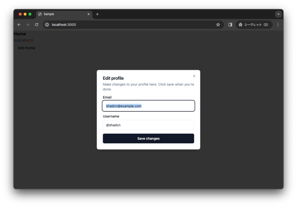
ボタンをクリックする前です。
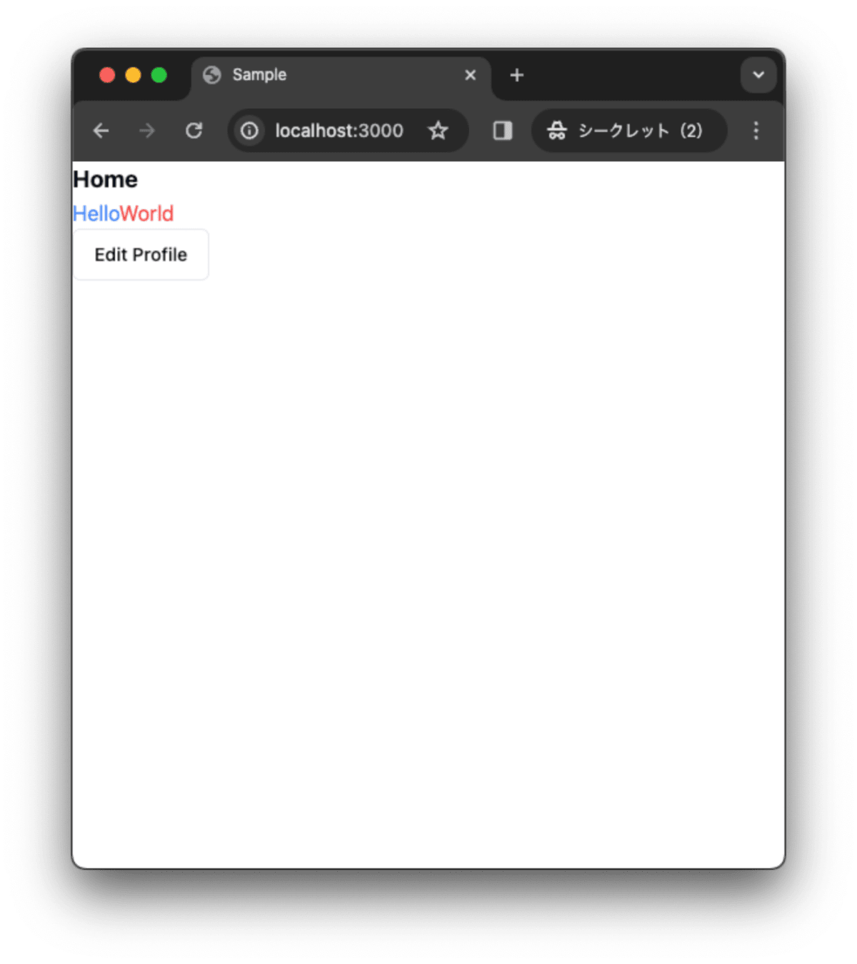
画面サイズが 768px 未満の場合は、Drawer が表示されます。
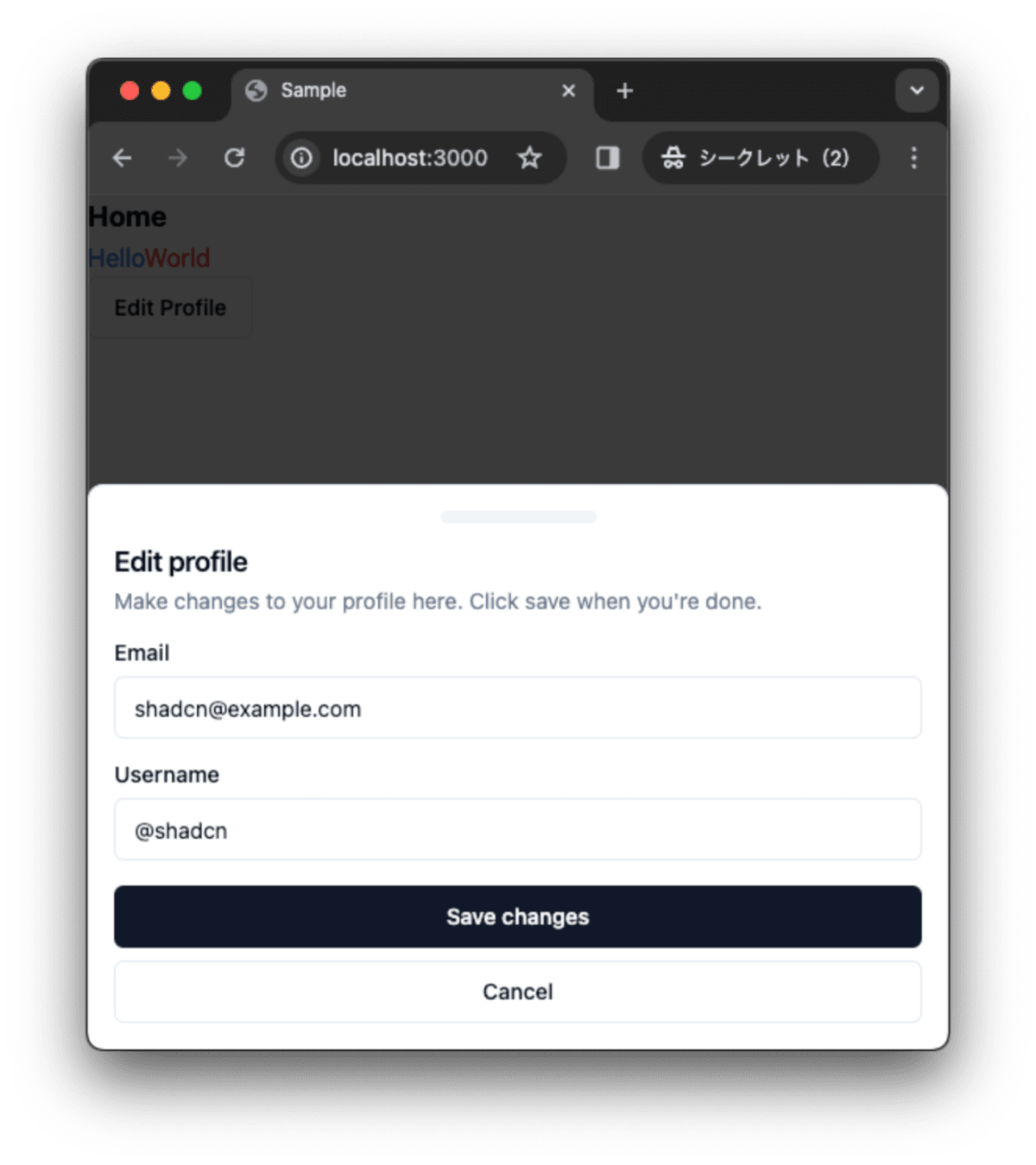
画面サイズが 768px 以上の場合は、Dialog が表示されます。
コミットして作業結果を保存しておきます。
$ pnpm build
$ git add .
$ git commit -m "feat:Drawerコンポーネントを作成"
最後に
shadcn/ui の Drawer を利用して、Dialog コンポーネントと Drawer コンポーネントを作成しました。画面サイズが 768px 未満の場合に表示し、画面サイズが 768px 以上の場合は Dialog コンポーネントを表示できます。Drawer コンポーネントは、Vaul をベースにしているため、Vaul のドキュメントを参考にすることで、Drawer コンポーネントのカスタマイズが可能です。
作業結果は以下のリポジトリーで公開しています。
Discussion