💃
shadcn/uiの新機能Themesがリリース!テーマカラーが簡単に変更可能に!✨
はじめに
先日の 8 月 8 日に shadcn/ui でテーマカラーを変更できる Themes がリリースされました。Themes を利用することで、コピペで全体の Themes を即座に変更できます。
shadcn/uiのThemes の使い方を紹介します。
結論(Themeの使い方)
- shadcn/ui Themes を開きます

- お好みのテーマを選択します。
- 「Customize」をクリックします。
- 「Style, Color, Radius, Mode」を選択します。
- 「Copy code」をクリックします。

- CSS ファイルにコピペする設定が表示されるので、「Copy」をクリックします。

-
globals.cssを開き、@layer baseと.darkを置換すれば完了です。
globals.css
...

@layer base {
  :root {
    --background: 0 0% 100%;
    --foreground: 222.2 84% 4.9%;

    --card: 0 0% 100%;
    --card-foreground: 222.2 84% 4.9%;

    --popover: 0 0% 100%;
    --popover-foreground: 222.2 84% 4.9%;

    --primary: 222.2 47.4% 11.2%;
    --primary-foreground: 210 40% 98%;

    --secondary: 210 40% 96.1%;
    --secondary-foreground: 222.2 47.4% 11.2%;

    --muted: 210 40% 96.1%;
    --muted-foreground: 215.4 16.3% 46.9%;

    --accent: 210 40% 96.1%;
    --accent-foreground: 222.2 47.4% 11.2%;

    --destructive: 0 84.2% 60.2%;
    --destructive-foreground: 210 40% 98%;

    --border: 214.3 31.8% 91.4%;
    --input: 214.3 31.8% 91.4%;
    --ring: 222.2 84% 4.9%;

    --radius: 0.5rem;
  }

  .dark {
    --background: 222.2 84% 4.9%;
    --foreground: 210 40% 98%;

    --card: 222.2 84% 4.9%;
    --card-foreground: 210 40% 98%;

    --popover: 222.2 84% 4.9%;
    --popover-foreground: 210 40% 98%;

    --primary: 210 40% 98%;
    --primary-foreground: 222.2 47.4% 11.2%;

    --secondary: 217.2 32.6% 17.5%;
    --secondary-foreground: 210 40% 98%;

    --muted: 217.2 32.6% 17.5%;
    --muted-foreground: 215 20.2% 65.1%;

    --accent: 217.2 32.6% 17.5%;
    --accent-foreground: 210 40% 98%;

    --destructive: 0 62.8% 30.6%;
    --destructive-foreground: 210 40% 98%;

    --border: 217.2 32.6% 17.5%;
    --input: 217.2 32.6% 17.5%;
    --ring: hsl(212.7,26.8%,83.9);
  }
}
...
以下のようにテーマが変更されます。
実装
実際に実装して行きます。
Next.jsプロジェクトの新規作成
作業するプロジェクトを新規に作成していきます。
長いので、折りたたんでおきます。
新規プロジェクト作成と初期環境構築の手順詳細
$ pnpm create next-app@latest nextjs-shadcnui-theme-sample --typescript --eslint --import-alias "@/*" --src-dir --use-pnpm --tailwind --app
$ cd nextjs-shadcnui-theme-sample
以下の通り不要な設定を削除し、プロジェクトの初期環境を構築します。
$ mkdir src/styles
$ mv src/app/globals.css src/styles/globals.css
src/styles/globals.css
@tailwind base;
@tailwind components;
@tailwind utilities;
src/app/page.tsx
export default function Home() {
  return (
    <main className="text-lg">
      テストページ
    </main>
  )
}
src/app/layout.tsx
import '@/styles/globals.css'

export const metadata = {
  title: "Create Next App",
  description: "Generated by create next app",
};

export default function RootLayout({
  children,
}: {
  children: React.ReactNode;
}) {
  return (
    <html lang="ja">
      <body className="">{children}</body>
    </html>
  );
}
tailwind.config.js
/** @type {import('tailwindcss').Config} */
module.exports = {
  content: [
    "./src/components/**/*.{js,ts,jsx,tsx,mdx}",
    "./src/app/**/*.{js,ts,jsx,tsx,mdx}",
  ],
  plugins: [],
};
tsconfig.json
{
  "compilerOptions": {
    "target": "es5",
    "lib": ["dom", "dom.iterable", "esnext"],
    "allowJs": true,
    "skipLibCheck": true,
    "strict": true,
    "forceConsistentCasingInFileNames": true,
    "noEmit": true,
    "esModuleInterop": true,
    "module": "esnext",
    "moduleResolution": "node",
    "resolveJsonModule": true,
    "isolatedModules": true,
    "jsx": "preserve",
    "incremental": true,
    "plugins": [
      {
        "name": "next"
      }
    ],
+   "baseUrl": ".",
    "paths": {
      "@/*": ["./src/*"],
    }
  },
  "include": ["next-env.d.ts", "**/*.ts", "**/*.tsx", ".next/types/**/*.ts"],
  "exclude": ["node_modules"]
}
コミットします。
$ pnpm build
$ git add .
$ git commit -m "新規にプロジェクトを作成し, 作業環境を構築"
schadcn/uiを設定
shadcn-ui CLI を実行し、作業環境を構築します。
$ pnpm dlx shadcn-ui@latest init
プロンプトで確認されるので返信していきます。
✔ Would you like to use TypeScript (recommended)? … yes
✔ Which style would you like to use? › Default
✔ Which color would you like to use as base color? › Slate
✔ Where is your global CSS file? … src/styles/globals.css
✔ Would you like to use CSS variables for colors? … yes
✔ Where is your tailwind.config.js located? … tailwind.config.js
✔ Configure the import alias for components: … @/components
✔ Configure the import alias for utils: … @/lib/utils
✔ Are you using React Server Components? … yes
✔ Write configuration to components.json. Proceed? … yes
コミットします。
$ pnpm build
$ git add .
$ git commit -m "shadcn/uiを設定"
デモコンポーネントの追加
デモコンポーネントを2つ追加します。
長いので折りたたみます。
デモコンポーネント実装
$ pnpm dlx shadcn-ui@latest add tabs button card input label
$ touch src/components/tabs-component.tsx
src/components/tabs-comoponent.tsx
import { Button } from "@/components/ui/button"
import {
  Card,
  CardContent,
  CardDescription,
  CardFooter,
  CardHeader,
  CardTitle,
} from "@/components/ui/card"
import { Input } from "@/components/ui/input"
import { Label } from "@/components/ui/label"
import {
  Tabs,
  TabsContent,
  TabsList,
  TabsTrigger,
} from "@/components/ui/tabs"

export function TabsDemo() {
  return (
    <Tabs defaultValue="account" className="w-[400px]">
      <TabsList className="grid w-full grid-cols-2">
        <TabsTrigger value="account">Account</TabsTrigger>
        <TabsTrigger value="password">Password</TabsTrigger>
      </TabsList>
      <TabsContent value="account">
        <Card>
          <CardHeader>
            <CardTitle>Account</CardTitle>
            <CardDescription>
              Make changes to your account here. Click save when you're done.
            </CardDescription>
          </CardHeader>
          <CardContent className="space-y-2">
            <div className="space-y-1">
              <Label htmlFor="name">Name</Label>
              <Input id="name" defaultValue="Pedro Duarte" />
            </div>
            <div className="space-y-1">
              <Label htmlFor="username">Username</Label>
              <Input id="username" defaultValue="@peduarte" />
            </div>
          </CardContent>
          <CardFooter>
            <Button>Save changes</Button>
          </CardFooter>
        </Card>
      </TabsContent>
      <TabsContent value="password">
        <Card>
          <CardHeader>
            <CardTitle>Password</CardTitle>
            <CardDescription>
              Change your password here. After saving, you'll be logged out.
            </CardDescription>
          </CardHeader>
          <CardContent className="space-y-2">
            <div className="space-y-1">
              <Label htmlFor="current">Current password</Label>
              <Input id="current" type="password" />
            </div>
            <div className="space-y-1">
              <Label htmlFor="new">New password</Label>
              <Input id="new" type="password" />
            </div>
          </CardContent>
          <CardFooter>
            <Button>Save password</Button>
          </CardFooter>
        </Card>
      </TabsContent>
    </Tabs>
  )
}
$ pnpm dlx shadcn-ui@latest add progress
$ touch src/components/progress-component.tsx
src/components/progress-comoponent.tsx
"use client"

import * as React from "react"

import { Progress } from "@/components/ui/progress"

export function ProgressDemo() {
  const [progress, setProgress] = React.useState(13)

  React.useEffect(() => {
    const timer = setTimeout(() => setProgress(66), 500)
    return () => clearTimeout(timer)
  }, [])

  return <Progress value={progress} className="w-[60%]" />
}
ページにデモコンポーネントを追加します。
src/app/page.tsx
import { ProgressDemo } from "@/components/progress-component";
import { TabsDemo } from "@/components/tabs-component";

export default function Home() {
  return (
    <main className="grid grid-cols-2 gap-3 items-center justify-items-center mt-3">
      <TabsDemo />
      <ProgressDemo />
    </main>
  );
}
コミットします。
$ pnpm build
$ git add .
$ git commit -m "デモコンポーネントの作成"
動作確認
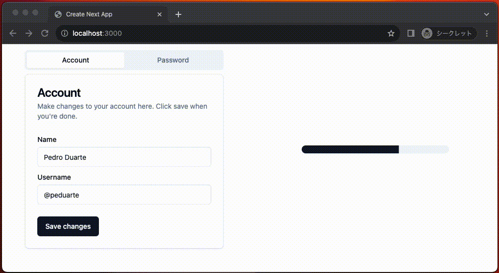
pnpm dev で開発サーバーを起動し確認します。
$ pnpm dev

shadcn/ui Themes でテーマカラーを選択
- shadcn/ui Themes を開きます
- お好みのテーマを選択します。
- 「Customize」をクリックします。
- 「Style, Color, Radius, Mode」を選択します。
- 「Copy code」をクリックします。
- CSS ファイルにコピペする設定が表示されるので、「コピー」をクリックします。
-
globals.cssを開き、@layer baseと.darkを置換すれば完了です。
globals.css
@tailwind base;
@tailwind components;
@tailwind utilities;

-@layer base {
-  :root {
-    --background: 0 0% 100%;
-    --foreground: 222.2 84% 4.9%;
-
-    --card: 0 0% 100%;
-    --card-foreground: 222.2 84% 4.9%;
-
-    --popover: 0 0% 100%;
-    --popover-foreground: 222.2 84% 4.9%;
-
-    --primary: 222.2 47.4% 11.2%;
-    --primary-foreground: 210 40% 98%;
-
-    --secondary: 210 40% 96.1%;
-    --secondary-foreground: 222.2 47.4% 11.2%;
-
-    --muted: 210 40% 96.1%;
-    --muted-foreground: 215.4 16.3% 46.9%;
-
-    --accent: 210 40% 96.1%;
-    --accent-foreground: 222.2 47.4% 11.2%;
-
-    --destructive: 0 84.2% 60.2%;
-    --destructive-foreground: 210 40% 98%;
-
-    --border: 214.3 31.8% 91.4%;
-    --input: 214.3 31.8% 91.4%;
-    --ring: 222.2 84% 4.9%;
-
-    --radius: 0.5rem;
-  }
-
-  .dark {
-    --background: 222.2 84% 4.9%;
-    --foreground: 210 40% 98%;
-
-    --card: 222.2 84% 4.9%;
-    --card-foreground: 210 40% 98%;
-
-    --popover: 222.2 84% 4.9%;
-    --popover-foreground: 210 40% 98%;
-
-    --primary: 210 40% 98%;
-    --primary-foreground: 222.2 47.4% 11.2%;
-
-    --secondary: 217.2 32.6% 17.5%;
-    --secondary-foreground: 210 40% 98%;
-
-    --muted: 217.2 32.6% 17.5%;
-    --muted-foreground: 215 20.2% 65.1%;
-
-    --accent: 217.2 32.6% 17.5%;
-    --accent-foreground: 210 40% 98%;
-
-    --destructive: 0 62.8% 30.6%;
-    --destructive-foreground: 210 40% 98%;
-
-    --border: 217.2 32.6% 17.5%;
-    --input: 217.2 32.6% 17.5%;
-    --ring: hsl(212.7,26.8%,83.9);
-  }
-}

+@layer base {
+  :root {
+    --background: 0 0% 100%;
+    --foreground: 20 14.3% 4.1%;
+    --card: 0 0% 100%;
+    --card-foreground: 20 14.3% 4.1%;
+    --popover: 0 0% 100%;
+    --popover-foreground: 20 14.3% 4.1%;
+    --primary: 24.6 95% 53.1%;
+    --primary-foreground: 60 9.1% 97.8%;
+    --secondary: 60 4.8% 95.9%;
+    --secondary-foreground: 24 9.8% 10%;
+    --muted: 60 4.8% 95.9%;
+    --muted-foreground: 25 5.3% 44.7%;
+    --accent: 60 4.8% 95.9%;
+    --accent-foreground: 24 9.8% 10%;
+    --destructive: 0 84.2% 60.2%;
+    --destructive-foreground: 60 9.1% 97.8%;
+    --border: 20 5.9% 90%;
+    --input: 20 5.9% 90%;
+    --ring: 24.6 95% 53.1%;
+    --radius: 0.5rem;
+  }
+
+  .dark {
+    --background: 20 14.3% 4.1%;
+    --foreground: 60 9.1% 97.8%;
+    --card: 20 14.3% 4.1%;
+    --card-foreground: 60 9.1% 97.8%;
+    --popover: 20 14.3% 4.1%;
+    --popover-foreground: 60 9.1% 97.8%;
+    --primary: 20.5 90.2% 48.2%;
+    --primary-foreground: 60 9.1% 97.8%;
+    --secondary: 12 6.5% 15.1%;
+    --secondary-foreground: 60 9.1% 97.8%;
+    --muted: 12 6.5% 15.1%;
+    --muted-foreground: 24 5.4% 63.9%;
+    --accent: 12 6.5% 15.1%;
+    --accent-foreground: 60 9.1% 97.8%;
+    --destructive: 0 72.2% 50.6%;
+    --destructive-foreground: 60 9.1% 97.8%;
+    --border: 12 6.5% 15.1%;
+    --input: 12 6.5% 15.1%;
+    --ring: 20.5 90.2% 48.2%;
+  }
+}

@layer base {
  * {
    @apply border-border;
  }
  body {
    @apply bg-background text-foreground;
  }
}
下記の通り変更されました。

コミットします。
$ pnpm build
$ git add .
$ git commit -m "テーマをオレンジに変更"
まとめ
- shadcn/uiのThemes の使い方を紹介しました。
- 作業コードはこちらです。
Discussion