next-themesでライトモードとダークモードを切り替えを実装
はじめに
本記事では、next-themes を使用して、Next.js のプロジェクトにライトモードとダークモードを切り替えする方法を紹介します。
作業リポジトリはこちらになります。
next-themes
next-themes は、Next.js フレームワークにおけるテーマ管理を簡単にするためのライブラリです。next-themes を使用することで、ダークモードやライトモードなど、異なるテーマを簡単に切り替えることができます。
主な特徴
以下は next-themes の主な特徴です。
- たった 2 行のコードで完璧なダークモードを実装。
- システム設定の prefers-color-scheme に対応。
- color-scheme を使用したブラウザ UI のテーマ設定。
- Next.js 13 の App Router をサポート。
- SSR および SSG において読み込み時のフラッシュを無くす。
- タブやウィンドウ間でのテーマ同期。
- テーマ変更時のフラッシュを無効化。
- 特定のページに特定のテーマを強制する機能。
- クラスまたはデータ属性セレクタを選択可能。
- テーマ管理のための
useThemeフック。
作業環境を構築
作業するための Next.js のプロジェクトを新規に作成していきます。長いので、折り畳んでおきます。
新規プロジェクト作成と初期環境構築の手順詳細
プロジェクトを作成
create next-app@latestでプロジェクトを作成します。
$ pnpm create next-app@latest next-next-themes-sample --typescript --eslint --import-alias "@/*" --src-dir --use-pnpm --tailwind --app
$ cd next-next-themes-sample
Peer Dependenciesの警告を解消
Peer dependenciesの警告が出ている場合は、pnpm installを実行し、警告を解消します。
 WARN  Issues with peer dependencies found
.
├─┬ autoprefixer 10.0.1
│ └── ✕ unmet peer postcss@^8.1.0: found 8.0.0
├─┬ tailwindcss 3.3.0
│ ├── ✕ unmet peer postcss@^8.0.9: found 8.0.0
│ ├─┬ postcss-js 4.0.1
│ │ └── ✕ unmet peer postcss@^8.4.21: found 8.0.0
│ ├─┬ postcss-load-config 3.1.4
│ │ └── ✕ unmet peer postcss@>=8.0.9: found 8.0.0
│ └─┬ postcss-nested 6.0.0
│   └── ✕ unmet peer postcss@^8.2.14: found 8.0.0
└─┬ next 14.0.4
  ├── ✕ unmet peer react@^18.2.0: found 18.0.0
  └── ✕ unmet peer react-dom@^18.2.0: found 18.0.0
以下を実行することで警告が解消されます。
$ pnpm i postcss@latest react@^18.2.0 react-dom@^18.2.0
クリーンアップ
不要な設定を削除し、プロジェクトを初期化します。
styles
CSSなどを管理するstylesディレクトリを作成します。globals.cssを移動します。
$ mkdir src/styles
$ mv src/app/globals.css src/styles/globals.css
globals.cssの内容を以下のように上書きします。
@tailwind base;
@tailwind components;
@tailwind utilities;
初期ページ
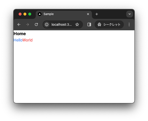
app/page.tsxを上書きします。
import { type FC } from "react";

const Home: FC = () => {
  return (
    <div className="">
      <div className="text-lg font-bold">Home</div>
      <div>
        <span className="text-blue-500">Hello</span>
        <span className="text-red-500">World</span>
      </div>
    </div>
  );
};

export default Home;
レイアウト
app/layout.tsxを上書きします。
import "@/styles/globals.css";
import { type FC } from "react";
type RootLayoutProps = {
  children: React.ReactNode;
};

export const metadata = {
  title: "Sample",
  description: "Generated by create next app",
};

const RootLayout: FC<RootLayoutProps> = (props) => {
  return (
    <html lang="ja">
      <body className="">{props.children}</body>
    </html>
  );
};

export default RootLayout;
TailwindCSSの設定
TailwindCSSの設定を上書きします。
import type { Config } from 'tailwindcss'

const config: Config = {
  content: [
    './src/pages/**/*.{js,ts,jsx,tsx,mdx}',
    './src/components/**/*.{js,ts,jsx,tsx,mdx}',
    './src/app/**/*.{js,ts,jsx,tsx,mdx}',
  ],
  plugins: [],
}
export default config
TypeScriptの設定
baseUrlを追加します。
{
  "compilerOptions": {
    "target": "es5",
    "lib": ["dom", "dom.iterable", "esnext"],
    "allowJs": true,
    "skipLibCheck": true,
    "strict": true,
    "forceConsistentCasingInFileNames": true,
    "noEmit": true,
    "esModuleInterop": true,
    "module": "esnext",
    "moduleResolution": "node",
    "resolveJsonModule": true,
    "isolatedModules": true,
    "jsx": "preserve",
    "incremental": true,
    "plugins": [
      {
        "name": "next"
      }
    ],
+   "baseUrl": ".",
    "paths": {
      "@/*": ["./src/*"],
    }
  },
  "include": ["next-env.d.ts", "**/*.ts", "**/*.tsx", ".next/types/**/*.ts"],
  "exclude": ["node_modules"]
}
動作確認
ローカルで動作確認します。
$ pnpm dev
コミットして作業結果を保存しておきます。
$ pnpm build
$ git add .
$ git commit -m "feat:新規にプロジェクトを作成し, 作業環境を構築"
next-themesを導入
next-themes でテーマカラーを変更できるよう設定します。
next-themesをインストール
next-themes のパッケージを追加します。
$ pnpm add next-themes
0.2.1 がインストールされました。
dependencies:
+ next-themes 0.2.1
Providerを作成
next-themes を使用するために、Provider コンポーネントを作成します。
$ mkdir -p src/components
$ touch src/components/theme-provider.tsx
"use client";

import { ThemeProvider as NextThemesProvider } from "next-themes";
import type { ThemeProviderProps } from "next-themes/dist/types";
import { FC } from "react";

export const ThemeProvider: FC<ThemeProviderProps> = (props) => {
  return <NextThemesProvider {...props}>{props.children}</NextThemesProvider>;
};
Providerをlayout.tsxに設定
ThemeProvider を layout.tsx に設定します。
import "@/styles/globals.css";
+import { ThemeProvider } from "@/components/theme-provider";
import { type FC } from "react";
type RootLayoutProps = {
  children: React.ReactNode;
};

export const metadata = {
  title: "Sample",
  description: "Generated by create next app",
};

const RootLayout: FC<RootLayoutProps> = (props) => {
  return (
   <html lang="ja"
+     suppressHydrationWarning
   >
      <body className="">
+       <ThemeProvider>
          {props.children}
+       </ThemeProvider>
      </body>
    </html>
  );
};

export default RootLayout;
テーマを切り替えるボタンを作成
ここではテーマを切り替えるボタンを作成します。
後ほど装飾するとして、ここではデザインは考慮しません。
$ mkdir -p src/components
$ touch src/components/theme-toggle.tsx
"use client";

import type { FC } from "react";
import { useTheme } from "next-themes";

interface ThemeToggleProps {
  className?: string;
}

export const ThemeToggle: FC<ThemeToggleProps> = (props) => {
  const { setTheme, theme } = useTheme();

  return (
    <div className="flex flex-row space-x-1">
      <button
        onClick={() => {
          setTheme("light");
        }}
        className="py-1 px-2 border-2 rounded-md"
      >
        light
      </button>
      <button
        onClick={() => {
          setTheme("dark");
        }}
        className="py-1 px-2 border-2 rounded-md"
      >
        dark
      </button>
      <button
        onClick={() => {
          setTheme("system");
        }}
        className="py-1 px-2 border-2 rounded-md"
      >
        system
      </button>
    </div>
  );
};
ボタンを追加
page.tsx にテーマを切り替えるボタンを追加します。
+import { ThemeToggle } from "@/components/theme-toggle";
import { type FC } from "react";

const Home: FC = () => {
  return (
    <div className="">
      <div className="text-lg font-bold">Home</div>
      <div>
        <span className="text-blue-500">Hello</span>
        <span className="text-red-500">World</span>
      </div>
+     <ThemeToggle />
    </div>
  );
};

export default Home;
動作確認
ローカルで動作確認をします。
$ pnpm dev
light, dark, system のボタンをクリックすることでテーマを切り替えられることが確認できます。


コミットして作業結果を保存しておきます。
$ pnpm build
$ git add .
$ git commit -m "feat:next-themesを導入"
イケてる感じにデザイン
イケてる感じにデザインを変更します。必須ではないですが、shadcn/ui を利用します。
shadcn/uiとは
shadcn/ui は、@shadcnが開発しているコンポーネントライブラリーです。コンポーネントはアプリケーションにコピー&ペーストして使うことができます。
主な特徴
- 美しいデザイン: コンポーネントは見た目が良く、現代的な UI のニーズに適応しています。
- 簡単な統合: コンポーネントはコピー&ペーストするだけで使うことができ、迅速にプロジェクトに統合可能です。
- アクセシビリティ: すべてのユーザーがアクセスしやすいように設計されています。
- カスタマイズ可能: さまざまなニーズに合わせてカスタマイズできます。
- オープンソース: GitHub でソースコードが公開されており、コミュニティによる貢献が可能です。
shadcn/uiを導入
shadcn/ui を設定します。
$ pnpm dlx shadcn-ui@latest init
✔ Would you like to use TypeScript (recommended)? … no / yes
✔ Which style would you like to use? › Default
✔ Which color would you like to use as base color? › Slate
✔ Where is your global CSS file? … src/styles/globals.css
✔ Would you like to use CSS variables for colors? … no / yes
✔ Are you using a custom tailwind prefix eg. tw-? (Leave blank if not) …
✔ Where is your tailwind.config.js located? … tailwind.config.ts
✔ Configure the import alias for components: … @/components
✔ Configure the import alias for utils: … @/lib/utils
✔ Are you using React Server Components? … no / yes
✔ Write configuration to components.json. Proceed? … yes

✔ Writing components.json...
✔ Initializing project...
✔ Installing dependencies...

Success! Project initialization completed.
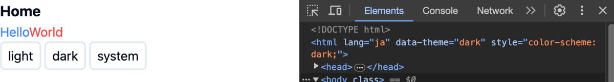
この時点で、テーマの切り替えができなくなっているはずです。next-theme は、<html> に data-theme を追加することでテーマを切り替えています。しかし、shadcn/ui では、<html> の class を参照しているため、テーマを切り替えることができません。
layout.tsx の ThemeProvider の props を修正します。
import "@/styles/globals.css";
import { type FC } from "react";
import { ThemeProvider } from "@/components/theme-provider";
type RootLayoutProps = {
children: React.ReactNode;
};
export const metadata = {
title: "Sample",
description: "Generated by create next app",
};
const RootLayout: FC<RootLayoutProps> = (props) => {
return (
<html lang="ja" suppressHydrationWarning>
<body className="">
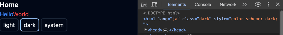
<ThemeProvider
+ attribute="class"
+ defaultTheme="system"
+ enableSystem
+ disableTransitionOnChange
+ storageKey="acme-theme"
>{props.children} </ThemeProvider>
</body>
</html>
);
};
export default RootLayout;
attribute に class を設定することで、<html> の class を参照するようになります。defaultTheme に system を設定することで、システム設定の prefers-color-scheme に対応します。enableSystem に true を設定することで、システム設定の prefers-color-scheme に対応します。disableTransitionOnChange に true を設定することで、テーマ変更時のフラッシュを無効化します。storageKey に acme-theme を設定することで、テーマの設定をローカルステージに保存します。
ローカル環境で試すと、無事にテーマを切り替えることができるようになります。
$ pnpm dev
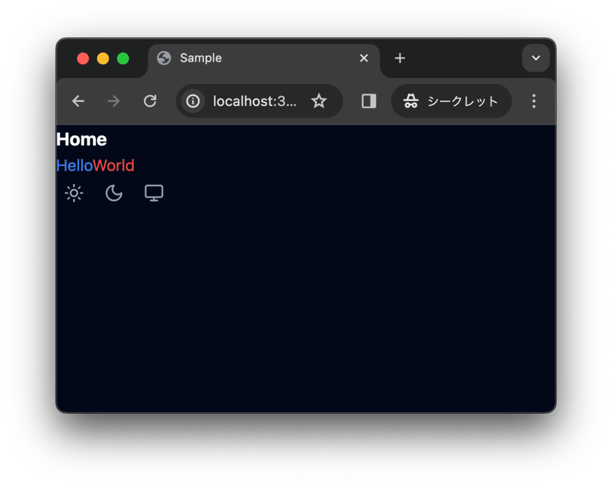
続いてデザインを修正します。まず、lucid-react をインストールします。
$ pnpm install lucide-react
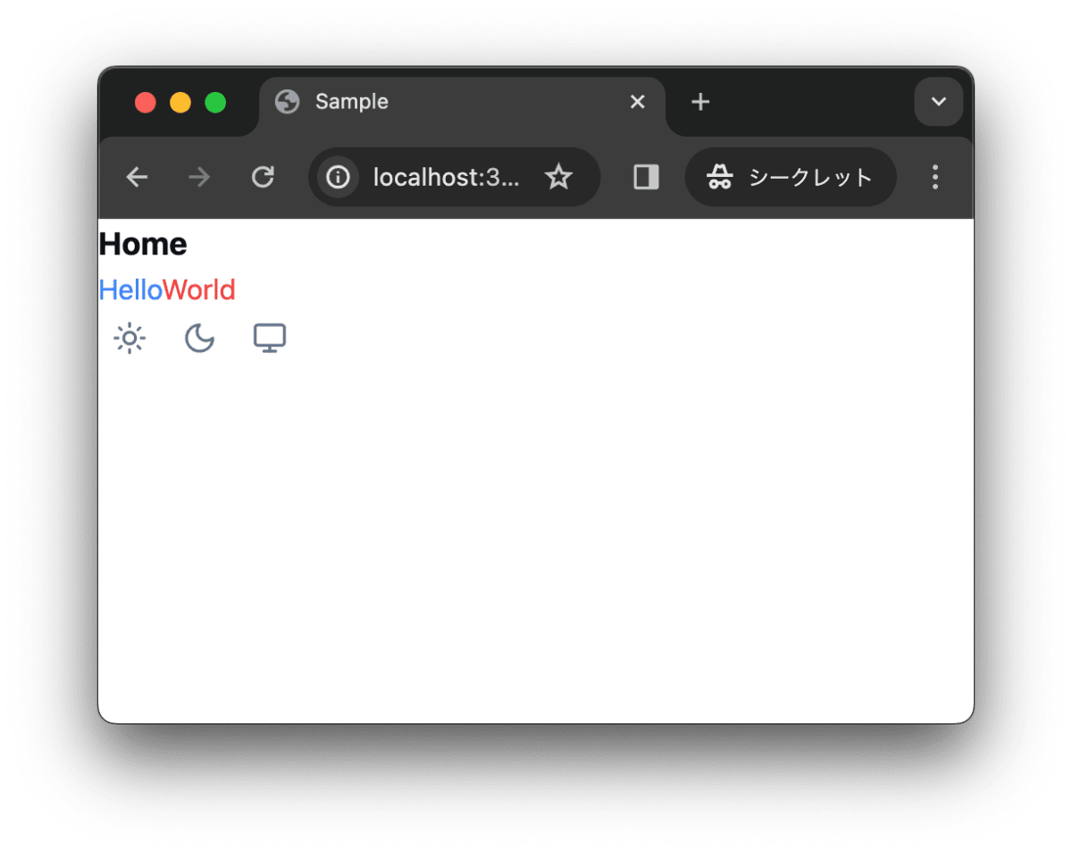
theme-toggle.tsx を修正します。
"use client";

import type { FC } from "react";
import { useTheme } from "next-themes";
import { Monitor, Moon, Sun } from "lucide-react";
import { cn } from "@/lib/utils";

interface ThemeToggleProps {
  className?: string;
}

export const ThemeToggle: FC<ThemeToggleProps> = (props) => {
  const { setTheme, theme } = useTheme();
  const className =
    "hover:bg-primary/10 text-muted-foreground hover:text-foreground group flex h-8 flex-row items-center space-x-2 rounded-md px-2 text-sm";
  return (
    <div className="flex flex-row space-x-1">
      <button
        onClick={() => {
          setTheme("light");
        }}
        className={cn(className, props.className)}
      >
        <Sun aria-hidden="true" className="h-5 w-5" />
      </button>
      <button
        onClick={() => {
          setTheme("dark");
        }}
        className={cn(className, props.className)}
      >
        <Moon aria-hidden="true" className="h-5 w-5" />
      </button>
      <button
        onClick={() => {
          setTheme("system");
        }}
        className={cn(className, props.className)}
      >
        <Monitor aria-hidden="true" className="h-5 w-5" />
      </button>
    </div>
  );
};
ローカルで動作確認します。
$ pnpm dev
作業結果をコミットしておきます。
$ pnpm build
$ git add .
$ git commit -m "feat:デザインを設定"
トラブルシューティング
よくある間違いについて記述します。
ハイドレーションエラー
suppressHydrationWarning を <html> に設定しないと警告が出てしまいます。next-themes は <html> に data-theme を追加し、テーマを管理します。以下は、data-theme が追加された <html> の例です。data-theme の値がクライアントで変更されるため、クライアントとサーバでの値が異なり、ハイドレーションエラーが発生します。
<html lang="ja" class="dark" style="color-scheme: dark;">
インポート誤りによるエラー
layout.tsx で import するコンポーネントを誤るとエラーが出ます。具体的には、作成した ThemeProvider ではなく、next-themes の ThemeProvider を import してしまうとエラーが出ます。
Error: (0 , react__WEBPACK_IMPORTED_MODULE_0__.createContext) is not a function
エラーメッセージからは何か読み取れませんが、これはインポートしているコンポーネントに use client が設定されていないことが原因です。use client を設定することで、クライアントサイドでのみコンポーネントが使用されることを明示します。
作成した ThemeProvider には use client が設定されていますが、next-themes の ThemeProvider には use client が設定されていません。そのため、layout.tsx で next-themes の ThemeProvider を import してしまうとエラーが出てしまいます。
❌ import { ThemeProvider } from "next-themes";
⭕ import { ThemeProvider } from "@/components/theme-provider";
さいごに
next-themes を導入することで、ライトモードとダークモードを切り替えることができるようになりました。また、shadcn/ui を導入することで、デザインを簡単に変更できるようになりました。
作業リポジトリはこちらになります。
参考
Discussion