shadcn/uiで新しくリリースされたSonnerを触ってみる
概要
2023/12/23 shadcn/ui に新しいコンポーネントが追加されました。この記事では追加された Sonner コンポーネントを触ってみます。
結論
shadcn/uiのSonnerを利用することで、以下のようなトーストが簡単に実装することができます。カスタマイズすることもできるため、おすすめです。
作業リポジトリはこちらです。
この記事の対象者
- shaadcn/ui に興味を持っている人
- shadcn/ui の Sonner を触ってみたい人
shadcn/ui
shadcn/ui は、@shadcnが開発しているコンポーネントライブラリーです。コンポーネントはアプリケーションにコピー&ペーストして使うことができます。
主な特徴
- 美しいデザイン: コンポーネントは見た目が良く、現代的な UI のニーズに適応しています。
- 簡単な統合: コンポーネントはコピー&ペーストするだけで使うことができ、迅速にプロジェクトに統合可能です。
- アクセシビリティ: すべてのユーザーがアクセスしやすいように設計されています。
- カスタマイズ可能: さまざまなニーズに合わせてカスタマイズできます。
- オープンソース: GitHub でソースコードが公開されており、コミュニティによる貢献が可能です。
アップデート
2023/12/23にshadcn/uiのコンポーネントが追加されました。追加されたのは以下の通りとなります。
本記事では、Sonnerを触ってみます。
Sonner
shadcn/uiでSonnerがリリースされました。Sonner はいわゆる Toast コンポーネントです。
文章だとややこしいですが、shadcn/uiが今回リリースしたSonnerは、Vercelのデザインエンジニアの@emilkowalski_が開発したSonnerをヘッドレスAPIとして利用し、デザインを調整し、shadcn/uiのライブラリーコンポーネントの一つとしてリリースしています。
shadncn/ui の Sonner のドキュメントは以下にあります。
shadcn/ui の Sonner がヘッドレスとして利用している @emilkowalski_ の Sonner のドキュメントは以下になります。(日本語がややこしい)
さらに、@emilkowalski_が公開している Sonner のデモページは以下になります。
Sonnerがどのような挙動をするか、@emilkowalski_の下記のツイートの動画見るとよくわかります。
以下が、@emilkowalski_のSonner のリポジトリです。
Next.jsで作業環境を構築
作業するための Next.js プロジェクトを新規に作成します。長いので、折り畳んでおきます。
新規プロジェクト作成と初期環境構築の手順詳細
プロジェクトを作成
create next-app@latestでプロジェクトを作成します。
$ pnpm create next-app@latest next-shadcnui-sonner --typescript --eslint --import-alias "@/*" --src-dir --use-pnpm --tailwind --app
$ cd next-shadcnui-sonner
Peer Dependenciesの警告を解消
Peer dependenciesの警告が出ている場合は、pnpm installを実行し、警告を解消します。
 WARN  Issues with peer dependencies found
.
├─┬ autoprefixer 10.0.1
│ └── ✕ unmet peer postcss@^8.1.0: found 8.0.0
├─┬ tailwindcss 3.3.0
│ ├── ✕ unmet peer postcss@^8.0.9: found 8.0.0
│ ├─┬ postcss-js 4.0.1
│ │ └── ✕ unmet peer postcss@^8.4.21: found 8.0.0
│ ├─┬ postcss-load-config 3.1.4
│ │ └── ✕ unmet peer postcss@>=8.0.9: found 8.0.0
│ └─┬ postcss-nested 6.0.0
│   └── ✕ unmet peer postcss@^8.2.14: found 8.0.0
└─┬ next 14.0.4
  ├── ✕ unmet peer react@^18.2.0: found 18.0.0
  └── ✕ unmet peer react-dom@^18.2.0: found 18.0.0
以下を実行することで警告が解消されます。
$ pnpm i postcss@latest react@^18.2.0 react-dom@^18.2.0
クリーンアップ
不要な設定を削除し、プロジェクトを初期化します。
styles
CSSなどを管理するstylesディレクトリを作成します。globals.cssを移動します。
$ mkdir src/styles
$ mv src/app/globals.css src/styles/globals.css
globals.cssの内容を以下のように上書きします。
@tailwind base;
@tailwind components;
@tailwind utilities;
初期ページ
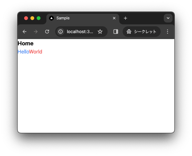
app/page.tsxを上書きします。
import { type FC } from "react";

const Home: FC = () => {
  return (
    <div className="">
      <div className="text-lg font-bold">Home</div>
      <div>
        <span className="text-blue-500">Hello</span>
        <span className="text-red-500">World</span>
      </div>
    </div>
  );
};

export default Home;
レイアウト
app/layout.tsxを上書きします。
import "@/styles/globals.css";
import { type FC } from "react";
type RootLayoutProps = {
  children: React.ReactNode;
};

export const metadata = {
  title: "Sample",
  description: "Generated by create next app",
};

const RootLayout: FC<RootLayoutProps> = (props) => {
  return (
    <html lang="ja">
      <body className="">{props.children}</body>
    </html>
  );
};

export default RootLayout;
TailwindCSSの設定
TailwindCSSの設定を上書きします。
import type { Config } from 'tailwindcss'

const config: Config = {
  content: [
    './src/pages/**/*.{js,ts,jsx,tsx,mdx}',
    './src/components/**/*.{js,ts,jsx,tsx,mdx}',
    './src/app/**/*.{js,ts,jsx,tsx,mdx}',
  ],
  plugins: [],
}
export default config
TypeScriptの設定
baseUrlを追加します。
{
  "compilerOptions": {
    "target": "es5",
    "lib": ["dom", "dom.iterable", "esnext"],
    "allowJs": true,
    "skipLibCheck": true,
    "strict": true,
    "forceConsistentCasingInFileNames": true,
    "noEmit": true,
    "esModuleInterop": true,
    "module": "esnext",
    "moduleResolution": "node",
    "resolveJsonModule": true,
    "isolatedModules": true,
    "jsx": "preserve",
    "incremental": true,
    "plugins": [
      {
        "name": "next"
      }
    ],
+   "baseUrl": ".",
    "paths": {
      "@/*": ["./src/*"],
    }
  },
  "include": ["next-env.d.ts", "**/*.ts", "**/*.tsx", ".next/types/**/*.ts"],
  "exclude": ["node_modules"]
}
動作確認
ローカルで動作確認します。
$ pnpm dev
コミットして作業結果を保存しておきます。
$ pnpm build
$ git add .
$ git commit -m "feat:新規にプロジェクトを作成し, 作業環境を構築"
Sonnerをインストール
shadcn/ui をインストールし、Sonnerを利用できるようにします。
shadcn/uiをインストール
shadcn/uiをインストールします。
$ pnpm dlx shadcn-ui@latest init
✔ Would you like to use TypeScript (recommended)? … no / yes
✔ Which style would you like to use? › Default
✔ Which color would you like to use as base color? › Slate
✔ Where is your global CSS file? … src/styles/globals.css
✔ Would you like to use CSS variables for colors? … no / yes
✔ Are you using a custom tailwind prefix eg. tw-? (Leave blank if not) …
✔ Where is your tailwind.config.js located? … tailwind.config.ts
✔ Configure the import alias for components: … @/components
✔ Configure the import alias for utils: … @/lib/utils
✔ Are you using React Server Components? … no / yes
✔ Write configuration to components.json. Proceed? … yes

✔ Writing components.json...
✔ Initializing project...
✔ Installing dependencies...

Success! Project initialization completed.
作業結果を保存しておきます。
$ pnpm build
$ git add .
$ git commit -m "feat:shadcn/uiを設定"
Sonnerをインストール
Sonner をインストールします。
$ pnpm dlx shadcn-ui@latest add sonner
Sonner を利用するには、<Toaster /> を、<body>内に設置する必要があります。
+import { Toaster } from "@/components/ui/sonner";
import "@/styles/globals.css";
import { type FC } from "react";
type RootLayoutProps = {
  children: React.ReactNode;
};

export const metadata = {
  title: "Sample",
  description: "Generated by create next app",
};

const RootLayout: FC<RootLayoutProps> = (props) => {
  return (
    <html lang="ja">
      <body className="">{props.children}</body>
+      <Toaster />
    </html>
  );
};

export default RootLayout;
あとは、クライアントコンポーネントで、toastを実行するだけで、Toast を表示できます。
作業結果を保存しておきます。
$ pnpm build
$ git add .
$ git commit -m "feat:sonnerをインストール"
Sonnerを利用
SonnerをNext.jsのプロジェクトで利用してみます。
デモに必要なコンポーネントを追加
デモに必要なコンポーネントを追加します。
$ pnpm dlx shadcn-ui@latest add button
Toastを呼び出す
Toastを呼び出すには、toastを実行する必要があります。
デモ用にSonnerTypeDemoButtonとSonnerPositionDemoButtonコンポーネントを作成します。コンポーネントの詳細については後ほど説明します。
$ touch src/components/sonner-type-demo-button.tsx
$ touch src/components/sonner-position-demo-button.tsx
"use client";
import { toast } from "sonner";
import { Car } from "lucide-react";
import { Sun } from "lucide-react";

import { Button } from "@/components/ui/button";

import { FC } from "react";

interface SonnerTypeDemoProps {}

export const SonnerTypeDemoButton: FC<SonnerTypeDemoProps> = ({}) => {
  const promise = (): Promise<{ name: string }> =>
    new Promise((resolve) =>
      setTimeout(() => resolve({ name: "Sonner" }), 2000)
    );

  return (
    <div className="grid grid-cols-4 gap-4">
      <Button variant="outline" onClick={() => toast("Event has been created")}>
        Default
      </Button>
      <Button
        variant="outline"
        onClick={() =>
          toast("Event has been created", {
            description: "Sunday, December 03, 2023 at 9:00 AM",
          })
        }
      >
        Description
      </Button>
      <Button
        variant="outline"
        onClick={() =>
          toast("Event has been created", {
            description: "Sunday, December 03, 2023 at 9:00 AM",
            action: {
              label: "Undo",
              onClick: () => console.log("Undo"),
            },
          })
        }
      >
        Description, Action
      </Button>

      <Button
        variant="outline"
        onClick={() =>
          toast.promise(promise, {
            loading: "Loading...",
            success: (data) => {
              return `${data.name} toast has been added`;
            },
            error: "Error",
          })
        }
      >
        Promise
      </Button>

      <Button
        variant="outline"
        onClick={() =>
          toast("Event has been created", { icon: <Car className="w-4 h-4" /> })
        }
      >
        Icon
      </Button>

      <Button
        variant="outline"
        onClick={() =>
          toast("Event has been created", {
            icon: <Car className="w-4 h-4" />,
            style: { background: "#dc2626", color: "#fff" },
          })
        }
      >
        Color
      </Button>

      <Button
        variant="outline"
        onClick={() =>
          toast(
            <div className="flex flex-col space-y-2">
              <div className="flex flex-row space-x-2 items-center">
                <Sun className="w-4 h-4" />
                <div>Good Morning</div>
              </div>
              <div>
                <div className="flex justify-center items-center">
                  <div className="bg-yellow-400 rounded-full w-24 h-24 flex justify-center items-center">
                    <div className="bg-yellow-500 rounded-full w-16 h-16 flex justify-center items-center">
                      <div className="bg-yellow-600 rounded-full w-8 h-8"></div>
                    </div>
                  </div>
                </div>
              </div>
            </div>
          )
        }
      >
        Custom
      </Button>
    </div>
  );
};
"use client";
import { toast } from "sonner";

import { Button } from "@/components/ui/button";

import { FC } from "react";

interface SonnerPositionDemoProps {}

export const SonnerPositionDemoButton: FC<SonnerPositionDemoProps> = ({}) => {
  return (
    <div className="grid grid-cols-3 gap-4">
      <Button
        variant="outline"
        onClick={() => toast("Top Left", { position: "top-left" })}
      >
        Top Left
      </Button>
      <Button
        variant="outline"
        onClick={() => toast(" Top Center", { position: "top-center" })}
      >
        Top Center
      </Button>
      <Button
        variant="outline"
        onClick={() => toast("Top Right", { position: "top-right" })}
      >
        Top Right
      </Button>
      <Button
        variant="outline"
        onClick={() => toast("Bottom Left", { position: "bottom-left" })}
      >
        Bottom Left
      </Button>
      <Button
        variant="outline"
        onClick={() => toast(" Bottom Center", { position: "bottom-center" })}
      >
        Bottom Center
      </Button>
      <Button
        variant="outline"
        onClick={() => toast("Bottom Right", { position: "bottom-right" })}
      >
        Bottom Right
      </Button>
    </div>
  );
};
作成したコンポーネントをHomeコンポーネントで呼び出します。下記でpage.tsxを上書きします。
import { SonnerPositionDemoButton } from "@/components/sonner-position-demo-button";
import { SonnerTypeDemoButton } from "@/components/sonner-type-demo-button";
import { type FC } from "react";
const Home: FC = () => {
return (
<div className="container flex flex-col space-y-4 mt-4">
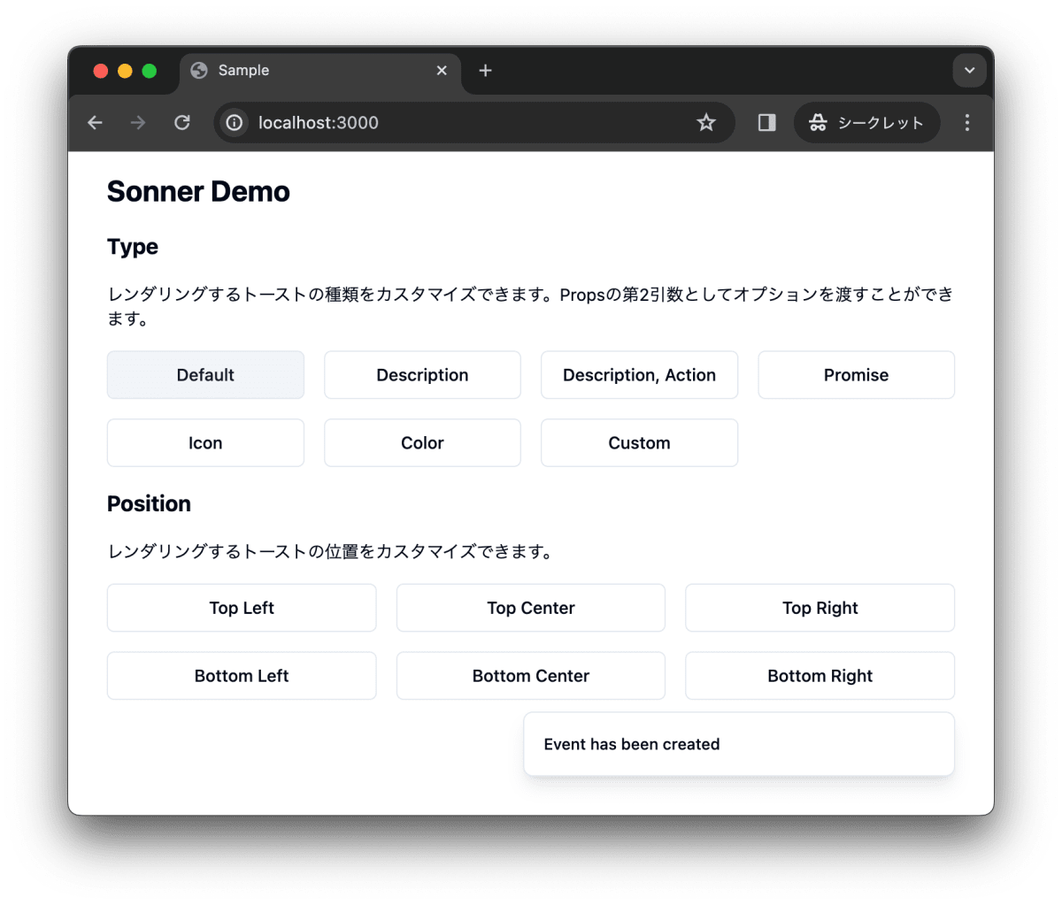
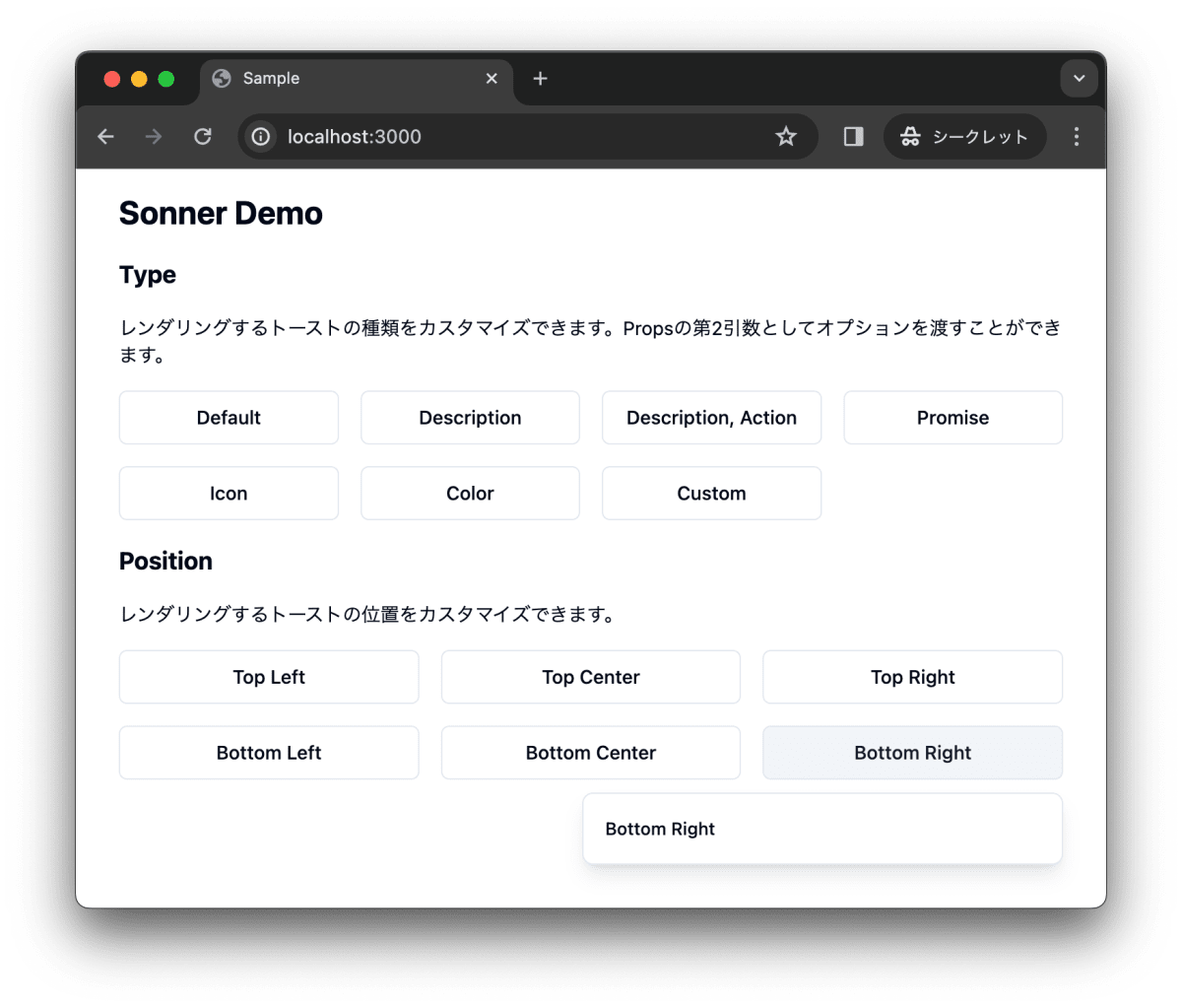
<h1 className="text-2xl font-bold">Sonner Demo</h1>
<div className="flex flex-col space-y-4">
<div className="flex flex-col space-y-4">
<h2 className="text-lg font-bold">Type</h2>
<p className="text-sm">
レンダリングするトーストの種類をカスタマイズできます。Propsの第2引数としてオプションを渡すことができます。
</p>
<div>
<SonnerTypeDemoButton />
</div>
</div>
<div className="flex flex-col space-y-4">
<h2 className="text-lg font-bold">Position</h2>
<p className="text-sm">
レンダリングするトーストの位置をカスタマイズできます。
</p>
<div>
<SonnerPositionDemoButton />
</div>
</div>
</div>
</div>
);
};
export default Home;
まず、実行してみ動作を確認します。
$ pnpm dev
以下の動画で動作結果が確認できます。
作業結果をコミットしておきます。
$ pnpm build
$ git add .
$ git commit -m "feat:Sonnerを利用"
解説
SonnerTypeDemoButtonとSonnerPositionDemoButtonコンポーネントの詳細について説明します。
Default
toast()で基礎的なトーストが表示できます。
toast("Event has been created")
<Button variant="outline" onClick={() => toast("Event has been created")}>
  Default
</Button>
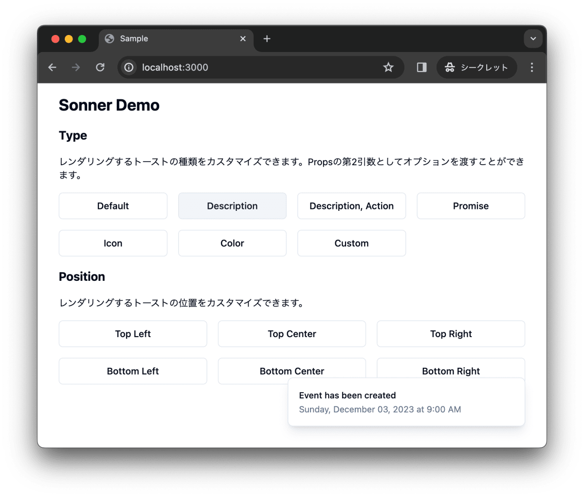
Description
toast()にdescriptionを設定することでメッセージの詳細メッセージの追加ができます。
toast("Event has been created", {
      description: "Sunday, December 03, 2023 at 9:00 AM",
    })
<Button
  variant="outline"
  onClick={() =>
    toast("Event has been created", {
      description: "Sunday, December 03, 2023 at 9:00 AM",
    })
  }
>
  Description
</Button>
Action
toast()にactionを設定することでボタンのクリック時のアクションを追加できます。以下の例では、Undoをクリックすると、console.log("Undo")が実行されます。
toast("Event has been created", {
      description: "Sunday, December 03, 2023 at 9:00 AM",
    })
<Button
  variant="outline"
  onClick={() =>
    toast("Event has been created", {
      description: "Sunday, December 03, 2023 at 9:00 AM",
      action: {
        label: "Undo",
        onClick: () => console.log("Undo"),
      },
    })
  }
>
  Description, Action
</Button>

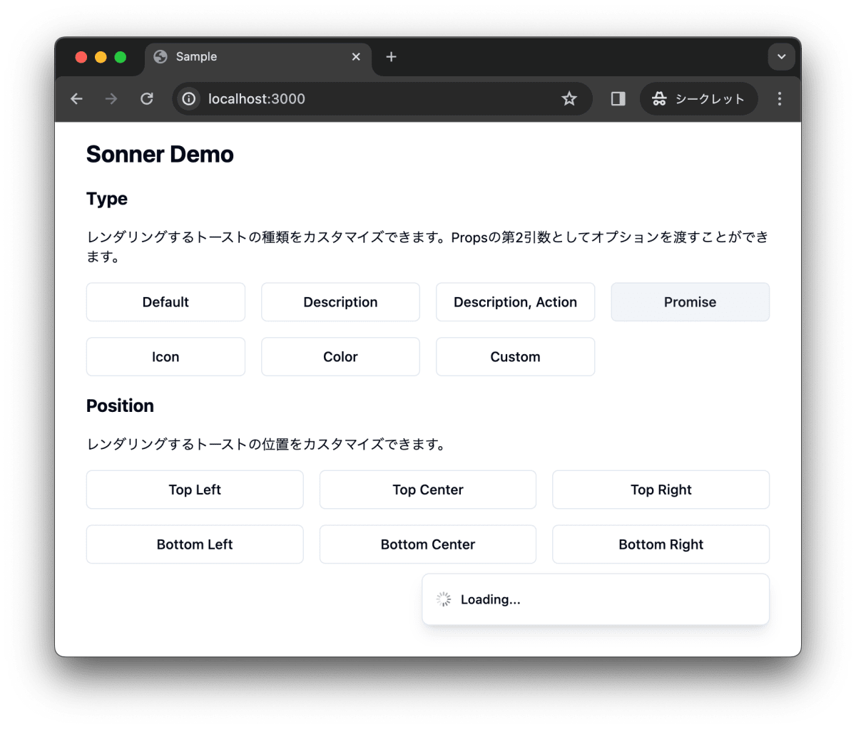
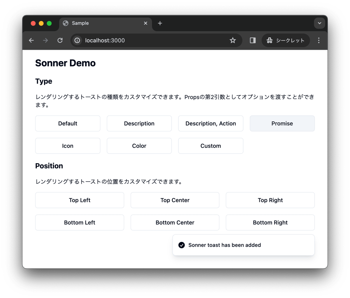
Promise
toast.promiseでPromiseを処理することができます。
const promise = (): Promise<{ name: string }> =>
  new Promise((resolve) =>
    setTimeout(() => resolve({ name: "Sonner" }), 2000)
  );
<Button
  variant="outline"
  onClick={() =>
    toast.promise(promise, {
      loading: "Loading...",
      success: (data) => {
        return `${data.name} toast has been added`;
      },
      error: "Error",
    })
  }
>
  Promise
</Button>
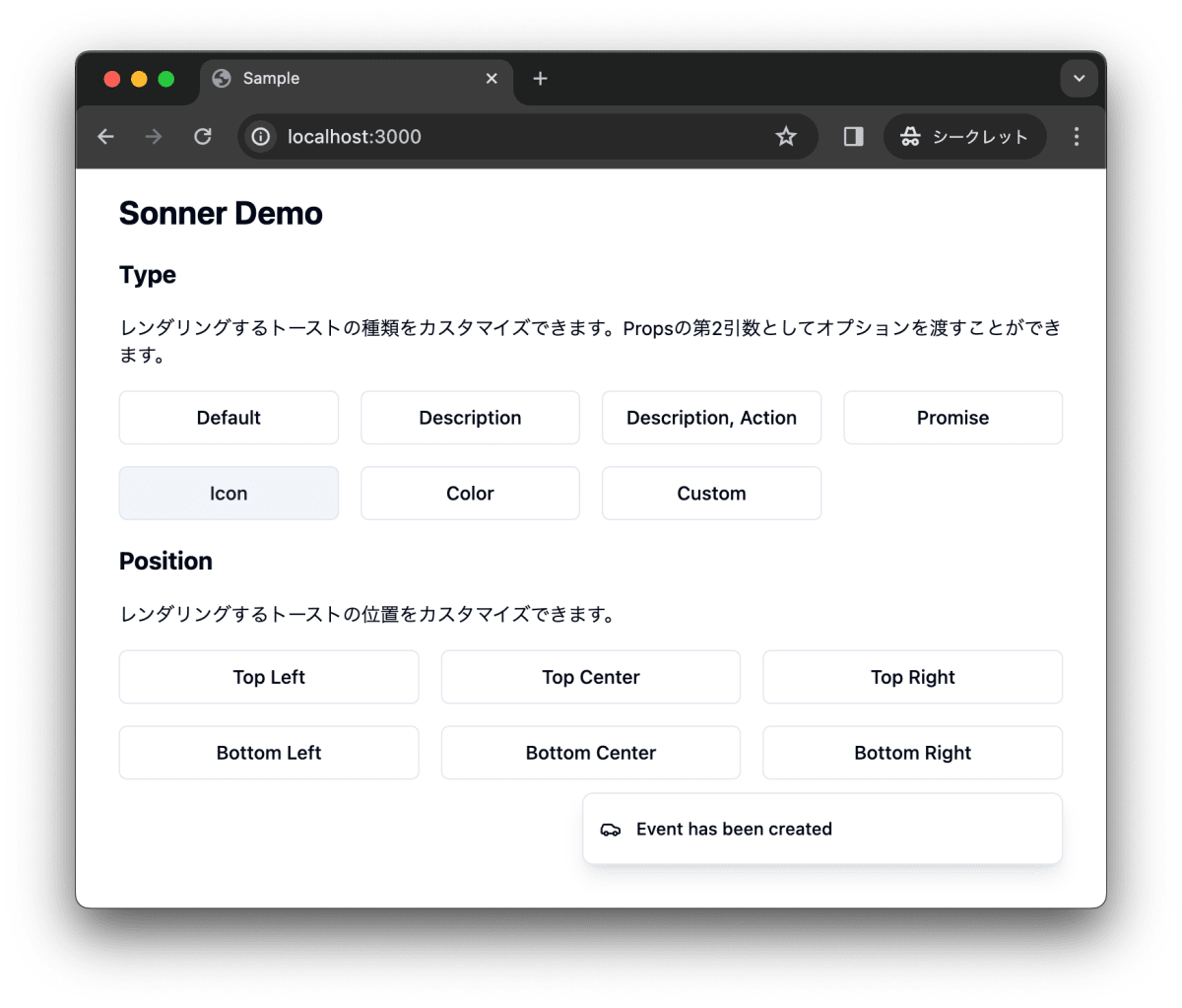
Icon
toast()にiconを設定することで、アイコンを追加できます。
toast("Event has been created", { icon: <Car className="w-4 h-4" /> })
<Button
  variant="outline"
  onClick={() =>
    toast("Event has been created", { icon: <Car className="w-4 h-4" /> })
  }
>
  Icon
</Button>
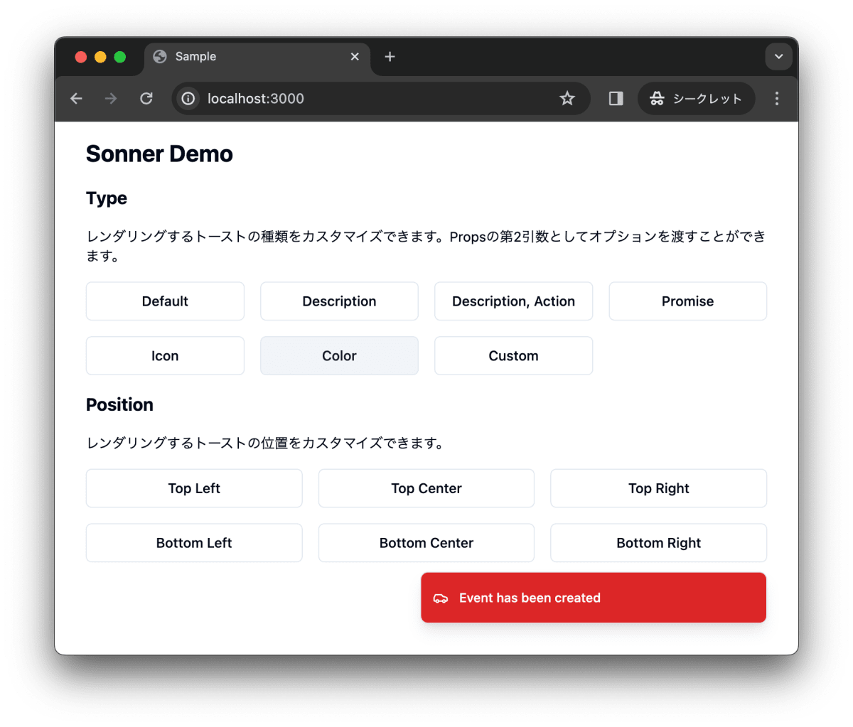
Color
toast()にstyleを設定することで、デザインをカスタマイズできます。
toast("Event has been created", {
  style: { background: "#dc2626", color: "#fff" },
})
<Button
  variant="outline"
  onClick={() =>
    toast("Event has been created", {
      icon: <Car className="w-4 h-4" />,
      style: { background: "#dc2626", color: "#fff" },
    })
  }
>
  Color
</Button>
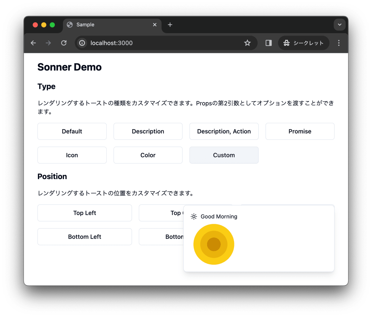
Custom
toast()にコンポーネントを設定することで、トーストをカスタマイズできます。
 toast(
  <div className="flex flex-col space-y-2">
    <div className="flex flex-row space-x-2 items-center">
      <Sun className="w-4 h-4" />
      <div>Good Morning</div>
    </div>
    <div>
      <div className="flex justify-center items-center">
        <div className="bg-yellow-400 rounded-full w-24 h-24 flex justify-center items-center">
          <div className="bg-yellow-500 rounded-full w-16 h-16 flex justify-center items-center">
            <div className="bg-yellow-600 rounded-full w-8 h-8"></div>
          </div>
        </div>
      </div>
    </div>
  </div>
)
<Button
  variant="outline"
  onClick={() =>
    toast(
      <div className="flex flex-col space-y-2">
        <div className="flex flex-row space-x-2 items-center">
          <Sun className="w-4 h-4" />
          <div>Good Morning</div>
        </div>
        <div>
          <div className="flex justify-center items-center">
            <div className="bg-yellow-400 rounded-full w-24 h-24 flex justify-center items-center">
              <div className="bg-yellow-500 rounded-full w-16 h-16 flex justify-center items-center">
                <div className="bg-yellow-600 rounded-full w-8 h-8"></div>
              </div>
            </div>
          </div>
        </div>
      </div>
    )
  }
>
  Custom
</Button>
Position
トーストの表示する位置をカスタマイズできます。
トーストを左上に表示します。
toast("Top Left", { position: "top-left" })

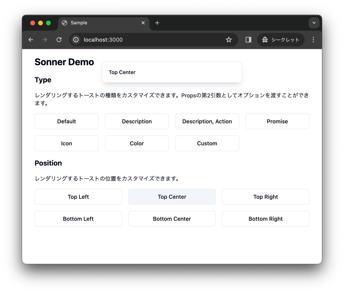
トーストを中央、上に表示します。
toast(" Top Center", { position: "top-center" })
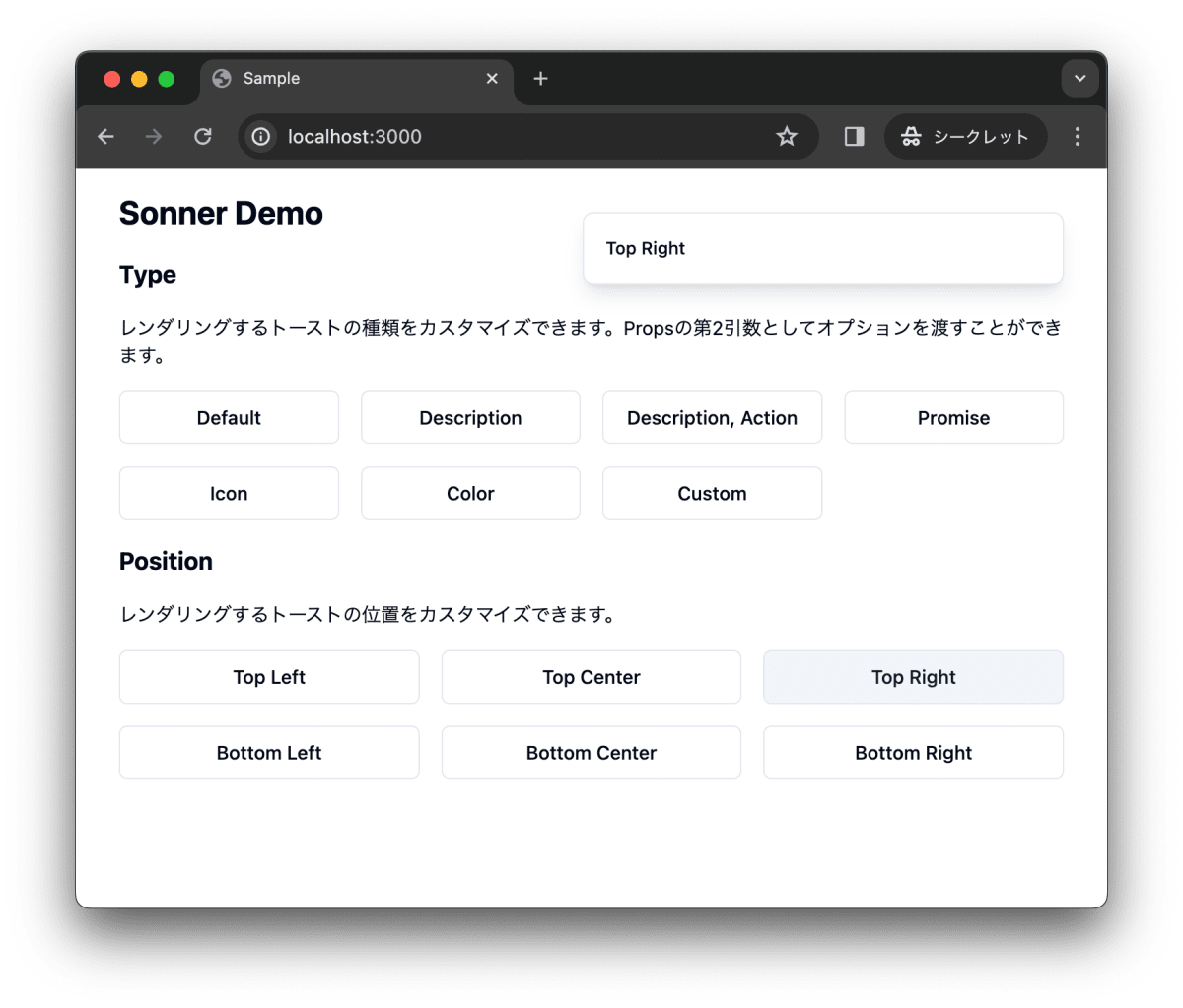
トーストを右上に表示します。
toast("Top Right", { position: "top-right" })
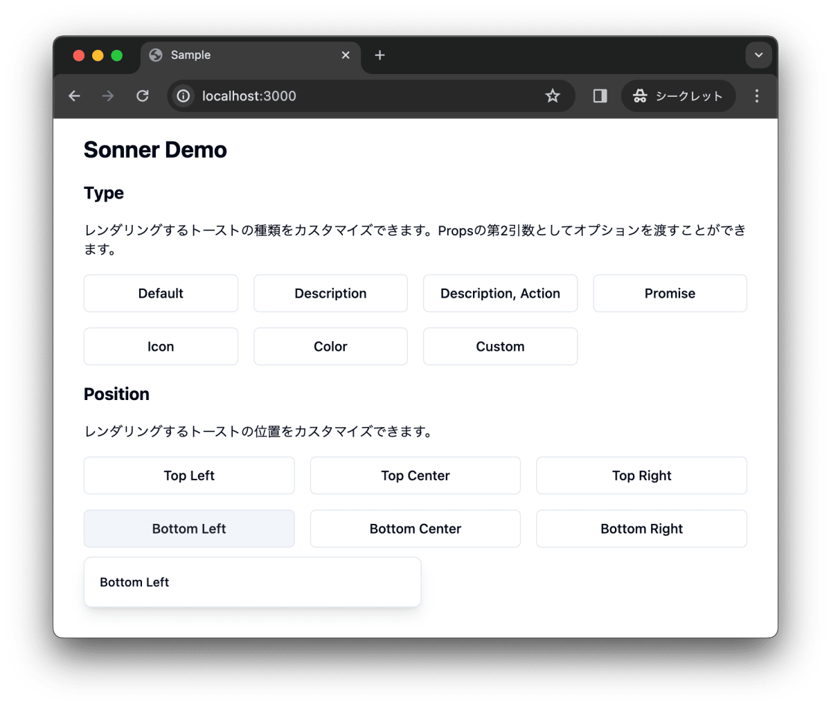
トーストを左下に表示します。
toast("Bottom Left", { position: "bottom-left" })
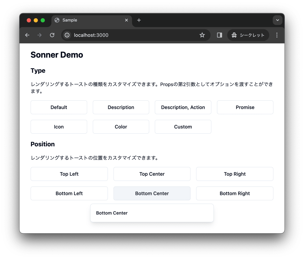
トーストを中央、下に表示します。
toast(" Bottom Center", { position: "bottom-center" })
トーストを右下に表示します。
toast("Bottom Right", { position: "bottom-right" })
SonnerのAPI
最後に、SonnerのAPIについて紹介します。
toast()で利用可能なAPIはこちらで確認できます。
Toastで利用可能なAPIはこちらで確認できます。
stylingはこちらで確認できます。
まとめ
shadcn/ui で Sonner がリリースされました。Sonner はいわゆる Toast コンポーネントです。Sonner は @emilkowalski_ が開発した Sonner をヘッドレス API として利用し、デザインを調整し、shadcn/ui のライブラリーコンポーネントの一つとしてリリースしています。
作業リポジトリはこちらです。
Discussion