こんにちはMUI! 新しくなったMaterial UI v5
どうもよしです。久しぶりの投稿になります。
元々、Material Design をベースとした UI コンポーネントライブラリである、Material UI の v5 が遂にリリースされました!
v4 からどう変わったのか自分でも試すなど、さらっと見てみたので、ここにまとめてみました。
※2023/11/25 MUI の更新に伴い、MUI v5.0系のドキュメント参照したほうが良い部分はリンクを差し替えました。
Material UI とは?
元々、Google の Material Design をベースに開発された、UI コンポーネントライブラリです。
Material UI の概要や v4 の機能に関しては、以前に記事を書いていますので、よろしければそちらをご参照ください。
※今回の記事は、主に以下の公式ブログ記事をもとにしています。引用文の出典もそちらです。
そのため、すでにそちらをご覧になっている方には、あまり真新しい情報はないやもしれません。
v5 の開発背景
In our last survey, the number of developers that commented about improving the Material Design implementation was down by 60% compared to the year before. At the same time, 5X more developers were struggling to customize the components.
It was based on this context that we started work on v5 in 2019. Our primary focus was to revamp the customization Developer Experience (DX). It had become clear that design (aesthetic, UX) and DX were key to unlocking the next stage of growth.
The new brand supports the v5.0.0 release while also creating space for new initiatives that broaden the company horizon. It's a big deal!
Our ultimate goal is to become the most effective and efficient tool to build UIs while making it accessible to the many.
↓
前回の調査では、Material Design の実装の改善についてコメントした開発者の数は、前年と比較して60%減少しました。同時に、5倍以上の開発者がコンポーネントのカスタマイズに苦労していました。
2019年に v5 の作業を開始したのは、このコンテキストに基づいていました。私たちの主な焦点は、カスタマイズの開発者エクスペリエンス(DX)を刷新することでした。デザイン(美的、UX)と DX が成長の次の段階を解き放つ鍵であることが明らかになりました。
新しいブランドはv5.0.0リリースをサポートすると同時に、会社の視野を広げる新しいイニシアチブのためのスペースを作成します。それは大したことです!
私たちの究極の目標は、多くの人がアクセスできるようにしながら、UI を構築するための最も効果的かつ効率的なツールになることです。
Material UI は元々、React の開発者が Material Design を使用できるようにと、Material Design ガイドラインの React 実装として 2014年に開発開始されました。
2018年に v1 をリリース。
その後も開発は続けられ、日々改善が行われていましたが、コンポーネントのカスタマイズ性に関して課題を抱えていたようです。
それを解決するというのが、v5 開発の大きな目的だったとのこと。
実際に、v5 にはコンポーネントのカスタマイズをよりやりやすくするような新機能が取り入れられています。
新ブランド
これまでのMaterial UIから、MUIというブランド名に変わりました。
We are breaking the strong association with Material Design as we have seen too many people confusing Material-UI with Google, or as a synonym of Material Design.
We are now called MUI. It stands for Material to build UIs and is pronounced /ɛm juː aɪ/.
It's shorter, it distinguishes us, and it's familiar – many people already used it for abbreviating Material-UI. More importantly, it allows for the release of products not directly coupled to Material Design, such as an unstyled/headless version of the components, a brand new second design system as an alternative to MD, and more ambitious initiatives.
↓
Material-UI を Google と混同している人や、Material Design の同義語として多くの人が見ているため、Material Design との強い関連性を断ち切っています。
現在は MUI と呼ばれています。 UI を構築するための Material の略で、/ɛmjuːaɪ/と発音されます。
短く、私たちを区別し、よく知られています。多くの人がすでにMaterial-UI の省略形として使用しています。さらに重要なことは、コンポーネントのスタイルなし/ヘッドレスバージョン、MD の代替としてのまったく新しいセカンドデザインシステム、より野心的なイニシアチブなど、Material Design に直接結合されていない製品のリリースを可能にすることです。
Material Design の枠だけにとらわれない、新たな試みを行っていくことが示されていますね。
その中で、3つのプロダクトに分かれることにもなりました。
- MUI Core:すぐに使用できる基本コンポーネント群 + 永久に無料で使えるもの
- MUI X:より複雑なユースケース向けの高度なコンポーネント群 + 有料部分も含むもの
- Templates:コミュニティによって開発された、MUI を使用したテンプレート
ロゴ
微妙に変わりました。
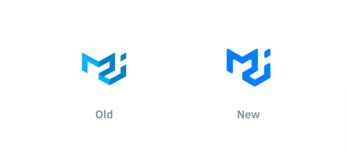
(画像は公式ブログ記事より)
It's basically the same, to keep it familiar – we're keeping the geometrical shape, to resonate with the building blocks idea of the components – however, we're reducing the emphasis on the 3D perspective, stepping away from the notion of elevation that Material Design coined.
↓
基本的には同じです。慣れるために、幾何学的な形状を維持し、コンポーネントのビルディングブロックのアイデアに共鳴します。ただし、3D パースペクティブの重要性を減らし、標高の概念から離れています。Material Design の造語。
リポジトリ名
2021/09/26現在、material-ui のままでした。
ただ、README では、ちゃんとMUIという表記になっていました。
ドメイン
これまではこちらでした。
https://material-ui.com/
現在はこちら。シンプルになりましたね。
v5 の公式サイトはデザインが一新されています。
ちなみにhttps://material-ui.com/にアクセスすると、https://mui.com/へリダイレクトするようになっていました。
パッケージ名
こちらも新ブランド名に応じた名称へ変わりました。
MUI Core プロダクトに含まれるパッケージ一覧。
@material-ui/core -> @mui/material
@material-ui/system -> @mui/system
@material-ui/unstyled -> @mui/core
@material-ui/styles -> @mui/styles
@material-ui/icons -> @mui/icons-material
@material-ui/lab -> @mui/lab
@material-ui/types -> @mui/types
@material-ui/styled-engine -> @mui/styled-engine
@material-ui/styled-engine-sc ->@mui/styled-engine-sc
@material-ui/private-theming -> @mui/private-theming
@material-ui/codemod -> @mui/codemod
@material-ui/docs -> @mui/docs
@material-ui/envinfo -> @mui/envinfo
インストール方法も同様に変わっています。
以下は基本パッケージである@material-ui/core(@mui/material)をライブラリとしてインストールする例です。
v4
- React:16.8.0 以上
- react-dom:16.8.0 以上
npm install @material-ui/core
or
yarn add @material-ui/core
↓
v5
- React:17.0.0 以上
- react-dom:17.0.0 以上
# emotion を使う場合
npm install @mui/material @emotion/react @emotion/styled
# or
yarn add @mui/material @emotion/react @emotion/styled

# styled-components を使う場合
npm install @mui/material @mui/styled-engine-sc styled-components
# or
yarn add @mui/material @mui/styled-engine-sc styled-components
後述しますが、v5 ではデザインシステムの実体であるスタイリングソリューションが変更され、emotion か styled-components を使うようになりました。
そのため、このようなインストール方法となっています。
パッケージ名が変更になっている分、v4 と v5 を共存させることもできそうです。(CodeSandbox では確認できました)
1プロジェクトのコードでパフォーマンスの比較をしたり、一時的に共存させて、段階的に v5 に移行していくということもできそうですね。
セカンドデザインシステム
Developing a new design system is one of the main initiatives, alongside this new brand and the unstyled components, to grow MUI beyond Material Design. Its codename is Joy and we have just started the high-level discussion around it.
It will be built on top of our foundation packages (the base/unstyled components and
@mui/system) to provide the API shaped similarly to our Material Design components. We plan on having built-in CSS variables generated from the theme, a great dark mode API, a custom look and feel, and more.We're aiming for developing the most frequently used components first, as we plan on releasing them continuously with each milestone. We intend to have Joy versions of all components already available on Material Design so that developers can then pick between them, choosing the design they like the most. The main difference will be the theme structure, where we want to achieve the right amount of flexibility while providing an amazing design by default.
We'll keep you updated about the progress. And as always, you're invited to contribute to it as well. Stay tuned!
↓
新しいデザインシステムの開発は、この新しいブランドやスタイルのないコンポーネントと並んで、Material Design を超えて MUI を成長させるための主要なイニシアチブの1つです。そのコードネームは Joy で、私たちはそれに関するハイレベルな議論を始めたばかりです。
これは、ファンデーションパッケージ(ベース/スタイルなしコンポーネントおよび
@mui / system)の上に構築され、Material Design コンポーネントと同様の形状の API を提供します。テーマから生成された組み込みのCSS変数、優れたダークモード API、カスタムのルックアンドフィールなどを計画しています。マイルストーンごとに継続的にリリースする予定であるため、最も頻繁に使用されるコンポーネントを最初に開発することを目指しています。開発者が最も気に入ったデザインを選択できるように、Material Design ですでに利用可能なすべてのコンポーネントの Joy バージョンを用意する予定です。主な違いはテーマの構造です。テーマの構造では、デフォルトですばらしいデザインを提供しながら、適切な量の柔軟性を実現したいと考えています。
進捗状況を随時お知らせします。そしていつものように、あなたもそれに貢献するように招待されています。乞うご期待!
前述の通り、新ブランドへの移行に関して Material Design の枠だけにとらわれない、新たな試みを行っていくことが示されていました。
そのなかでセカンドデザインシステムのことに触れられていましたが、Joy というコードネームのデザインシステムが開発されているようです。
全てのコンポーネントの Joy バージョンを開発予定ということで、より表現の幅が広がりそうですね!
デザインシステム
スタイリングソリューションの再考
v5 でコンポーネントのカスタマイズ性の向上させるにあたって、まずはデザインシステムの実体であるスタイリングソリューションを再考。
これまでも何度か移行を繰り返してきた中で、v4 ではスタイリングソリューションとして JSS が使われていました。
しかし、以下のような問題を抱えていたとのこと。
The React community is settling on styled() as the most popular CSS-in-JS API. We have used popularity as a proxy for "best".
You can find it in styled-components, emotion, goober, stitches, or linaria. While MUI is compatible with any styling solution (as long as the styles have more specificity, for example, Tailwind CSS), many developers still felt the need to learn something new: the makeStyles API.Our React integration with JSS (@mui/styles) is too slow to unlock the next layer of customization DX we aim for. The static CSS generation using v4 was fast enough, even faster than emotion, however, the dynamic style generation was too slow to be used in production. We would have needed to reimplement it.
Many developers were advocating for MUI to migrate to styled-components, which would allow us to drop the custom React JSS wrapper we maintain. From our experience, maintaining a custom styling solution takes a considerable amount of time.
↓
React コミュニティは、最も人気のある CSS-in-JS APIとしてstyled()を採用しています。私たちは「最高」の代用として人気を利用してきました。
あなたはそれを styled-components, emotion, goober, stitches, または linaria で見つけることができます。 MUI はどのスタイリングソリューションとも互換性がありますが(たとえば、Tailwind CSS など、スタイルの特異性が高い限り)、多くの開発者は、makeStyles API という新しいことを学ぶ必要性を感じていました。React と JSS(
@mui/styles)の統合は遅すぎて、私たちが目指すカスタマイズ DX の次のレイヤーのロックを解除できません。 v4 を使用した静的 CSS 生成は十分に高速で、emotion よりも高速でしたが、動的スタイル生成は遅すぎて本番環境で使用できませんでした。それを再実装する必要があったでしょう。多くの開発者は、MUI を styled-components に移行することを提唱していました。これにより、私たちが維持しているカスタム React JSS ラッパーを削除できるようになります。私たちの経験から、カスタムスタイリングソリューションの維持にはかなりの時間がかかります。
これらを解決するために検討を重ねた結果がこちら。
After exploring many different options, we settled on what we believe is a great tradeoff to solve the above issues:
1.We have made styled() the lowest level primitive to add styles. This API is already known by many.
2.We have defined a common interface with concrete implementations:
- @mui/styled-engine: implemented with emotion (default).
- @mui/styled-engine-sc: implemented with styled-components
If you are using a different styling library, feel free to contribute a wrapper. For instance, there is one attempt with goober, a library obsessing on bundle size (3kB gzipped).
This allows developers to swap between different style engines. For example, styled-components users no longer need to bundle emotion and styled-component, nor do they need to configure the server-side rendering for each. How does the swap work? The same way it does from React to Preact.3.For the last couple of months, we have been sponsoring emotion with a $100/month grant. We are now increasing this amount to $1,000/month. It's in our best interest to help ensure the library keeps pushing the envelope, leading the state of the art in a competitive space.
↓
多くの異なるオプションを検討した後、上記の問題を解決するための大きなトレードオフであると私たちが信じていることを決定しました。
1.styled()を、スタイルを追加するための最低レベルのプリミティブにしました。この API はすでに多くの人に知られています。
2.具体的な実装との共通インターフェースを定義しました。
@mui/styled-engine:emotion で実装されます(デフォルト)@mui/styled-engine-sc:styled-components で実装別のスタイリングライブラリを使用している場合は、ラッパーを自由に提供してください。たとえば、バンドルサイズ(3kB gzip圧縮)にこだわるライブラリである goober を使用した1つの試みがあります。
これにより、開発者は異なるスタイルのエンジン間で交換できます。たとえば、styled-components のユーザーは、emotion と styled-components をバンドルする必要がなくなり、それぞれのサーバー側レンダリングを構成する必要もなくなりました。スワップはどのように機能しますか? React から Preact までと同じ方法です。3.過去数か月間、私たちは月額100ドルの助成金で emotion を後援してきました。現在、この金額を月額1,000ドルに増やしています。図書館が限界を押し上げ続け、競争の激しい分野で最先端をリードすることを確実にすることは、私たちの最大の利益です。
インストール方法の所でも少し触れましたが、v5 では emotion もしくは styled-components がデザインシステムの実体として使われることになりました。
共通インタフェースを定義したうえで、この2つの実装がされているため、どちらか好きな方を使えます。
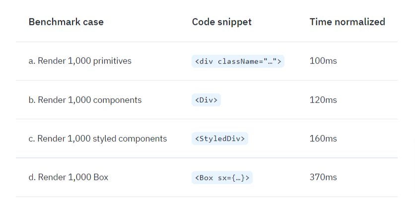
デフォルトでは emotion が使われるようになっており、emotion を採用した決め手としては、パフォーマンス面が大きかったようです。
こちらで Box コンポーネントを使ったパフォーマンス比較のコードが用意されていて、v4 と比べると5倍以上も高速化しているのが確認できます。早い👀
v4 でも styled()を使ったスタイルのカスタマイズは可能でしたが、makeStylesを使った書き方が一般的でした。
v4:makeStyles方式例
import { VFC, ReactNode } from 'react';
import { makeStyles } from '@material-ui/core/styles';
import Button from '@material-ui/core/Button';

const useStyles = makeStyles({
  button: {
    backgroundColor: 'green'
  }
});

type Props = {
  children: ReactNode;
}

const HooksButton: VFC<Props> = ({ children }) => {
  const classes = useStyles();

  return (
    <Button variant="contained" className={classes.button}>
      {children}
    </Button>
  );
}

export default HooksButton;
v4:styled方式例
import { VFC, ReactNode } from 'react';
import { styled } from '@material-ui/core/styles';
import Button from '@material-ui/core/Button';

const CustomButton = styled(Button)({
  backgroundColor: 'red'
});

type Props = {
  children: ReactNode;
}

const StyledButton: VFC<Props> = ({ children }) => {
  return <CustomButton variant="contained">{children}</CustomButton>;
};

export default StyledButton;
v5 では、makeStylesは廃止され、styled()でカスタマイズがメインになっていくようです。
v5:styled方式例
import { VFC, ReactNode } from 'react';
import { styled } from '@mui/material/styles';
import Button from '@mui/material/Button';

const CustomButton = styled(Button)({
  backgroundColor: 'red'
});

type Props = {
  children: ReactNode;
}

const StyledButton: VFC<Props> = ({ children }) => {
  return <CustomButton variant="contained">{children}</CustomButton>;
};

export default StyledButton;
なお、v5 でもmakeStyles方式を使いたい場合は、@mui/stylesに従来の JSS でのスタイルシステムが残されているので、そちらから使うことができるとのこと。
(基本的にはコアコンポーネントと一致させるために移行を推奨)
プレーンな CSS、CSS Modules との併用は引き続き可能です。
emotion 版を使っているのであれば、emotion の css props を使うのも1つの手ですね。
(個人的な好みとして、emotion では css props を使う派でして...)
ちなみに v4 時代から styled-components および emotion との親和性はあったようで、v4 の公式ドキュメントにも使い方は載っていました。
/** @jsxImportSource @emotion/react */
import { VFC, ReactNode } from 'react';
import Button from '@mui/material/Button';
import { css } from '@emotion/react';

type Props = {
  children: ReactNode;
};

const EmotionButton: VFC<Props> = ({ children }) => {
  return (
    <Button
      css={css`
        width: 100px;
      `}
      variant="contained"
    >
      {children}
    </Button>
  );
};

export default EmotionButton;
sx props
styled()を使うまでもない、少しのスタイルカスタマイズや1回きりのスタイル定義に使える新機能。
sxという props にスタイルを定義することで、スタイルのカスタマイズができます。
その特性から「ユーティリティ」とも呼ばれているそうです。
// my は marginTop と marginBottom のエイリアス
// margin: 8px 0px;
<Button sx={{ my: 1 }}>Test</Button>
このsx propsは、以下のコンポーネントで使用できます。
- MUI Core プロダクトに含まれる(
@mui/material,@mui/icons-material,@mui/labなど)コンポーネント - (
@mui/material/stylesの)styled()で作成したカスタムコンポーネント - babel プラグインを含む任意の要素(※2021/09/26時点で TODO になっていました)
一見、styleによるインラインスタイルと似ていますね。
sx propsの場合は通常のスタイル定義が書けることに加え、特定の CSS プロパティでエイリアスが使えたり、テーマ情報とマッピングされた値が使えたり。
疑似要素やメディアクエリが使えたり、ネストができたり。
より柔軟に書くことができるようになっています。
特定の CSS プロパティ(デザインシステムに実装されているシステムプロパティ)の一覧はこちら。
sx propsの使用例
import Box from '@mui/material/Box';

const BoxSx = () => {
  return (
    <Box
      sx={{
        boxShadow: 1 // theme.shadows[1]
        color: 'primary.main', // theme.palette.primary.main
        m: 1, // margin: theme.spacing(1)
        p: {
          xs: 1, // [theme.breakpoints.up('xs')]: { padding: theme.spacing(1) }
          md: 2  // [theme.breakpoints.up('md')]: { padding: theme.spacing(2) }
        },
        zIndex: 'tooltip', // theme.zIndex.tooltip
      }}
    >
      test
    </Box>
  );
}

export default BoxSx;
疑似要素の例
<Box
  sx={{
    '&:hover': {
      boxShadow: 1
    }
  }}
/>
メディアクエリの例
<Box
  sx={{
    '@media (max-width: 600px)': {
      width: 300,
    }
  }}
/>
ネストの例
<Box
  sx={{
    '& div': {
      bgcolor: 'primary.main',
    }
  }}
>
  <div>test</div>
</Box>
また、テーマ情報を受け取るコールバック式でも書くことができます。
こちらは、テーマ情報を元に加工した値を設定したい時などに使うイメージです。
<Box sx={{ height: (theme) => theme.spacing(10) }} />
優先度
同一 CSS プロパティの指定が複数あった時の優先度は、低い順から
- そのコンポーネントが元々受け入れる props によるスタイル(Button コンポーネントの color props など)
-
sx propsによるスタイル - インラインスタイル
となっていました。
パフォーマンス
公式に比較表がありました。
sx propsを使用すると、やや速度が落ちるようです。
それでもほとんどの用途では十分高速であるとされていますが、あまりの多用は控えた方がいいやもしれませんね。
CSS コンポーネントユーティリティ
新機能のsx propsですが、実は v4 の Box コンポーネントでも少し似たようなことは出来ていました。
こちらはsx propsを使わずに直接 props として渡す感じ。
違いといえば、疑似要素やメディアクエリ等は使えず、特定の CSS プロパティ(デザインシステムに実装されているシステムプロパティ)のみ対応だったことでしょうか。
v4 での Box コンポーネントの使用例
import { VFC } from 'react';
import { Box, Button } from '@material-ui/core';

const App: VFC = () => {
  return (
    <Box m={2}>
      <Button variant="contained">Test</Button>
    </Box>
  );
}

export default App;
このシステムプロパティを受け入れるコンポーネントは、CSS コンポーネントユーティリティと言われるそうで。
v5 においては以下の4つのコンポーネントが該当します。
- Box
- Stack
- Typography
- Grid
なぜこの4つだけなのかは、公式ドキュメントの API トレードオフの項に記述があります。
これ以外のコンポーネントでシステムプロパティを使いたかったり、小さなスタイルのカスタマイズをしたい時にsx propsを使っていく感じになるようです。
ちなみに CSS コンポーネントユーティリティに該当する4つのコンポーネントでもsx propsは使用できます。
sx propsの方がカスタマイズ性に優れているので、直接システムプロパティを使っていくことはあまりないやもしれませんね。
(公式のサンプルコードでもsx propsを使っているものが多く見受けられました)
直接システムプロパティを指定するのと、sx propsで指定するのとで、同一 CSS プロパティを指定した場合は後者の値が使われました。
開発背景
v5 におけるスタイルのカスタマイズはstyled()を使うのがメインになったわけですが、少しのスタイルカスタマイズでもこれを使うということは、以下のような問題がありました。
- Switching context wastes time. The styled API forces you to constantly jump between the use of the styled components and where they are defined. Could we move the style descriptions right where we need them?
- Naming things is hard. Have you ever found yourself struggling to find a good name for a styled component? Could we remove the need to create and name yet another component?
- Enforcing consistency in UIs is hard. This is especially true when more than one person is building the application, as there has to be some coordination amongst members of the team regarding the choice of design tokens and how they are used, what parts of the theme structure should be used with what CSS properties, and so on.
↓
コンテキストを切り替えると時間が無駄になります。スタイル付き API を使用すると、styled-components の使用とそれらが定義されている場所の間を常にジャンプする必要があります。スタイルの説明を必要な場所に移動できますか?
名前を付けるのは難しいです。styled-components の適切な名前を見つけるのに苦労したことがありますか?さらに別のコンポーネントを作成して名前を付ける必要をなくすことができますか?
UI で一貫性を強制することは困難です。これは、複数の人がアプリケーションを構築している場合に特に当てはまります。デザイントークンの選択とその使用方法、テーマ構造のどの部分をどの CSS で使用するかについて、チームのメンバー間で調整を行う必要があるためです。プロパティなど。
これらの問題を解決するための機能として、sx propsが実装されたとのことです。
(これも emotion への移行により可能となったものです)
1と2に関しては、自分が個人的に styled-components 方式をあまり好きになれない理由に近いものがあり、すごいわかるーってなりました(笑)
動的 props
MUI のコンポーネントに独自の props を追加するなど拡張したい時、v4 ではラッパーコンポーネントを作るような方法で多くは対応されてきました。
しかし、以下のような問題を抱えていたとのこと。
Each time you create a new component, it's another import option for your team. Now, you have to ensure that the right component is imported.
Adding a new color="success" prop to a Button component requires non-trivial CSS customizations. How do you ensure that all the styles (hover, focus, focus-visible) are consistent with the other built-in colors?
It adds a boilerplate.
↓
新しいコンポーネントを作成するたびに、それはチームのもう1つのインポートオプションになります。ここで、適切なコンポーネントがインポートされていることを確認する必要があります。
新しい color="success" props を Button コンポーネントに追加するには、重要な CSS のカスタマイズが必要です。すべてのスタイル(hover、focus、focus-visible)が他の組み込みの色と一致していることをどのように確認しますか?
ボイラープレートを追加します。
このため、v5 では、テーマから直接コンポーネントの組み込み動作を拡張する機能を追加。
公式ブログ記事においては、CodeSandbox のサンプルコードを添えて2パターン紹介されていました。
既存のスタイルマッピングを利用して、Button コンポーネントの color props に色を追加する例
(このスタイルマッピング部分は v4 にもあり)
import createTheme from "@mui/material/createTheme";
import ThemeProvider from "@mui/material/ThemeProvider";
import Button from "@mui/material/Button";

// 1. テーマを拡張
const theme = createTheme({
  palette: {
    neutral: {
      main: "#d79b4a"
    }
  }
});

// 2. パレットの新しい色について TypeScript に通知
declare module "@mui/material/styles" {
  interface Palette {
    neutral: Palette["primary"];
  }
  interface PaletteOptions {
    neutral: PaletteOptions["primary"];
  }
}

// 3. Button の color props を更新
declare module "@mui/material/Button" {
  interface ButtonPropsColorOverrides {
    neutral: true;
  }
}

export default function App() {
  // 4. 使用
  return (
    <ThemeProvider theme={theme}>
      <Button color="neutral">color="neutral"</Button>
    </ThemeProvider>
  );
}
テーマにカスタムバリアントを追加して、特定のコンポーネント props の組み合わせである CSS をオーバーライドする例
import createTheme from "@mui/material/createTheme";
import ThemeProvider from "@mui/material/ThemeProvider";
import Button from "@mui/material/Button";

// 1. テーマを拡張
const theme = createTheme({
  components: {
    MuiButton: {
      variants: [
        {
          props: { variant: "dashed", color: "error" },
          style: {
            border: "1px dashed red",
            color: "red"
          }
        }
      ]
    }
  }
});

// 2. Button の color props を更新
declare module "@mui/material/Button" {
  interface ButtonPropsVariantOverrides {
    dashed: true;
  }
}

export default function App() {
  // 3. 使用
  return (
    <ThemeProvider theme={theme}>
      <Button variant="dashed" color="error">
        dashed
      </Button>
    </ThemeProvider>
  );
}
グローバルクラス
MUI の各種コンポーネントへ適用されることになるグローバル CSS のクラス名およびルール名は、公式ドキュメントの各種コンポーネントのページに一覧化されています。
それらのクラス自体のカスタマイズや、それらのクラスをベースとしたカスタマイズをしたい場合は、そこから名を特定。
特定したクラスを元に独自スタイルを定義する。ということができました。
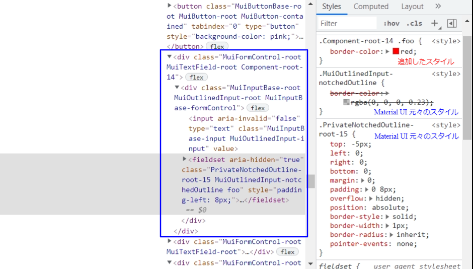
以下は TextField コンポーネントでvariant="outlined"を指定した時に適用される、MuiOutlinedInput-notchedOutlineクラス(notchedOutlineルール)をカスタマイズして、枠線を赤色に変更している例です。
v4:グローバル CSS でカスタマイズ
/* styles.css */
.MuiOutlinedInput-notchedOutline {
  border-color: red;
}
import './styles.css';
.
.
.
<TextField variant="outlined" />
v4:コンポーネント個別でカスタマイズ
(variant="outlined"の時にfooクラスを追加 + & fooクラスでスタイル定義)
import TextField from '@material-ui/core/TextField';
import { styled } from '@material-ui/core/styles';

const CustomizedTextField = styled((props) => (
  <TextField
    {...props}
    variant="outlined"
    InputProps={{ classes: { notchedOutline: 'foo' } }}
  />
))({
  '& .foo': {
    borderColor: 'red'
  }
}) as typeof TextField;
.
.
.
<CustomizedTextField />
v4 の後者では、グローバル CSS クラスと連動させた独自クラスを追加したうえで、そのクラスのスタイル定義をするようなやり方でした。
v5 では、直接グローバル CSS のクラスにスタイルを追加するような感覚で扱える、新しいやり方が追加されました。 より型安全に扱うのであれば、2パターン目の方が良さそうです。
import TextField from '@mui/material/TextField';
import { outlinedInputClasses } from '@mui/material/OutlinedInput';
import { styled } from '@mui/material/styles';

// ※v5 では TextField の variant のデフォルト値が standard → outlined に変更された

// Option 1: global class
const CustomizedTextField1 = styled(TextField)({
  '& .MuiOutlinedInput-notchedOutline': {
    borderColor: 'red',
  },
});

// Option 2: global class + const
const CustomizedTextField2 = styled(TextField)({
  [`& .${outlinedInputClasses.notchedOutline}`]: {
    borderColor: 'red',
  },
});
.
.
.
<CustomizedTextField1 />
<CustomizedTextField2 />
実際に適用される CSS を比較するとこんな感じ。
v4 の後者のやり方で適用される CSS
v5 のやり方で適用される CSS
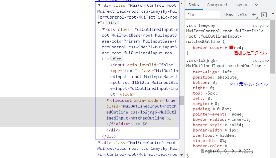
クラスを追加しているという点はどちらも同じですね。
v4 では、独自に追加したクラス(今回だとfoo)の他に、そのコンポーネントのルート DOM にComponents-root-XXクラスが別途追加されるような仕組みになっています。
v5 では、そのコンポーネントのルート DOM に、元々あるクラス(今回だとMuiFormControl-root, MuiTextField-root)をベースとしたクラス(今回だとcss-1mmysby-MuiFormControl-root-MuiTextField-root)が追加されていますね。
スタイルなしコンポーネント
コンポーネントのロジックをフックとスタイルのないコンポーネントに分離したものを提供する、という新しい試みです。
現状、まだアルファ版で、以下のコンポーネントのみ対応しています。
- Autocomplete
- Button
- Modal
- Pagination
- Slider
- Switch
現在の開発状況に関しては、こちらの Issue で確認できます。
スタイルなし Button コンポーネントの例
import clsx from 'clsx';
import Stack from '@mui/material/Stack';
import { ButtonUnstyledProps, useButton } from '@mui/core/ButtonUnstyled';
import { styled } from '@mui/system';

const CustomButtonRoot = styled('button')(`
  background-color: #007fff;
  padding: 15px 20px;
  border-radius: 10px;
  color: #fff;
  font-weight: 600;
  font-family: Helvetica, Arial, sans-serif;
  font-size: 14px;
  transition: all 200ms ease;
  cursor: pointer;
  box-shadow: 0 4px 20px 0 rgba(61, 71, 82, 0.1), 0 0 0 0 rgba(0, 127, 255, 0);
  border: none;

  &:hover {
    background-color: #0059b2;
  }

  &.active {
    background-color: #004386;
  }

  &.focusVisible {
    box-shadow: 0 4px 20px 0 rgba(61, 71, 82, 0.1), 0 0 0 5px rgba(0, 127, 255, 0.5);
    outline: none;
  }

  &.disabled {
    opacity: 0.5;
    cursor: not-allowed;
    box-shadow: 0 0 0 0 rgba(0, 127, 255, 0);
  }
`);

const CustomButton = React.forwardRef(function CustomButton(
  props: ButtonUnstyledProps,
  ref: React.ForwardedRef<any>,
) {
  const { children } = props;
  const { active, disabled, focusVisible, getRootProps } = useButton({
    ...props,
    ref,
    component: CustomButtonRoot,
  });

  const classes = {
    active,
    disabled,
    focusVisible,
  };

  return (
    <CustomButtonRoot {...getRootProps()} className={clsx(classes)}>
      {children}
    </CustomButtonRoot>
  );
});

export default function UseButton() {
  return (
    <Stack spacing={2} direction="row">
      <CustomButton onClick={() => console.log('click!')}>Button</CustomButton>
      <CustomButton disabled>Disabled</CustomButton>
    </Stack>
  );
}
開発背景
A key reason why developers pick MUI is to be able to build UIs faster. When they depend on us, they make a tradeoff. They estimate that applying new styles on top of the Material Design components will be faster than creating components from scratch or picking another library. They estimate that it will be performant enough, and they won't miss too much freedom.
This tradeoff works really well when having a small, constrained engineering team or a large team building internal (/secondary) tools. But what about the medium/large size engineering team that works on ambitious projects? Shouldn't they have a better option for not including Material Design and maximizing freedom than building the components from scratch?
We have started working on this exact problem, isolating the logic of the Material Design components into hooks and unstyled components. While the effort is still in alpha, you can already find the first building blocks in a new unstyled package.
↓
開発者が MUI を選択する主な理由は、UI をより高速に構築できるようにするためです。彼らが私たちに依存するとき、彼らはトレードオフをします。彼らは、Material Design コンポーネントの上に新しいスタイルを適用する方が、コンポーネントを最初から作成したり、別のライブラリを選択したりするよりも高速であると見積もっています。彼らはそれが十分に実行可能であると見積もっており、彼らはあまり多くの自由を逃すことはありません。
このトレードオフは、小規模で制約のあるエンジニアリングチームや、内部(/セカンダリ)ツールを構築する大規模なチームがある場合に非常にうまく機能します。しかし、野心的なプロジェクトに取り組む中規模/大規模のエンジニアリングチームはどうでしょうか。コンポーネントを最初から作成するよりも、Material Design を含めず、自由度を最大化するためのより良いオプションがあるべきではないでしょうか。
Material Design コンポーネントのロジックをフックとスタイルのないコンポーネントに分離して、この正確な問題に取り組み始めました。取り組みはまだ alpha 版ですが、スタイルが設定されていない新しいパッケージで最初のビルディングブロックを見つけることができます。
スタイルなしコンポーネントに関しては、元々 2017/02 から議論されていたようで。
よりカスタマイズ性を高めるための一環として、取り組みが開始されたようです。
デザインは自分たちで独自のこだわりがあるが、機能は MUI のものを活用したいという時に良さそうですね。
コンポーネント
大きな変更や基本的な部分のみ記載します。
(細かな変更点は公式の移行ガイドを参照ください)
基本的な使い方に関して、シンプルな例であればインポート元が変わるくらいです。
v4
import { VFC } from 'react';
import Button from '@material-ui/core/Button';

const App: VFC = () => {
  return (
    <Button variant="contained" color="primary">
      Test
    </Button>
  );
}

export default App;
↓
v5
import { VFC } from 'react';
import Button from '@mui/material/Button';

const App: VFC = () => {
  return (
    <Button variant="contained" color="primary">
      Test
    </Button>
  );
}

export default App;
機能追加されたコンポーネント
Grid
グリッドレイアウトを表現するためのコンポーネントにいくつかの機能が追加されました。
行と列の間隔をサポート
<Grid container rowSpacing={1} columnSpacing={2} />
すべての props でレスポンシブ値をサポート
<Grid container spacing={{ xs: 2, md: 3 }} />
12とは異なる列数のサポート
<Grid container columns={16}>
Material Icon
5つの異なるテーマで、600の新しいアイコンをリリース。
パッケージとしては@mui/icons-material。
v4
- Filled:1117
- Oulined:1116
- Rounded:1109
- Two tone:1107
- Sharp:1106
↓
v5
- Filled:1780
- Oulined:1780
- Rounded:1775
- Two tone:1771
- Sharp:1769
所属が変わったコンポーネント
lab → material
v4 で lab だったものが、material に取り込まれました。
Inputs
Feedback
Navigation
pickers → lab
※2023/11/25 リンクをリポジトリ URL に差し替え
v4 の時点では、全くの別パッケージとして存在していた Date Pickers 的なコンポーネント群が lab に取り込まれました。
そのため、元々のリポジトリはすでにアーカイブとなっています。
新しく追加されたコンポーネント
()は所属パッケージ。
スクショ及び GIF の撮影元は、公式ドキュメントより。
Stack(material)
種別は Layout。
1次元レイアウトを処理するためのコンポーネント。
Figma の auto layout に似ている。
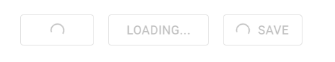
Loading Buttons(lab)
種別は Input。
通常の Button コンポーネントを拡張したもので、読み込み中・二度押し防止などの表現もできるようにしたもの。
LoadingButton の例(CircularProgress との組み合わせ)
Trap Focus(lab)
子孫コンポーネントの focus を管理するコンポーネント。
モーダルダイアログなどのオーバーレイを実装するときに活用できる。
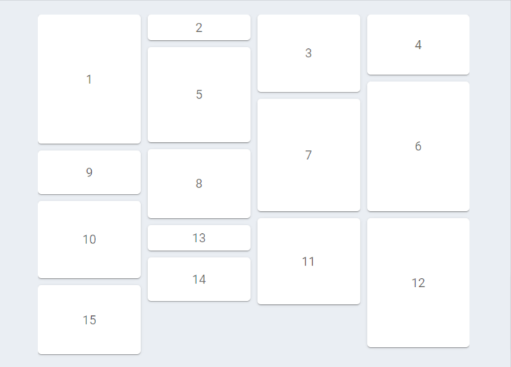
Masonry(lab)
横幅は一定であるが高さが可変というコンテンツブロックリストである、組構造を表現できるコンポーネント。
グリッドではスペースが無駄になってしまうときに活用できる。
Masonry、MasonryItem の例
MUI X
これまでに紹介してきたものは、MUI Core プロダクトを中心とした話でした。
今回の新ブランド移行に伴い、MUI X というプロダクトが新たに発表されました。
MUI Core に対して MUI X は、より複雑なユースケース向けの高度なコンポーネント群を提供するもので、一部有料の機能も持っています。
以前より、データグリッド機能を提供する@material-ui/data-grid(フル機能版:@material-ui/x-grid)というパッケージが v4-alpha 版で公開されていました。
それが MUI X として正式にリリースされた形になるようです。
パッケージ名
正式リリースに伴い、パッケージ名も変わりました。
@material-ui/data-grid → @mui/x-data-grid
@material-ui/x-grid → @mui/x-data-grid-pro
コンポーネント
公式サイトで確認できたものは、主に以下の8つ。
- DataGrid
- Date Picker
- Tree View
- Sparkline(Coming soon!)
- Charts(Coming soon!)
- Upload(Coming soon!)
- Scheduler(Coming soon!)
- Gauge(Coming soon!)
現状、Date Picker と Tree View は @mui/labの方に属してますが、その後は @mui/materialに取り込まれるのでなく、こちらに取り込まれるということなのかな?と思いました。
また、有料版の機能として、Date Range Picker を提供しているそうです。
開発ロードマップが公開されているので、そちらから開発状況が確認できます。
※2025/09/15...リンク切れを起こしていたので削除。
その他の新仕様と v4 からの移行
公式ドキュメントにガイドがあるので、そちらを参照ください。
やや長いページではありますが、コンポーネントごとの仕様変更など、細かい変更点もまとめられています。
移行の際は、公式ブログ記事とともに、ぜひ最後まで一読することをおすすめします。
以前に Material UI v4 記事を書いていたこともあり、今回 v5 の記事も書いてみました。
公式ブログ記事の内容をそのまま書いてもしょうがないので、なるべく自分でも試しながら v4 と比較できるような内容にしたつもりです。
代表的な部分のみ紹介のつもりが、ずいぶん長くなってしまいました...🙄
ここまで読んでいただいた方、ありがとうございます!
MUI の使用を検討している方にとって、何かの参考になれば幸いです。
Discussion