Next.js×microCMSでブログっぽいページを作成


はじめに
先日microCMSのデータを表示させると言う過程をChatGPTを使ってなんとか実装したと言う記事を投稿したのですが、せっかくなのでmicroCMS様のブログに似たようなサイトを模写してみようと思い色々やった過程を残しておきます。(未完成)
先日投稿した記事 microCMS様のブログ
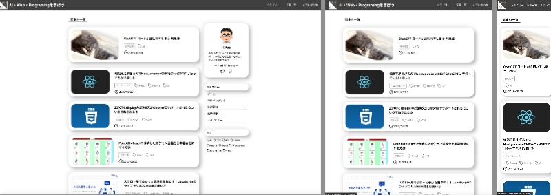
完成したサイト
ヘッダーやフッター、カテゴリー、タグのリンクは設置してしませんが記事とページネーションはできるようになっています。仕事終わりに一週間ほどちゃちゃっとして作ったものですので甘い部分ばかりですがご容赦ください
参考にしたサイト
以下のサイトで雛形を作成し、そこから随時必要な部分を追加していきまして作成しました
作成の過程
コンポーネント構成を考える
正直ファイルやフォルダ構成もベストプラクティスがわかっていないのですが、まず見た目を見てどんなコンポーネント構成にしようかと考えました。正直後で瓦解するのですがざっとこんな感じです。
この世の終わりかのようなイメージ画像です
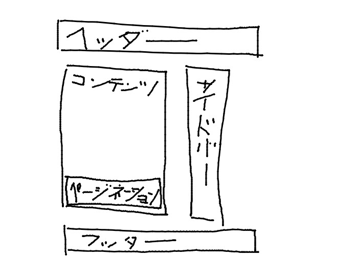
以上のような構成でとりあえず作ってみようと作成したのですが、コンポーネントはどれくらいの粒度で分割すればいいのかと言うのがわかっておりませんので、比較的粗めの分割になっているかと思います。記事ごとのカードなどはコンポーネントに分割してもよかったのかと思っています。
見た目を仮で作成
制作過程として、とりあえず必要なデータを取得してそれを徐々に整えていくのが正しいのか、見た目を作って合わせてデータを取得してくのが正しいのかわからないのでやりやすい後者で今回は作成いたしました。
コンポーネントごとに分けて見た目を仮で作成していきました。
仮で作成する際のコード
 <ul>
    <li>
        <Link className={styles.header_link} href="/">
            HTML
        </Link>
    </li>
    <li>
        <Link className={styles.header_link} href="/">
            CSS
        </Link>
    </li>
    <li>
        <Link className={styles.header_link} href="/">
            JavaScript
        </Link>
    </li>
    <li>
        <Link className={styles.header_link} href="/">
            TypeScript
        </Link>
    </li>
    <li>
        <Link className={styles.header_link} href="/">
            Next.js
        </Link>
    </li>
    <li>
        <Link className={styles.header_link} href="/">
            React
        </Link>
    </li>
</ul>
実際のコード(カテゴリー)
<ul>
  {categories.map((category) => (
      <li className={styles.category_name} key={category.id}>
          <Link href={`/category/${category.id}`}>{category.name}</Link>
      </li>
  ))}
</ul>
仮の見た目の中にAPIからのデータを反映していく
上のコードで書くためにデータを取得するのですがエンドポイントさえ指定すれば簡単に取得できるようにしてくださっているので、取得したデータのエンドポイントを指定して取得します。
複数のエンドポイントからの取得につまづいたので記しておきます。
受け取ったデータの名称を複数形にしなかったのは可読性も下がりますし自分でも書きずらかったので修正するべき点でした。
データを取得するためのコード
export const getStaticProps = async () => {
    const data = await client.get({ endpoint: "blogs", queries: { offset: 0, limit: 10 } });
    // カテゴリーコンテンツの取得
    const categoryData = await client.get({ endpoint: "categories" });
    // タグコンテンツの取得
    const tagData = await client.get({ endpoint: "tag" });

    return {
        props: {
            blog: data.contents,
            category: categoryData.contents,
            tag: tagData.contents,
            totalCount: data.totalCount,
        },
    };
};
取得したデータを表示するコード(タグ)
<span className={styles.flex_center}>
  {blog.tag.map((tagItem) => (
    <div className={`${styles.tag} ${styles.flex_center}`} key={tagItem.tag}>
        <Icon.Tag />
        <p>{tagItem.tag}</p>
      </div>
   ))}
</span>
投稿時間を表示する方法
意外とどうしようとなったので一応記しておきます。
正しい方法ではないかもしれません。
<div className={`${styles.flex_center} ${styles.mt_12}`}>
  <Icon.Clock />
  <time className={styles.date}>{blog.publishedAt.slice(0, 10).replace(/-/g, "/")}</time>
</div>
各コンポーネントごとに型指定やpropsの調整など
私の設計が良くなかったんだと思います、ヘッダーやフッター、サイドバーは共通表示でコンテンツ部分のみ表示を切り替えたかったのですが力不足で実装ならず随時共通コンポーネントにpropsの受け渡しを行わねばならず難航しましたがなんとか手を動かし続ければ時間が解決してくれました。
今度何かしらを作るときはuseContextを使用して状態や変数の管理を行ってみようと思います。
なんかごちゃごちゃになってしまったコード
interface RightbarProps {
    category: Categories[];
    tag: Tags[];
    contentHeight: number;
}

const Rightbar: React.FC<RightbarProps> = ({ category, tag, contentHeight }) => {
型指定はtypesフォルダを用意してtype.tsにまとめることで再利用性と可読性の向上につながったと喜んでいたのですが、結局随時ファイルごとに書いてしまったりしたので今後改善していきたい。
見た目の調整(レスポンシブなど)
サイドバーの追従
position: sticky;を使ったことがなかった男が一から書いてみて後悔した苦労
const rightBarRef = useRef<HTMLDivElement>(null);
    const rightBarTop = useRef<number | null>(null);
    const rightBarBox = useRef<HTMLDivElement>(null);
    const [windowTop, setWindowTop] = useState(0);
    const [rightBarTopPosition, setRightBarTopPosition] = useState<number | null>(null);
    const [windowHeight, setWindowHeight] = useState<number>(0);
    const [rightBarHeight, setRightBarHeight] = useState<number>(0);
    // 画面の高さを取得する

    useEffect(() => {
        const updateWindowHeight = () => {
            setWindowHeight(window.innerHeight);
        };
        updateWindowHeight();

        const updateRightbarHeight = () => {
            if (rightBarRef.current) {
                setRightBarHeight(rightBarRef.current.offsetHeight);
            }
        };

        const updateRightbarTop = () => {
            if (rightBarRef.current) {
                setRightBarTopPosition(rightBarRef.current.offsetTop);
            }
        };

        updateWindowHeight();
        updateRightbarHeight();
        updateRightbarTop();

        window.addEventListener("resize", updateWindowHeight);
        window.addEventListener("resize", updateRightbarHeight);
        window.addEventListener("resize", updateRightbarTop);

        return () => {
            window.removeEventListener("resize", updateWindowHeight);
            window.removeEventListener("resize", updateRightbarHeight);
            window.removeEventListener("resize", updateRightbarTop);
        };
    }, [windowHeight]);

    // 条件分岐(Rightbarの高さが画面幅よりも高いか低いか)
    useEffect(() => {

        const stopLine = contentHeight - 300;

        if (windowHeight > rightBarHeight) {
            const handleScroll = () => {
                setWindowTop(window.scrollY);

                if (rightBarRef.current && rightBarTop.current !== null) {
                    if (window.scrollY > rightBarTop.current) {
                        // windowTop が rightBarTop を超えたら追従スタイルを適用
                        rightBarRef.current.classList.add(styles.sticky);
                    } else {
                        rightBarRef.current.classList.remove(styles.sticky);
                    }

                    const rightBarBottom = rightBarRef.current.offsetHeight + window.scrollY;

                    if (rightBarBottom > stopLine) {
                        rightBarRef.current.classList.add(styles.stop);
                        const topValue = stopLine - rightBarRef.current.offsetHeight;
                        rightBarRef.current.style.top = `${topValue}px`;
                    } else {
                        rightBarRef.current.classList.remove(styles.stop);
                        rightBarRef.current.style.top = '0';
                    }
                }
            };

            if (rightBarRef.current && rightBarTop.current === null) {
                rightBarTop.current = rightBarRef.current.offsetTop; // 最初のレンダリング時に取得
            }

            window.addEventListener("scroll", handleScroll);
            return () => {
                window.removeEventListener("scroll", handleScroll);
            };
        } else {
            const handleScroll = () => {
                if (rightBarRef.current &&  rightBarTopPosition !== null) {
                    const rightBarBottom = rightBarTopPosition + rightBarRef.current.offsetHeight;
                    const windowBottom = window.scrollY + window.innerHeight;

                    if (windowBottom > rightBarBottom) {
                        // 画面下限と Rightbar の一番下が交差したら追従スタイルを適用
                        rightBarRef.current.classList.add(styles.under_sticky);
                    } else {
                        rightBarRef.current.classList.remove(styles.under_sticky);
                    }

                    const rightBarBottomScroll = rightBarHeight + window.scrollY;

                    if (rightBarBottomScroll > stopLine) {
                        rightBarRef.current.classList.add(styles.stop);
                        const topValue = stopLine - rightBarHeight;
                        rightBarRef.current.style.top = `${topValue}px`;
                    } else {
                        rightBarRef.current.classList.remove(styles.stop);
                        rightBarRef.current.style.top = '0';
                    }
                }
            };

            window.addEventListener("scroll", handleScroll);
            return () => {
                window.removeEventListener("scroll", handleScroll);
            };
        }
    }, [windowHeight, contentHeight, rightBarHeight,rightBarTopPosition]);

    // スクロールに合わせて追従する
レスポンシブ
そして最後にレスポンシブっぽくしました
以上をもってひとまず完成
反省・改善点
実際に作ってみて抱いた感想としましては、レンダリングの範囲などが全く意識出来ていないためNext,Reactのメリットが全然享受できていないなと感じました。Next.js自体への理解やpropsの受け渡しなどコンポーネントごとの状態の管理能力が低いのが現状ですので様々なことを調べながら使い心地の良いサービスを作れるようになりたいところです…。
最後に
最初は戸惑うことも多くありましたが慣れればデータが取得しやすく便利だなと感じました。人気の記事などもGoogle Analyticsと連携して表示できるそうなので様々なアレンジもしやすそうで楽しそうです。今後microCMSの案件に携わるかはわかりませんし、月並みな感想ではありますが楽しかったです。個人的にWordPressで受注していたような案件も置き換えられるくらいにはなりたいところです。それでは失礼いたします。
Discussion