📈
Rechartsで株式のグラフを書く
はじめに
Reactには様々なグラフのライブラリがありますが、
Next.jsで株式のグラフ(CandleStick)を書こうとした時には意外と選択肢が少ないです。
で紹介されているように、Rechartsが一番人気そうで使いやすそうなのですが、
以下のExampleのページには公式でCandleStickは提供されていないです。
残念だ…と思っていたら、一番最後のExampleにそれっぽいのがありました。
https://recharts.org/en-US/examples/CustomizedRectangleContent のサンプル画像
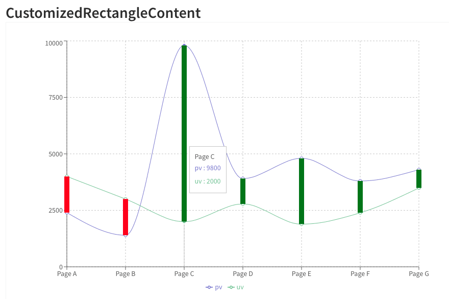
以下のコードを見ても、この赤と緑をいい感じに拡張or応用すれば行けそうだなと思い、
RechartsでCandleStickを書きます。
コードと実行結果
コードは地味に長いので隠します。
import React from "react";
import {
  LineChart,
  Line,
  XAxis,
  YAxis,
  CartesianGrid,
  Tooltip,
  Legend,
  ResponsiveContainer,
  Customized,
  Rectangle
} from "recharts";

interface IData {
  dt: string
  open: number
  high: number
  low: number
  close: number
}

const data: IData[] = [
  {
    dt: "2023/01/01",
    open: 3000,
    high: 3600,
    low: 2500,
    close: 2800
  },
  {
    dt: "2023/01/02",
    open: 3100,
    high: 3700,
    low: 2600,
    close: 2900
  },
  {
    dt: "2023/01/03",
    open: 2900,
    high: 3500,
    low: 2400,
    close: 2600
  },
  {
    dt: "2023/01/04",
    open: 3000,
    high: 3600,
    low: 2800,
    close: 3300
  },
  {
    dt: "2023/01/05",
    open: 2900,
    high: 3500,
    low: 2400,
    close: 2600
  },
];

// ここで赤か緑の太いバーを出す
const CustomizedRectangleUpDown = (props: any) => {
  const {formattedGraphicalItems} = props;
  console.log(props);
  // get first and second series in chart
  const firstSeries = formattedGraphicalItems[0];
  const secondSeries = formattedGraphicalItems[1];

  // render custom content using points from the graph
  return firstSeries?.props?.points.map((_: any, index: number) => {
    const firstSeriesPoint = firstSeries?.props?.points[index];
    const secondSeriesPoint = secondSeries?.props?.points[index];
    const yDiff = firstSeriesPoint.y - secondSeriesPoint.y;

    return (
      <Rectangle
        key={index}
        width={10}
        height={-yDiff}
        x={firstSeriesPoint.x - 5}
        y={firstSeriesPoint.y}
        fill={yDiff > 0 ? "red" : yDiff < 0 ? "green" : "none"}
      />
    );
  });
};

// ここで高値と底値の細いバーを出す
const CustomizedRectangleHighLow = (props: any) => {
  const {formattedGraphicalItems} = props;
  console.log(props);
  // get first and second series in chart
  const highSeries = formattedGraphicalItems[2];
  const lowSeries = formattedGraphicalItems[3];

  // render custom content using points from the graph
  return highSeries?.props?.points.map((_: any, index: number) => {
    const firstSeriesPoint = highSeries?.props?.points[index];
    const secondSeriesPoint = lowSeries?.props?.points[index];
    const yDiff = firstSeriesPoint.y - secondSeriesPoint.y;

    return (
      <Rectangle
        key={index}
        width={2}
        height={-yDiff}
        x={firstSeriesPoint.x - 1}
        y={firstSeriesPoint.y}
        fill={"gray"}
      />
    );
  });
};

export const CandleChart = () => {
  return (
    <ResponsiveContainer width="100%" height={500}>
      <LineChart
        width={500}
        height={300}
        data={data}
        margin={{
          top: 5,
          right: 30,
          left: 20,
          bottom: 5
        }}
      >
        <CartesianGrid strokeDasharray="3 3"/>
        <XAxis dataKey="dt"/>
        <YAxis/>
        <Tooltip/>
        <Legend/>
        <Line type="monotone" dataKey="close" stroke="#8884d8"/>
        <Line type="monotone" dataKey="open" stroke="#82ca9d"/>
        <Line type="monotone" dataKey="high" stroke="none"/>
        <Line type="monotone" dataKey="low" stroke="none"/>
        <Customized component={CustomizedRectangleHighLow}/>
        <Customized component={CustomizedRectangleUpDown}/>
      </LineChart>
    </ResponsiveContainer>
  );
};
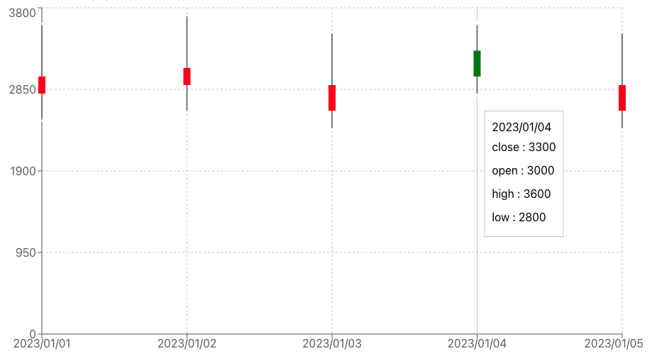
上記のコードを動かすと以下の図のようになります。
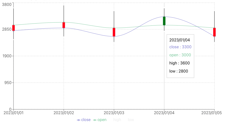
紫と緑の線が気になる場合には、以下のようにstroke="none"で線を消すことができます。
さらに<Legend/>を消すことで下の凡例も消すことができます。
(CandleStickなら凡例が無くても分かるだろうという判断です)。
-        <Legend/>
-        <Line type="monotone" dataKey="close" stroke="#8884d8"/>
-        <Line type="monotone" dataKey="open" stroke="#82ca9d"/>
+        <Line type="monotone" dataKey="close" stroke="none"/>
+        <Line type="monotone" dataKey="open" stroke="none"/>
おわりに
RechartsでCandleStickを書いてみました。案外楽にかけたのでよかったです。
余談:他にもAPEXCHARTSや、この記事を参考にAppache Echartsとかは見たのですが、
コード例があまり私にとってよくなかったのでやめました。
Discussion