SLDSでsalseforceのセクション的なものを作ってみた class="slds-section"編


はじめに
前回の記事で全く同じものを作ったのですが、別の方法で作り直してみました。
今回はSLDSので使われているdivのクラス名によって挙動を変えるものです。
1.ヘッダーにボタンがついている。

2.折りたたみ機能がついている。
ベースは
SLDSのExpandable SectionとButtonsを使用しています。
この記事でわかること
- SLDSのdiv要素のクラス名slds-section と slds-is-openを使って、salseforceのセクションのレイアウトで折りたたみ機能を作成する。
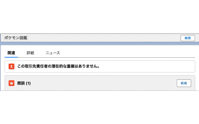
完成イメージ
左端に折りたたみ機能のついたボタンを配置。
右端に別機能のボタンを配置。
今回の挙動確認は折りたたみ機能のみ。

手順
セクションのレイアウトをSLDSから拝借
SLDSのExpandable Sectionから
セクションのBaseを拝借。
<div class="slds-section slds-is-open">
  <h3 class="slds-section__title">
    <button aria-controls="expando-unique-id" aria-expanded="true" class="slds-button slds-section__title-action">
      <svg class="slds-section__title-action-icon slds-button__icon slds-button__icon_left" aria-hidden="true">
        <use xlink:href="/assets/icons/utility-sprite/svg/symbols.svg#switch"></use>
      </svg>
      <span class="slds-truncate" title="Section Title">Section Title</span>
    </button>
  </h3>
  <div class="slds-section__content" id="expando-unique-id">
    <p>Aenean eu leo quam. Pellentesque ornare sem lacinia quam venenatis vestibulum. Fusce dapibus, tellus ac cursus commodo, tortor mauris condimentum nibh, ut fermentum massa justo sit amet risus. Lorem ipsum dolor sit amet, consectetur adipiscing elit.
      Nullam quis risus eget urna mollis ornare vel eu leo. Nulla vitae elit libero, a pharetra augue.</p>
  </div>
</div>
そして、
セクションのClosedを拝借。
<div class="slds-section">
  <h3 class="slds-section__title">
    <button aria-controls="expando-unique-id" aria-expanded="false" class="slds-button slds-section__title-action">
      <svg class="slds-section__title-action-icon slds-button__icon slds-button__icon_left" aria-hidden="true">
        <use xlink:href="/assets/icons/utility-sprite/svg/symbols.svg#switch"></use>
      </svg>
      <span class="slds-truncate" title="Section Title">Section Title</span>
    </button>
  </h3>
  <div hidden="" class="slds-section__content" id="expando-unique-id">
    <p>Aenean eu leo quam. Pellentesque ornare sem lacinia quam venenatis vestibulum. Fusce dapibus, tellus ac cursus commodo, tortor mauris condimentum nibh, ut fermentum massa justo sit amet risus. Lorem ipsum dolor sit amet, consectetur adipiscing elit.
      Nullam quis risus eget urna mollis ornare vel eu leo. Nulla vitae elit libero, a pharetra augue.</p>
  </div>
</div>
これを元に編集していく。
それぞれで異なるのは、
Baseの
<div class="slds-section slds-is-open">

<button aria-controls="expando-unique-id" aria-expanded="true" class="slds-button slds-section__title-action">
Closedの
<div class="slds-section">

<button aria-controls="expando-unique-id" aria-expanded="false" class="slds-button slds-section__title-action">
の部分。
class="slds-is-open"はSLDSで折りたたみ機能で開いている状態を示している。
aria-controlsはどこを表示・非表示にするのかを制御するもの。
aria-expanded="true"は折りたたみがされているかどうかのstatusでtrueが開いている状態。
今回は表示・非表示する場所は"expando-unique-id"で固定なので、
他2つが、JavaScriptで変化する様に実装してみた。
ヘッダーの部分は、こんな感じ。
    <div class={sectionClass}>
      <div class="slds-section__title slds-theme_shade">
        <div>
          <button
            aria-controls="expando-unique-id"
            aria-expanded={isExpanded}
            class= "toggle-button"
            onclick={toggleSection}
          >
            ポケモン図鑑
          </button>
        </div>
        <div>
          <button
            class="slds-button slds-button_neutral header-search-button"
            onclick={toggleSearch}
          >
            検索
          </button>
        </div>
      </div>
CSSは以下の通り
ボタンの位置を修正しちゃうと色々不都合がでてきたので、ちょっと修正。
/* セクション全体の配置位置 */

.slds-section {
    /* マージンをリセット */
    margin-top: 0;
    margin-bottom: 0;
    /* パディングをリセット */
    padding: 0;
}

.toggle-button {
    border: none;
}


/* セクションのヘッダーの位置と背景色 */

.slds-section__title.slds-theme_shade {
    padding: 0px 8px;
    display: flex;
    justify-content: space-between;
}

/* ヘッダーのボタンサイズ */

.slds-button.slds-button_neutral.header-search-button {
    font-size: 13px;
    height: 26px;
}
今度はボディ部分だが、前回は<div class="slds-section__content" id="expando-unique-id">要素にif:true={isExpanded}をつかっていたが、それを削除
 <!-- 表示/非表示させるもの -->
      <div class="slds-section__content" id="expando-unique-id">
        <div class="form-row">
          <label class="pokemon-key">図鑑No.</label>
          <input class="pokemon-value" type="number"></input>
        </div>
        <div class="form-row">
          <label class="pokemon-key">名前</label>
          <label class="pokemon-value">ピカチュウ</label>
        </div>
        <div class="form-row">
          <label class="pokemon-key">タイプ1</label>
          <label class="pokemon-value">でんき</label>
        </div>
        <div class="form-row">
          <label class="pokemon-key">タイプ1</label>
          <label class="pokemon-value"></label>
        </div>
        <div class="form-row">
          <label class="pokemon-key">詳細</label>
          <label class="pokemon-value">これはこう。あれもこう。</label>
        </div>
      </div>
JavaScriptでisExpandedがtrueとなれば表示。falseなら非表示とするのは一緒。
前回と違うのは、もしisExpandedがtrueなら
<div class="slds-section slds-is-open">
を使用し、
falseなら
<div class="slds-section">
とするため、
sectionClassメソッドを作成した。
CSSとJavaScriptは以下の通り。
/* セクションのボディの各出力項目のkey-valueの親 */

.form-row {
    display: flex;
    align-items: center;
}

/* labelのkey */

.pokemon-key {
    width: 130px;
    margin: 5px;
}

/* labelのvalue */

.header-search-button {
    position: relative;
    right: 8px;
}
import { LightningElement, track } from "lwc";

export default class MyComponent extends LightningElement {
  @track isExpanded = true;

  get sectionClass() {
    return `slds-section ${this.isExpanded ? "slds-is-open" : ""}`;
  }
  toggleSection() {
    this.isExpanded = !this.isExpanded;
  }
}
## 全体のコード
pokemonData.html
<template>
  <!-- 大枠 -->
  <div class="slds-box">
    <!-- セクション -->
    <div class={sectionClass}>
      <div class="slds-section__title slds-theme_shade">
        <div>
          <button
            aria-controls="expando-unique-id"
            aria-expanded={isExpanded}
            class= "toggle-button"
            onclick={toggleSection}
          >
            ポケモン図鑑
          </button>
        </div>
        <div>
          <button
            class="slds-button slds-button_neutral header-search-button"
            onclick={toggleSearch}
          >
            検索
          </button>
        </div>
      </div>
      <!-- 表示/非表示させるもの -->
      <div class="slds-section__content" id="expando-unique-id">
        <div class="form-row">
          <label class="pokemon-key">図鑑No.</label>
          <input class="pokemon-value" type="number"></input>
        </div>
        <div class="form-row">
          <label class="pokemon-key">名前</label>
          <label class="pokemon-value">ピカチュウ</label>
        </div>
        <div class="form-row">
          <label class="pokemon-key">タイプ1</label>
          <label class="pokemon-value">でんき</label>
        </div>
        <div class="form-row">
          <label class="pokemon-key">タイプ1</label>
          <label class="pokemon-value"></label>
        </div>
        <div class="form-row">
          <label class="pokemon-key">詳細</label>
          <label class="pokemon-value">これはこう。あれもこう。</label>
        </div>
      </div>
    </div>
  </div>
</template>
pokemonData.css
/* 大枠 */

.slds-box {
    background-color: #ffff;
    padding: 0;
    overflow: hidden;
    border: solid 1px rgb(113, 113, 113);
}

/* セクション全体の配置位置 */

.slds-section {
    /* マージンをリセット */
    margin-top: 0;
    margin-bottom: 0;
    /* パディングをリセット */
    padding: 0;
}

.toggle-button {
    border: none;
}

/* セクションのヘッダーの位置と背景色 */

.slds-section__title.slds-theme_shade {
    padding: 0px 8px;
    display: flex;
    justify-content: space-between;
}

/* セクションのボディの各出力項目のkey-valueの親 */

.form-row {
    display: flex;
    align-items: center;
}

/* labelのkey */

.pokemon-key {
    width: 130px;
    margin: 5px;
}

/* labelのvalue */

.header-search-button {
    position: relative;
    right: 8px;
}

/* ヘッダーのボタンサイズ */

.slds-button.slds-button_neutral.header-search-button {
    font-size: 13px;
    height: 26px;
}
pokemonData.js
import { LightningElement, track } from "lwc";

export default class MyComponent extends LightningElement {
  @track isExpanded = true;

  get sectionClass() {
    return `slds-section ${this.isExpanded ? "slds-is-open" : ""}`;
  }

  toggleSection() {
    this.isExpanded = !this.isExpanded;
  }
}
挙動確認
前と全く同じ挙動となりました。
別法
他にも
detailsタグも使えるらしいですね。
<details>
<summary>タイトル</summary>
ボディ
</details>
終わりに
前回の課題は解決できました!
あ、相変わらず折りたたみボタン入れ忘れた。。。
Discussion