Angular Material の css バンドルサイズを削減しよう!
Angular Advent Calendar 2023 17 日目の記事です。
みなさ〜ん、Angular Material 使ってますか〜?
今回は Angular Material の css バンドルサイズを削減する小技をご紹介します!
使う Component だけ theme を設定しよう!
【準備】 theme は Custom を選ぶ
この小技を使うには ng add する際に聞かれる Choose a prebuilt theme name, or "custom" for a custom theme: で Custom を選択する必要があります。
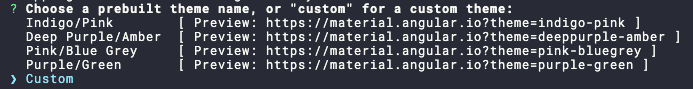
Custom 以外の theme を選択してしまうと、Angular Material によって事前にビルドされた css がバンドルに入り、 Component 単位での設定ができなくなってしまうためです。
既存のアプリケーションですでに Custom 以外の theme を設定している場合も、事前ビルドされた css を外し Custom と同じように scss を書くことで実現できますのでご安心ください。(こちらの詳しい方法については割愛します。)
改めて style.scss の変更を確認する
Angular Material を ng add したあとの style.scss の差分、読み飛ばしている方も多いのではないでしょうか? なぜそう思うかと言えば、英語のコメントがめっちゃ多いからです。v17.0.4 の時点で下記画像のようになっています。
// Custom Theming for Angular Material
// For more information: https://material.angular.io/guide/theming
@use '@angular/material' as mat;
// Plus imports for other components in your app.

// Include the common styles for Angular Material. We include this here so that you only
// have to load a single css file for Angular Material in your app.
// Be sure that you only ever include this mixin once!
@include mat.core();

// Define the palettes for your theme using the Material Design palettes available in palette.scss
// (imported above). For each palette, you can optionally specify a default, lighter, and darker
// hue. Available color palettes: https://material.io/design/color/
$my-primary: mat.define-palette(mat.$indigo-palette);
$my-accent: mat.define-palette(mat.$pink-palette, A200, A100, A400);

// The warn palette is optional (defaults to red).
$my-warn: mat.define-palette(mat.$red-palette);

// Create the theme object. A theme consists of configurations for individual
// theming systems such as "color" or "typography".
$my-theme: mat.define-light-theme((
  color: (
    primary: $my-primary,
    accent: $my-accent,
    warn: $my-warn,
  )
));

// Include theme styles for core and each component used in your app.
// Alternatively, you can import and @include the theme mixins for each component
// that you are using.
@include mat.all-component-themes($my-theme);

/* You can add global styles to this file, and also import other style files */

html, body { height: 100%; }
body { margin: 0; font-family: Roboto, "Helvetica Neue", sans-serif; }
読まんて。
もうおまじないだと思って見なかったことにするって。
でも今回は我慢して下の方の // Include theme styles ... ってコメントだけ読んでみましょう。訳すと下記の内容になります。
// アプリで使用するコアと各コンポーネントのテーマ・スタイルをインクルードします。
// あるいは、あなたの使用する各コンポーネントのテーマミキシンをインポートして @include することもできます。
1 行目はそのすぐ下の include 文の説明です。
@include mat.all-component-themes($my-theme);
この mixin が何をしているか確認していきましょう。
mat.all-component-themes() の実装
mat.all-component-themes() の実装はこのようなコードになっています。
その名の通り、Angular Material に存在する全ての Component 用の css を出力します。つまり、アプリケーションで使用していない Component 用の css も出力されているのです!なんということでしょう!
使っている Component だけ theme を設定する
style.scss のコメントを振り返ってみましょう。
// アプリで使用するコアと各コンポーネントのテーマ・スタイルをインクルードします。
// あるいは、あなたの使用する各コンポーネントのテーマミキシンをインポートして @include することもできます。
今回はこの 2 行目に従って、使っている Component の theme だけ include してみます。mat-button しか使っていないアプリケーションの場合下記のとおりです。
-  @include mat.all-component-themes($my-theme);
+  @include mat.core-theme($my-theme); // 全 Component に共通する設定
+  @include mat.button-theme($my-theme);
これで mat-button 用の css だけ出力されます。
各 Component の theme 設定用 mixin の命名ですが、基本的に {Component名}-theme() になっています。Angular Material のドキュメントには載ってませんので、迷ったら先程の mat.all-component-themes() の実装を見るのが良いでしょう。
バンドルサイズを比較しよう!
mat-button のみ使用するアプリケーションの場合
早速 build して、バンドルサイズを確認してみましょう。
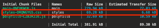
まずは初期状態の全 Component 分の css を出力している場合
続いて mat-button のみの css を出力している場合
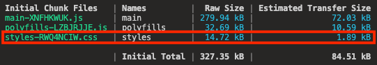
Estimated Transfer Size が 6.68 kB -> 1.89kB になりました! 初期バンドルの css サイズが、なんと約 70% 減です!
おわりに
みなさんの中にも、使わない css が初期バンドルに紛れ込んじゃってるって方は多いのではないでしょうか!?
しかしこの方法だと、新たな Angular Material の Component を使うたびに theme の設定を入れなければならないのでちょっと面倒くさいですよね。なのでアプリケーションがある程度完成してからリファクタリングするのが良いと思います。
Angular Material を使っていて、最近バンドルサイズが気になっている方、ぜひ試してみてください!
明日は @KShamoji さんです。よろしくお願いします!
Discussion