先日リリースされたTailwind CSS v4.0でコンテナクエリがプラグインなしで利用できるようになりました。今回はカードのグリッドレイアウトをつくりながら、使い方を学んでいこうと思います。
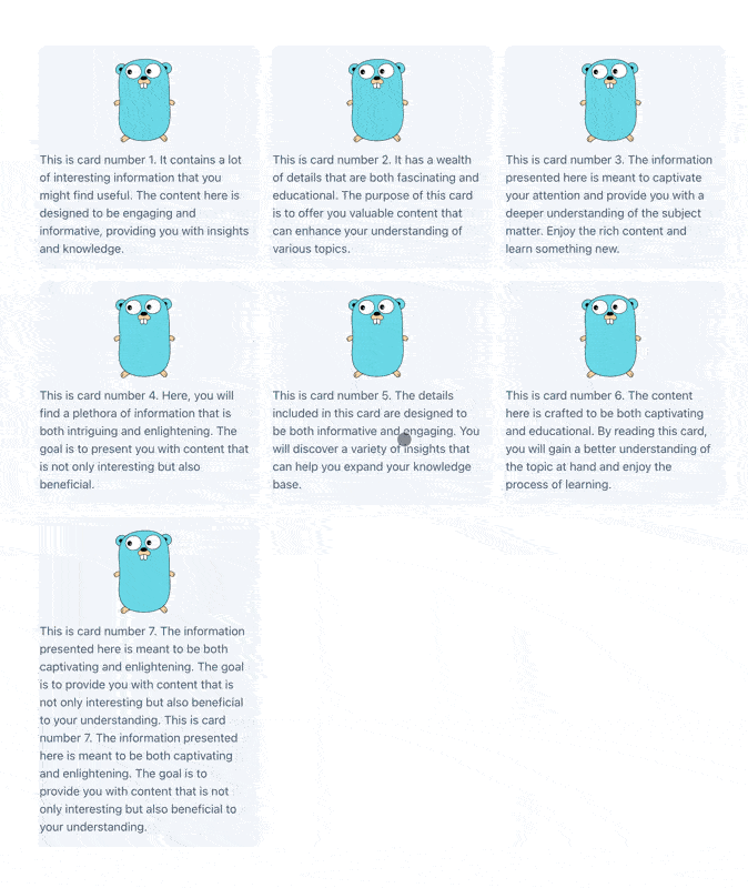
カードのグリッドレイアウト
コンテナクエリの使い方
@container クラスを付けるとコンテナコンテキストが生成されます。その中では @xs や @max-xs といったTailwind variantsが利用できるため、コンテナのサイズに応じて、きめ細かなスタイルの制御を行えます。
ブレイクポイント
スクリーンサイズで制御する従来のメディアクエリよりも、より適したブレイクポイントでスタイルを調整できるのがコンテナクエリの強みです。以下のカードコンポーネントでは 320px をブレイクポイントとして、いくつかのスタイルを制御しています。
- カード内の要素を横積みに切り替え
- 画像幅の相対値を大きくする
- (長いテキストに備えて) 説明文の行数を最大8行に指定
card.tsx
type Props = {
  description: string;
};

export function Card({ description }: Props) {
  return (
    <div className="@container rounded-xl bg-slate-100 px-2 py-4 text-slate-600">
      {/*           ^^^^^ コンテナコンテキストを生成 */}
      <div className="flex flex-col items-center gap-y-2 @xs:flex-row @xs:gap-x-4">
        {/*                                              ^^^^^ 320px以上で要素を横積みにする */}
        <div className="w-[30cqw] @xs:w-[50cqw] @xs:min-w-[100px]">
        {/*                       ^^^^^ 320px以上で画像幅の相対値を大きくする */}
          <img src="/gopher.svg" alt="Go Gopher" className="aspect-2/3 h-[150px] w-[100px]" />
        </div>
        <div className="@xs:line-clamp-8">{description}</div>
        {/*             ^^^^^ 320px以上で説明文の行数を8行までにする */}
      </div>
    </div>
  );
}
コンテナのサイズを取得
また、コンテナクエリでは cqw を使うことで、コンテナの幅を取得できます。以下のコードでは、コンテナのサイズから画像幅を動的に算出しています。
{/* 320px以下でコンテナ幅の30%、それ以上でコンテナ幅の50%の大きさになる */}
<div className="w-[30cqw] @xs:w-[50cqw] @xs:min-w-[100px]">
グリッドレイアウトに組み込む
続いて、カードコンポーネントを囲むグリッドレイアウトをつくっていきます。グリッドアイテムの幅を minmax(250px,1fr) と指定することで、250px以上の大きさでカラム数が増減します。
カードは 320px で横積み切り替わるため、「コンテナの幅が 250px - 320px の間では縦積み、それ以上の幅では横積み」というレイアウトを実現しています。
App.tsx
function App() {
  return (
    <div className="grid grid-cols-[repeat(auto-fit,minmax(250px,1fr))] gap-4 p-4">
      <Card description="This is card number 1. It contains a lot of interesting information that you might find useful. The content here is designed to be engaging and informative, providing you with insights and knowledge." />
      <Card description="This is card number 2. It has a wealth of details that are both fascinating and educational. The purpose of this card is to offer you valuable content that can enhance your understanding of various topics." />
      <Card description="This is card number 3. The information presented here is meant to captivate your attention and provide you with a deeper understanding of the subject matter. Enjoy the rich content and learn something new." />
      <Card description="This is card number 4. Here, you will find a plethora of information that is both intriguing and enlightening. The goal is to present you with content that is not only interesting but also beneficial." />
      <Card description="This is card number 5. The details included in this card are designed to be both informative and engaging. You will discover a variety of insights that can help you expand your knowledge base." />
      <Card description="This is card number 6. The content here is crafted to be both captivating and educational. By reading this card, you will gain a better understanding of the topic at hand and enjoy the process of learning." />
      <Card description="This is card number 7. The information presented here is meant to be both captivating and enlightening. The goal is to provide you with content that is not only interesting but also beneficial to your understanding. This is card number 7. The information presented here is meant to be both captivating and enlightening. The goal is to provide you with content that is not only interesting but also beneficial to your understanding." />
    </div>
  );
}
おわりに
Tailwind CSS v4.0における、コンテナクエリの使い方を紹介しました。これらの機能を活用することで、スクリーンの大きさに依存しない、より独立性の高いコンポーネントがつくれそうです。
Discussion