Flutter Typography (Google Fontsを使う)
Flutter's fonts and typography
タイポグラフィは、活字やフォントのスタイルや外観をカバーする。フォントの重さ、フォントの傾き、文字の間隔、その他テキストの視覚的な側面を指定する。
フォントはすべて同じに作られるわけではありません。
フォント・スタイルは、最低限、RobotoやNotoといった同じ書体ファミリーのフォントを記述する共通の文字規則のセットを表す書体、フォントの太さ(例えば、レギュラー、ボールド、または数値)、およびスタイル(レギュラー、イタリックなど)によって定義されます。これらすべてと、さらにあらかじめ設定された属性が組み合わさって、静的フォントと呼ばれるものが構成されます。
バリアブル・フォントは、これらの属性のいくつかを実行時に変更することを可能にし、通常は複数の静的フォントを1つのファイルに保存します。
公式サイトを見るとGoogle Fontsを使用する方法が記載されていた。デザインにこだわる現場だとTypographyは使う。Figmaのデザインに合わせてフォントを選ぶ。
タイポグラフィ(typography)とは、文字を美しく、読みやすく配置するデザインの手法です。文字の大きさやフォント、行間などを調整することで、文章をわかりやすく表現します。
FlutterでGoogle Fontsを使用することができるパッケージが昔からあったのだがメンテナンスがされていないようだった。
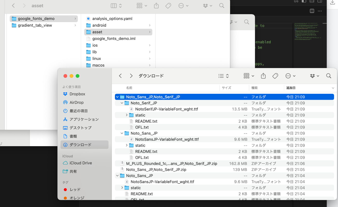
なので標準機能だけで行う。公式サイトからダウンロードする。assetsディレクトリを作成して配置する。
完成品もあるので参考にしてみてください。


yamlファイルに相対パスとフォントの名前を指定しておく。
yaml
name: google_fonts_demo
description: "A new Flutter project."

publish_to: 'none'

version: 1.0.0+1

environment:
  sdk: ^3.7.0

dependencies:
  flutter:
    sdk: flutter

  cupertino_icons: ^1.0.8

dev_dependencies:
  flutter_test:
    sdk: flutter

  flutter_lints: ^5.0.0

flutter:

  uses-material-design: true

  # To add assets to your application, add an assets section, like this:
  # assets:
  #   - images/a_dot_burr.jpeg
  #   - images/a_dot_ham.jpeg

  # An image asset can refer to one or more resolution-specific "variants", see
  # https://flutter.dev/to/resolution-aware-images

  # For details regarding adding assets from package dependencies, see
  # https://flutter.dev/to/asset-from-package

  # To add custom fonts to your application, add a fonts section here,
  # in this "flutter" section. Each entry in this list should have a
  # "family" key with the font family name, and a "fonts" key with a
  # list giving the asset and other descriptors for the font. For
  # example:
  # コメントアウトを解除する。
  fonts:
    - family: NotoSansJP # フォントの名前をつけておく
      fonts:
        - asset: asset/NotoSansJP-VariableFont_wght.ttf

    - family: NotoSerifJP # フォントの名前をつけておく
      fonts:
        - asset: asset/NotoSerifJP-VariableFont_wght.ttf
  #
  # For details regarding fonts from package dependencies,
  # see https://flutter.dev/to/font-from-package
このままフォントの名前を書いても良いがハードコードディングするより、static constで呼び出せるクラスを定義した方が開発では使いやすい。ファイルが多くありますので😅
class GoogleFontsStyle {
  GoogleFontsStyle._();
  static const notoSansJP = 'NotoSansJP';
  static const notoSerifJP = 'NotoSerifJP';
}
このように使用すれば毎回fontFamilyの名前を指定しなくもよくなる。
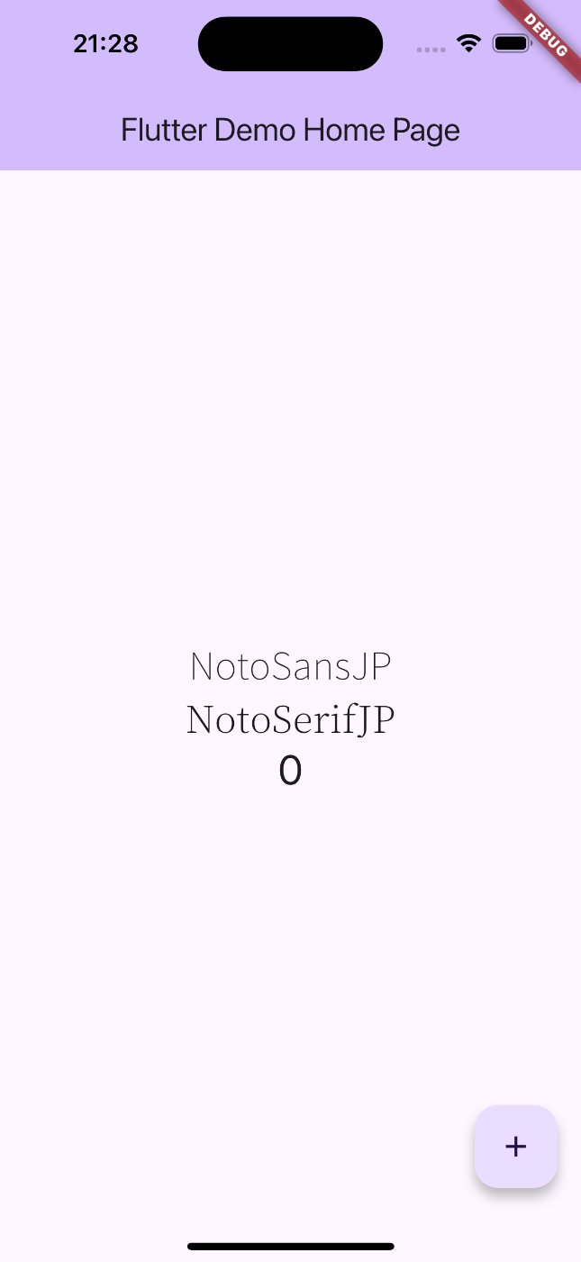
const Text('NotoSansJP', style: TextStyle(fontFamily: GoogleFontsStyle.notoSansJP, fontSize: 25),),
デモ用のカウンターアプリに適用してみる。
import 'package:flutter/material.dart';
import 'package:google_fonts_demo/google_fonts_style.dart';
void main() {
runApp(const MyApp());
}
class MyApp extends StatelessWidget {
const MyApp({super.key});
Widget build(BuildContext context) {
return MaterialApp(
title: 'Flutter Demo',
theme: ThemeData(
colorScheme: ColorScheme.fromSeed(seedColor: Colors.deepPurple),
),
home: const MyHomePage(title: 'Flutter Demo Home Page'),
);
}
}
class MyHomePage extends StatefulWidget {
const MyHomePage({super.key, required this.title});
final String title;
State<MyHomePage> createState() => _MyHomePageState();
}
class _MyHomePageState extends State<MyHomePage> {
int _counter = 0;
void _incrementCounter() {
setState(() {
_counter++;
});
}
Widget build(BuildContext context) {
return Scaffold(
appBar: AppBar(
backgroundColor: Theme.of(context).colorScheme.inversePrimary,
title: Text(widget.title),
),
body: Center(
child: Column(
mainAxisAlignment: MainAxisAlignment.center,
children: <Widget>[
const Text('NotoSansJP', style: TextStyle(fontFamily: GoogleFontsStyle.notoSansJP, fontSize: 25),),
const Text('NotoSerifJP', style: TextStyle(fontFamily: GoogleFontsStyle.notoSerifJP, fontSize: 25),),
Text(
'$_counter',
style: Theme.of(context).textTheme.headlineMedium,
),
],
),
),
floatingActionButton: FloatingActionButton(
onPressed: _incrementCounter,
tooltip: 'Increment',
child: const Icon(Icons.add),
),
);
}
}
このようにtypographyが適用できました。文字を見やすく美しくすることがユーザー体験の向上につながると思われます。
まとめ
業務系アプリの開発が多くてデザインにこだわることがなかったのですが、IOTアプリの開発に携わったときにデザイナーさんがtypographyの導入もしていたので、文字を美しくするだけで見た目が美しくなるのだなと学びました。
Discussion